Advertorial Landing Page: Definition, How to Create and 10 Examples
What is an Advertorial Landing Page? An advertorial landing page is a page that reads like editorial content but is built to convert. It looks like a news story, a reported piece, or a first-person account. It leads with information, builds a case, and only reveals the promotional intent once the re

What is an Advertorial Landing Page?
An advertorial landing page is a page that reads like editorial content but is built to convert. It looks like a news story, a reported piece, or a first-person account. It leads with information, builds a case, and only reveals the promotional intent once the reader is already bought in.
Unlike a standard landing page, which opens with an offer and asks for a decision immediately, an advertorial earns that decision gradually. The reader feels informed rather than sold to. That difference in psychology is why advertorials consistently outperform hard-sell pages on cold traffic.
The term combines “advertising” and “editorial.” In print, advertorials were full-page spreads written in the voice of the publication. Online, they live on branded blogs, native content hubs, and publisher partner pages, and they run on Taboola, Outbrain, Facebook, and Google. The format has been a staple of direct response marketing for decades because it works across virtually every vertical and traffic source.
Advertorial Landing Page vs. Regular Landing Page vs. Presell Page
These three page types are often confused because they occupy the same funnel position: between the ad and the offer. Here is how they differ in practice:
Feature | Advertorial | Regular Landing Page | Presell Page |
|---|---|---|---|
Format | Editorial article or news story | Sales page with headline, bullets, CTA | Short bridge page before the offer |
Traffic type | Cold (native, display, social) | Warm to hot (search, email) | Cold to warm |
Length | Long-form (1,500+ words) | Variable, often short | Short to medium |
Tone | Journalistic, informational | Promotional, direct | Conversational, curiosity-driven |
CTA placement | Mid-article and end, contextual | Above fold and throughout | Single CTA at the end |
Best for | Lead gen, nutraceuticals, insurance, solar, finance | SaaS, ecommerce, direct offers | Affiliate offers, bridge funnels |
The key distinction: a regular landing page asks for the conversion upfront. An advertorial earns it. A presell page teases it. Which one you use depends on how warm your traffic is and how much the reader needs to understand before they act.
Why Use Advertorial Landing Pages?
Advertorials outperform direct offers on cold traffic because they remove the friction that kills conversions before they start. A reader arriving from a Taboola ad or a Facebook scroll is not in buying mode. They are in consuming mode. An advertorial meets them there.
By leading with information, the page earns trust before asking for anything. The reader learns something, connects the problem to their situation, and arrives at the CTA already half-convinced. That psychological path is much shorter than the one a hard-sell page tries to force.
Advertorials also give you more surface area for messaging. You can test different angles, hooks, and narratives without rebuilding a full sales page. A health supplement can lead with a metabolic science angle, a personal story, a news-style investigation, or a comparison of options. Each is a different advertorial. Same offer, different entry points.
For lead generation specifically, advertorials qualify intent passively. A reader who makes it to the CTA after 1,500 words of context is a warmer lead than one who skimmed a short landing page and clicked impulsively. That difference shows up downstream in contact rates, set rates, and close rates.
When to Use Advertorial Landing Pages
Advertorials are the right tool in the following situations:
- Cold traffic campaigns on native or social: When you are buying traffic from Taboola, Outbrain, Facebook, or display networks, your audience has not shown purchase intent. Advertorials bridge the gap between curiosity and conversion.
- High-skepticism verticals: Health, finance, insurance, and legal offers carry built-in resistance. An editorial frame lowers that guard before the offer appears.
- Complex or unfamiliar offers: If your product requires explanation before someone will act, a sales page will not do it. An advertorial gives you the space to educate first.
- Improving lead quality: Adding an advertorial to the funnel filters out low-intent clicks. People who read through and convert are more likely to answer the phone, complete the form, and convert downstream.
- Testing new angles: Advertorials let you run multiple narrative approaches against the same offer quickly, without retooling your core sales page or product page.
- Warming up remarketing audiences: Not everyone converts on the first visit. Readers who engage with an advertorial but do not convert are high-value remarketing targets, because they already understand the problem you are solving.
How to Create an Advertorial Landing Page
The structure below applies across verticals. The specifics change, but the underlying logic stays the same.
- Choose your angle. The angle is the specific lens through which you frame the problem. For an auto insurance offer, the angle might be “why most people are overpaying without knowing it.” For a supplement, it might be a specific mechanism (slow metabolism, cortisol, gut health). The angle determines the hook, the story, and the CTA. Define it before you write a word.
- Write a hook that pulls, not pushes. The opening paragraph should make the reader feel seen. Reference a specific frustration, situation, or question they already have. The goal is to make them think “this is written about me” within the first three sentences.
- Build the problem before the solution. Spend the middle section establishing why the problem exists, why common solutions fail, and what most people miss. This is where the advertorial does its work. Do not rush to the product.
- Introduce the solution as a discovery, not a pitch. Frame the product or offer as something the reader is learning about, not something being sold to them. Use language like “what we found” or “how it works” rather than “buy now” or “our product.”
- Add social proof at the point of highest resistance. Testimonials, case study numbers, and third-party references work best placed just before the CTA, where skepticism is highest, not at the bottom of the page where most people have already left.
- Use a contextual CTA. The call to action should feel like a logical next step, not a gear shift. “Check if you qualify,” “see your savings estimate,” and “find out if this applies to you” are lower friction than “buy now” or “sign up.”
- Build it for mobile first. Most native and social traffic is mobile. Short paragraphs, clear subheadings, and thumb-friendly buttons are not optional. A beautiful desktop layout that breaks on mobile is not an advertorial: it is an expensive bounce.
- Use a tool built for this format. LanderLab includes 30+ advertorial templates designed for performance marketing, with an AI builder that generates a full page structure from a single prompt describing your offer and angle. You can test multiple versions without rebuilding from scratch, and built-in A/B testing shifts traffic to winning variants automatically.
Advertorial Landing Page Best Practices for Higher Conversions
1. Lead With the Reader’s Problem, Not Your Product
The most common mistake is opening with what you are offering. Advertorials that convert open with the reader’s situation: a cost they are paying unnecessarily, a problem they have accepted as permanent, a question they have had for a while. The product is the answer to a question the reader is already asking. If you lead with the product before the reader has felt the problem, there is nothing to be the answer to.
2. Write Like a Reporter, Not a Copywriter
The journalistic frame is what makes the format work. That means specific facts over vague claims, third-person framing where possible, and language that informs rather than persuades. “A new program is helping homeowners cut their energy bills without upfront costs” reads differently than “our product saves you money.” Same message. Different trust level.
3. Match Message to Traffic Source
An advertorial running on Taboola targets a different mindset than one running on Facebook. Taboola readers are in content-browsing mode. Facebook readers are in social-scrolling mode. The hook, the headline, and the opening frame should reflect where the reader is coming from. A page that ignores traffic source context will underperform regardless of how good the copy is.
4. Place CTAs Where Interest Peaks, Not Just at the End
Most advertorials bury the CTA at the bottom. By the time readers get there, the ones who were going to convert have already made up their minds mid-article. Place a contextual CTA immediately after the strongest section of your argument, where belief and curiosity peak. Then place a second one at the end for readers who want to finish before acting.
5. Keep Visual Proof Functional
Images in advertorials should support the argument, not decorate the page. Screenshots of results, charts showing data, photos of real products in use, and images that match the narrative all increase credibility. Generic stock photos that could belong to any page add nothing and can actually reduce perceived legitimacy, because they signal template rather than substance.
6. Test Angles, Not Just Layouts
Most A/B tests on advertorials focus on button color, headline phrasing, or image placement. The bigger variable is the angle: the specific problem frame you lead with. Two advertorials for the same offer with different angles can produce conversion rates that differ by 3x or more. Test the story before you test the button.
10 Advertorial Landing Page Examples
The examples below cover a range of verticals, structures, and conversion techniques. Each one illustrates a specific approach worth understanding before building your own.
1) Auto Insurance Savings Advertorial (Zip Code Entry)
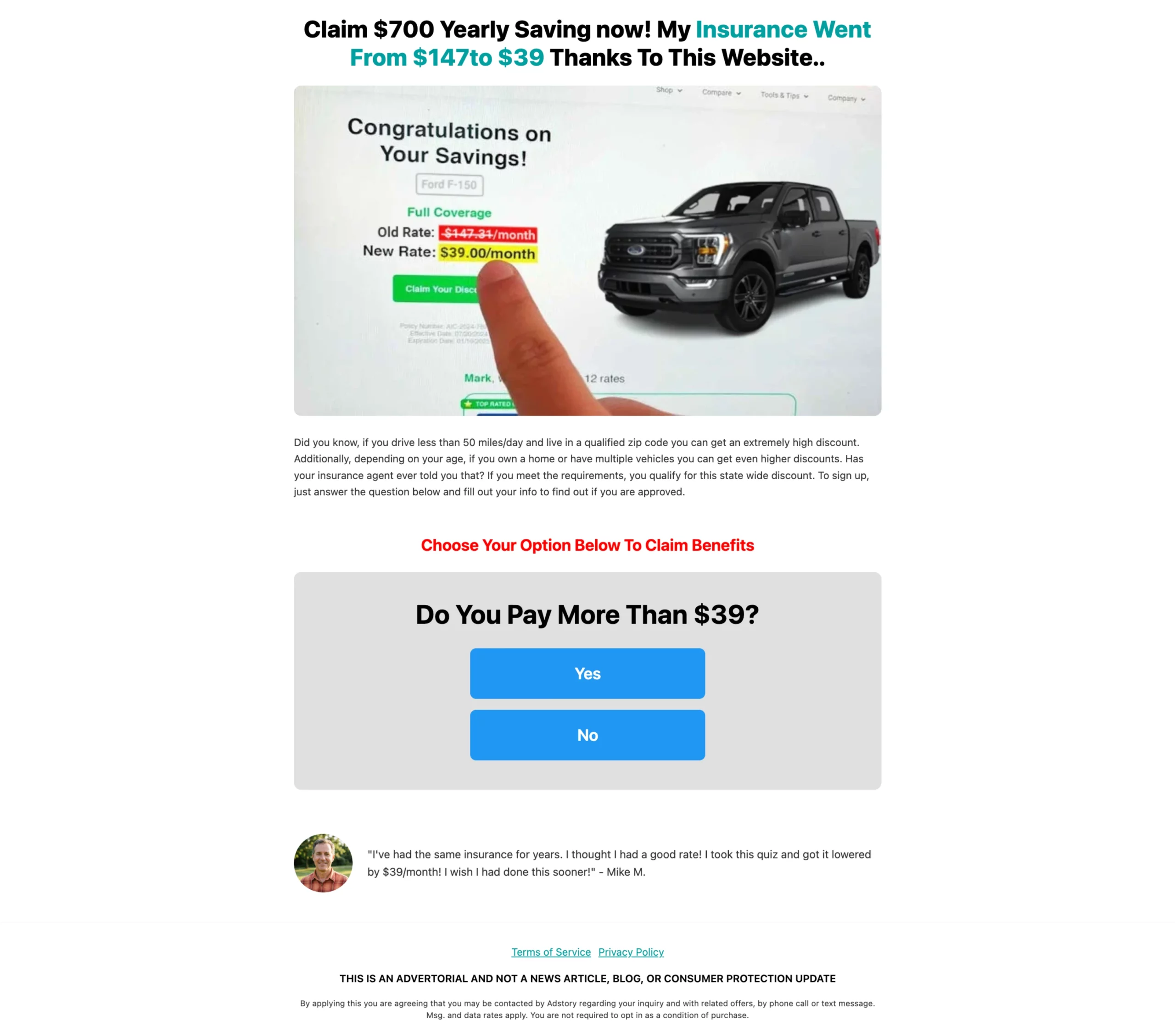
This is one of the most widely run advertorial formats in performance marketing. The page opens with a news-style headline about drivers in a specific state or region being overcharged for car insurance. It cites a triggering fact: that rates vary significantly based on zip code, and that most people never check competing rates after their initial policy.
The structure follows a tight problem-agitate-solve arc. The problem is overpaying without knowing it. The agitation is the specific dollar amount being left on the table. The solution is a short zip code entry that starts a comparison.
Why it works: The micro-commitment is extremely low: entering a zip code is not filling out a form. It is checking something. That single friction reduction accounts for a significant portion of the conversion lift. The advertorial does not sell insurance; it sells the idea that checking takes thirty seconds and could save $600 a year. The reader does the rest of the math themselves.
2) Debt Relief Advertorial (Qualification Funnel)
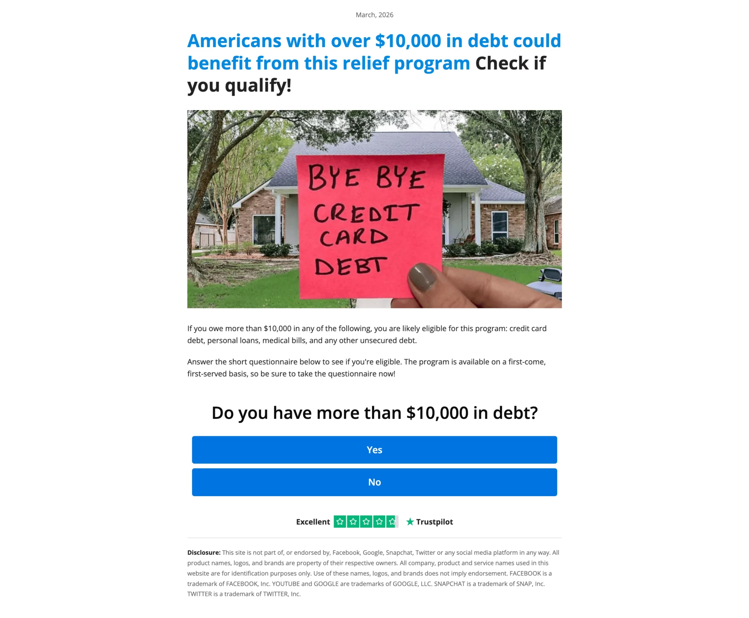
Debt relief advertorials target readers carrying $10,000 or more in unsecured debt, typically credit cards, personal loans, or medical bills. The page reads like a financial news story about programs that exist to help people in this situation, with a tone that is empathetic rather than salesy.
The structure builds urgency through education: it explains why minimum payments trap people, what debt settlement actually means, and what types of debt qualify. By the time the reader reaches the CTA, they have a working understanding of the offer and feel like they discovered it themselves, rather than being pitched.
Why it works: The reader’s primary barrier is skepticism. Debt relief has a reputation problem because of scammy players in the space. The advertorial format pre-handles that objection by reading like reporting rather than advertising. Specific eligibility criteria (minimum debt amount, types of debt covered) also serve as a self-qualification mechanism: readers who do not match the criteria exit early, which improves downstream lead quality.
3) Residential Solar Savings Advertorial (Program Frame)
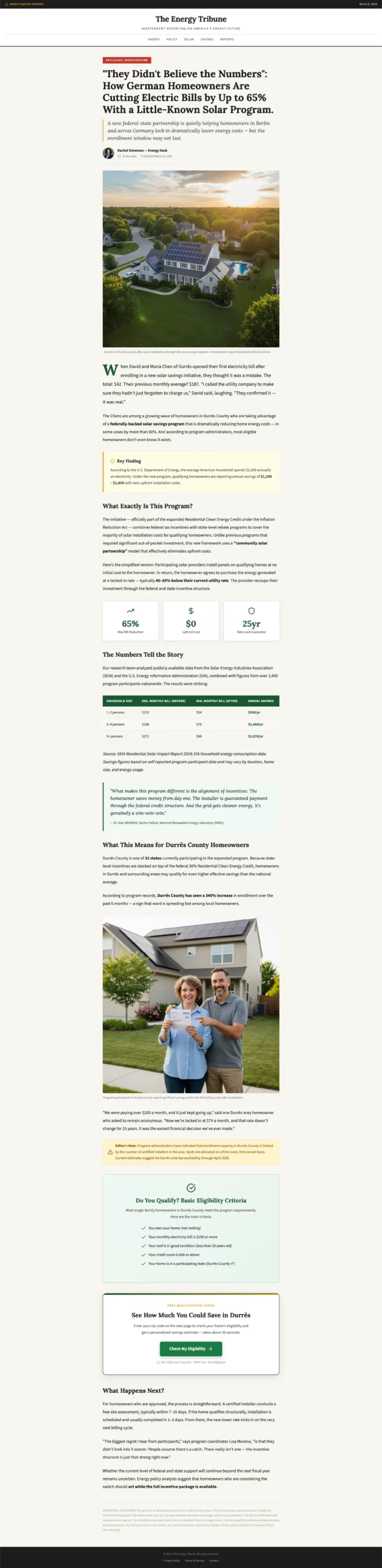
Solar advertorials perform best when framed around a program or initiative rather than a product. Instead of “buy solar panels,” the angle becomes “homeowners in [state] may qualify for a program that eliminates their electricity bill.” The advertorial explains how the program works, who qualifies, and why availability is limited.
The page typically walks through the mechanism: how solar credits and net metering work, why installation costs have dropped, and how the qualification check works. The CTA is not a purchase; it is an eligibility check.
Why it works: The program frame removes the high-ticket sales anxiety that shuts down conversions on direct solar landing pages. The reader is not buying a $20,000 system; they are checking whether they qualify for something. The advertorial also does substantial education work that the downstream sales call does not have to repeat, which shortens the sales cycle and improves close rates for the operators buying these leads.
4) Weight Loss Supplement Advertorial (Mechanism Story)
Supplement advertorials in the weight loss vertical are built around a named mechanism: a specific biological process that explains why the reader’s previous attempts have failed and why this approach is different. Common mechanisms include cortisol suppression, metabolic rate, gut microbiome imbalance, and cellular energy production.
The page leads with the reader’s frustration (doing everything right and still not losing weight), introduces the mechanism as the missing piece, explains the science in accessible terms, and positions the supplement as the practical application of that mechanism.
Why it works: The mechanism story converts the product from a commodity into a solution to a specific problem the reader now understands. Without the mechanism, the advertorial is just another supplement pitch. With it, the reader feels like they have learned something that changes how they see their situation. That shift in understanding is what drives the click.

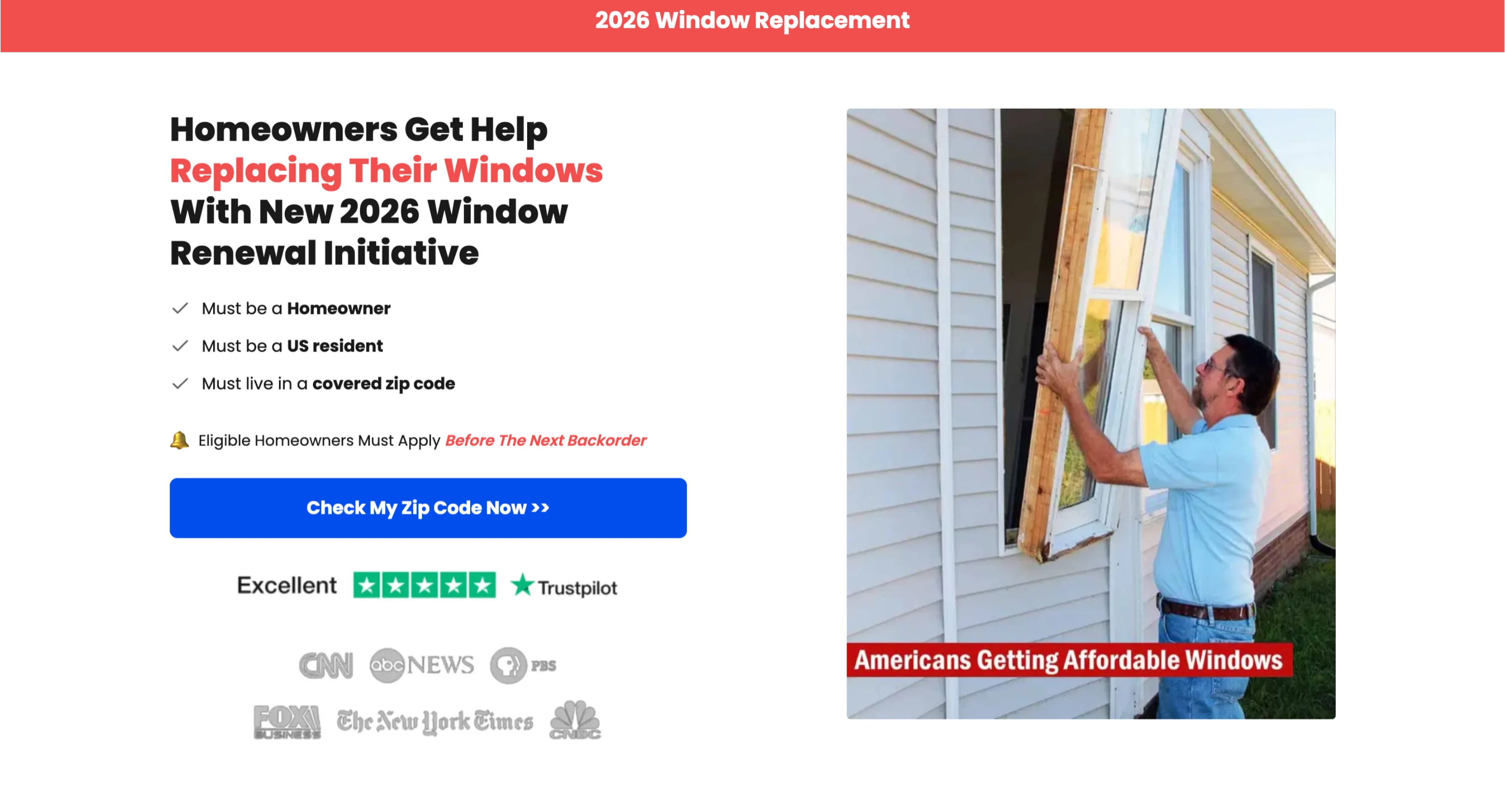
5) Window Replacement Initiative (Zip Code Funnel)
This advertorial uses government-adjacent framing: a “window replacement initiative” available to eligible homeowners, with specific eligibility criteria and deadline language. The entry point is a zip code check, not a form or a quote request.
The page establishes authority through visual signals (seal-style badges, program language, specific eligibility thresholds) and reduces friction through progressive commitment. The zip code check leads to a short multi-step form rather than a long single-page form.
Why it works: Authority signals and deadline language work together to create legitimate urgency without manufactured pressure. The zip code micro-commitment gets the reader into the funnel before the larger form ask appears. Each step the reader takes increases their psychological investment in completing the process, a principle known as commitment and consistency.
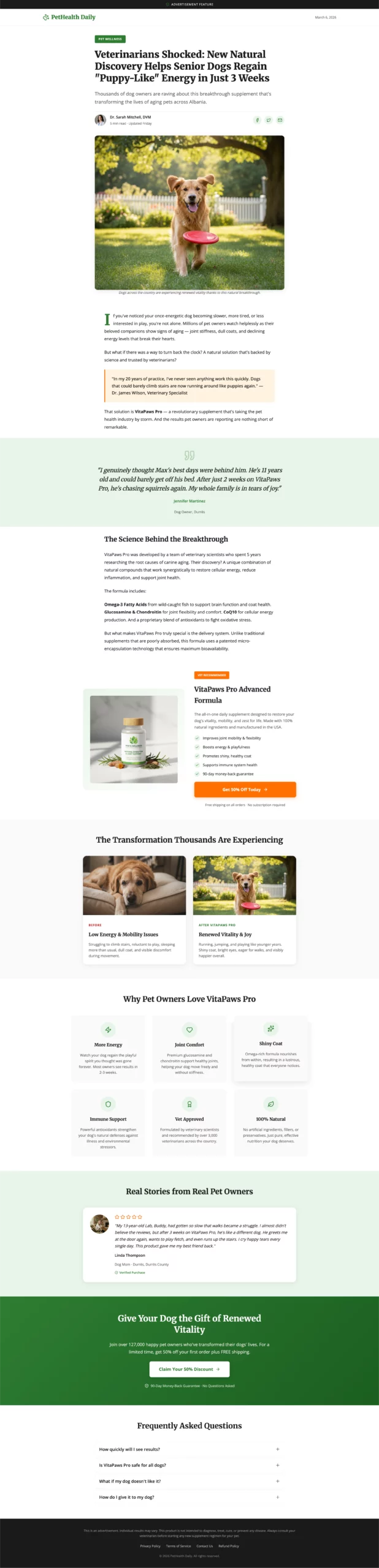
6) Pet Supplement Advertorial (Transformation Story)
Pet supplement advertorials lead with an emotional story: a dog or cat that was lethargic, in pain, or declining, and the owner’s search for something that actually helped. The advertorial is written from the pet owner’s perspective, in first or third person, with specific details about the animal’s age, symptoms, and the moment things started to change.
The supplement is introduced mid-story, after the emotional investment is already established. Ingredient explanations follow the story section, giving rational cover for an emotionally driven decision. The CTA is typically framed around trying it for the pet, not buying a product.
Why it works: Pet owners are a uniquely motivated audience. The emotional stakes are high and the purchase threshold is relatively low. The transformation story bypasses the typical skepticism around supplements because the reader is empathizing with the owner before evaluating the product. By the time the product details appear, the reader wants it to work.
7) Investment Strategy Advertorial (Authority and Insider Access)
Financial advertorials in the investment space use an investigation or exposé frame: a strategy that major investors use that most retail investors have never heard of, or a market dynamic that creates an unusual opportunity right now. The page is written with the authority of financial journalism: data references, expert credentials, and measured analytical language.
The CTA is typically access-based rather than purchase-based: a free report, a private briefing, or a special research letter. The advertorial is the pitch for the content, not for the underlying product.
Why it works: Financial readers are highly skeptical of direct sales pitches but respond strongly to perceived insider knowledge. The authority frame, which positions the content as research rather than advertising, increases perceived credibility. The access CTA also reduces perceived risk: the reader is not spending money on a product; they are unlocking information. The product comes later in the funnel.

8) Anti-Aging Skincare Advertorial (Comparison Frame)
Skincare advertorials in the anti-aging space use a comparison structure: cosmetic procedures versus topical solutions, with the advertorial positioned as an objective evaluation. The page examines why surgical options are expensive, risky, and impermanent, then introduces science-backed topical formulas as the rational alternative.
Key structural elements include ingredient breakdowns with clinical reference language, before-and-after framing, and social proof from users across different age ranges. The tone is educational rather than promotional, closer to a consumer guide than a product pitch.
Why it works: The comparison frame is effective because it performs the reader’s own evaluation process for them. Rather than the reader wondering “is this better than alternatives,” the advertorial answers that question explicitly. The result is a reader who arrives at the CTA already having made the comparison, with the product coming out ahead.

9) Home Renovation Assistance Advertorial (Program Eligibility)
Home renovation advertorials use the same program framing that works in solar: a funding initiative or eligibility-based assistance program that helps homeowners cover upgrade costs. The specific upgrade (kitchen, bathroom, roof, HVAC) is secondary to the framing of qualified access.
The page explains who tends to qualify, what types of improvements are typically covered, and how the process works, then routes the reader to a short eligibility check. Urgency is created through funding availability rather than manufactured countdown timers.
Why it works: Homeowners are predisposed to want home improvements but resistant to the cost. The program frame resolves that tension directly: the improvement is now about accessing something available to them, not spending money. The eligibility check is low friction and creates natural segmentation for the media buyer’s lead buyers downstream.

10) Medical Alert Device Advertorial (Safety and Independence)
Medical alert advertorials target adult children making purchasing decisions for elderly parents, alongside the seniors themselves. The page leads with the fear of a fall or health emergency with no way to call for help, builds empathy for the desire to stay independent, and introduces the device as the solution that makes independence safe rather than risky.
The advertorial typically compares device types (wearable vs. in-home, fall detection vs. manual activation), which adds comparison value and positions the featured product within a category context. Testimonials from both seniors and family members address both buyer personas simultaneously.
Why it works: The dual audience structure (the user and the buyer) means the advertorial needs to address emotional safety concerns for both. The feature comparison gives the adult child the rational justification they need to feel confident in the decision, while the independence framing gives the senior a reason to want the device rather than resist it. Both objections are handled inside the content before the CTA appears.

Ready to Build Your Own Advertorial Landing Page?
LanderLab gives you 30+ advertorial templates built for performance marketing, an AI builder that generates a full page structure from a single prompt, and built-in A/B testing that shifts traffic to winning variants automatically. No separate tools, no manual traffic balancing.
Start Your Free Trial at LanderLab
How to Measure Advertorial Landing Page Performance
Standard conversion rate is not the only metric that matters for advertorials. Because advertorials work across a longer funnel, you need to measure performance at multiple points:
- Scroll depth: How far down the page are readers getting? If most people drop off before reaching the mechanism section or the CTA, the hook is not holding them. Scroll depth tells you where the page loses them.
- Time on page: Advertorials are long-form. A 90-second average session on a 1,500-word page means most people are skimming. That is not necessarily bad if conversion rate is acceptable, but it tells you the narrative is not fully engaging.
- Click-through rate to the offer: For two-step funnels where the advertorial routes to a separate offer page, CTR from the advertorial measures how well the page is warming the reader, independent of offer page performance.
- Lead quality metrics: Contact rate, set rate, and close rate on leads generated through advertorials should be tracked separately from leads generated through direct landing pages. Advertorial leads typically show higher quality downstream. If they do not, the page may be attracting the wrong audience.
- Bounce rate by traffic source: An advertorial that performs well on Facebook may underperform on Taboola, and vice versa. Breaking out bounce rate by source tells you whether the page-to-source match is working.
Common Advertorial Mistakes to Avoid
- Leading with the product: If the first mention of your product comes in the first paragraph, it reads as an ad. The reader’s guard goes up immediately. Earn the product mention by establishing the problem first.
- Generic hooks: “Are you tired of paying too much for X?” is not a hook. It is a category statement. A real hook is specific: a named fact, a surprising statistic, or a precise situation the reader recognizes as their own.
- Single CTA at the bottom: Most readers make their decision mid-article, at the peak of interest. A page that forces them to scroll to the bottom to act is losing conversions in the middle section.
- Irrelevant outbound links: Links to unrelated tools, resources, or services inside an advertorial break the editorial frame and can damage page authority. Every link in the article should either support the argument or route to the offer.
- Skipping mobile optimization: If your paragraphs run more than four lines on mobile, readers will not finish them. Short paragraphs, clear subheadings, and easy-to-tap buttons are non-negotiable when most of your traffic is on a phone.
- Testing layouts before testing angles: The angle (the specific problem frame and narrative lens) drives the biggest variance in advertorial performance. Test different angles before spending time on button colors and layout variations.
Advertorial Landing Page FAQs
What is an advertorial landing page?
An advertorial landing page is a page that reads like editorial content (a news story, article, or first-person account) but is structured to convert readers into leads or customers. It leads with information rather than a sales pitch, using the journalistic format to build trust before presenting an offer.
What is the difference between an advertorial page and an advertorial landing page?
The terms are used interchangeably in performance marketing. “Advertorial page” and “advertorial landing page” both refer to the same format: a page that combines editorial presentation with a conversion goal. Some marketers use “advertorial page” to refer to shorter formats or pages hosted on publisher sites, while “advertorial landing page” often refers to pages hosted on the brand’s own domain. The underlying structure and purpose are the same.
How is an advertorial landing page different from a regular landing page?
A regular landing page opens with the offer and asks for a decision immediately. An advertorial earns that decision gradually by educating the reader first. Regular landing pages work better for warm or intent-based traffic (search, email). Advertorials work better for cold traffic where the reader needs context before they will act.
What is the typical conversion rate for an advertorial landing page?
Advertorials typically convert cold traffic at 1 to 3 percent from click to lead or sale. However, the downstream quality of those leads is usually higher than leads from direct landing pages, because readers who convert after engaging with long-form content have a stronger understanding of the offer. Measure advertorial performance across the full funnel, not just the first conversion event.
How long should an advertorial landing page be?
Most effective advertorials run between 1,000 and 2,500 words, depending on the complexity of the offer and the sophistication of the audience. The page should be long enough to build the problem, introduce the mechanism or solution, add social proof, and deliver the CTA, but not so long that scroll depth drops before readers reach the offer. Use scroll depth data to find where you are losing readers and cut or improve that section.
Can I use an advertorial landing page for cold traffic?
Yes. Advertorials are specifically designed for cold traffic, where readers have no prior awareness of your offer. The editorial format meets readers where they are: in content-consuming mode rather than buying mode. That alignment is the primary reason advertorials outperform direct offers on native and social traffic sources.
Do advertorial landing pages work for lead generation?
Advertorials are one of the most effective formats for lead generation across high-value verticals including insurance, legal, solar, home services, financial services, and health. The format qualifies intent passively: readers who engage with the full article and convert are higher quality leads than readers who skimmed a short page and clicked impulsively.