Crafting a high-converting landing page used to be a technical task reserved for developers. But with the rise of no-code tools like LanderLab, that’s no longer the case.
What once required hours of coding can now be accomplished by anyone—whether you’re a marketer, entrepreneur, or even a first-time website creator. Imagine building sleek, responsive, and conversion-driven landing pages with zero coding experience.
In this guide, we’ll break down how to create a high-converting landing page without coding skills. And how you can leverage LanderLab’s intuitive platform to design landing pages that don’t just look good but are optimized for maximum results.
The Importance of Conversion-Focused Landing Pages
Landing pages are specifically designed to turn visitors into leads or customers. Unlike regular web pages that offer multiple navigation options, a landing page is more like a direct route with a specific goal in mind. It eliminates distractions and hones in on a single conversion objective, whether that’s collecting email addresses, generating leads, or making sales.
A well-crafted landing page can significantly reduce obstacles for your visitors, leading to a boost in conversions. A common myth is that you need coding expertise to create an effective landing page, but that’s not the case at all. With user-friendly tools like LanderLab, even those without technical skills can whip up conversion-focused landing pages in just a few minutes.
Step 1: Set Your Campaign’s Objective Before You Dive In
Every great landing page starts with a solid objective in mind. Are you aiming to gather email addresses for your newsletter? Or maybe you’re highlighting a webinar, product, or service?
Your objective will shape how your page looks and what it says. With LanderLab, you can pick from a range of ready-made templates tailored for various objectives, such as:
- Lead Generation: Designed to capture visitor information with minimal distractions.
- Product Showcase: Ideal for presenting your product’s benefits, features, and testimonials.
- Webinar Registration: Encourage users to sign up for an event with countdown timers, key benefits, and a prominent registration form.
Once you select the right template for your campaign’s purpose, you’ll have the building blocks for a high-converting page.
Step 2: Personalize Your Page with LanderLab’s Drag-and-Drop Builder
Every audience is unique, and a one-size-fits-all landing page template won’t cut it for every campaign. That’s where LanderLab’s drag-and-drop builder comes in handy. You can effortlessly tweak the layout, text, images, and form fields to match your brand and cater to your visitors’ tastes without tech skills.
Example: Crafting an Eye-Catching Hero Section
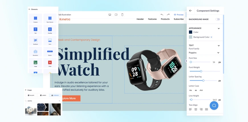
The hero section (the top part of your landing page) is crucial for capturing attention. For instance:
- Headline: Instead of a generic “Welcome to Our Site,” create something action-oriented that addresses a specific pain point. If you’re promoting a time-management tool, use a headline like “Take Control of Your Time in Just 7 Days.”
- Image or Video: Visitors respond to visuals. Using LanderLab, you can drag an image or embed a video into your hero section to illustrate your product in action. Video, in particular, is known to increase engagement and conversion rates.
Step 3: Optimize Your Forms for Higher Conversion Rates
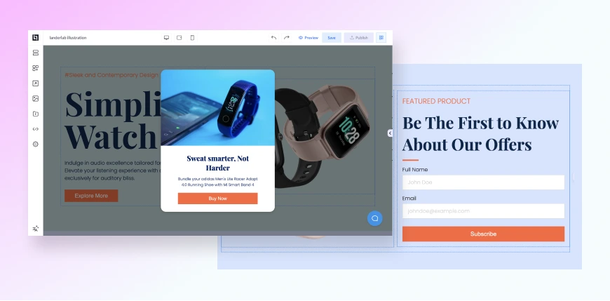
With LanderLab, adding and customizing lead-capture forms is quick and easy. Here’s how you can optimize them for higher conversions:
- Add custom fields: Depending on your campaign, include fields like “Company Name” and “Job Title” for B2B audiences.
- Customize field labels: Use personalized placeholder text like “Enter Your Best Email for Instant Access” instead of generic labels.
- Seamless integration: Connect your form to email platforms like Mailchimp or Brevo, ensuring new leads go straight into your email funnel.
Step 4: Ensure Mobile and Tablet Responsiveness
With more people browsing on mobile and tablet devices, ensuring your landing page is responsive is crucial. Learn more about why this matters in our guide to mobile-responsive landing pages.
LanderLab automatically adjusts your page’s layout for mobile and tablet views, providing an optimal experience on any device. However, if you want more control, you can manually fine-tune how the page looks on different screen sizes. This flexibility allows you to ensure the best possible user experience, no matter how your visitors are accessing your page.
Step 5: Establish Trust Through Testimonials and Social Proof
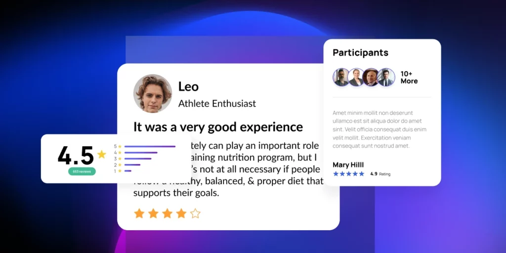
Building trust is crucial for boosting conversion rates on your landing page. When people feel confident about what you’re offering, they’re more likely to take action. To build this trust, consider adding:
- Customer Testimonials: Share positive feedback from happy customers, along with their names and photos. This adds a personal touch and enhances your brand’s credibility.
- Trust Badges: Display logos from reputable brands or media that have recognized your business. Badges like “Featured in Forbes” or “Approved by XYZ” provide an extra sense of authenticity.
- Case Studies and Reviews: Present real success stories that demonstrate how your product or service has made a difference for others in similar situations.
These trust-building elements work together to give visitors the reassurance they need that your offer is genuine, dependable, and worth their attention and investment. Learn more about leveraging testimonials to boost conversions.
Step 6: Harness the Power of A/B Testing
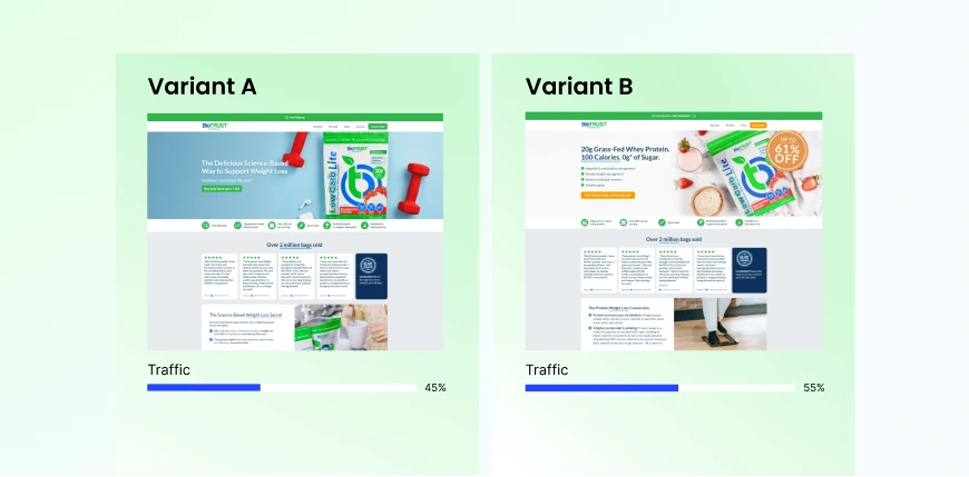
Even if your landing page looks great, there’s always a chance to make it better. That’s where A/B testing comes into play. By trying out different versions of your page, you can find out which parts work best and keep improving your conversion rates.
Here’s how to kick things off:
- Focus on one element at a time: Begin by changing just one thing, like the headline or the color of your CTA button. Keep everything else the same to get clear results.
- Review the results: Monitor how each version does in terms of conversion rates, bounce rates, and user engagement. Over time, you’ll collect insights on what clicks with your audience.
- Make changes based on what you learn: Once you identify what’s effective, apply those changes and keep testing other aspects to boost performance even more.
A/B testing is a continuous journey that helps you refine your landing page, allowing you to make smart, data-driven choices to enhance its impact.
Step 7: Keep an Eye on Performance and Make Smart Changes
Launching your landing page is just the start. To boost conversions, you’ve got to keep tabs on how it’s doing and tweak things based on what the data tells you. Here’s how to track and enhance your page effectively:
- Use analytics tools: Tools like Google Analytics or Hotjar can give you a peek into how visitors are behaving—like where they lose interest, how long they stick around, and which parts of the page catch their eye.
- Watch key metrics: Pay attention to crucial stats like conversion rates, bounce rates, and session length. If you notice high bounce rates, it could mean your page isn’t engaging enough or that visitors aren’t finding what they’re looking for.
- Make data-driven adjustments: When you see trends, don’t hesitate to make changes. For example, if people are leaving after seeing the form, it might be too complicated, so consider simplifying it.
By using data wisely, you can keep fine-tuning your landing page to hit those conversion targets.
Conclusion: How to Create a High-Converting Landing Page Without Coding Skills
Creating a landing page that converts well doesn’t need to be a daunting task, even if coding isn’t your thing. By taking the right steps—like choosing the right design, adding elements that build trust, and conducting A/B tests—you can really enhance your campaign’s performance.
Aim for a smooth user experience, captivate your audience with meaningful content, and let data drive your ongoing improvements. Whether you’re new to this or fine-tuning a current page, these tips will help you craft landing pages that get results.

