
Frustrated with a “below average” landing page experience score in Google Ads? Or maybe you’re pouring money into ads, but your landing pages just aren’t converting?
You’re not alone. This is a common problem across all ad platforms. Lots of marketers and business owners are in the same boat, watching ad costs climb while conversions flatline. The culprit? Often, it’s a neglected landing page experience.
Why does it matter? Well, for starters, it directly impacts your Google Ads quality score. But more importantly, it’s crucial for success on any ad platform.
That said, pleasing Google isn’t the only goal. You want pages that resonate with visitors and nudge them towards action.
This guide will help you understand which attributes describe a good landing page experience and how to apply these key elements to drive more conversions.
The strategies we’ll share work across any advertising platform. We’ll help you build landing pages that not only impress Google, but also turn more visitors into paying customers.
What is Landing Page Experience?
Landing page experience is all about how users interact with your page after clicking an ad or link. It’s the total satisfaction and relevance a visitor experiences upon reaching your landing page, including everything from their initial impression to their ultimate action.
To create a high-performing landing page, it’s essential to understand the anatomy of a high-converting landing page. It’s the crucial link between your advertising and actual conversions. When someone clicks your ad, they have expectations. Your landing page experience either meets those expectations or falls short.
The Importance of Landing Page Experience
The effect of the landing page experience goes much deeper than merely user satisfaction. A bad landing page experience can lead to significant repercussions for your business:
Effect on Search Engine Rankings
A subpar landing page experience can greatly affect your search engine visibility. When visitors immediately click the back button or close the window (high bounce rates) or spend very little time engaging with your content, search engines see it as a sign that your page is failing to satisfy user expectations.
This may result in decreased rankings and diminished organic visibility over time.
Effect on Advertising Costs
Your landing page experience directly influences your Quality Score, especially in Google Ads. This score determines both your ad position and how much you pay per click.
A poor landing page experience can:
- Increase your cost-per-click (CPC)
- Lower your ad positions
- Reduce your ad’s visibility
- Result in fewer impressions and clicks
This means you’ll end up paying more for your ads while potentially reaching fewer people.
Impact on Conversion Rates
Perhaps most critically, landing page experience directly affects your conversion rates. Here are some statistics that might convince you:
- A 1-second delay in mobile page load time can reduce conversions by up to 7%
- Pages that take more than three seconds to load have 32% higher bounce rates
- Slow loading speeds negatively impact conversion rates across all industries
What is Landing Page Experience Score?
While landing page experience is universal across ad platforms and even organic traffic sources, Google Ads is the most popular platform that qualifies and incorporates it to their ad quality metrics.
And as we previously mentioned, it greatly impacts your overall ad quality score.
Google assigns one of three ratings to evaluate your landing page experience:
- Above Average: A score of 7 and above, indicating you’ve achieved the highest possible rating
- Average: A score between 5 and 6, showing you’ve achieved a moderate rating
- Below Average: A score of 4 or below, indicating your landing page needs improvement
Your landing page experience score is determined through a combination of automated systems and human evaluation. Google Ads routinely reviews landing pages to determine their quality and relevance for users.
When viewing your scores in Google Ads, you can access both current and historical data, marked as “(hist)” in your reports. These historical quality scores matter a lot as they influence the performance of your new PPC campaigns.
That’s why it’s crucial to optimize your landing pages according to Google Ads requirements from the very beginning. Starting with a low quality score can make it more challenging to achieve good ad performance and costs.
Components of Quality Score
Landing page experience is one of three key parts that make up your overall Quality Score in Google Ads:
- Expected Click-Through Rate (CTR)
- Ad Relevance
- Landing Page Experience
These three factors determine your landing page Quality Score on a scale of 1 to 10.
No one outside of Google knows for sure how the Quality Score is calculated or how each factor is weighted in the algorithm, so we can’t give you calculations.
What we do know is that all three play important roles in influencing both your ad rank and costs in the ad auction process.
Which Attributes Describe A Good Landing Page Experience?
Understanding what makes a good landing page experience is only the first step. The real challenge—and opportunity—lies in implementing systematic improvements that transform your landing pages from mere destinations into conversion powerhouses.
Research has found that people judge websites very quickly. Just 50 milliseconds (0.05 seconds), in fact! This means you have less than a second to show visitors they’re in the right place.
But making a great landing page isn’t just about that first look. It’s about creating a smooth journey that leads visitors toward taking the action you want them to take.
The attributes we’ll talk about come from lots of research, real testing, and methods that work well across different industries.
We’ve looked at every part of the landing page experience, including:
- How well the page works technically
- How it looks
- What content it has
- How people think and act when using it
So to guide you along the way, we’ll discuss the characteristics of a good landing page. And not only that, we’ll even provide some optimization tips to help you easily grasp the concepts.
1. Contains Amazing Landing Page Content
Your page’s content serves as the building blocks of user experience. Well-crafted content not only helps achieve a good landing page experience but also builds trust with your target audience. And with trust comes taking desired actions.
How can you achieve this? Here’s a quick rundown:
Write Compelling Headlines
Transform your headlines from generic to attention-grabbing:
- Address your visitor’s primary pain point or desire
- Be clear, concise, and benefit-focused
- Create a sense of urgency or curiosity when appropriate
For example:
❌ Generic: “Project Management Software”
✅ Better: “Complete Projects 30% Faster With AI-Powered Task Management”
❌ Generic: “Email Marketing Platform”
✅ Better: “Double Your Email Open Rates in 30 Days – Or Your Money Back”
Create Engaging Copy
Improve your landing page by creating copy that maintains interest and drives action:
- Write at a grade 6-9 reading level for maximum accessibility
- Use short paragraphs and bullet points for better readability
- Include relevant keywords naturally throughout the content
- Focus on benefits rather than just features
- Address potential objections proactively
- Maintain consistency with your ad messaging
- Use action-oriented language that improves user engagement
Let’s look at how to transform features into benefits:
❌ Feature-focused copy: “Our project management software includes Gantt charts, task dependencies, and resource allocation tools.”
✅ Benefit-focused copy: “Take control of your projects and deliver on time, every time.
See exactly who’s working on what, eliminate problems before they start, and keep your team working together without endless meetings. Save an average of 5 hours per week on project coordination!”
Here are other ways to improve your landing page copy, focusing more on the benefit than the feature:
❌ Feature: “256-bit encryption”
✅ Benefit: “Keep your customer data completely secure with bank-level protection”
❌ Feature: “Cloud-based platform”
✅ Benefit: “Access your work from anywhere, collaborate in real-time, and never lose a file again”
❌ Feature: “AI-powered analytics”
✅ Benefit: “Make data-driven decisions in minutes instead of hours – no data science degree required”
Communicate Your Value Proposition
Your Unique Value Proposition (UVP) tells visitors why they should choose you instead of other options. It clearly shows how you solve their problems and what makes you different.
Here’s how to build a strong UVP:
- Main Headline: Write your biggest benefit in one clear sentence
- Supporting Subheadline: Explain exactly what you offer
- Key Benefits: List 3-4 main points that prove what you claim
- Visual Element: Add a picture, video, or graphic that supports your message
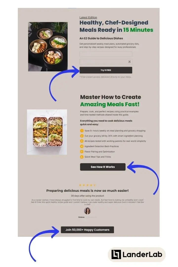
Example UVP for a meal planning recipe book:
Headline: “Healthy, Chef-Designed Meals Ready in 15 Minutes”
Subheadline: “Get personalized weekly meal plans, automated grocery lists, and step-by-step recipes designed for busy professionals”
Key Benefits:
- Save 5+ hours weekly on meal planning and grocery shopping
- Cut your grocery bill by 35% with smart ingredient planning
- All recipes tested with working parents for real-world simplicity
Visual: Images of prepped meals + quick time-lapse video of a meal being prepared
Optimize Your Call-to-Action
Transform your CTAs into conversion machines. Personalized CTAs can perform up to 202% better than generic ones (Hubspot).
Here’s how to create personalized versions:
- Use Action-Oriented Language:
❌ Generic: “Submit”
✅ Better: “Start My Free Trial”
❌ Generic: “Download”
✅ Better: “Get My Marketing Blueprint”
- Create Industry-Specific CTAs
There are terms that matter most to your customers, depending on your industry or niche. A couple of examples are as follows:
For Real Estate:
❌ Generic: “Contact Us”
✅ Better: “Find My Dream Home”
For B2B Software:
❌ Generic: “Book Demo”
✅ Better: “See How [Software] Can Save Your Team 10 Hours/Week”
- Placement Strategy:
- Primary CTA: Place above the fold, with contrasting colors
- Secondary CTAs: Strategically position after key benefit sections
- Final CTA: Include at the bottom with additional social proof
Example CTA progression on a page:
Top: “Try It Free”
Middle: “See How It Works” (after features section)
Bottom: “Join 50,000+ Happy Customers”
When running ad campaigns across different platforms, you can personalize landing pages to match specific audience segments and traffic sources.
Here’s how to approach personalization when using Google Ads:
- Create Dedicated Landing Pages
Instead of using static content, create separate, optimized landing pages for different:
- Ad campaigns / Ad groups
- Target audiences
- Industries
- Geographic regions
Let’s use a project management software as example:
- Landing Page A: Tailored for healthcare teams, featuring medical project templates
- Landing Page B: Customized for ecommerce businesses, showcasing retail management tools
- Landing Page C: Designed for marketing teams, highlighting campaign planning features
- Geographic Customization (Localized landing pages)
Create location-specific landing pages that feature:
- The location name on headings and appropriate sections
- Local case studies and testimonials
- Region-specific pricing and offers
- Relevant contact information and office locations
- Language and cultural considerations
If you’re advertising using a different network, check if they allow Dynamic Insertion.
With Google Ads, you can only dynamically insert keywords on ad copy and landing pages, but with other platforms, you can do so much more.
For platforms that support dynamic insertion, you can use URL parameters to personalize your landing pages. Here’s how it works:
URL Structure Example:
https://yourwebsite.com/landing-page?city=[[city]]&device=[[device]]
The tokens automatically adjust based on the user’s information.
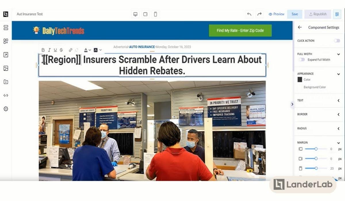
Landing page builders like Landerlab support dynamic tokens that can automatically insert information on the lander based on these URL parameters or visitor data:
- [[country]] – Visitor’s country
- [[city]] – Visitor’s city
- [[region]] – Visitor’s region/state
- [[browser]] – Visitor’s web browser
- [[operatingSystem]] – Visitor’s OS
- [[device]] – Visitor’s device type
You can use these tokens in your landing page content like this:
Welcome to [[city]]’s Best Digital Marketing Agency
If someone visits from London, they’ll see: “Welcome to London’s Best Digital Marketing Agency”
This allows you to create one landing page that automatically personalizes itself based on visitor data or URL parameters.
For example:
- Headline: “Find Your Dream Home in [[city]]”
- CTA: “Get [[city]] Property Listings”
- Device-specific messaging: “Download Our [[device]] App”
Remember to:
- Test your dynamic insertions thoroughly
- Provide fallback content if parameters aren’t available
- Ensure your dynamic content maintains relevance to your ad messaging
- Keep personalization meaningful and valuable to the user
This alignment helps achieve a better landing page experience and boost conversion rates across all advertising platforms.
Is Your Landing Page Costing You Conversions?
Misaligned landing pages can waste ad spend and drive potential customers away. Discover how to fix it now!
2. Landing Page is Technically Optimized
Your technical landing page performance forms the foundation of user experience. Even if you have amazing, relevant content, it won’t help if visitors can’t see it quickly and easily.
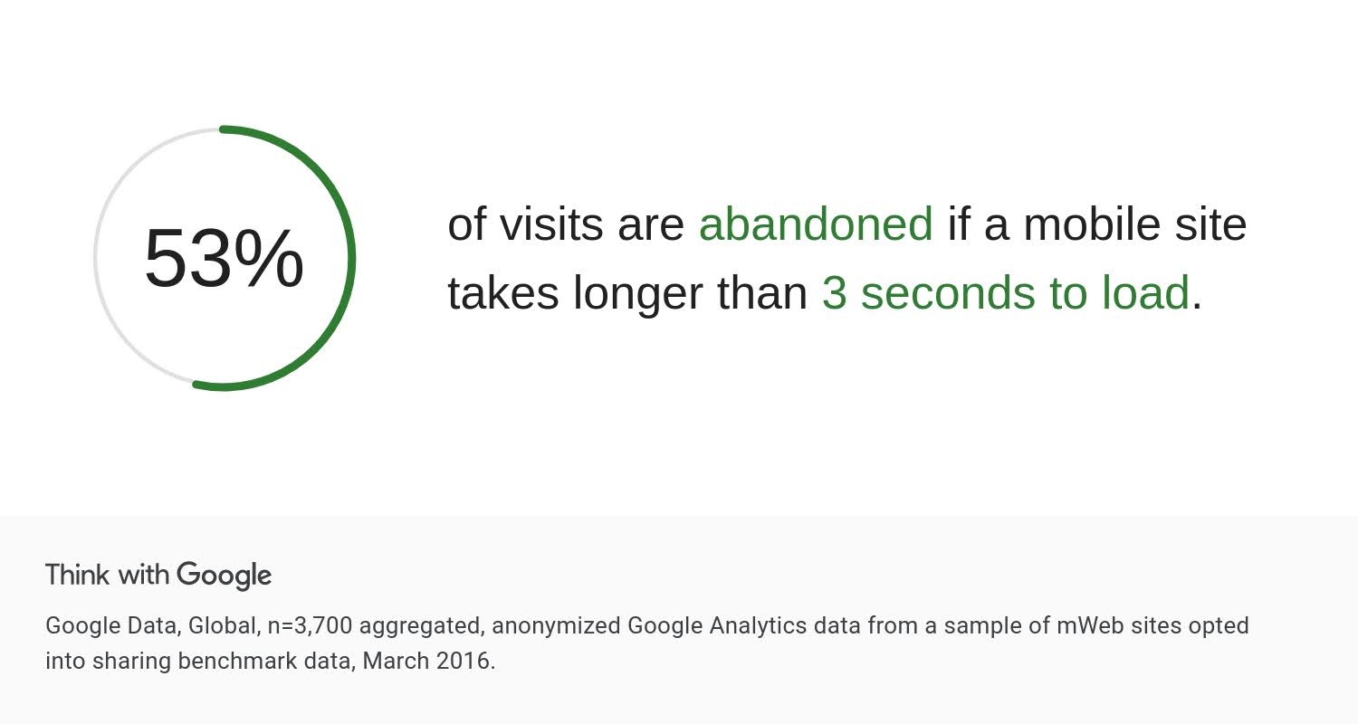
Studies by Google have found that 53% of people using phones will leave if a page takes more than three seconds to load. This is why optimizing for mobile-responsive landing pages is critical to keeping users engaged.
Optimize Page Load Speed
Page speed isn’t just about Google’s requirements—it’s about keeping visitors engaged from the moment they click. The ideal page speed is 2.75 seconds (Nitropack).
Here’s how to achieve optimal loading times:
Image Optimization
- Compress images without sacrificing quality using tools like TinyPNG or ImageOptim
- Apply lazy loading for images below the fold
- Use next-gen formats like WebP with proper fallbacks
- Specify image dimensions to prevent layout shifts
❌ Bad practice: Uploading a 4000px wide hero image and scaling it down with CSS ✅ Good practice: Using an appropriately sized image (e.g., 1200px for desktop) with srcset for different viewports
Resource Management
- Minify CSS, JavaScript, and HTML
- Leverage browser caching for static assets
- Remove unused code and third-party scripts
- Implement Critical CSS for above-the-fold content
Content Delivery
- Use a Content Delivery Network (CDN) to serve assets from locations closer to your visitors (Cloudflare is a commonly-used one)
- Enable GZIP compression
- Implement preloading for critical resources
- Consider AMP for ad-driven landing pages
Tools like Google PageSpeed Insights, GTmetrix, and WebPageTest can help identify specific optimization opportunities.
For WordPress users, plugins like WP Rocket or Nitropack can automate many of these optimizations.
Make it Mobile-Friendly
With mobile devices contributing to over 62% of web traffic, mobile optimization isn’t optional—it’s essential.
Here’s how to ensure your landing page delivers a seamless mobile experience:
Responsive Design Implementation
- Use flexible grid layouts and relative units
- Implement proper viewport settings
- Design touch-friendly elements (minimum 44x44px for tap targets)
- Ensure text remains readable without zooming
Mobile-Specific Considerations
- Optimize forms for mobile input
- Remove hover-dependent interactions
- Hide non-essential elements for mobile users
- Test across multiple devices and orientations
❌ Poor mobile experience: Desktop-sized navigation menu
✅ Better approach: Hamburger menu with touch-optimized dropdown
You don’t have to create separate landing pages for desktop and mobile—all you have to do is work with a platform that has a true mobile responsive feature, like LanderLab.
You can create and design one landing page and it will automatically adjust to the user’s screen size without having to manually edit the elements.
3. Landing Page is Aligned to the Ad
The connection between your ad and landing page can make or break your conversion rates. When visitors click an ad, they form specific expectations.
Your landing page must not only meet these expectations but exceed them. Here’s how to create perfect alignment between your ads and landing pages.
Message Match
Message match ensures your landing page delivers exactly what your ad promised. This alignment builds trust and reduces bounce rates.
Visual Consistency (if using banner ads)
- Use similar color schemes and design elements
- Maintain consistent branding across ad and landing page
- Keep imagery style and themes aligned
- Match the tone and personality of your ad creative
Copy Consistency
- Mirror ad headlines in your landing page headlines
- Use the same key phrases and terminology
- Maintain consistent product/service descriptions
- Keep promotional details exactly matched
❌ Poor alignment: Ad shows a 50% discount, landing page shows “Starting at $99”
✅ Good alignment: Ad promotes “50% Off All Courses”, landing page headline reads “Get Your 50% Discount on All Courses Today”
User Intent Alignment
Match your landing page content to the user’s stage in the buying journey, as indicated by their ad interaction.
Search Intent Types
- Informational: Provide educational content and soft conversion points
- Commercial: Offer comparison tools and detailed product information
- Transactional: Focus on purchase process and create CTAs depending on what stage of the funnel they are in (this is especially useful if you’re using retargeting)
- Navigational: Direct users to specific products or services
Example Intent Alignment:
❌ Poor alignment: Ad targets “how to start investing” but landing page pushes immediate account signup
✅ Good alignment: Ad targets “how to start investing” and landing page offers a free investment guide with optional signup
Offer Consistency
Your landing page must deliver on every promise made in your ad, without exception.
Price Alignment
- Display the exact prices mentioned in ads
- Maintain consistent discount amounts
- Show all fees and conditions upfront
- Keep pricing structure clear and transparent
Promotion Alignment
- Match all promotional terms exactly
- Display the same deadlines and limitations
- Keep bonus offers consistent
- Maintain identical warranty or guarantee terms
Audience Segmentation
Create dedicated landing pages for different audience segments targeted by your ads.
Segment-Specific Content
- Customize messaging for each target audience segment
- Use relevant industry terminology
- Feature appropriate case studies and testimonials
- Adjust CTAs to match segment preferences
Remember: Every disconnect between your ad and landing page creates friction that can prevent conversion.
Focus on creating a perfect transition from ad to landing page, maintaining consistency in messaging, design, and offering details throughout the user journey.
Personalize Your Content
4. Uses Marketing Psychology to Keep Visitors Hooked on the Landing Page
While technical optimization and content quality form the foundation of a good landing page experience, it’s the psychological elements that often affect user behavior.
Let’s explore how to ethically implement psychological principles that guide visitors toward taking desired actions while building trust and reducing friction.
Social Proof
People are skeptical nowadays and often look at others’ experiences before making decisions. Social proof on your landing page shows potential customers that others have tried your product and found success.
Customer Testimonials
Think of testimonials as your silent salesforce. When strategically placed and properly formatted, they can address objections and showcase benefits more effectively than your marketing copy ever could. The key is authenticity and specificity.
❌ Poor social proof: Generic testimonial without details “Great product, really helped our business!”
✅ Better social proof: Specific, results-focused testimonial “Using [Product], we increased our team’s productivity by 47% and reduced project delays by 60% in just three months.” – Sarah Chen, Director of Operations at TechCorp
To maximize the impact of testimonials:
- Feature real customer stories with specific results
- Include customer photos and company logos
- Highlight industry-specific testimonials
- Use video testimonials for higher impact
Signs of Credibility
Beyond testimonials, visitors look for additional proof that your business is legitimate and trustworthy. Throughout your landing page, include elements that show your credibility:
- Logos of well-known customers or clients
- Number of current users or customers
- Relevant awards and certifications
- Mentions in respected media outlets
Authority and Expertise
Visitors need to know they’re in capable hands, that the offer and the one offering it is “legit”. Establishing authority isn’t about boasting—it’s about demonstrating genuine expertise in ways that help visitors feel confident in their choice.
Think of authority signals as trust-building elements that answer the question “Why should I believe you?”
This can be accomplished through:
- Relevant certifications and credentials
- Industry partnerships and affiliations
- Expert team member profiles
- Proprietary research and insights
More importantly, show your expertise through high-quality, actionable, relevant content that demonstrates deep understanding of your visitors’ needs.
Choice Architecture
How you show choices on your landing page can make a big difference in getting people to take action.
While you might want to offer many options to please everyone, research shows that too many choices can overwhelm visitors and stop them from making any decision. This is called Analysis Paralysis.
Think of it like a well-designed restaurant menu. The best menus don’t list every possible dish—instead, they guide diners toward popular choices through smart organization and highlighting.
Your landing page should do the same:
- Feature a clear “most popular” or “recommended” option
- Use simple comparison tables to show differences
- Limit main options (3-4 choices work best)
- Make pricing tiers easy to understand
❌ Poor practice: Overwhelming visitors with too many options (like 10+ different plans)
✅ Better approach: Offering 3-4 clear choices with one recommended option
Reciprocity
Building goodwill before asking for commitment can significantly improve landing page experience. Think of it as making the first move in a relationship. When you provide value upfront, visitors are more likely to reciprocate by taking your desired action.
The key is offering something genuinely valuable that gives visitors a taste of what they can expect from a fuller engagement with your product or service.
This might include:
- Useful tools or calculators
- Valuable industry insights
- Limited access to premium features
- Educational content that solves immediate problems
Visual Hierarchy
Your landing page should guide visitors naturally toward taking action, like a well-marked path that leads to a destination. This means organizing information in a way that’s easy to understand and navigate.
Clear Visual Flow
Just as a well-designed store layout guides shoppers naturally through different sections, your landing page should create an obvious path for visitors:
- Use contrast to make important elements stand out
- Leave enough empty space so the content isn’t cramped
- Add visual cues (like arrows or highlighted sections)
- Show clear connections between related information
More importantly, avoid overwhelming visitors with too much information at once. Break complex information into smaller, manageable pieces:
- Split long forms into several shorter steps
- Hide detailed information behind “Read More” buttons
- Show one feature or benefit at a time
- Include progress bars for multi-step processes
❌ Poor practice: Long, complex forms with all fields visible
✅ Better approach: Multi-step forms that guide users through the process
There are other marketing psychology principles that can be applied to a Google Ads landing page, like Scarcity, Urgency, Loss Aversion, and more. However, those we mentioned above are the ones that we believe can help improve landing page experience.
While psychological principles can powerfully influence conversion rates, your primary focus should be on creating genuine value and building trust.
The best landing pages don’t need to rely on pressure tactics because they naturally demonstrate value and build confidence through honest, customer-focused messaging.
Wrapping Up
Keep in mind that making your landing page experience better isn’t something you do just once. It’s an ongoing process where you:
- Test changes
- Monitor changes to the landing page experience score
- Measure the results
- Make things even better based on what you learn
So to create effective landing pages, keep optimizing!
FAQs
Q: How to check the Landing Page Experience Score?
A: To find your Google Ads landing page experience score:
- Sign in to your Google Ads account
- Click Campaigns → Audiences, keywords, and content → Search keywords
- Click the Columns icon above the table
- Click Quality Score to expand the section
- Select the checkboxes next to the metrics you want to view
- Click Apply
Your score will then be visible in the statistics table, allowing you to monitor and track improvements over time.
Q: What makes a good landing page experience?
A: A good landing page experience includes:
- Loads quickly (under 2.75 seconds)
- Relevant, original content matching ad messaging
- Mobile-friendly design
- Clear navigation
- Clear Call to Actions
- Trustworthy elements (contact information, security badges)
- High-quality, engaging content
- Message match with advertising
Q: What does “landing page experience below average” mean in Google Ads?
A: This rating indicates your Google Ads landing page doesn’t meet Google’s quality standards for user experience, content relevance, or technical performance.


")
