Landing pages are crucial in online businesses, forming the main tool in converting visitors to customers. In fact, the average conversion rate of all industries on landing pages is about 9.7%, showing how effective they are in generating leads and sales.
The design of the landing page, its content, and its format determine how many of the visitors will be turned into customers.
It is very important for your landing page to be mobile-responsive, as a big portion of your traffic may come through on mobile devices.
A successful landing page is more than just looking good; it is all about driving your visitors to act as you want them to.
This article will look into the must-haves of performance-driven landing pages and the things that should be non-negotiable on every landing page.
The thing is, by the end, you’ll learn how to create a converting landing page and implement these tips into your campaigns. Now, let’s get into it and analyze the anatomy of the landing page.
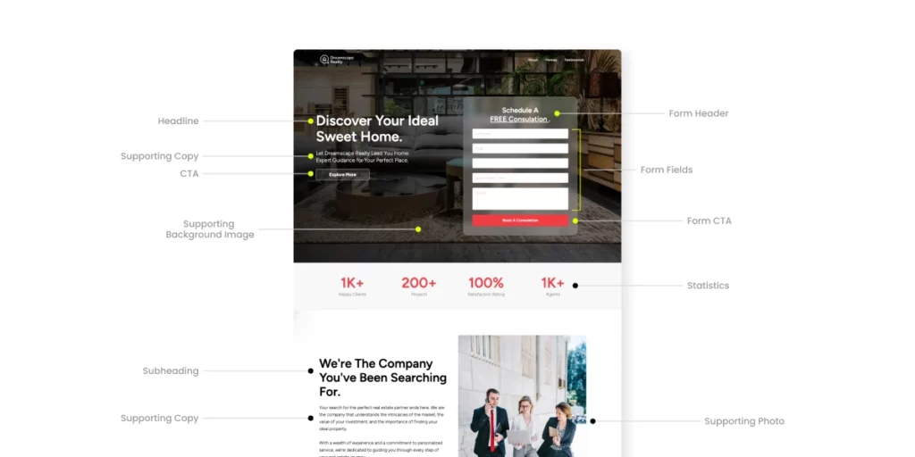
1. The Headline: Your First (and Most Important) Impression
Your headline is the first element visitors encounter upon arriving at your page, playing a pivotal role in their decision to stay or leave. In fact, studies show that 80% of visitors read headlines, but only 20% read the rest of the page. That means you have just 1.7 seconds to grab their attention.
This shows the powerhouse of a good headline that can influence an audience.
Therefore, crafting a headline that captures users’ attention from the beginning and communicates your offer in a way that makes them feel they have found what they’ve been looking for is even more critical.
There are two things a good headline should do: be brief and clear.
Your visitors should know what they will get with your offer within seconds without using cryptic or ambiguous words. The simpler, the better.
Identify and Address a Pain Point or a Need: The people are after solutions. The headline should highlight how the product or service will solve their problems or improve their lives. It is not about what one is selling but what is in it for the target audience.
Create Curiosity or Urgency: Your headline should be catchy and make the reader want to read more. Using words or phrases such as “Free,” “Exclusive,” “Limited Time,” or “Proven“ will create a sense of urgency or exclusivity.
Avoid headlines like “Buy Now” and be specific. Instead, create a hook like “Unlock Your Free Trial Today and Boost Your Productivity.”
2. The Subheadline: Supporting Your Main Message
After the headline has captured attention, the subheadline provides additional information. Think of the subheadline as the supporting actor in the starring role your headline plays.
The subheadline provides more context or explains the benefit your product or service will provide. Its job is to inform visitors and guide them deeper into the page.
A strong subheadline should:
- Expand on the headline without being redundant.
- Highlight the key benefit in a way that resonates with the audience.
- Address potential concerns that might stop visitors from taking action.
For example:
- Headline: “Get Started With Your Free Trial Today”
- Subheadline: “No credit card required. Experience all premium features for 30 days.”
![]()
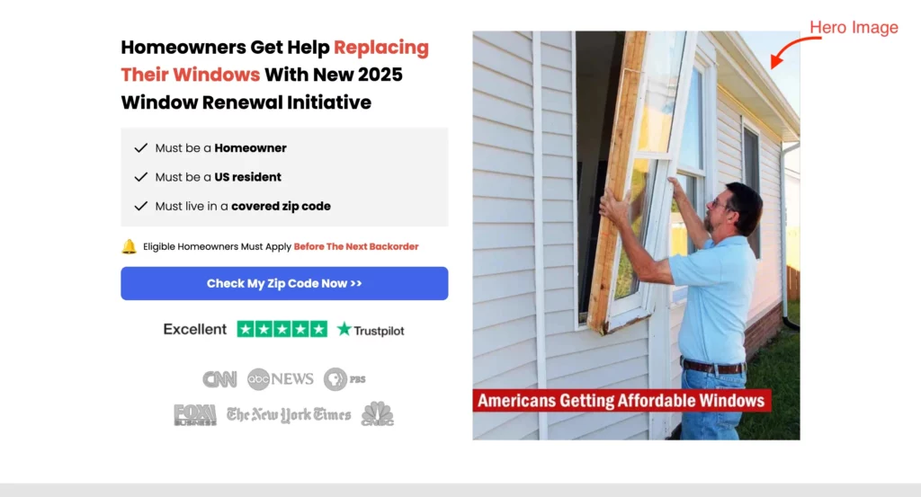
3. Hero Image or Video: Visual Appeal Matters
A picture is worth a thousand words and on a landing page, it could be worth thousands of dollars. Studies show that landing pages with videos can increase conversions by 86%.
People are highly visual creatures; a compelling image or video can instantly engage visitors and help them understand your offering.
When used effectively, visuals can build trust, explain complex concepts, or elicit an emotional response that drives conversions.
Your hero image or video should serve two purposes:
- Showcase Your Offer: The visual should reflect the product or service you’re promoting. For example, consider using a screenshot or short demo video that shows your software in action if you’re selling a SaaS tool.
- Evoke Emotion: A well-chosen image or video can evoke emotions that align with your brand’s message. For example, a photo of a happy customer enjoying your product can create a positive emotional response, helping visitors envision themselves using your solution.
4. Your Unique Selling Proposition (USP): What Makes You Different
Why would they buy your product and not those of your competitor?
That is where your USP comes into play. Your USP is going to explain the unique things that differentiate your product or service and what actually makes it a lot better for the target market.
Use your USP to answer this question: “What is in it for me?”
When making an effective USP, the questions to ask are the following:
Solve a Problem: The specific pain your product or service solves.
Highlight Benefits, Not Features: People care about the benefits they will get, not about the features of your product.
Instead of saying, “Our product has 50 features,” say, “Save time, reduce the stress of what could be done with an all-in-one tool.”
Be Specific and Clear: Being too vague or broad diminishes a potentially strong USP.
An example of a USP could be: “Get More Done in Less Time with Our Time Management Tool“; it is very specific, clear, and catches many people’s problems.
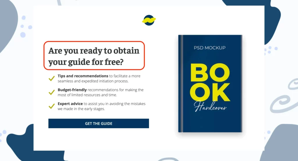
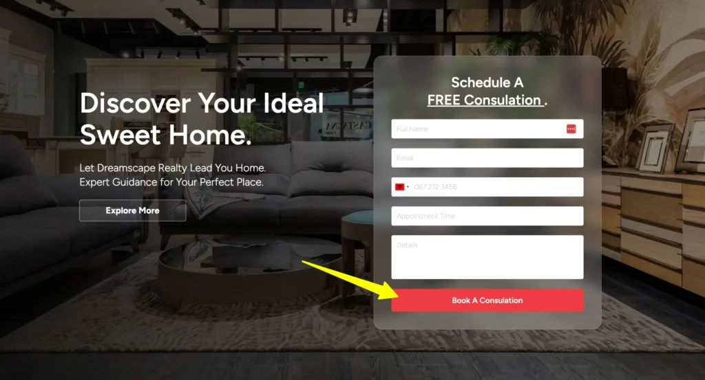
5. Call to Action (CTA): Lead Visitors to the Next Step
Your CTA is the gateway to conversions it’s where visitors become customers. But here’s the catch: Generic CTAs like ‘Submit’ or ‘Click Here’ can hurt your conversion rates.
A high-converting CTA should:
- Use Action-Oriented Language: Phrases like “Start My Free Trial” or “Get Started” perform better.
- Be Visually Prominent: Use contrasting colors and bold text to make it stand out.
- Offer Value: Clearly communicate the benefit of clicking (e.g., “Book A Consultation”).
It’s also important to place your CTAs in the right places.
For instance, rather than waiting for the bottom of the page to ask for conversion, place CTAs above the fold and consider adding more as users scroll.
Here is a table showing some examples on Good vs Bad CTA Examples:
Good vs. Bad CTA Examples
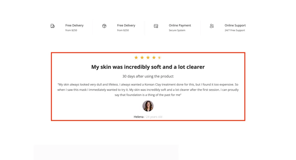
6. Social Proof: Build Trust and Credibility
Adding social proof is one of the most effective ways to improve conversions on your landing page.
The principle of social proof is that people are more likely to do something if they see others doing it or if they respect someone who would do the same thing. That is why customer case studies, reviews, and testimonials are important.
Types of social proof:
- Customer Testimonials: Long, relatable quotes from a satisfied customer are powerful.
- Case Studies: Demonstrate the specific cases in which your product or service helped real customers.
- Reviews: If your product has a high rating on any review platform, it’s good to highlight that on your landing page.
- Trust Badges: If your business is certified or accredited by recognized authorities, displaying trust seals can help build trust.
Showing them other people’s experiences will help the visitors feel more confident about pursuing your offer.
Read more: How to Use Social Proof to Increase Landing Page Conversions
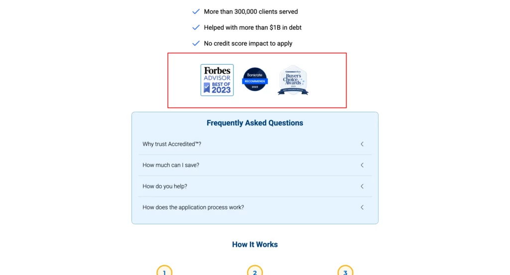
7. Trust Elements: Reassure Visitors
Trust and social proof go hand in hand. People will always feel confident that your offer is real and that their data is safe. Adding security badges or industry certifications to your website will greatly increase users’ confidence.
Examples of trust elements:
- Security Badges: Showcase SSL certificates and other security seals to assure visitors that personal information will be protected.
- Money-Back Guarantees: A guarantee can reduce friction and make visitors feel more comfortable completing a transaction.
- Industry Certifications: If your product or service is regulated, showcasing certifications helps customers trust your brand.
These elements help diminish any kind of lingering doubt and move users closer to conversion.
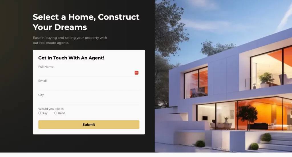
8. Forms: Keep It Simple and Easy
The form is essential to your landing page if you’re trying to capture leads. However, people will run for the hills if it is too long or complicated. Keep your forms short and straightforward.
Only request information you absolutely need, and don’t hit visitors with multiple fields. The more information you request, the fewer visitors will complete the form.
For instance, rather than requesting a person’s full name, email address, and telephone number, request only their email address.
You can always request further information later.
9. Mobile Optimization: Meet Visitors Where They Are
More than half of web traffic is mobile, so it is crucial that your landing page is friendly to mobile users.
A device-optimized page means visitors will have a great experience on desktops, tablets, and phones.
Here’s what to pay attention to for mobile-optimized landing pages:
- Responsive Design: Ensure your landing page looks good in all screen sizes so users have a great experience.
- Fast loading: On mobile, users are on the move and less likely to wait for your page to load if it takes too long.
- Easy to Use: Since mobile phone users have limited screen space, your page navigation should be easy and the layout streamlined.
Read more about The Importance of Mobile-Responsive Landing Pages.
10. The Thank You Page: Keep the Momentum Going
Once a visitor has completed the desired action, don’t just let the journey end there. A well-crafted “Thank You” page is an excellent opportunity to continue engaging with your visitors.
Consider adding these elements to your thank you page:
- Further Offers: Now that they’ve converted, consider offering additional value, such as a discount on future purchases or upselling another product.
- Social Sharing Buttons: Encourage users to share their experiences on social media to expand their reach.
- Additional Content: Direct users to related blog posts, videos, or resources that interest them.
This is also a great place to express gratitude and confirm their actions.
Conclusion on the Anatomy of a Landing Page
To wrap it all up, a high-converting landing page is a combination of design, messaging, and knowing your target audience.
By laying the groundwork with a fantastic hook/headline, a thoroughly considered subheadline, striking hero images or videos, and USP that showcases your product’s advantages, you’re setting the bedrock for success.
Your CTA should be bold, striking, and value-driven to move the users along in their journey.
Not to forget-social proof, trust signals, customer testimonials would add credibility to your offer and make it look more attractive.
Keep your forms light and easy, so the burden does not befall the visitors.
It’s a must to optimize for mobile, as more than half of all web traffic comes from mobile devices.
Ensure your page is responsive on every device and super fast, so you can always provide a seamless experience.
Finally, end with a well-thought-out “Thank You” page that adds value, encourages social sharing, and leads users to more content.
By following these principles with your landing page, you will attract more visitors and convert them into leads and customers.
It may be lead generation, sales, or brand awareness, but creating landing pages can make them among your sharpest tools by way of performance-focused design.


