You’re getting traffic to your landing page, yet your conversion rate sits at 1-2%. Ring a bell? That’s the harsh reality: most landing pages fail because they have horrible products or crappy traffic, but because of easily fixable mistakes that business owners keep making.
These are not computer science-level technical issues for which a degree is needed in order to give an answer. They are basic issues with tried-and-true answers you can implement today.
In this guide, you’ll discover the landing page mistakes that are costing you conversions today and, more importantly, the best way to fix each one without hiring out developers or devoting weeks to completely overhauling everything.
No matter if you’re looking at 100 visitors a month or 10,000, these adjustments will radically improve your results. So, let’s begin.
10 Common Landing Page Mistakes & How to Fix Them
Landing Page Mistake #1: A Cluttered and Overwhelming Design
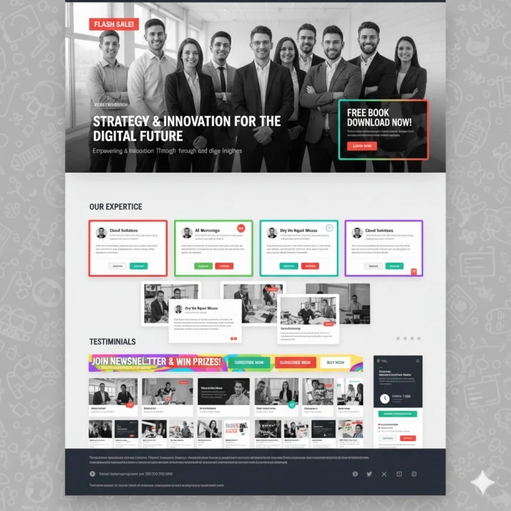
When people arrive on your site, they make a decision within half a second. If your design is confusing and cluttered, they’re elsewhere before you ever get to present your pitch. Clear, crisp design isn’t just about appearance; it’s about leading visitors to conversion.
Warning Signs You Have This Problem:
- You have more than 3 different fonts on your page
- There are competing colors everywhere (red buttons, blue headers, green text)
- Visitors have to scroll or search to find your main call-to-action
- You’re trying to explain everything about your product/service on one page
- There’s no clear visual path for the eye to follow
The Real Problem: When people can’t quickly figure out what you want them to do, they leave. Your brain processes visual information in 13 milliseconds – if your page is confusing in those first few moments, you’ve lost them.
How to Fix It:
- Use the “squint test” – squint at your page. What stands out? If it’s not your main headline and CTA button, you have too much clutter
- Stick to 2-3 colors maximum – one primary color for CTAs, one for headlines, neutral colors for everything else
- Remove anything that doesn’t support your main goal – that sidebar, those extra links, the company history paragraph
- Create white space – empty space actually helps people focus on what matters
- Make your CTA button the most visually prominent element on the page
Quick Check: If you can’t explain what your page is about in one sentence, it’s too cluttered.
Landing Page Mistake #2: Not Optimizing Contact Forms
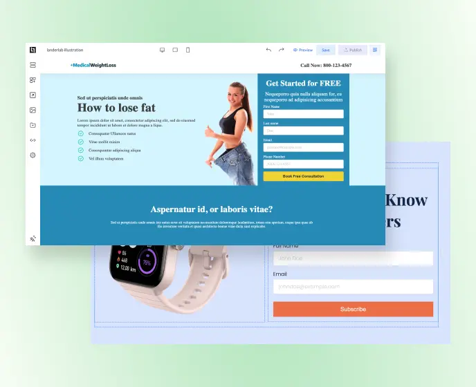
Your contact form is usually the last obstacle between a visitor and a conversion. Mess it up, and you’ll see potential customers bail at the last minute. The solution doesn’t always mean minimizing forms to size but ensuring them to be authentic.
Warning Signs You Have This Problem:
- Your form has more than 5 fields for a simple lead magnet
- You’re asking for information you don’t actually need (like company size for a free guide)
- Your form labels are unclear (“Name” instead of “First Name”)
- Required fields aren’t marked clearly
- The form looks different from the rest of your page design
The Real Problem: Every form field you add reduces conversions. But sometimes you DO need that information. The trick is asking for it the right way.
How to Fix It:
- Ask for essential information only – notice how the form above asks for just Name, Email, and Phone – the bare minimum needed for a consultation
- Use clear, descriptive labels – “Full Name” is better than just “Name,” and “Email” is clearer than “Email Address”
- Make your CTA button specific and action-oriented – “Book Free Consultation” tells people exactly what they’re getting, not just generic “Submit”
- Use contrasting colors strategically – see how the yellow CTA button stands out against the blue form background
- Keep consistent visual design – the form matches the page’s color scheme and doesn’t look like an afterthought
- Position forms prominently – placing the form “above the fold” where visitors can see it immediately
- Add trust indicators near the form – like the phone number at the top showing you’re a real business
Pro Tip: Notice how this form doesn’t ask for unnecessary details like company size, budget, or “How did you hear about us?” – save those questions for after they’ve shown interest.
Fix landing page mistakes faster with LanderLab templates and tools.
Landing Page Mistake #3: A Weak or Misplaced Call to Action (CTA)

Your CTA button is where conversions happen. If it’s weak, hidden, or unclear, you’re basically hiding your cash register from customers.
Warning Signs You Have This Problem:
- Your CTA says generic things like “Submit,” “Click Here,” or “Learn More.”
- The CTA button blends in with your page design
- You have multiple CTAs competing for attention
- Your CTA is buried below the fold, where people have to scroll to find it
- The button is too small to be easily clicked on a mobile
The Real Problem: Your CTA should tell people exactly what happens when they click AND why they should want to. “Submit” tells them nothing about the value they’ll get.
How to Fix It:
- Combine action with value in your copy – notice how “Get Started – it’s free” tells people both what to do AND removes price objections
- Use high-contrast colors that pop – the bright blue button in the example stands out immediately against any background
- Make buttons substantial and clickable – this button has generous padding and looks substantial, not like a tiny afterthought
- Add urgency or value qualifiers – the “it’s free” text removes hesitation and clarifies there’s no risk
- Keep the design clean and focused – no competing elements, gradients, or distracting effects – just clear, readable text
- Make it finger-friendly for mobile – wide enough to tap easily without precision
Reality Check: Your CTA should be the most obvious element on your page. If visitors have to hunt for it, you’ve failed.
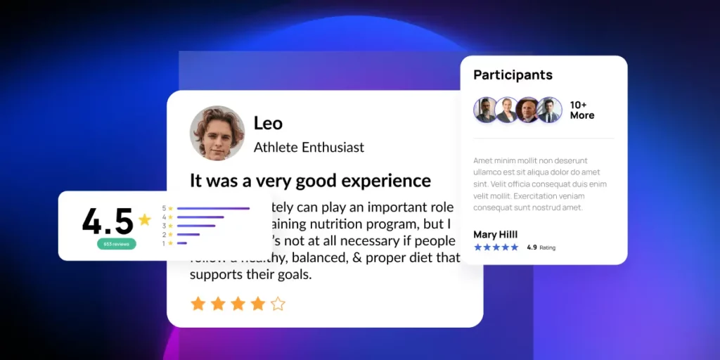
Landing Page Mistake #4: Lack of Social Proof
Warning Signs You Have This Problem:
- No customer testimonials, reviews, or success stories anywhere
- No logos of companies you’ve worked with
- No mention of how many customers you have
- No ratings or review scores visible
- Your testimonials are obviously fake (stock photos, generic names)
The Real Problem: People don’t trust unknown brands. They look for evidence that others have succeeded before them. Without social proof, you’re asking people to be your first customer – and that’s a hard sell.
How to Fix It:
- Use real customer photos and names – notice how “Leo” has an actual headshot and specific title “Athlete Enthusiast,” not a generic stock photo
- Include specific star ratings – the 4.5-star rating with a visual bar chart gives instant credibility at a glance
- Show participation numbers – “10+ More” participants indicate this isn’t just one person’s opinion
- Add detailed, specific testimonials – the review mentions actual results and specific benefits, not just “great service!”
- Display multiple types of social proof – combines star ratings, written reviews, participant count, and visual testimonials all in one section
- Use visual hierarchy – the rating score (4.5) is prominently displayed and easy to scan
- Show rating breakdowns – the colored bar chart shows the distribution of ratings, proving authenticity
Pro Tip: Notice how this social proof section combines multiple credibility indicators – you don’t need all of these, but having 2-3 different types makes it much more convincing than just one testimonial.
Landing Page Mistake #5: Slow Loading Page

Warning Signs You Have This Problem:
- Your page takes more than 3 seconds to fully load
- Images are loading slowly or appear blurry at first
- The page layout shifts around as elements load
- You’re using lots of plugins, widgets, or tracking scripts
- Large, uncompressed images
The Real Problem: Every second of delay kills conversions. At 3 seconds of load time, the bounce rate jumps to 32%. At 5 seconds, it’s 90%. Speed isn’t just about user experience – it directly impacts your bottom line.
How to Fix It:
- Compress your images – use tools like TinyPNG or compress to 80% quality in Photoshop
- Choose the right image format – JPEG for photos, PNG for graphics with text
- Minimize plugins and scripts – every tracking code and widget slows you down
- Use a fast hosting provider – shared hosting for $5/month probably isn’t cutting it
- Enable browser caching – so repeat visitors load faster
- Test your speed – use Google PageSpeed Insights and fix the issues it identifies
Quick Check: Use Google PageSpeed Insights or GTmetrix – if your mobile score is below 85, you’re losing conversions.
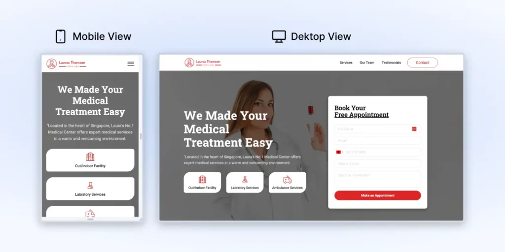
Landing Page Mistake #6: Mobile Optimization Issues
Warning Signs You Have This Problem:
- Text is too small to read without zooming
- Buttons are too small to easily tap with a finger
- Forms are cut off or difficult to fill out
- Page elements overlap or look squished
- You have to scroll horizontally to see content
The Real Problem: Over 50% of web traffic is mobile, but most landing pages are still designed desktop-first. If your mobile experience sucks, you’re losing half your potential conversions.
How to Fix It:
- Stack elements vertically on mobile – notice how the mobile view transforms the three horizontal service buttons into a clean vertical stack
- Make navigation mobile-friendly – the hamburger menu (three lines) on mobile replaces the full navigation bar from desktop
- Maintain readable text sizes – the headline “We Made Your Medical Treatment Easy” stays large and readable on both versions
- Optimize form placement – the booking form moves from a right sidebar on desktop to a prominent position on mobile
- Keep consistent branding – logo, colors, and core messaging remain the same across both versions
- Ensure buttons are touch-friendly – the “Make an Appointment” button is substantial and easy to tap with a finger
- Simplify layouts without losing functionality – mobile version removes clutter while keeping all essential elements
Mobile-First Tip: Design your mobile version first, then expand for desktop – not the other way around. This ensures your mobile experience isn’t an afterthought. Following a mobile-first landing page strategy leads to better conversions across all devices.
Landing Page Mistake #7: Not A/B Testing Landing Pages
Warning Signs You Have This Problem:
- You’ve been running the same landing page for months without any changes
- You make updates because “the CEO likes blue better” instead of testing what actually converts
- You changed your headline, CTA, and image all at once, then wonder which one improved results
- You’re running tests with only 50 visitors per week and expecting reliable data
- You either stop tests after 3 days or let them run for 6 months without checking results
- You don’t know your current conversion rate or have any baseline metrics
The Real Problem: You’re making expensive guesses instead of data-driven decisions. What you think will work and what actually works are often completely different. Without testing, you’re leaving money on the table every single day.
How to Fix It:
- Establish your baseline first – know your current conversion rate before testing anything
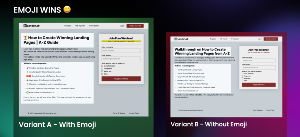
- Start with simple, testable elements – like testing “🏆 How to Create Winning Landing Pages” vs “How to Create Winning Landing Pages” (notice how even small changes like emojis can impact conversions)
- Follow the “one variable rule” – the example above tests ONLY the emoji addition, keeping everything else identical
- Calculate proper sample sizes – use a calculator to determine how long your test needs to run
- Account for weekly patterns – B2B pages often perform differently on weekends vs weekdays
- Create a testing calendar – plan what you’ll test next quarter, not just this week
- Document everything – failed tests teach you as much as successful ones
Test Ideas to Start With:
- Headlines with vs without emojis (like the example above)
- CTA button colors or text variations
- Form field reductions
- Different hero images or social proof placement
Reality Check: If you’re not testing, your competition probably is. They’re getting smarter about what works while you’re standing still.
Landing Page Mistake #8: Not Using High-Quality Images
Warning Signs You Have This Problem:
- Obviously, stock photos with fake-looking business people
- Pixelated, blurry, or low-resolution images
- Images that don’t relate to your actual product/service
- Generic “handshake” or “people pointing at laptops” photos
- Images that look like they’re from 2005
The Real Problem: Cheap-looking images make your entire brand look cheap. People make snap judgments about credibility based on visual quality.
How to Fix It:
- Use high-resolution images – at least 1200px wide for hero sections
- Show your actual product – real screenshots, real results, real customers
- Avoid obvious stock photos – especially the cheesy business handshake ones
- Make sure images are relevant – they should support your message, not just fill space
- Optimize file sizes – high quality doesn’t mean huge file sizes
- Use consistent style – all images should feel like they belong together
Quick Win: Replace your worst stock photo with a real screenshot or photo of your actual product/team.
Landing Page Mistake #9: Not Tracking and Analyzing Your Results
Warning Signs You Have This Problem:
- You don’t know your exact conversion rate
- You can’t tell which traffic sources convert best
- You don’t know where people are dropping off in your funnel
- You’re not tracking micro-conversions (email signups, video views, etc.)
- You make changes without measuring the impact
The Real Problem: You can’t improve what you don’t measure. Without proper tracking, you’re flying blind and probably leaving money on the table.
How to Fix It:
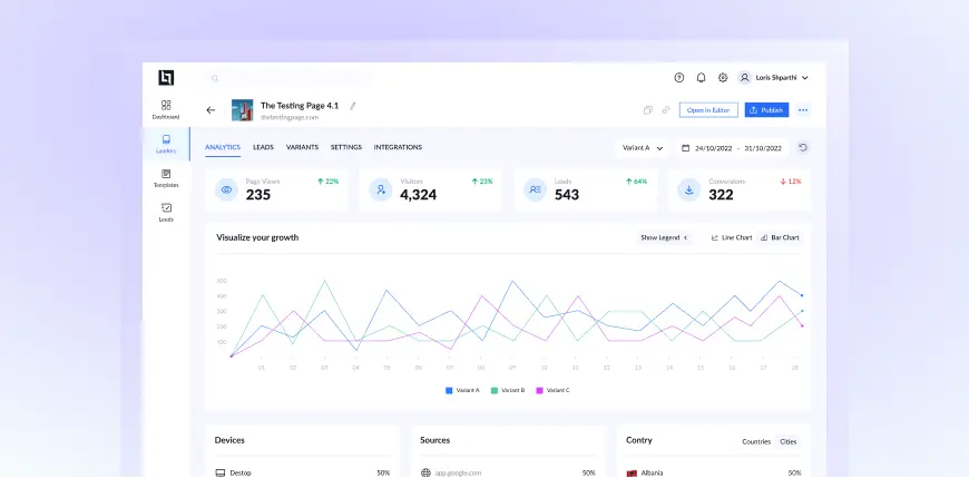
- Track the essential metrics that matter – notice how this dashboard shows Page Views (235), Visitors (4,324), Leads (543), and Downloads (322) with growth percentages
- Monitor performance over time – the line chart reveals trends and patterns you’d miss looking at single-day snapshots
- Compare different variants – see how Variant A, B, and C perform against each other with color-coded tracking
- Analyze traffic sources – know which channels (like thelandinglab.com shown) are driving your best results
- Track device performance – desktop vs mobile conversion rates help identify optimization opportunities
- Monitor geographic performance – see which countries/regions convert best for targeting decisions
- Set up proper date ranges – the 24/10/2022 – 31/10/2022 range shows weekly analysis periods
- Use built-in analytics plus integrations – LanderLab integrates with ClickFlare, RedTrack, and Voluum, so you get both easy dashboard reporting and advanced tracking capabilities
Key Metrics to Watch:
- Conversion rate trends – are you improving over time?
- Traffic source quality – which channels bring leads that actually convert?
- Device-specific performance – is mobile underperforming?
- Variant performance – which tests are winning?
Start Simple: Focus on the big four metrics shown above – page views, visitors, leads, and conversions. Everything else is secondary until you master these basics.
Landing Page Mistake #10: Relying Too Much on Manual Design

Warning Signs You Have This Problem:
- Your landing page looks homemade or unprofessional
- Elements aren’t aligned properly
- Inconsistent spacing, fonts, or colors throughout
- It took you weeks to build, and you’re still not happy with it
- You’re spending more time on design than on your actual business
The Real Problem: Unless you’re a professional designer, trying to build landing pages from scratch is usually a waste of time and money. You end up with something that looks amateur and probably doesn’t convert well.
How to Fix It:
- Start with conversion-proven templates – LanderLab offers hundreds of professionally designed templates that are optimized for conversions
- Use drag-and-drop builders – instead of coding from scratch, simply customize proven layouts to fit your content and brand
- Follow proven design patterns – the templates follow best practices for visual hierarchy, generous spacing, and mobile optimization
- Put content ahead of creation – spend time getting your offer and copy right instead of struggling with design principles
- Leverage Pro Design Systems – automatically get consistent fonts, colors, spacing, and alignment on every template
- Get live earlier – convert idea to live landing page in hours, not weeks
Reality Check: You are doing something wrong if you have invested more than 40 hours in the creation of a landing page.
Conclusion on Landing Page Mistakes to Avoid
These 10 errors are costing you literally money. 2% to 4% variation in your conversion rates won’t be something earth-shattering, but if you have 1,000 visitors per month, 20 additional conversions make all the difference. If a conversion is valued at $50, that’s an additional $1,000 monthly revenue.
Most importantly: try it all. Your audience is unique, and what gets one other person results may not work for you. Test, adjust, and continue to optimize. Your landing page has to be your best employee. Ensure it’s getting its money’s worth.
FREQUENTLY ASKED QUESTIONS
What are the biggest landing page mistakes that kill conversions?
The most prevalent conversion killers are disorganized design, slow speed, poor call-to-action buttons, and inadequate mobile optimization. The four of them combined can cut your conversion rate in half.
How fast should my landing page load?
Your landing page should take less than 3 seconds to load. Each second of delay boosts bounce rates in a big way. At 5 seconds, you’ll lose 90% of visitors before they even get to see your offer.
Should I use long or short forms on my landing pages?
It depends on your offer and target audience. For simple lead magnets, 2-3 fields are best. For high-ticket offers or consultations, longer forms can actually improve lead quality by filtering out tire-kickers. Experiment with both techniques.
How do I know if my landing page is working?
Keep an eye on your conversion rate, bounce rate, and time on page. If your conversion rate is below 2% or your bounce rate is above 70%, you most likely have one of the mistakes talked about in this guide.
Can I fix these mistakes myself, or do I need a developer?
The majority of these solutions are non-coding. Through the use of a landing page builder like LanderLab that uses pre-designed templates, design, mobile responsiveness, and speed issues can be resolved without coding.
Turn Mistakes Into Conversions
Use LanderLab templates, forms, and testing to fix the issues you saw and launch a page that converts.
No code needed. Build and publish in hours.


