We’ve highlighted the importance of creating an effective Call to Action (CTA) over and over when building landing pages, lead captures, and even wireframes. In digital marketing, any campaign is affected by its CTA. Looking at real-world call-to-action examples shows us what actually works to get people clicking and converting in different situations.
When’s the last time you felt compelled to click on Call Now over a brand you’re just getting to know? Or did you get frustrated when clicking a Download button and you were redirected to another page that asks for your email address before you can actually get the download? What interesting image made you click on a social media post? These are all examples of a CTA.
A CTA can dissuade prospects from converting just as it compels users to click.
As such, CTAs involve more psychological principles to drive user engagement and conversions than you’d think! Rather than mere website elements, effective CTAs tap into the cognitive biases and emotional triggers of your audience through various persuasive techniques.
It requires brands to understand their target audience’s needs, behavior patterns, and relative interests. When crafted thoughtfully, a CTA becomes a critical conversion tool in the customer journey.
Jump to Section:
🚀 KEY TAKEAWAYS
- Measuring the clicks a CTA gets is a key performance indicator in marketing which is why it is crucial to optimize this element in any landing page.
- CTA have key qualities that may indicate its effectiveness, and these must be considered when creating one.
- Some of the best CTAs you can write are original to your brand, so be creative with it!
In this blog, we’ll explore the different types of CTA (they are not just buttons!) and the key qualities of a well-crafted, powerful CTA. We’ll also look at 12 proven Call to Action examples that get clicked. Let’s start!
What is a Call to Action?
A Call to Action (CTA) is a content element that prompts users to take immediate, specific steps toward conversion. Together with other page elements, it forms a cohesive message that should compel users to take action.
A CTA is usually clickable, but it can also be non-clickable (directional image banners, headlines). The idea is that a CTA grabs a user’s attention and prompts them to click or to proceed to the next phase of the marketing funnel.
It’s important to note that the CTA never works alone—it needs to be supported by other parts of the page, such as the headings, the copy, the images/videos, and more. Even the color of the button or media is important!
Think of a CTA as a digital signpost in a buyer’s roadmap. When users reach a decision, a CTA helps them continue their journey. As an interactive component, it reduces friction by providing explicit directions on the next steps of the user. When a visitor clicks on a CTA, it creates a measurable engagement point that businesses can track and optimize—the CTR.
Click-through Rate (CTR), which is the number of clicks on a CTA, is a widely used Key Performance Indicator (KPI) for marketing campaigns and advertising. As a key variable in a funnel, the CTA is monitored and optimized as needed to bring success to campaigns.
To understand what examples of CTA get clicked, let’s look at its different types, the key qualities of a CTA, and how to use them effectively.
3 Types of CTA
1. CTA Buttons
CTA buttons are simply intuitive. Viewers see one, point at it, and then click on it. Because of this, they provide high visibility to an offer and should stand out in a marketing email or landing page.

CTA Button Example
A landing page wireframe shows the most basic structure of a page.
2. Text-based CTA
Text-based CTAs are usually used in emails or articles because they are less obtrusive and integrate seamlessly with written content.

Text-based CTA Example
3. CTA Banners
CTA boxes or banners combine imagery, text, and buttons to convey additional value propositions comprehensively. These banners are usually clickable as a whole and may appear more like an image than just buttons or text.

CTA Banner Example
Key Qualities of a CTA that Gets Clicked
How a CTA is crafted may depend on what kind of lead you attract (cold, warm, hot), the medium you use to market your offer, and your brand’s identity.
Here are some common characteristics of a call to action that get clicked:
Offers a Clear and Specific Goal
A basic rule in marketing is to stick to one marketing objective in one landing page. If the goal is to offer a PDF checklist, the CTA of that landing page should instruct the viewer on how to get that checklist.
This is not to say that landing pages with more CTAs will not work, but as a precaution, a landing page with one primary CTA will be easier to optimize for conversion. But if you can’t help using more than one, you’ll find working examples that use secondary CTA or even tertiary CTA.
Clear CTAs explicitly tell users what to expect when they click, and brands should match that expectation. Vague phrases like “Click Here” waste opportunities to reinforce value propositions; “Get PDF Here” may work better.
Personalized Interaction
First-person CTAs like “Start My Free Trial” create ownership and a personal perspective before the click occurs. Second-person CTAs, like “Start Your Free Trial,” speak directly to users in a more instructional manner.
First-person CTAs have been shown to outperform high-commitment offers as they psychologically transfer ownership to a significant investment. Some brands successfully use a hybrid approach at different funnel stages to gradually increase personal investment.
Moreover, CTAs that relate to your user’s previous touchpoint choices can increase conversion.
Uses Action Words and Verbs
Power verbs like “Get,” “Start,” “Build,” and “Join” psychologically prime users for conversion. The best action words match the interaction’s value proposition and expected outcome.
Use verbs in the present tense and active voice to create immediacy in the desired action. This can also be used to create urgency in an offer.
Matches Audience Intent
CTAs should match audience intent. In our article about lead capture pages, we highlighted the four categories of leads and how each may respond to different kinds of offers.
Are they just hearing about your brand? Do they need a checklist, or are they looking for something more in-depth?
Whatever category the lead falls in, the CTA language must align with the buyer’s journey. “Buy Now” may be daunting for a cold lead, but they may be interested in “Learn More.”
Appeals to Positive Emotion
Psychology plays a huge role in a CTA’s effectiveness and positive emotions can increase conversions.
Good CTAs tap into aspirational motivations, showing users how taking action improves their situation. They focus on solutions to problems, highlighting relief points rather than pain points.
Emotional CTAs perform better because they connect logically and emotionally with users’ fundamental needs.
Aligned with Brand Identity
CTAs should maintain a consistent brand voice across all touchpoints. Fun/cheeky brands might use “Grab Yours” or “Join the Club” to reflect their personality.
Luxury brands typically evoke elegance like “Discover” or “Experience”. Bold brands benefit from direct, powerful language like “Transform Me” or “I’m In!” suggests confidence.
This key quality reinforces brand awareness and is an opportunity to strengthen brand identity. Moreover, while CTAs tend to be general in a sense, some of the best CTAs you can write are ones original to your brand.
Now that you know the key qualities, let us look at some call to action examples that get clicked from different brands and see how you can use it for yours.
12 CTA Examples that Gets Clicked
In this list, we’ll show you examples of brands that continued to use the same CTAs for the lifespan of their company, albeit with different styles.
There’s only one reason why they continue to use the same CTAs over and over—because they have been proven to work!
1. Simple Single Page CTA

Simple Single Page CTA Example
It’s clear what visitors will get on this page: a free quotation for their car insurance. They get to the page with a single goal and a CTA button.
It also uses a first-person perspective in the CTA button and has visible social proof. Simple and effective CTA example.
2. Shopify’s Free Trial CTA
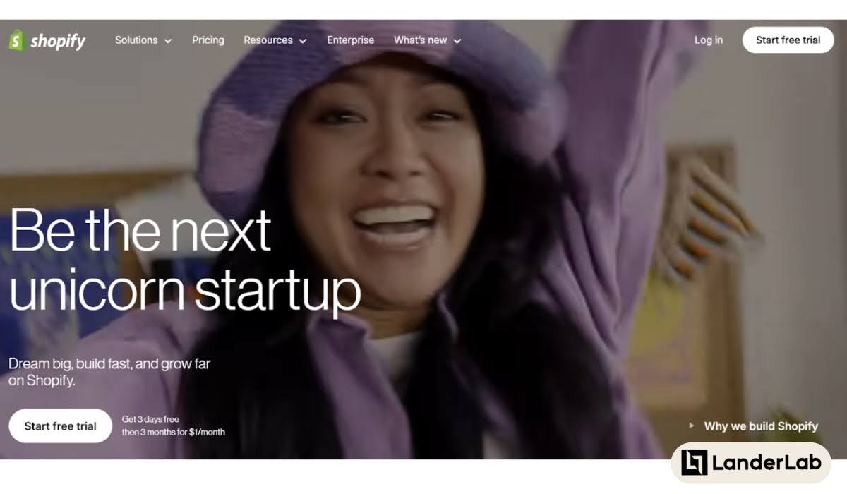
Shopify’s Free Trial CTA Example
Shopify is an e-commerce platform that supports different sizes of businesses. Its homepage’s headline starts with “Be the next big thing,” “Be the next category creator,” and “Be the next unicorn startup,” all of which support the CTA to “Start free trial.”
The whole page works together to appeal to a business’s aspirations. It’s a great way to exude optimism for those starting a free trial.
3. Bossbabe’s Brand-aligned CTA Button
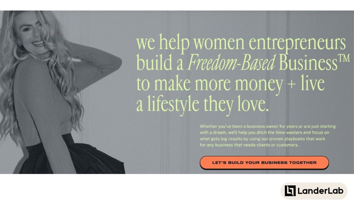
Bossbabe’s CTA Example
Here’s a homepage with a single CTA button in the above-the-fold section. The CTA headline calls on their audience, “women entrepreneurs”, and offers what they can help with, “to make more money + live a lifestyle you love”.
Moreover, the CTA button “Let’s Build Your Business Together” reiterates what Bossbabe can do.
4. Mango’s High Contrast CTA Button and Banners

Mango’s CTA Example
Here’s an example of a CTA banner with just text and a black button that says “Shop Now.”
Just as visual elements can be effective, big, bold, and direct texts can be just as powerful. It works because it has all the information a visitor needs about the season sale Mango is having.
What makes it even more attractive is that as users scroll, the text contrasts with the first colored visual element seen on the page, offering a different value: “New Now.” Visitors are then asked to “Discover More” and will go to a filtered category for new items.
The media itself is clickable, making it a CTA banner right beneath a CTA button. Who says CTAs can be next to each other? In Mango’s case, it works.
5. Barnes and Noble CTA Image Banner

CTA Image Banner Example
Doesn’t this look so attractive? We identify it as a CTA Image Banner because the whole image is clickable, even though there is a text that says “Explore Now” that looks like a button within the image.
Adding CTA text within an image is a great way to inform visitors that the banner itself is clickable.
It works because viewers tend to be naturally curious about great-looking images. It’s specific to The Hunger Games Collection, and the button is highlighted so users know to hover over it.
6. BetterHelp CTA Choices
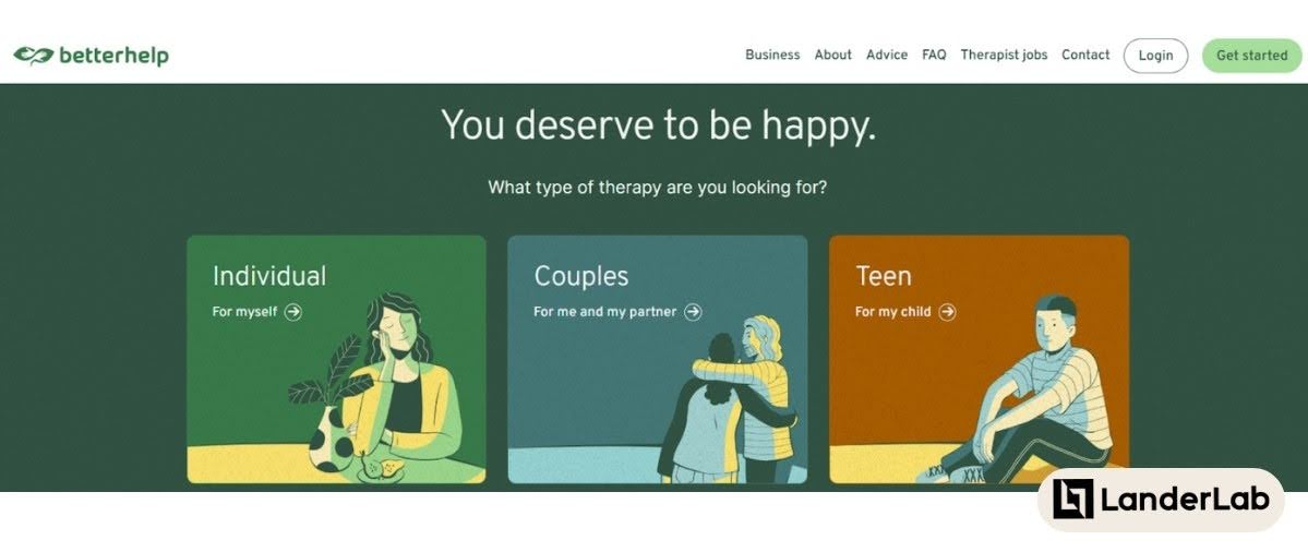
BetterHelp CTA Example
As we mentioned, there isn’t always just one primary CTA on a page. Betterhelp’s homepage has multiple CTA buttons (three, to be exact).
What makes this get clicked? It’s emotional, it allows the user to pick the best option for them, and the marketing funnel is segmented in the back end. It’s a win-win for users and marketers!
7. Neil Patel’s Free Analysis CTA
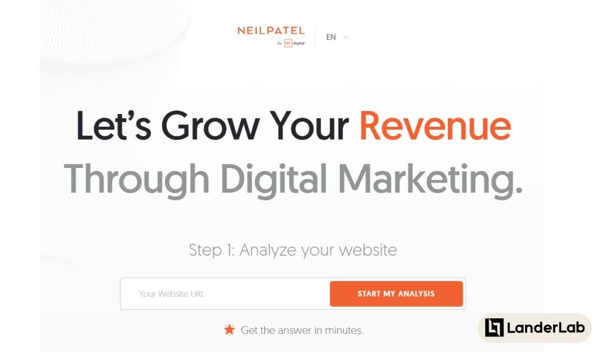
Neil Patel’s CTA Example
Aside from free trials, freebies are among the most clicked CTAs, and there are many kinds that brands can explore to give to their audience.
In the example above, Neil Patel’s homepage CTA offers a free website analysis. As a big player in the Digital Marketing industry, this is a strategic approach to getting new clients and a great way to convert prospects.
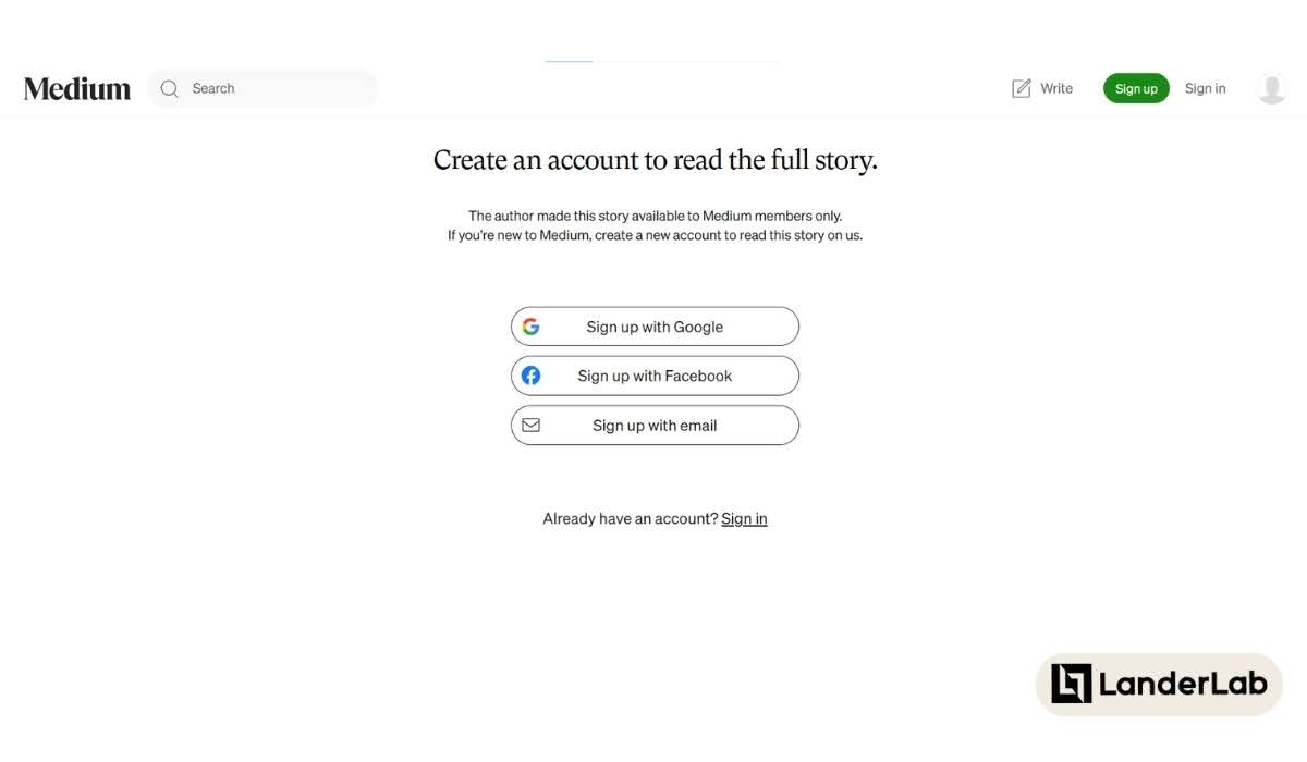
8. Medium’s For Members Only CTA
Medium’s CTA Example
Contents behind a paywall is a strategy to monetize a blog. This CTA asks viewers to “Create an account to read the full story” for articles meant for members only.
Since it’s paid, they include “create a new account to read this story on us” in the subheading to convey that viewers can read this article if they sign up, but any future articles may be up for payment.
It’s a great way to give a freebie, manage expectations, and measure commitment from new users.
9. Hotjar Interactive CTA

Hotjar’s CTA Example
Hotjar is a software that shows how users act when they get to a page. While a CTA appears in the above-fold section, when users scroll down, they’ll find a CTA section with a gradient background that moves with the cursor hover (like how heatmaps look). The interactiveness of this section makes it fun and memorable!
Every detail points to a new visitor being able to Get Started for Free. It even makes it easier to sign up because it’s connected to Google Sign In. Benefits are also highlighted for clarity, and a possible user objection is addressed with “no credit card required”.
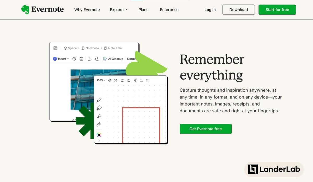
10. Evernote’s Emotional CTA Headline
Evernote’s CTA Headline Example
Evernote is a note-taking software, and it surely uses one of the key qualities of a CTA that gets clicked, which is using the visitor’s emotion while offering the tool for free.
The page’s emotional appeal focuses on the core benefit their users get, giving the powerful promise of being able to do something they need—to Remember Everything.
The focus is on the transformation they will experience rather than the mechanics of signing up, so it becomes a positive reinforcement for cold leads.
11. Bonanza Pop Up CTA

Bonanza Pop Up CTA Example
Another example of CTA proven to get clicked is an exclusive deals CTA. This pop-up form on the Bonanza home page instantly offers new visitors exclusivity by offering special coupons for those who sign up.
The CTA button, “Unlock Deals!” is a clear addition to this value proposition.
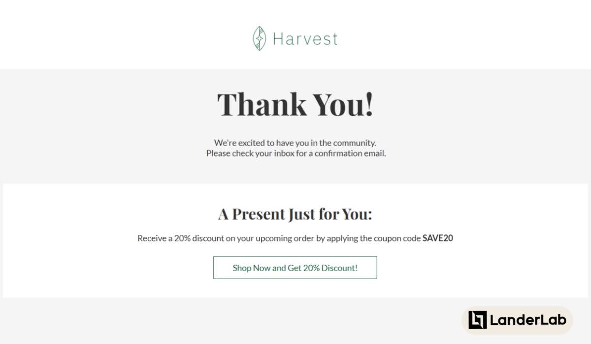
12. Thank You Page CTA
Thank You Page CTA Example
The Thank You page is a crucial digital real estate for your brand. When someone engages in your marketing funnel, such as getting a free download or signing up for the newsletter, the after-engagement action will be a crucial touchpoint.
The idea is to urge them to engage more. In this example, the CTA after saying Thank You directs the visitor to proceed with shopping and sends them along with a 20% discount. That’s a pretty sweet deal.
“Get Discount” and it’s variations have always been one of the most clickable CTAs ever since online promotions came to be.
Final Thoughts
While CTAs play on human psychology, it is important to be careful about using them.
Manipulative techniques like over-the-top FOMO strategies or misplaced scarcity tactics might get clicks, but they don’t build the best relationships. Go beyond quick decisions; deliver what your audience needs and values instead.
Ready to implement these CTA strategies in your own marketing? Landing page builders like Landerlab offer hundreds of templates designed with conversion in mind, making it easy to create pages with CTAs that incorporate the principles we’ve discussed.
With the right tools and these proven call to action examples, you can create landing pages that not only get clicks but also drive meaningful conversions.


