Creating high-converting landing pages is both an art and a science. This involves combining creative design that looks good with a well-articulated content piece that will drive conversions. While coming up with visually attractive designs and writing exceptional copy requires some creativity, there’s a specific formula you need to follow for better results. After all, a great landing page is a page that converts. It’s a page that gets you more email addresses, customers, or subscribers.
There are a few key elements that every high-converting landing page includes. Once we’ve covered what these key sections are, we will look at some successful landing page examples you can use as inspiration when creating your own.
We will then show how you can easily create converting pages without any prior coding or design knowledge using landing page builder tools.
If you’re new to landing pages, we recommend reading our article that explains what landing pages are and why you need them.
What is a high-converting landing page?
A high-converting landing page is a landing page that has a higher than average percentage of visitors taking the action you want them to take, whether that is to sign up, download something, or make a purchase. In other words, a landing page has a high conversion rate, which means it gets more visitors to become either leads or customers.
For context, let’s say that 100 people visit your page. If you have 5 sign-ups, then you have a 5% conversion rate, and if you have 20 sign-ups, then you have a 20% conversion rate. The higher that percentage, the better the conversion rate, and the more effective your landing page is.
4 Essential Elements of a High-Converting Landing Page
1. The first step is all about narrowing down your main value proposition
What benefits can a prospective client expect from your offer? What makes your offer unique in relation to your competition? These benefits should be reflected throughout the entire page. Next time you plan on creating a lander, try following these two steps first:
- On a separate document, write down your value proposition: this is one short sentence that summarizes your offer.
- Write down the three key benefits or features of your offer. Focus only on the things that will interest your target audience the most.
2. Next, you will need a good headline and a supporting sub-headline.
A good headline is catchy, and it clearly communicates your value proposition, while a good sub-headline offers further support to your headline.
3. While great copy will take you a long way, you also need to focus on the visual part of your page.
These days, clean and simple designs convert really well. Using your brand’s colors is preferable because it will help customers recognize and remember you. You also need to choose your hero shot – this is the image at the top of your landing page. Below, we will show you various designs that top-performing companies use for better conversions. If you need some more help with choosing your landing page image, read our article that focuses on this.
4. Last but not least, you will need a strong call-to-action, commonly referred to as CTA.
The call to action is generally a phrase that will motivate your visitor to take action (subscribe, download, buy). Landing pages generally display their call-to-action in the form of a button. To make this even more effective, you will need to personalize the CTA as much as possible.
Now that you know all four essential elements that need to be included in a landing page, let’s take a look at some examples!
15 Examples of High-Converting Landing Pages
Before we start, how do we know what a good conversion rate is? According to HubSpot, the average conversion rate across all industries stands at 9.7%. In reality, the target conversion rate varies heavily across industries. Check out the benchmark report to see what the average conversion rate for your industry is.
We’re going to look at 15 landing page examples next and analyze what makes them great.
1. Netflix
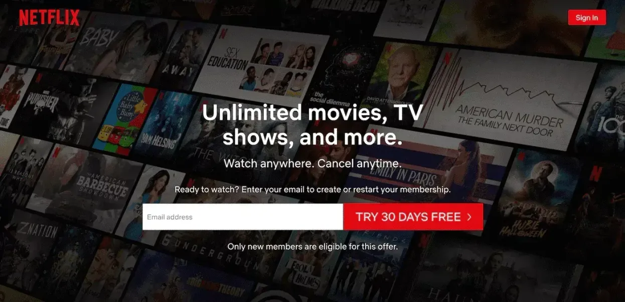
First, we have Netflix’s trial landing page – a simple page to promote the streaming service’s 30-day free trial period. Netflix has gone for a clean interface – there’s not a lot of text or additional elements included. Since they are not directly selling anything at this point, this page works great.
What makes this landing page convert?
- Straight-to-the-point headline: the headline directly explains what you can expect from this offer, and the usage of the word ‘Unlimited’ makes it even more powerful. They have effectively summarized their entire value proposition in a few keywords.
- Risk-free sub-headline: through this page, Netflix is basically reassuring you that you’ll lose absolutely nothing if you just try out their free trial. They do this by adding ‘Cancel anytime’ on their sub-headline. People are risk-averse by nature, so if you’re promoting a free trial, make sure to eliminate any possible risk for your visitors.
- Clear CTA: the CTA ‘Try 30 days free’ is very personalized for this specific offer, and again, it mentions clearly what you can expect if you proceed. The fact that you only need to write down your email address here also helps conversions – people are more likely to give away their email address than their phone number or home address
2. Neil Patel
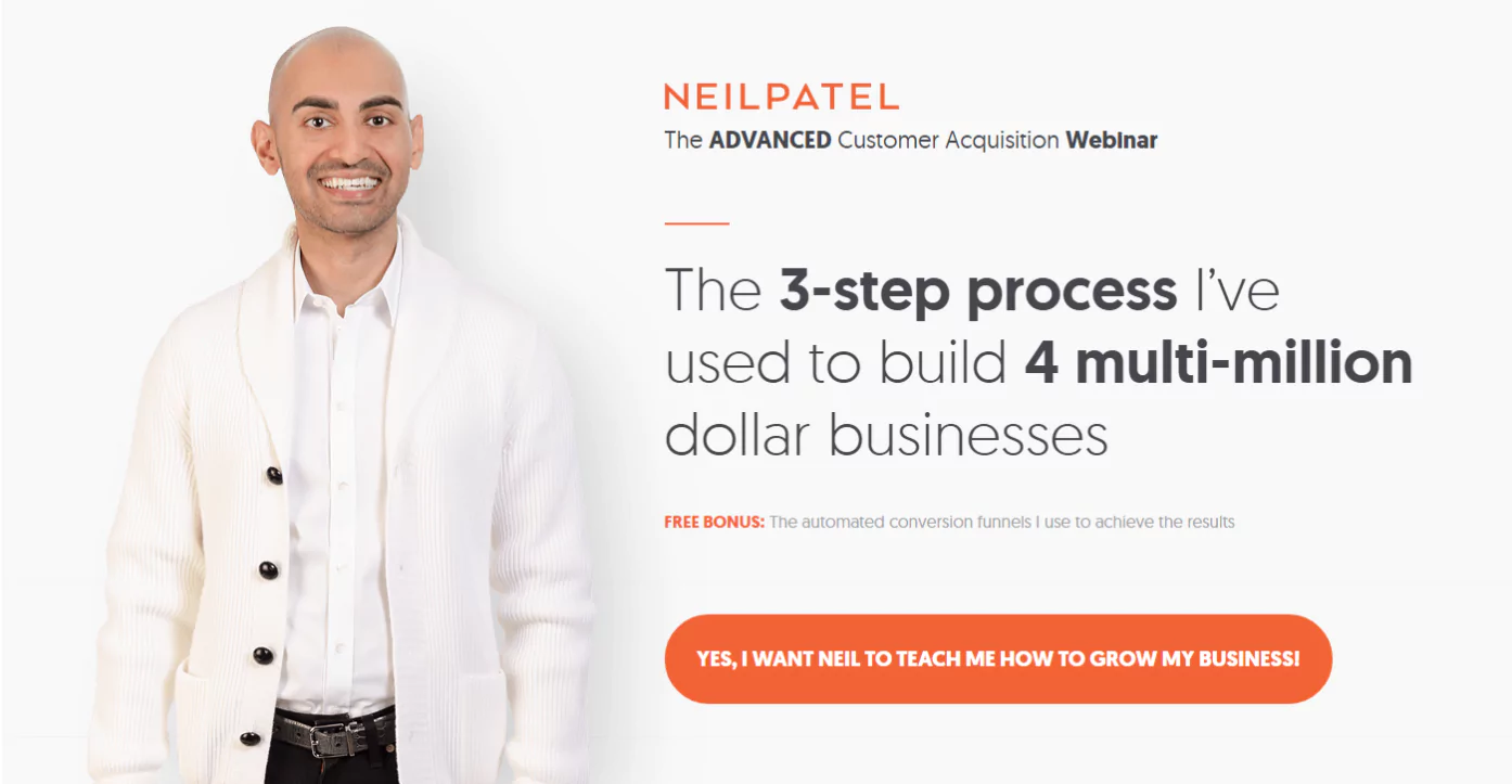
Marketing expert Neil Patel is promoting his webinar through this landing page. Again, this is a very simple page optimized for conversions.
What makes this landing page convert?
- Catchy headline: This headline works for multiple reasons. First, it summarizes in one sentence the value you’ll get from attending. Next, the incorporation of data makes the value proposition more trustworthy.
- Good hero image/overall look: generally, people like to put a face to a name and know who’s behind the scenes. It adds a personal touch and makes visitors feel more connected to your brand. In this case, Neil Patel has used an image of himself, which perfectly represents his brand. Also, the colors used here reflect his brand colors.
- Highly personalized CTA: before, we mentioned that a personal CTA converts better, and this one is extra personalized. Not only does the CTA stand out visually, but it also immediately establishes a sense of connection with the brand and the offer.
3. Shopify
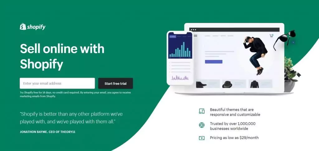
Shopify’s free trial landing page is another example of a perfectly executed page. Apart from the clean design, the e-commerce platform’s page includes a few extra elements compared to the first two examples.
What makes this landing page convert?
- Testimonial: on the left-hand side, you will find a testimonial from one of Shopify’s top clients. This simple step immediately establishes trust.
- Key benefits: at the bottom of the right-hand side, Shopify includes its 3 key benefits. They are short and concise, because this page is only promoting the free trial, but they already give you an idea of what you can expect from Shopify.
4. Adplexity
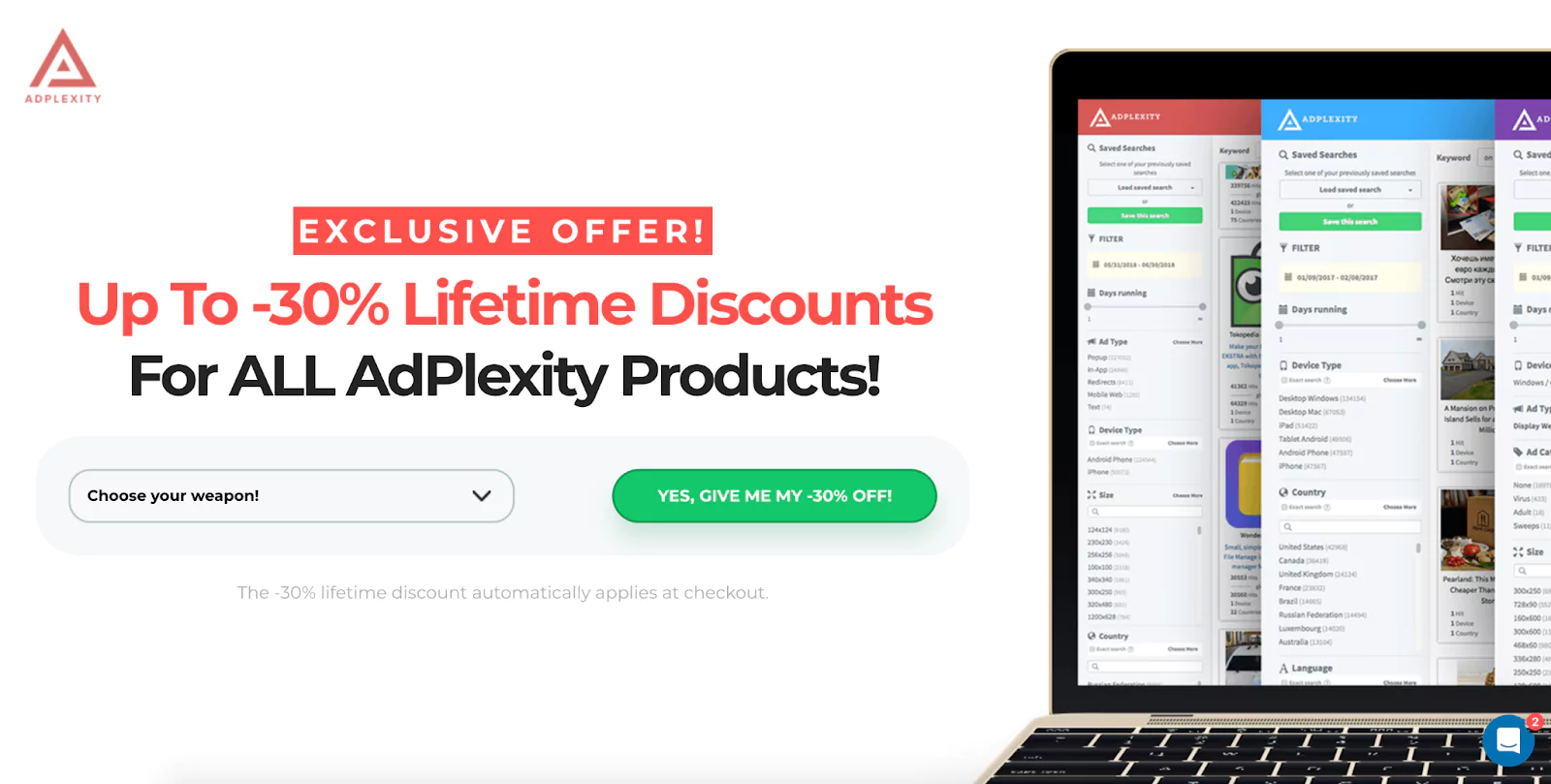
Marketing intelligence tool Adplexity is yet another example of a simple landing page that works!
What makes this landing page convert?
- No-brainer CTA: not only is the call-to-action personalized, it’s also written down in a way to make it seem like a clear no-brainer. Who wouldn’t want to get a 30% discount?
- Show-don’t-tell hero shot: the hero image simply gives you a sneak peek into Adplexity’s dashboard to show you what you can expect from the tool.
Want landing pages that actually convert? Try LanderLab and start building in minutes.
5. Trello
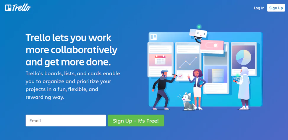
Project management tool Trello has a great landing page to promote its basic free version. We’ve already had a few similar examples, so by now you know that they only ask for your email address to get more conversions. The CTA is also straight to the point, and it stands out. But there are other elements that make this page convert.
What makes this landing page convert?
- Value proposition: Trello’s value proposition on the headline is even more powerful because it directly touches upon their customers’ pain point – productivity. Trello is all about planning and managing projects effectively, so mentioning ‘get more done’ directly speaks to their ideal visitor.
- Fun hero image: the hero image shows, in a creative way, what Trello’s interface looks like. The colors also fit with Trello’s brand identity and radiate trust.
6. GrowthHack
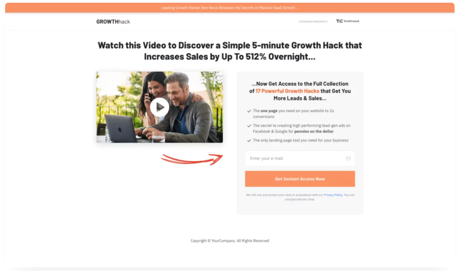
This landing page is built to capture leads quickly with a bold promise: “Discover a Simple 5-minute Growth Hack that Increases Sales by Up To 512% Overnight.” The focus is on urgency and high reward to push visitors into action.
What makes this landing page convert
- Killer headline & sub-headline: Numbers and statistics are more tangible, so the headline (and sub-headline) work particularly well when it comes to conveying Growthhack’s value proposition.
- Video: According to HubSpot’s research, adding video to your landing page can increase conversions by up to 86%!
- Key benefits & clear CTA: the key benefits are personalized for their target audience, truly showing their visitors not only what they’ll get from this offer, but also why they should care about it. The CTA is clear and ignites a sense of urgency.
7. NordVPN
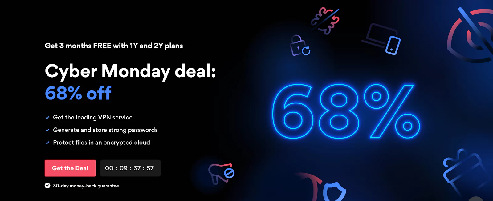
This landing page, used to promote NordVPN’s Cyber Monday sale, is also relatively simple; the key features are listed, and the CTA is personalized, but there are two other elements I would like to focus on.
What makes this landing page convert
- Timer: if you’re promoting a special deal, discount, or other time-sensitive offer, adding the timer can be highly effective. It simply increases the sense of urgency, and it will help convert more visitors.
- Risk-free: at the bottom, you can see the text ‘30-day money-back guarantee’. By removing any possible risk, more people are likely to click on ‘Get the Deal’.
8. Lyft
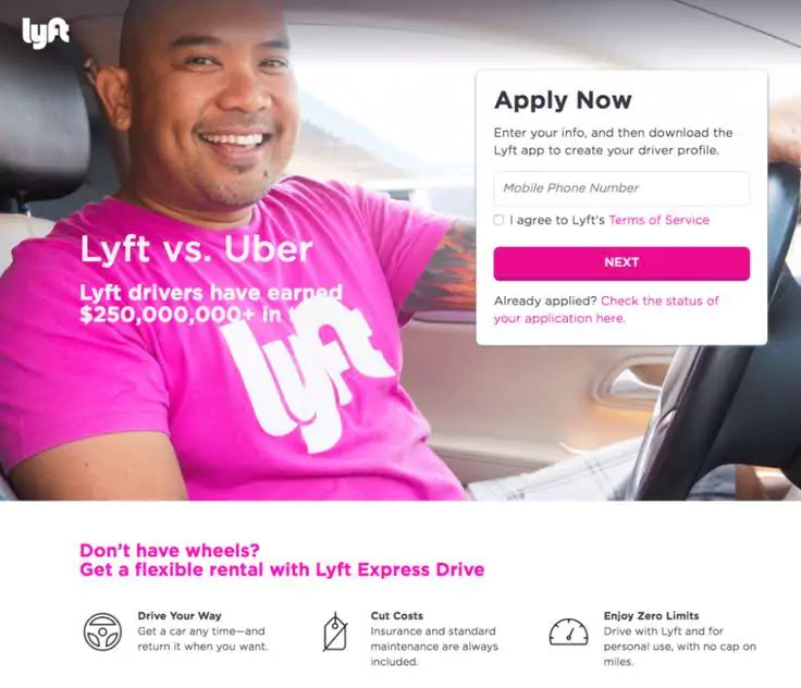
Ride-sharing company Lyft uses a very eye-catching landing page to promote its app. While there are a few small things that could be improved, such as the non-visible text of the sub-headline, the landing page has several great elements.
What makes this landing page convert
- Bold headline: Lyft knows their competition, and they’re not being subtle about why you should choose them over Uber if you’re considering becoming a driver. The data in the sub-headline further elaborates on the title.
- Hero image/overall look: not only do these colors represent the brand’s identity, but the hero image itself serves as a sort of testimonial. You can see a Lyft driver who is clearly happy, and again, it establishes that connection and trust with a brand.
The key elements at the bottom further explain Lyft’s benefits. You may be doubting their reason for requesting a mobile phone number in their form, but since you expect a level of seriousness from people who want to become Lyft drivers, this is a good choice. Remember, quality over quantity!
9. LeadFeeder
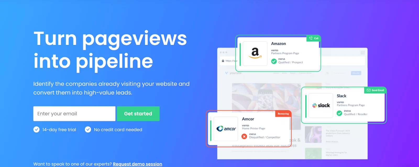
Lead generation tool LeadFeeder combines a lot of the tips we discussed above. They have a clear value proposition on their headline and sub-headline, a short but sweet CTA, and a show-don’t-tell approach. The hero image shows what the tool’s notifications look like.
What makes this landing page convert
- Demo session: at the bottom, you can request a demo session if you’re still not convinced. Adding a way for your visitors to be able to communicate with you and your team can be crucial.
10. GetResponse
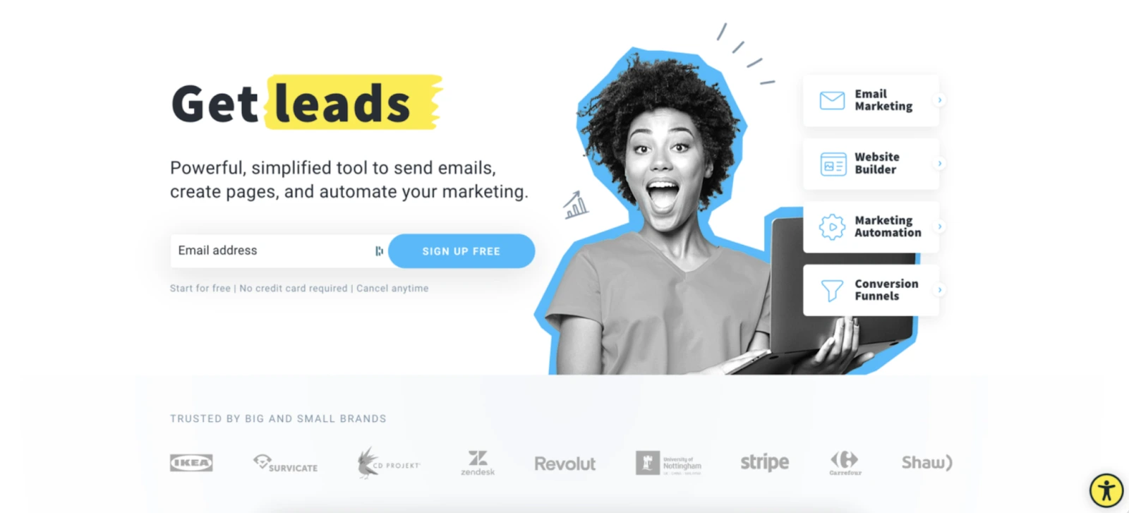
GetResponse has one of the best landing page designs – it’s neat and clean, but still creative and eye-catching.
What makes this landing page convert?
- Great headline and sub-headline: in one simple sentence, they are already telling you their offer.
- Client list: at the bottom, they have added a list of clients who use GetResponse for their marketing needs. This has the same effect as the testimonials, and it makes visitors trust the brand more.
11. Google Digital Garage
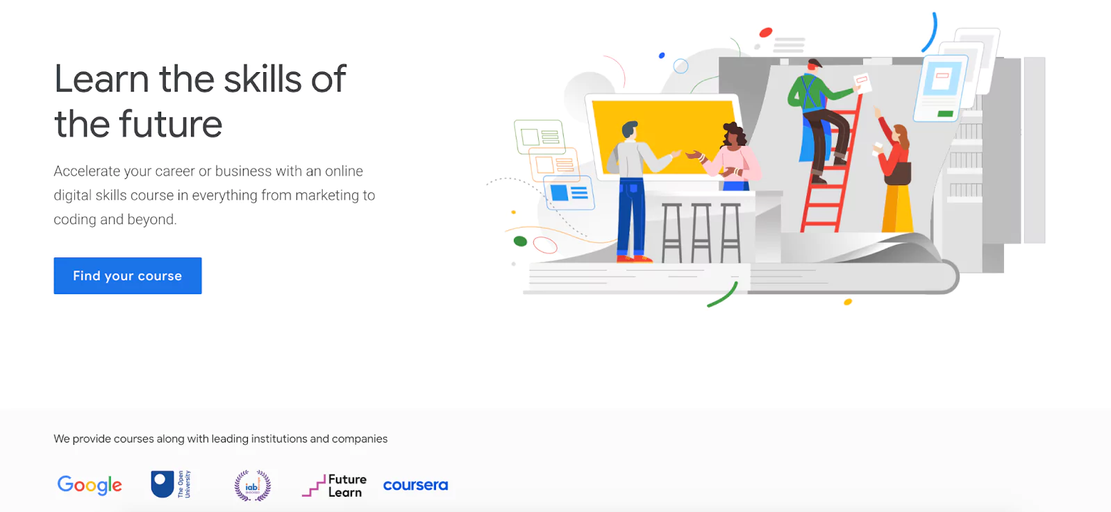
Google Digital Garage offers courses and training on digital skills.
What makes this landing page convert?
- Establishing themselves as experts: if you’re selling a course, educational e-book or something similar, you’ll want to establish yourself as an expert in the field. Why should someone take advice from you? At the bottom, you can see all the well-endowed institutions that Google Digital Garage collaborates with to provide these courses.
12. Lilt
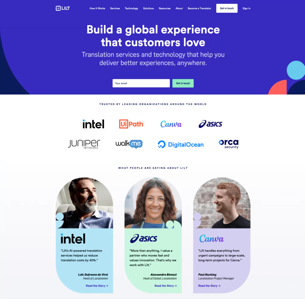
Translation company Lilt offers yet another example of a very convincing page.
What makes this landing page convert
- A lot of testimonials: the page is focused on really highlighting all the big companies that use Lilt, and on showcasing a few personal testimonials. If I see a review by the project manager of Canva, I will trust this product. As simple as that. The testimonials here are extra useful because they use a full name, position, and photo.
13.ExpressVPN
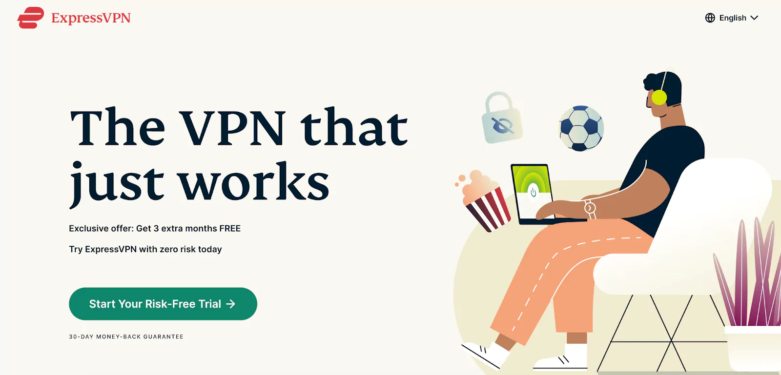
ExpressVPN has another great landing page, but this time for different reasons.
What makes this landing page convert
- Focus on risk-free: remember a few landing pages ago when we mentioned that people are risk-averse by nature and want to be assured they will not lose anything? ExpressVPN takes that to another level. One of the key benefits mentions ‘zero risk’. The CTA refers to a Risk-Free Trial. In reality, most trials are risk-free, but it’s good to remind your visitors. Even at the bottom, you can see a sign about a 30-day money-back guarantee.
14.Sendinblue
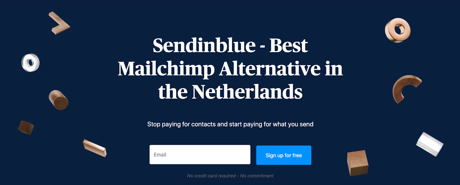
Sendinblue has been doing some aggressive marketing lately, and this page clearly shows that.
What makes this landing page convert?
- Highly personalized headline and sub-headline: not only does the sub-headline refer to a crucial pain point, it’s specifically addressing a pain point caused by their competitor. It’s a bold choice, but it clearly conveys their Unique Selling Point (USP) that sets them apart from the competition.
15. Remarkable
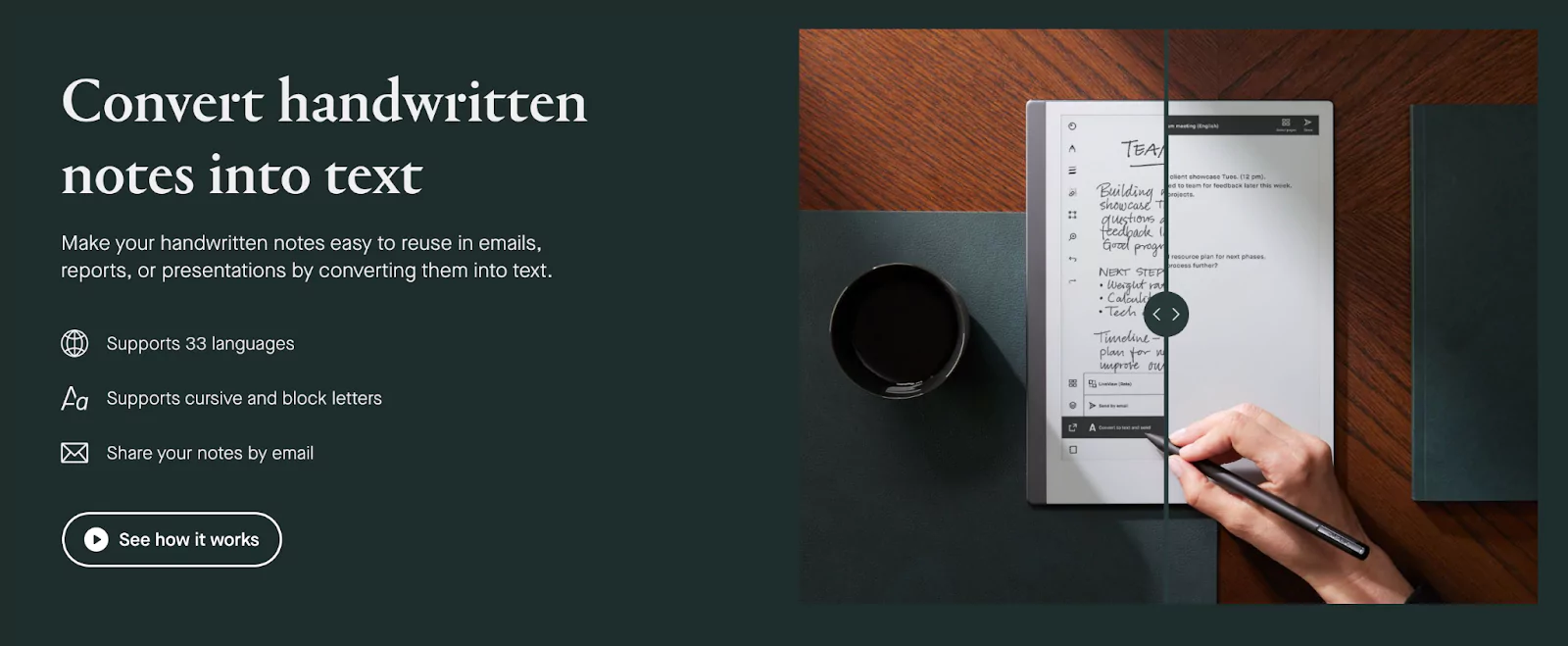
We’re ending today’s landing page examples with this great design by paper tablet company Remarkable. You may have noticed that no matter how different the offer or the design is, all successful landing pages are able to summarize their key values in one or two sentences. This example is no different.
What makes this landing page convert?
- High-quality image: Remarkable has created its own image that explains what they do better than words ever could – on the left-hand side, you can see the handwritten notes, and on the right-hand side, you can see the automatically generated digital version of the notes. Remember, the image is not there just to look good; it should also add some sort of value in relation to your offer.
16. Loom
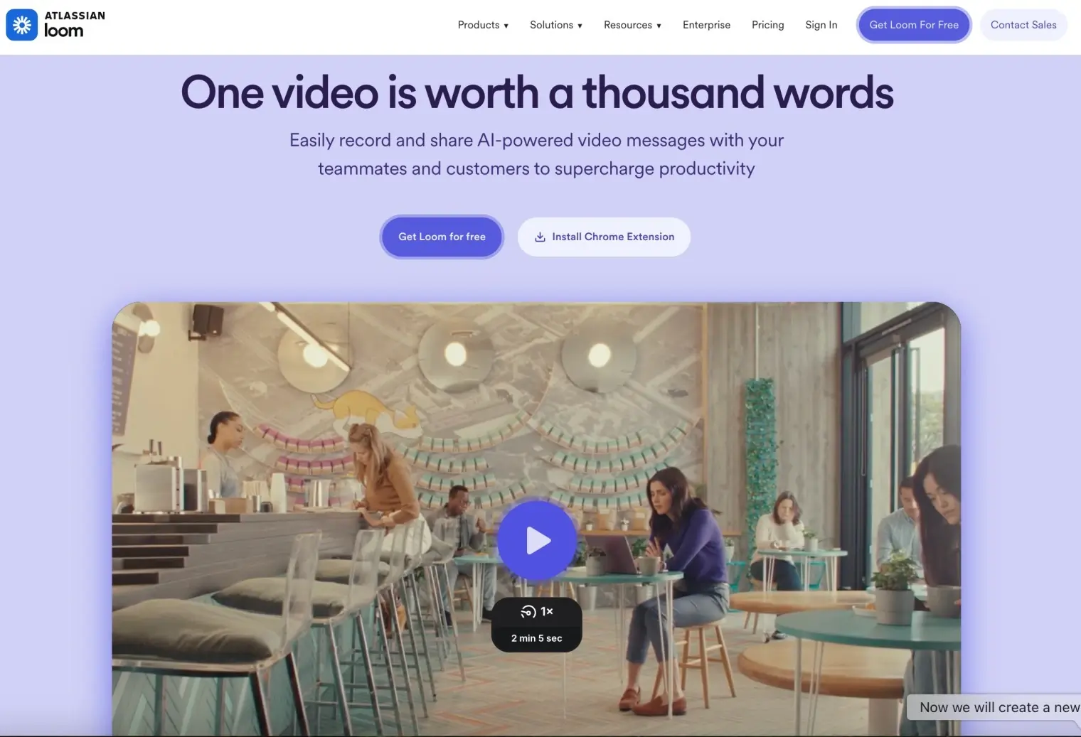
Loom’s landing page gets straight to the point. The headline “One video is worth a thousand words” explains the value instantly, supported by a hero video that shows the product in action.
What makes this landing page convert?
- Clear hero section with two CTAs (Get Loom for Free / See Pricing).
- Social proof with millions of users and logos from big brands like Netflix and HubSpot.
- Loom AI features that create transcripts and summaries automatically.
- Product visuals showing editing, analytics, and security.
- Use case cards for sales, support, collaboration, and design.
- Enterprise section highlighting scalability and security.
- Customer testimonials with names and photos.
It combines strong messaging, real product visuals, social proof, and repeated CTAs to guide visitors toward action.
17. Coursera
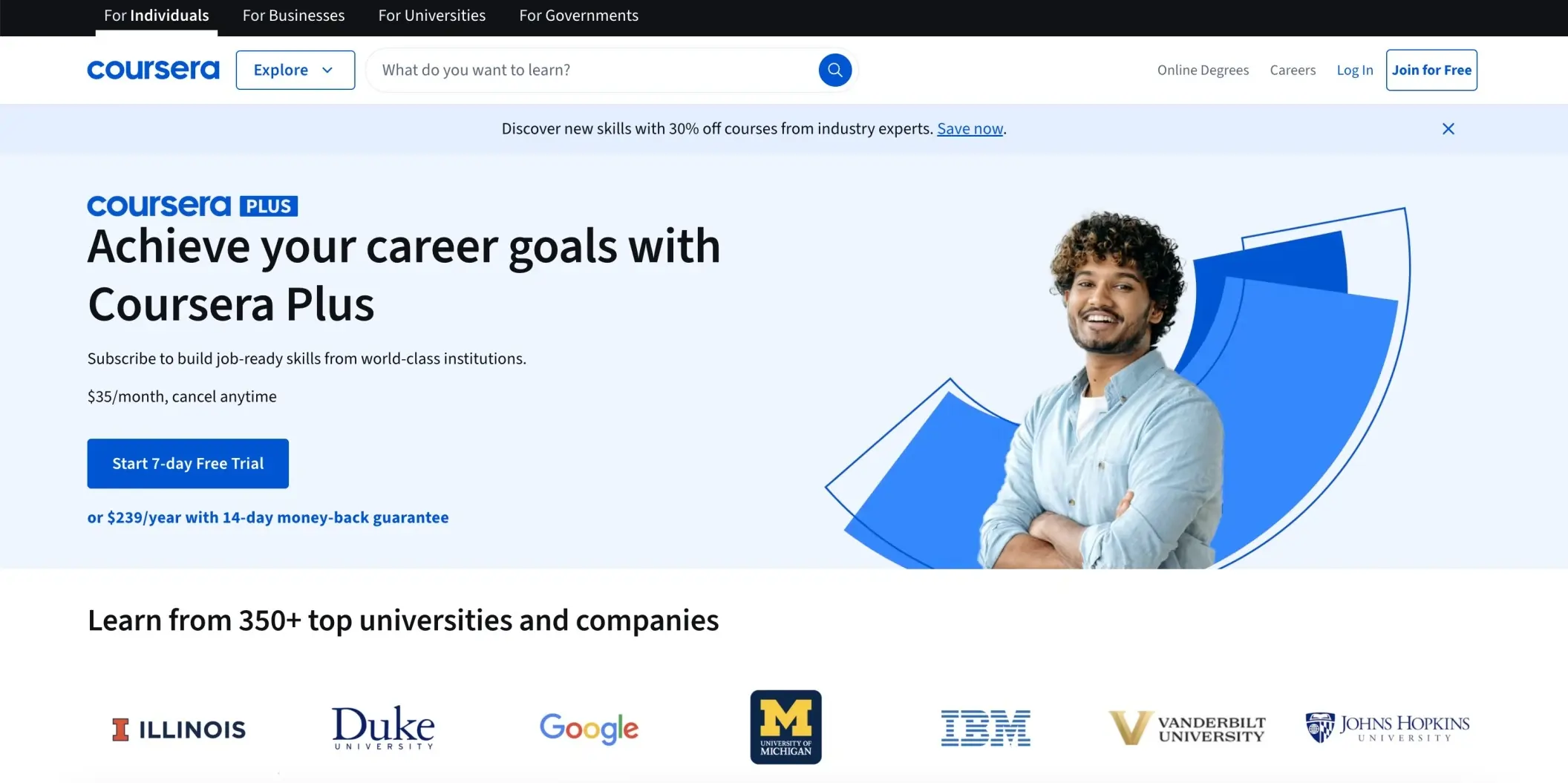
Coursera’s landing page highlights its subscription service with a clear promise: “Achieve your career goals with Coursera Plus.” The value is expressed in one line, supported by pricing details and a direct call to action.
What makes this landing page convert?
- Hero message: Straightforward headline with a clear benefit tied to career growth.
- Transparent pricing: $35 per month with cancel anytime, plus an annual option with a money-back guarantee.
- Free trial: Strong CTA offering a 7-day free trial to reduce sign-up hesitation.
- Visual trust element: A welcoming student image that adds a human touch.
- Institution credibility: Logos from respected universities and companies like Duke, Google, IBM, and Johns Hopkins build authority.
This page combines clarity, simple pricing, and strong trust signals to make subscribing feel like a low-risk and high-reward decision.
18. Calendly
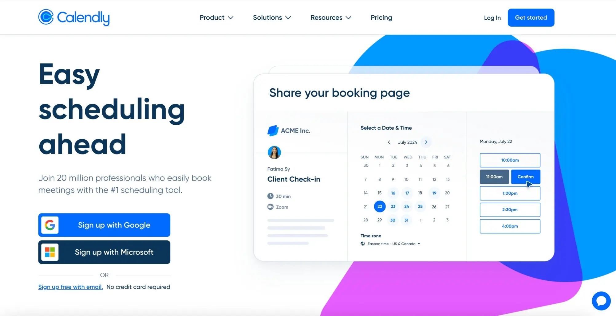
Calendly’s landing page makes scheduling feel effortless with a headline that immediately sets the expectation: “Easy scheduling ahead.” The layout combines simplicity with proof of popularity to build trust quickly.
What makes this landing page convert?
- Direct headline: Clear promise of time-saving scheduling.
- Social proof: Mentions 20 million professionals already using the tool.
- Interactive visual: Screenshot of the booking page shows how simple it is to pick a time.
- Simple sign-up: Options to sign up with Google, Microsoft, or email, with no credit card required.
- CTA placement: Bold “Get started” button in the top corner plus multiple sign-up prompts in the hero section.
The page works because it makes signing up simple, shows the tool’s popularity, and lets visitors see exactly how it functions.
19. Gumroad
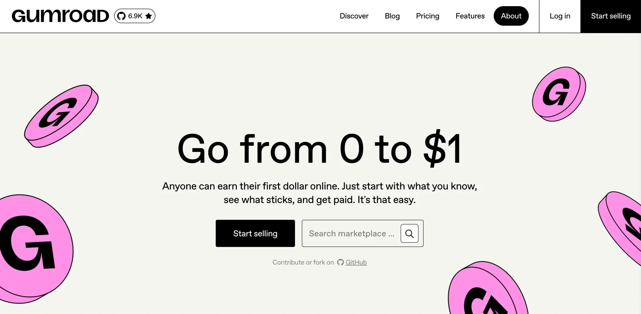
Gumroad’s landing page keeps things minimal with a bold statement: “Go from 0 to $1.” It captures attention by showing how easy it is to start selling online without overcomplicating the process.
What makes this landing page convert?
- Powerful headline: Simple wording that speaks directly to beginners looking to make their first online sale.
- Clear subtext: Explains that anyone can earn by starting with what they know and testing ideas quickly.
- Straightforward CTA: A single Start selling button with no distractions.
- Marketplace search bar: Let’s visitors explore products and see real examples instantly.
- Minimal design: Clean layout with playful visuals that match the brand’s creative audience.
This page works because it removes unnecessary complexity and reassures users that getting started is quick, simple, and achievable.
20. Crisp
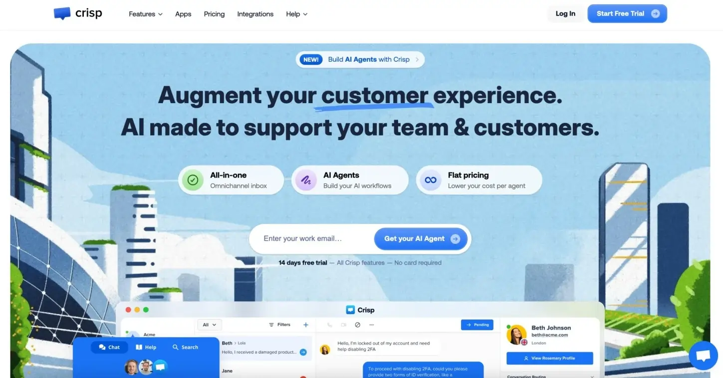
Crisp’s landing page puts customer support front and center with the headline “Augment your customer experience. AI made to support your team & customers.” The message is bold, modern, and clearly tied to their AI-driven features.
What makes this landing page convert?
- Focused headline: Immediately tells visitors the tool is built to enhance customer experience through AI.
- Feature highlights: Simple badges explain the key values — all-in-one inbox, AI agents, and flat pricing.
- Strong CTA: Email capture box with “Get your AI Agent” supported by a 14-day free trial, no credit card required.
- Trust element: Trial length and “no card required” reduce hesitation and encourage sign-ups.
- Visual proof: Screenshots of the chat interface show real interactions, making the product tangible.
- Reassuring design: Clean layout, soft colors, and bold copy give a modern, trustworthy look.
This page clearly states its value, lowers the entry barrier, and visually shows how teams can use the product right away.
21. Notion
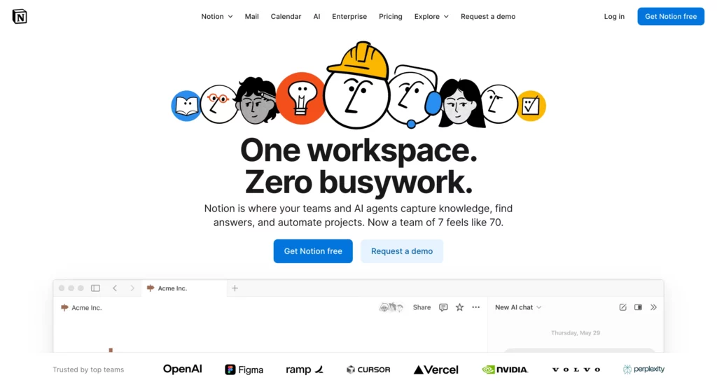
Notion’s landing page is a great example of how clarity and simplicity can drive conversions without overwhelming the visitor. The page focuses on one core message and supports it with clean visuals and strong trust signals.
What makes this landing page convert?
Clear value proposition:
The headline explains what Notion is in one simple sentence, making it immediately clear how the product helps teams and individuals stay organized and work better together.
Product-focused hero section:
Instead of abstract imagery, Notion shows the product interface early on. This helps visitors understand what they’re signing up for and reduces uncertainty around how the tool actually works.
Strong social proof:
Logos of well-known companies and short testimonials establish trust quickly. Seeing that teams of all sizes rely on Notion reassures new users that the product is proven and reliable.
Simple and risk-free CTA:
The call-to-action “Get Notion free” is clear, specific, and low-commitment. There’s no pressure, no credit card required, and no complex steps, which makes clicking feel like an easy decision.
Clean and distraction-free design:
The page avoids clutter and keeps the focus on the main action. White space, consistent typography, and a logical content flow guide visitors naturally toward the CTA.
Notion’s landing page converts because it removes friction, builds trust fast, and makes the value obvious within seconds
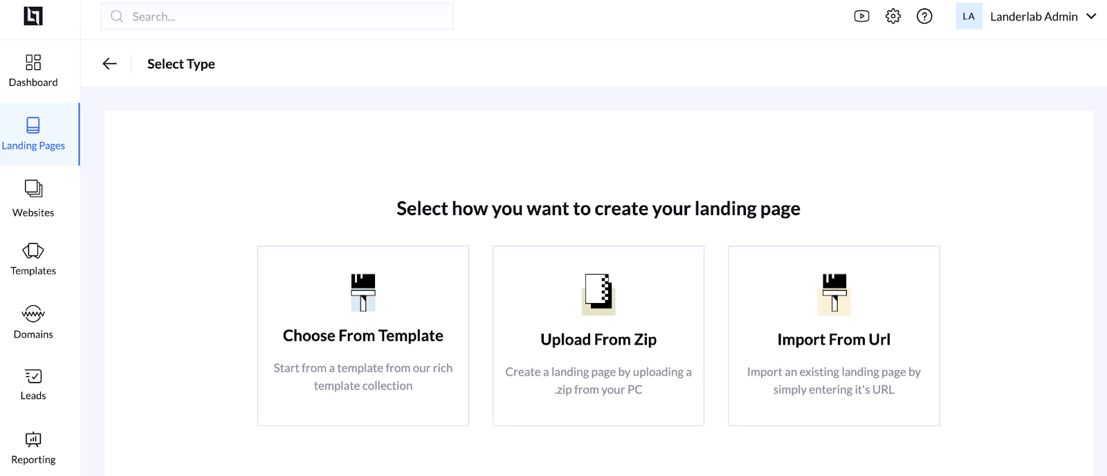
How to Build Your Own High-Converting Landing Pages with LanderLab
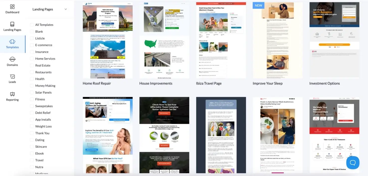
You can also choose from a selection of landing page templates proven to convert.
Conclusion
High-converting landing pages are not the result of luck or flashy design. They work because every element on the page has a clear purpose: communicating value, building trust, and guiding the visitor toward a single action.
Across all the examples we reviewed, the same principles repeat themselves. A strong value proposition, a clear headline, simple layouts, relevant visuals, and focused calls to action consistently outperform complex or cluttered pages. The best landing pages remove friction and make the next step obvious.
What has changed is how fast you can now build and improve these pages. Instead of starting from scratch or relying on designers for every iteration, AI-powered tools enable you to generate page structures and copy in minutes, then refine them through testing and optimization.
With a platform like LanderLab, you can build landing pages with AI, import proven designs, run A/B tests, and track results in one place. This makes it easier to apply the principles covered in this guide without slowing down execution.
The real advantage comes from combining fundamentals with speed. Start with a clear message, use AI to accelerate creation, test what works, and iterate based on data. That process, repeated consistently, is what turns landing pages into reliable growth assets.
Ready to Build Your Own High-Converting Landing Page?
Turn inspiration into action. Use LanderLab to create, test, and launch pages that convert visitors into leads and sales.


