A lead generation form may be the first meaningful interaction your business has with a potential customer.
If you get it right, you can collect a qualified lead who is primed to go down the funnel. If you get it wrong, you can lose that lead in seconds.
The good news is that a great form is not about adding more fields or creating something fancy. Rather, it is about creating something easy to complete, simple, straightforward, and valuable to users.
In this guide, you will find 21 lead generation form examples from leading companies operating in adjacent industries, as well as best practices that you can use to improve your forms.
By the time you finish the lead generation form examples, you will know exactly what works and what does not work, and how to convert more visitors into leads.
Jump to a Section
What is a Lead Generation Form?
A lead generation form is a tool businesses use to collect information from potential customers.
It is generally provided as a short form on a landing page, or as a pop-up or ad on a website, and asks for simple details such as the name, phone number, email address, or business information.
The objective is simple: turn visitors into leads, so your sales or marketing team can follow up. Understanding the different types of leads can help you design more effective form fields and improve how you segment and follow up.
A lead form works differently from a standard contact form because it is built for conversion, offering value in exchange for information, such as:
If everything is done well, a lead form should feel like a natural next step along the customer journey instead of an obstruction.
21 Best Lead Generation Form Examples
Newsletter Form
A newsletter signup form is probably the most common type of lead generation form. It captures emails from individuals who want updates, insights, or resources from your business on a regular basis.
What is important is that you make the value, and also make it easy to get to that value; typically, presenting the user with only one field for email, and a clear call to action.
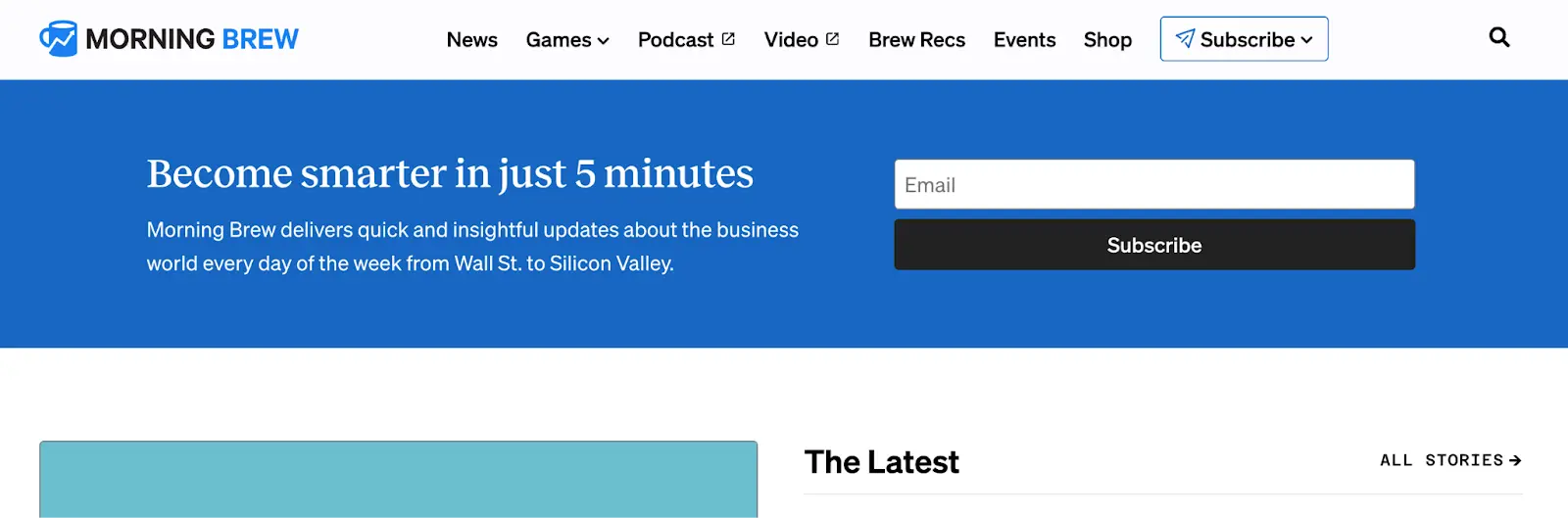
For example, Morning Brew has a very simple, straightforward form to sign up for their newsletter. They use one field for an email, and over the call to action, they say you will “become smarter in 5 minutes.” Fast, easy, and effective because there are no distractions.
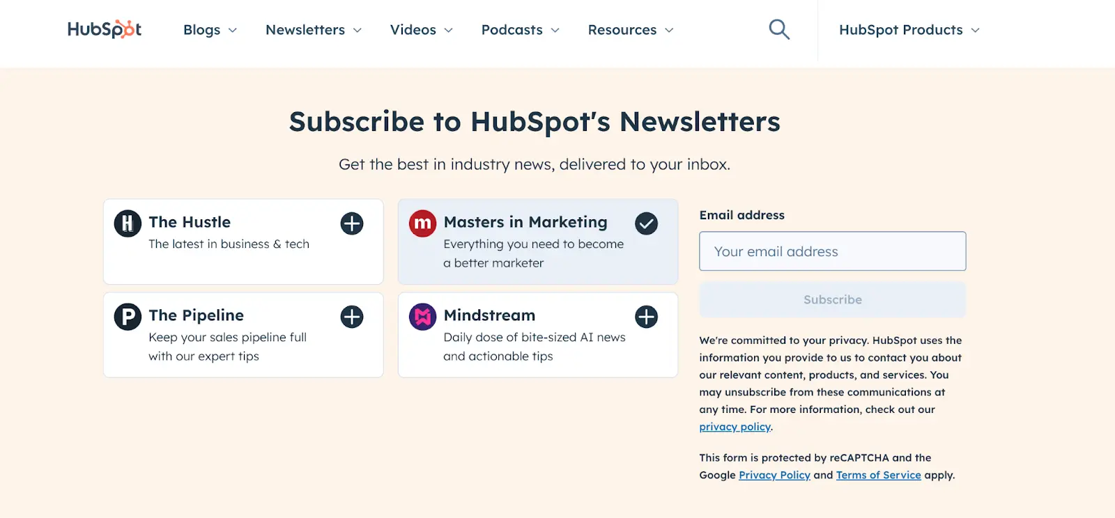
On the other hand, HubSpot adds a layer of personalization. Their newsletter form lets visitors choose from multiple categories, like The Hustle or Masters in Marketing.
Each option has a short description, making it clear what you’ll get. This helps segment audiences right from the start, leading to more relevant content delivery later.
Gated Content Form
In a gated content form, visitors exchange information (like name, job title, and email) for access to premium resources like ebooks, reports, and whitepapers.
Gated content forms are effective for B2B companies wanting to collect high-intent leads and offer visitors a valuable good in exchange.
For example, Salesforce’s “State of Sales Report” uses a deep gated form, further allowing the collection of valuable information that includes job role, company size, and region.
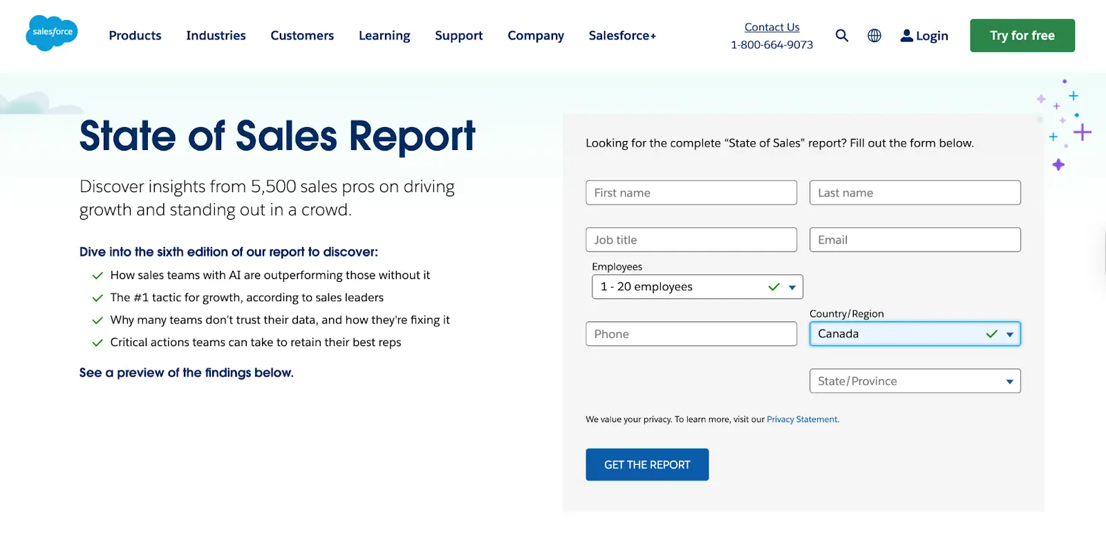
In exchange, visitors get access to in-depth insights from over 5,000 sales professionals. The form not only generates leads but also helps Salesforce segment audiences for more targeted follow-ups.
Product Demo Form
A product demo form is made specifically for prospects looking for a personalized walkthrough of your product.
These types of forms generally ask for a bit more detail than a simple newsletter signup: they might ask about company size, job title, and product interests. This additional information means the sales assistant or support agent has more information to customize the demo for each prospect and qualify leads before the demo call.
A good example of a demo request form is the Zoom demo request form, which has multiple fields, including email, nature of inquiry, and product of interest. While it has more fields than a basic demo request form, it was designed to capture higher-quality leads who are ready to speak with a sales rep.
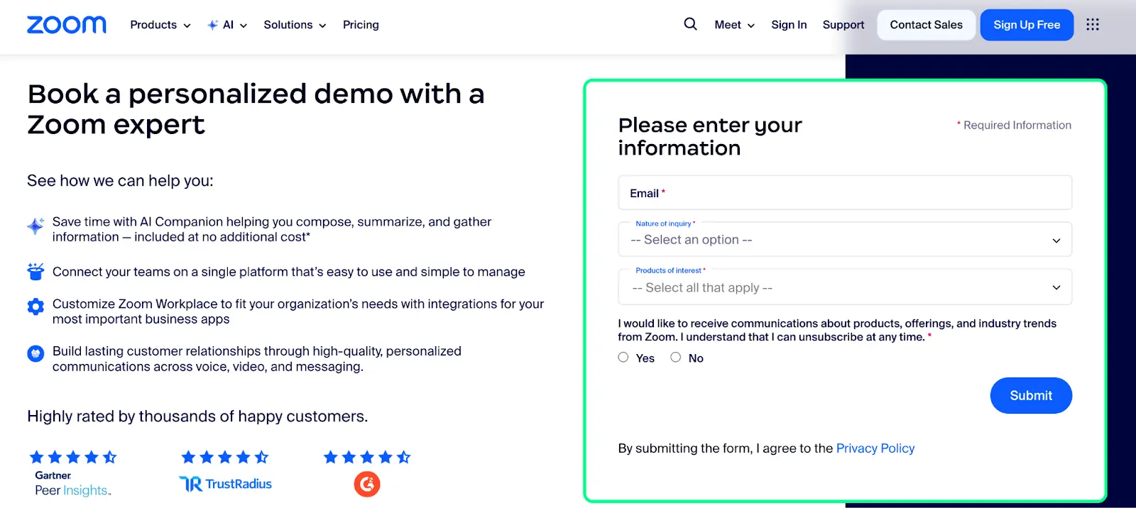
While it has more fields than a simple signup form, it’s designed to capture high-value prospects who are ready to talk with a sales rep.
Here’s another example of what a demo form would look like:
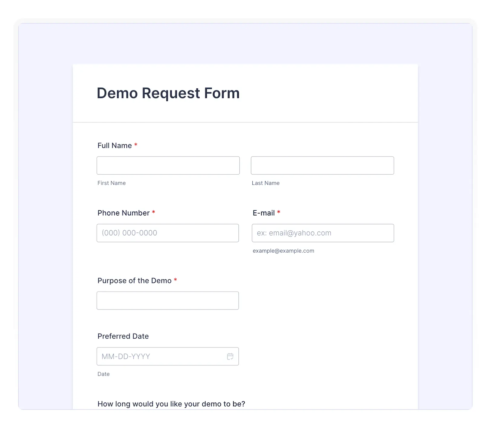
Course or Certification Sign-Up Form
Providing free courses or certifications serves as a great way to acquire qualified leads and give genuine value to your consumers.
These forms tend to ask for information only (name and email) or use sign-up forms that let users sign up quickly with Google, Microsoft, or Apple accounts, so they don’t have to go through an in-depth sign-up process.
For example, HubSpot Academy has simple sign-up forms for its certification courses. The user can sign up for their course with one click, signing in with Google or Microsoft, and they can start their course by simply inputting their email address.
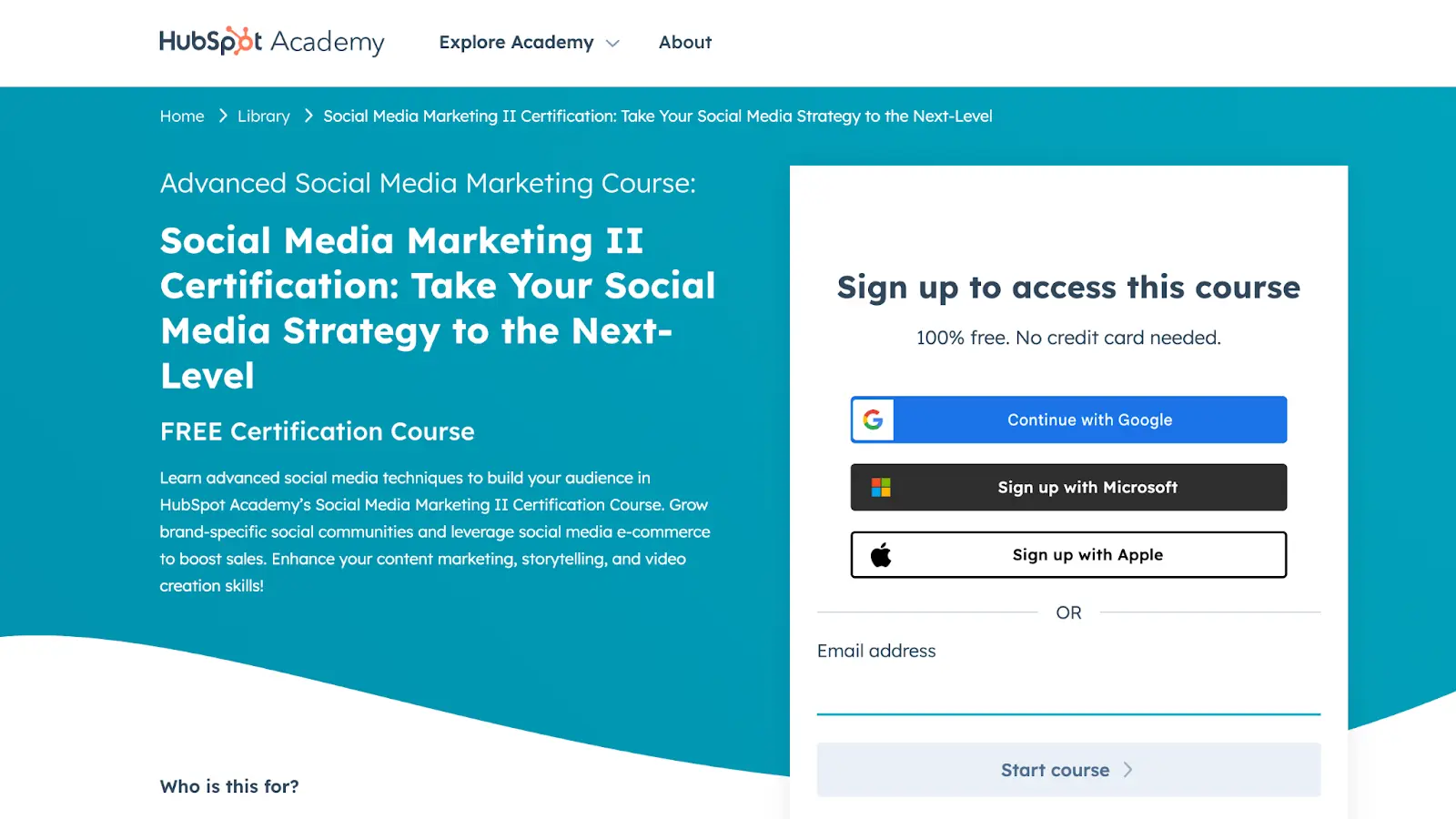
This lowers barriers, so it leads to more sign-ups and ensures that HubSpot obtains a consistent stream of qualified high-intent leads who want to learn about each of HubSpot’s products and services for marketing and sales purposes.
Free Trial Form
Free trial forms should be quick and frictionless, encouraging users to get started without hesitation.
The goal is to let people experience the product value immediately, without overwhelming them with too many steps.
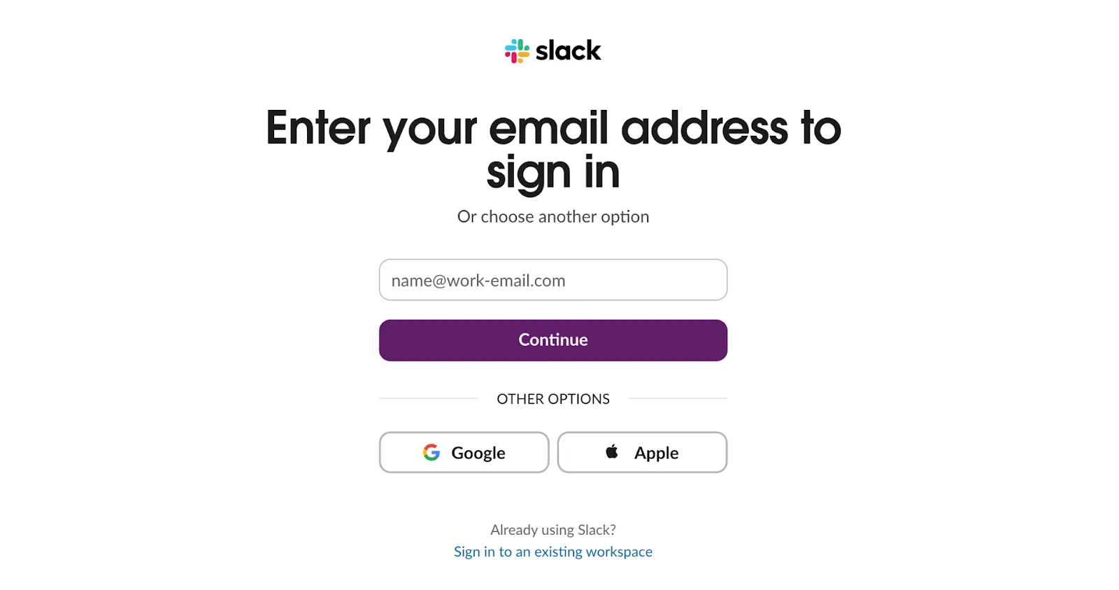
For example, Slack’s free trial form only asks for a work email, with the added convenience of signing up directly through Google or Apple.
Or you can take the example of ClickUp:
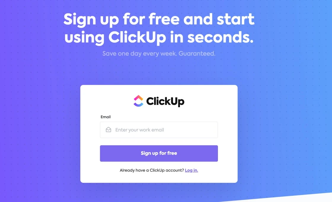
This minimal approach removes barriers, helping users jump straight into the product and increasing the likelihood they’ll stick with it.
Wondering What It Costs to Build Forms Like These?
LanderLab gives you everything you need to create high-converting forms, from free trials to advanced lead capture with the best pricing.
Contact Form
A contact form is one of the most direct ways to generate leads. Instead of chasing visitors, you give them a simple way to reach out with questions about your product, pricing, or services.
These forms are often the first step toward booking a call or starting a sales conversation.
For example, Zendesk’s contact form is short, clear, and professional. It asks for only the essentials: name, work email, message, and country.
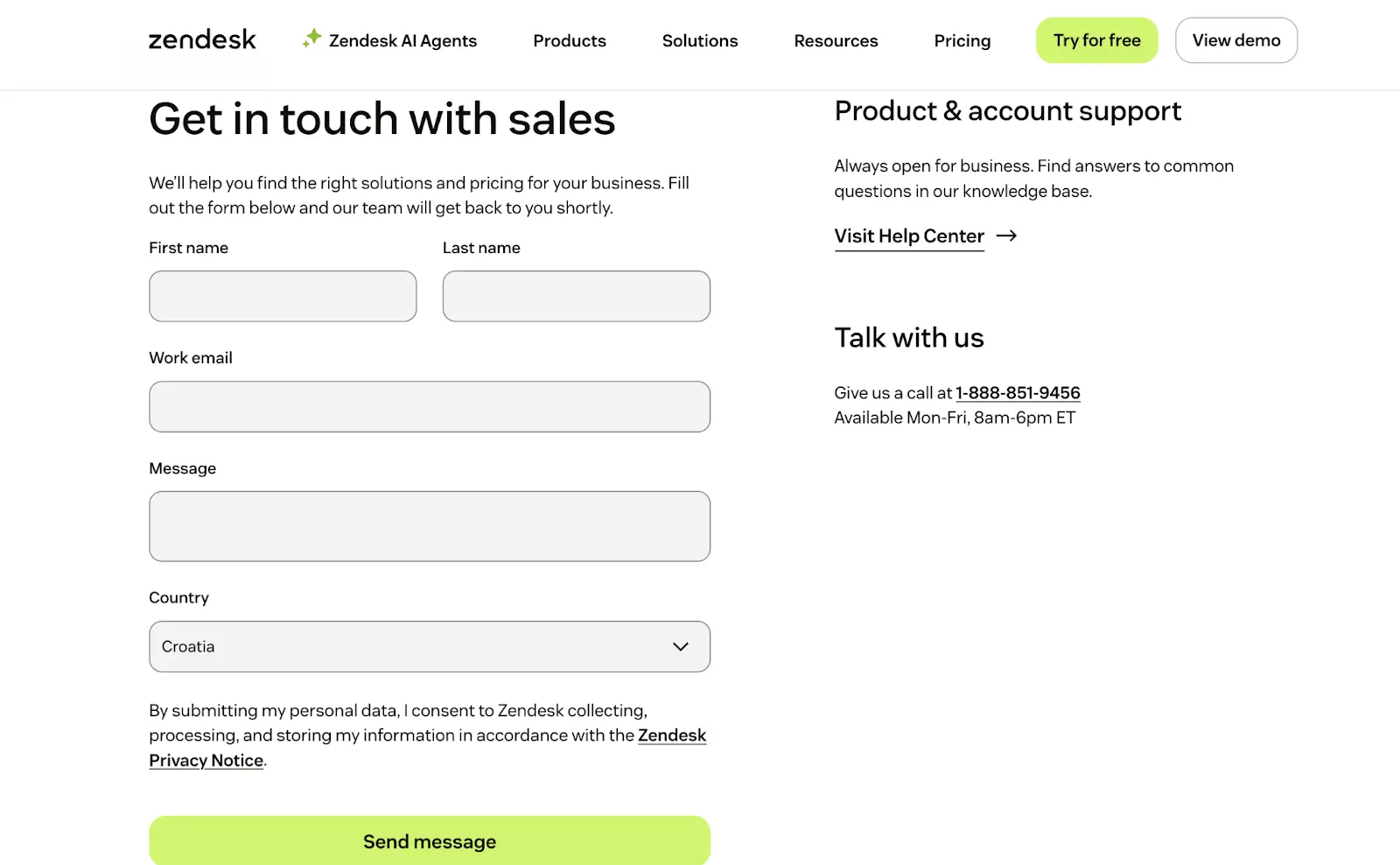
On the same page, visitors also see alternative support options like a help center link or a phone number.
This combination makes it easy for potential customers to connect in the way that feels most comfortable, while still capturing valuable lead information.
Event and Webinar Registration Form
Webinar registration forms are designed to capture interest while collecting just enough details to qualify participants.
They usually balance simplicity with fields that help sales and marketing teams understand who’s attending.
Miro does this well with its event registration form.
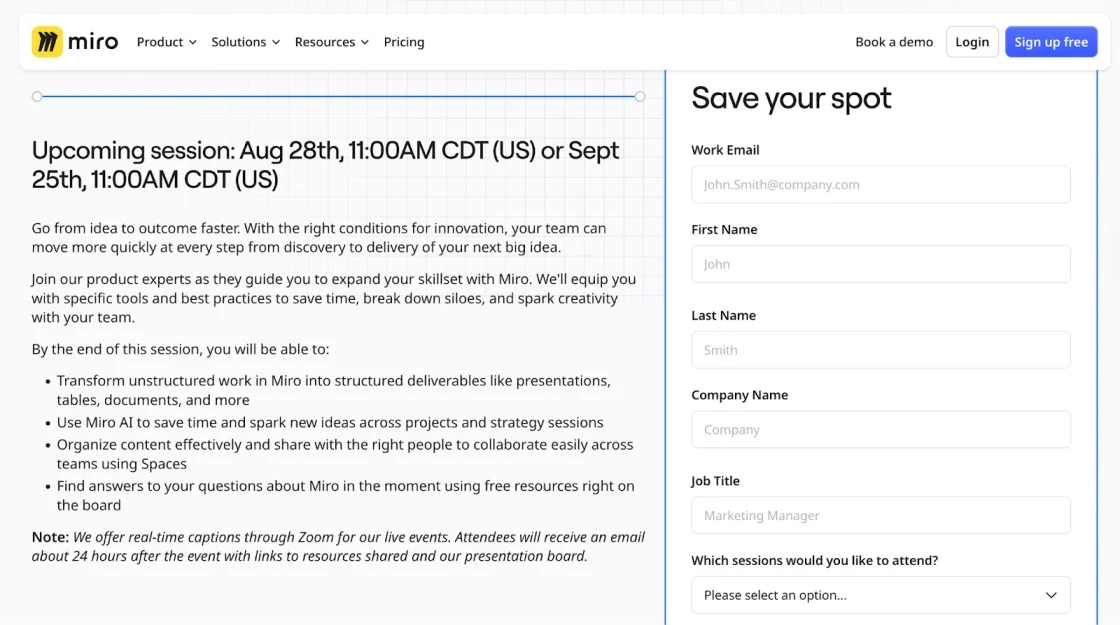
It asks for essentials like name, email, company, and job title, but also gives users the option to pick which session they’d like to attend.
This not only helps Miro plan attendance but also tailors the follow-up communication. The right-side panel is clean, easy to scan, and pairs well with the event details on the left, creating a smooth sign-up experience.
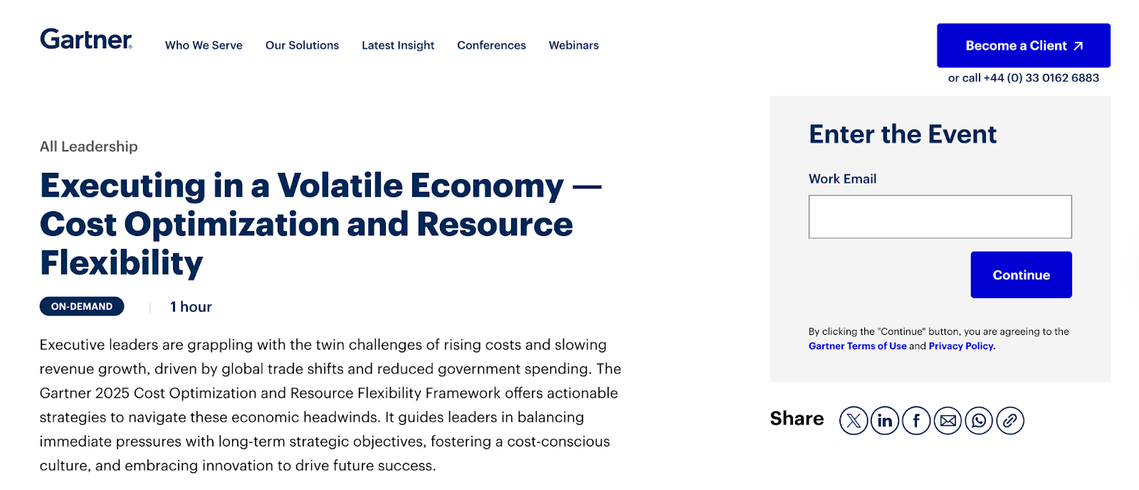
Here’ another similar example from Gartner:
Pop-Up Lead Capture Form
Pop-up forms are designed to appear at key moments, like when a visitor is about to leave a page or after they’ve spent time engaging with your content.
ServiceTitan uses a pop-up form to invite visitors on a self-guided product tour.
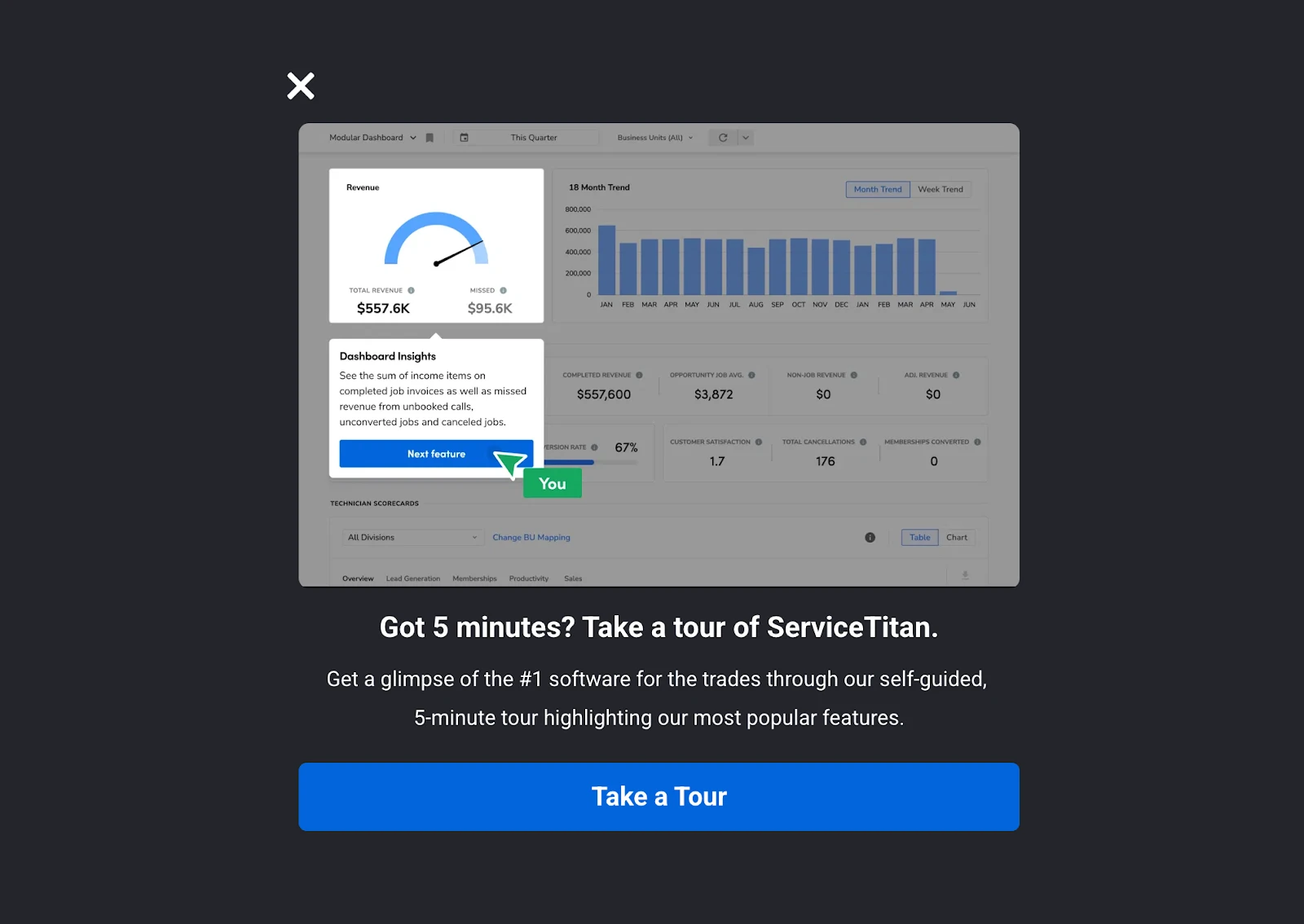
The copy highlights the time commitment (“Got 5 minutes?”) and promises value in return, a glimpse of their most popular features.
This type of lead capture works because it’s short, relevant, and meets the visitor where they are.
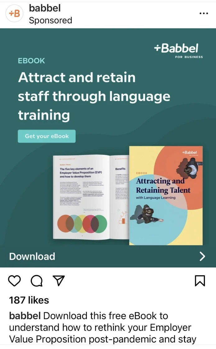
eBook Download Form
eBooks, whitepapers, and industry reports remain one of the most common B2B lead generation tactics.
The form exchanges valuable gated content (like insights, benchmarks, or research) for contact details that allow you to nurture leads further down the funnel.
For instance, HubSpot’s State of Marketing Report asks visitors to fill out a short form before downloading.
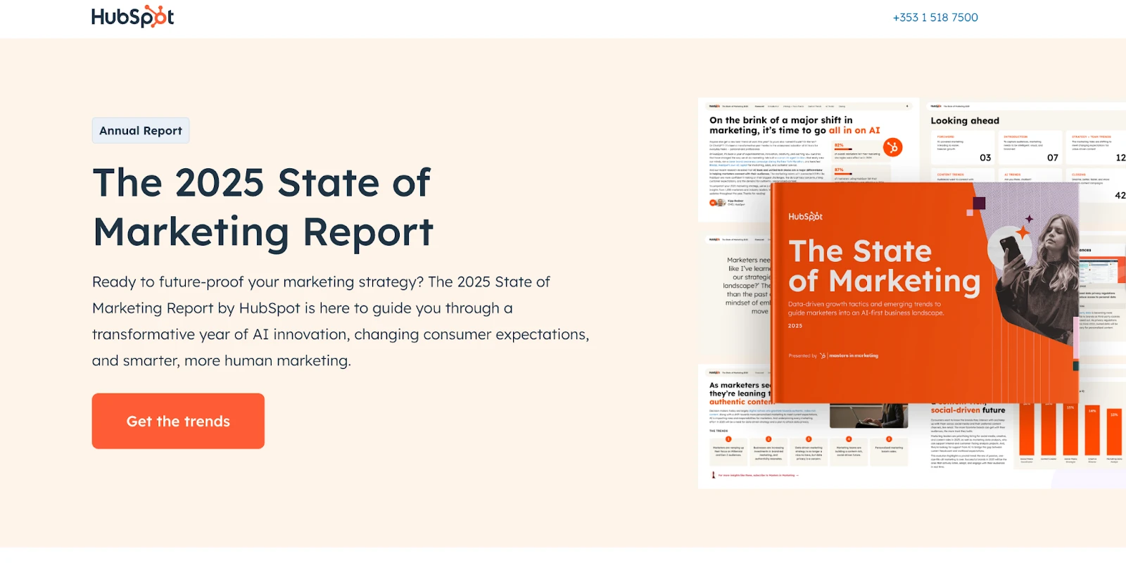
In return, users get access to exclusive research and actionable insights. This not only positions HubSpot as a thought leader but also attracts high-quality leads who are actively seeking solutions.
Social Media Lead Ads
Social platforms like LinkedIn and Facebook allow you to capture leads directly inside the feed without sending users to a separate landing page.

These built-in forms fill in automatically with information from the user’s profile, making the process quick and effortless. Here’s another ad from Facebook:
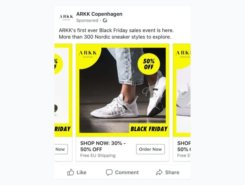
For example, Instagram ads let you promote content or offers while embedding a form right into the ad. Users can share their name, email, job title, and more with just a couple of clicks.
This reduces drop-off rates compared to sending them to an external page and works especially well for B2B campaigns.
Feedback Form
Feedback forms are a simple but powerful way to capture insights from users while also generating leads.
Instead of only collecting contact details, these forms invite people to share their opinions, challenges, or product experience.
This extra context helps you understand customer needs better, and in many cases, opens the door for follow-up conversations that lead to conversions.
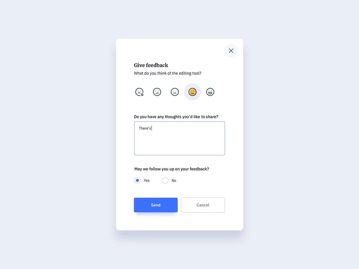
For example, Airbnb uses short feedback forms for hosts and guests to share how their experience went.
The questions are quick and mobile-friendly, making it easy for people to leave input without friction. The feedback keeps users engaged with the platform and improves future interactions.
Shopify also leverages feedback forms during and after free trials. They ask questions like “What’s stopping you from upgrading?” or “Which feature did you find most useful?”
Here’s another example when you want to rate a product:
Pricing Page or Quote Form
Pricing forms are ideal for visitors who are on the verge of making a decision but want transparency about pricing, followed by a purchase.
These forms are most commonly used by SaaS companies and service providers that offer multiple-tier plans or custom quotes.
Whereas a simple contact form does not assist users with making a self-selecting decision, a pricing form provides potential customers with the option to view the available options and self-select a plan that fits their needs.
From a backend perspective, using a pricing form also gives your sales team important information regarding which tier the prospective customer is interested in, allowing for more targeted follow-up.
For example, there are many SaaS companies that have transparent pricing forms where visitors can compare features across plans and select the one that works for their budget.
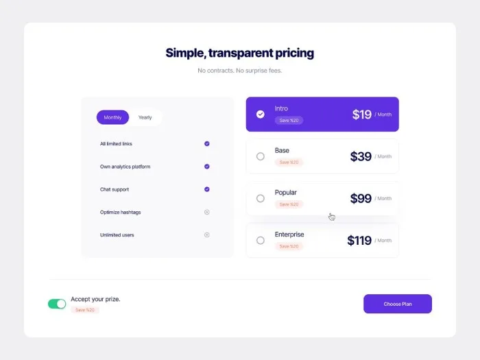
Often, these forms include toggles (monthly vs. yearly billing), upgrade incentives (like “Save $20”), and a clear CTA such as Choose Plan.
Here’s another example of requesting a quote:
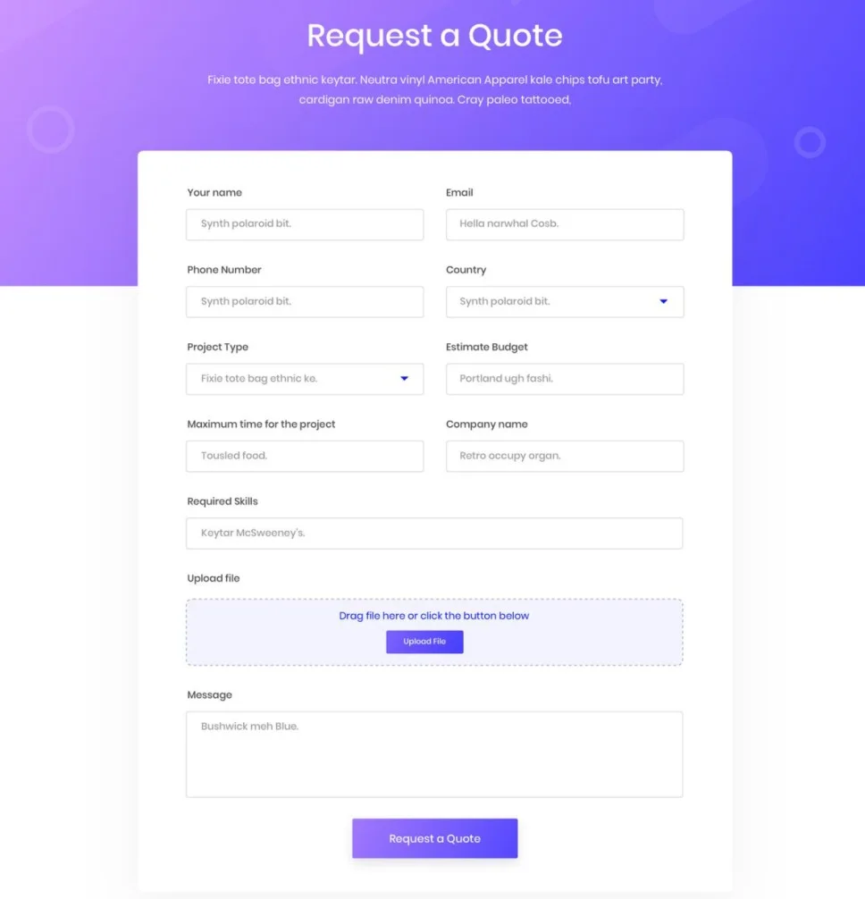
By presenting pricing in a clean, structured way, this type of form reduces hesitation and makes it easier for users to commit.
It works particularly well for bottom-of-funnel leads who are ready to convert but just need that last piece of clarity.
Form Timing: When to Show Your Form for Maximum Impact
Here’s something most businesses get wrong: they think about WHAT to put in their lead form but completely ignore WHEN to show it. The timing of your form can make or break your conversion rates, and the data proves it.
Based on user behavior research, there are three key moments when people are most receptive to your lead generation forms:
1. The “Quick Decision” Window (0-5 seconds)
Some visitors know exactly what they want.
Show a lead form right after someone lands on your site, because many people skim content and don’t stay long.
This works best for:
The catch: You need to be super relevant. Generic “Sign up for our newsletter” forms bomb here. Instead, offer something directly related to what brought them to your page.
2. The “Engagement Sweet Spot” (5-15 seconds)
This is where the magic happens. For lead forms, the optimal time delay is usually between 5 and 10 seconds after a visitor lands on a page – this way, users have a chance to interact with your content before they are interrupted.
Here is a professional tip: Show your form at 70 – 80% of your average page time. Go to Google Analytics for your average time on page, and then show your form a little before that.
3. The “Last Chance” Window (Exit Intent)
Exit-intent forms are your safety net. They catch people who are about to leave without taking action.
The key is not being desperate; instead, offer genuine value or address a specific concern that might be causing them to leave.
Mobile vs. Desktop: The Timing Game Changes
Lead forms created only for mobile devices had a higher conversion rate than desktop-only ones:
3.75% vs 2.67%.
Mobile users behave differently:
For mobile, consider showing forms slightly later (7-10 seconds) to account for slower loading times and the need to orient themselves on your page.
Best Practices for Lead Generation Forms
Looking at examples is great, but let’s talk about what actually makes forms convert. These aren’t theoretical tips – they’re proven strategies that can double or triple your lead capture rates.
1. Keep It Short (But Smart About It)
Here’s the brutal truth: every additional form field you add drops your conversion rate by about 11%. That means a 5-field form will convert roughly 44% fewer people than a single-field form.
But “short” doesn’t mean “stupid.” Instead of asking for everything up front, think about what you absolutely need to start a conversation. Usually, that’s just:
Save the detailed stuff for later in your sales process. Your job with the form is to get them in the door, not collect their life story.
2. Make the Value Crystal Clear
People aren’t filling out your form to do you a favor. They want something in return, and you need to spell out exactly what that is.
Instead of vague promises like “Get our newsletter,” try specific value statements:
Notice how specific these are? That’s what converts. Generic offers get generic results.
3. Your Call-to-Action Button Is Make or Break
Never, ever use “Submit” on your button. It sounds like homework.
Your CTA button should tell people exactly what happens when they click it:
Pro tip: Use first-person language (“Get MY guide” instead of “Get YOUR guide”). It makes people mentally commit to the action before they even click. If you’re looking for inspiration, here are 50 proven call-to-action phrases that convert.
4. Design for Thumbs, Not Cursors
Over 60% of people will see your form on their phone first. If it sucks on mobile, you’re losing more than half your potential leads.
Mobile form essentials:
The mobile experience should feel effortless. If people have to pinch, zoom, or struggle to fill out your form, they won’t.
5. Test the Stuff That Actually Matters
Everyone talks about A/B testing, but most people test the wrong things. Don’t waste time testing button colors. Test things that actually impact conversions:
Start with your headline and value proposition. These usually have the biggest impact on whether someone decides to fill out your form in the first place. Optimizing your forms is just one part of the equation. Pairing them with scalable lead generation ideas can drive more qualified traffic into your funnel.
6. The Psychology Tricks That Actually Work
Here are a few mental triggers that can boost your form conversions without being sleazy:
7. The Trust Signals People Actually Notice
Your form needs to feel safe. Add these trust elements:
Lead Generation Form Mistakes That Kill Conversions
Avoid these rookie mistakes:
The best lead generation forms are a natural conversation, not an interrogation. Keep it simple, make the value clear, and always keep the user experience in mind instead of the delight of more data points.
How LanderLab Helps You Create High-Converting Lead Forms
It’s great to see examples from some big brands, but imposing that same idea onto your business can be a big lift.
These are some of the functional benefits of using LanderLab for form building:
Break long forms into smaller, guided steps that feel natural and encourage higher completion rates.
Turn lead capture into an interactive experience while collecting highly qualified data in the background.
Launch forms for newsletters, demos, webinars, or pop-ups without starting from scratch.
Push every lead into your CRM or email tool instantly so you can follow up right away.
With LanderLab, you move beyond static contact forms and create engaging, conversion-focused experiences, without coding.
Start Building Better Lead Forms with LanderLab
Ready to see how interactive, multi-step, and quiz-style forms can boost your conversions? Turn more visitors into qualified leads starting today.
FAQs About Lead Generation Forms
What should a good lead gen form include?
A strong lead gen form should be concise and targeted. Only request key details, such as, name, email and company name. If there are too many fields, you can expect drop-offs, so keep your form user-friendly and in line with your marketing funnel.
How can businesses online capture lead information more effectively?
Multiple businesses have experienced success with their use of multi-step forms or placing social proof adjacent to the form. Multi-step forms keep users engaged by breaking up a form into smaller steps, and reviews or testimonials provide potential leads with confidence that they are sharing their contact information for a safe and valuable purpose.
What’s the best way to use a form builder?
A contemporary form builder supports you in creating web forms quickly, integrating them with your CRM, and sending new contacts immediately into your sales process. It makes for faster follow-up and no loss of lead info.
How do lead gen forms fit into digital marketing?
Lead forms are an essential aspect of content marketing. They are the last stop after experiencing a lead magnet such as a downloadable report, webinar, or eBook. This section allows you to collect emails from potential leads. This is how service businesses and e-commerce companies can nurture new leads into clients and paying customers.


![21 Best Lead Generation Tools & Software [2026 Comparison]](https://wp.landerlab.io/wp-content/uploads/2025/10/15-Best-Lead-Generation-Tools-Software-for-2040.webp "21 Best Lead Generation Tools & Software [2026 Comparison]")