If you are trying to sell a product or service online, you need a sales page.
A sales page is a single page designed to serve one purpose: to sell your product. It is one of the most common landing page types, and it differs from your homepage.
To demonstrate the difference between a website and a sales page, let’s look at this example from Fitbit’s webshop. Here you see an overview of all the different products they have.
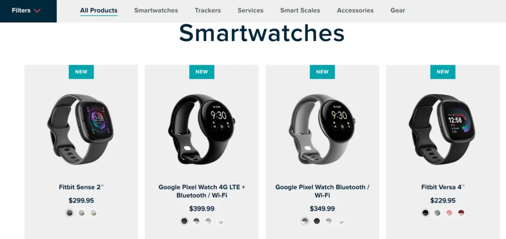
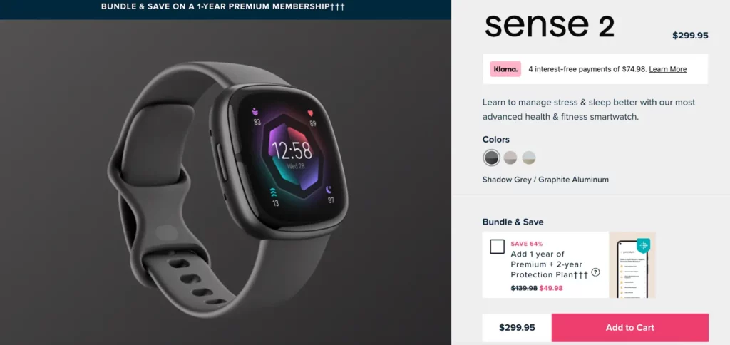
Each of these products has its own sales page. So if we click on Fitbit Sense 2, we will get a sales page with all the details we need to know about this specific product.
So, a sales page focuses on one product at a time. Its sole focus on conversions is the main reason why it is so effective and profitable.
So what do you need in order to create a high converting sales page? In this guide, we’ll show you how to write a sales page that converts.
2 Things You Need to Know Before Creating Your Sales Page
First, you need to understand your audience. Who are you going to sell this product to? Usually, the answer to this question lies in your offer.
For example, if you are selling a new high-end smartphone, your target audience would mostly consist of adults who belong to the upper-middle class group. If you are uncertain about who your target audience is, a good tip is to search online for data from your possible competitors. Following the smartphone example, you can Google “Apple’s target audience”. There are a lot of case studies online that will give you an idea on who your buyers could be.
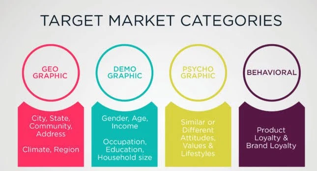
Image source: Digital School of Marketing
When it comes to understanding your audience, the more you know, the better. Most successful businesses create what is called a buyer persona. This is a semi-fictional character that represents your target audience based on four categories – geographic, demographic, psychographic and behavioral.
Once you know who your target audience is, you will need to understand them. The most effective way to do this is by identifying their pain points. These are problems that your target audience experiences often. Again, the easiest and cheapest way to find these out is to do some research online. For example, you can search “pain points of high income adults” and “pain points of smartphone users”.
Now that you know who your target audience is and understand their motivations and struggles, it’s time to come up with your value proposition. Write down all the key features your product has, and then think how each of them benefits your ideal buyer. Your value proposition should ideally answer the question: “What does your product offer, and why should your audience care about this?”.
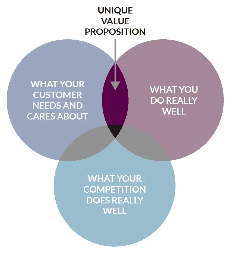
Image source: Social Impact Architects
It’s important to cover these two steps, because the information you gathered above will form the core of your sales page.
Key Elements of a High-Converting Sales Page
- Headline and sub-headline
The headline is the first piece of text your visitors will read. Apart from making it catchy and curiosity-inducing, make sure that it is relevant for your target audience.
Back to the smartphone example, let’s assume that through your research you found out that most high-end smartphone users struggle with low battery life. Your product has a higher battery life than most alternatives in the market. An example of a good headline could be “Get 15% higher battery life with our new phone”, or “The phone that never sleeps”. The tone is up to you, but it should directly speak to the pain point of your visitors.
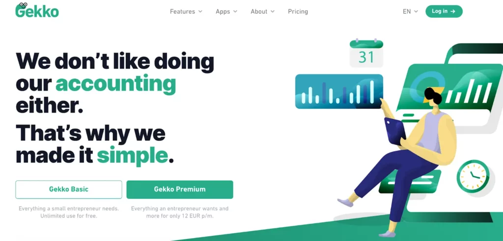
Accounting software Gekko knows that most small business owners find doing their accounting a hassle. The headline they use on their page directly addresses this pain point and ensures the visitor that if they choose Gekko, their accounting needs will be covered in a simple way.
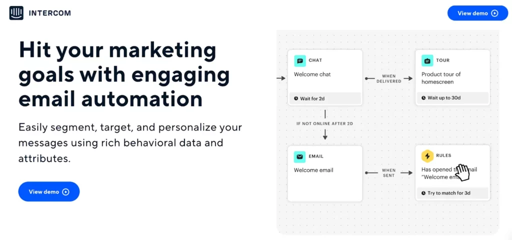
The sub-headline goes directly under the headline, and it is an extra sentence or two that further supports the claim made by the headline. It is especially smart to use this if your headline is vague. Look at the example below from email automation software Intercom. In one sentence, the sub-headline offers useful information about the product.
2. Hero image or video
The image that first meets the visitor once they click on your page is called the hero image. In the case of a sales page, it is recommended to use a high-quality picture of your product as your hero image. To make it more visually appealing, make sure that the hero image fits the overall look of the page.
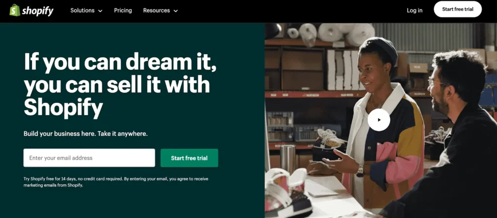
Instead of a hero image, you can also use a video. In fact, using a video can increase your conversions by up to 86%. E-commerce company Shopify uses a promotional video, and the thumbnail matches the colors and style of the landing page.
If you would like to know more about using video on your page, here is our simple guide on creating video landing pages.
3. Call-to-Action
The call-to-action usually comes in the form of a button added to your page. The purpose of this button is to urge your visitor to take action and purchase the product. Make sure your call-to-action copy is personalized for your specific offer. Personalized call-to-actions convert up to 202% better than non-personalized ones. CTAs such as “Buy now” are not as effective as “Get your new phone here”.
Streaming service Hulu is also using a personalized CTA to promote their special Disney Bundle Trio Basic. They avoid possible triggering words that represent commitment, such as “Buy”. Instead, they use “Get all three”, making it appear as if you would be missing out if you do not click on the CTA button.
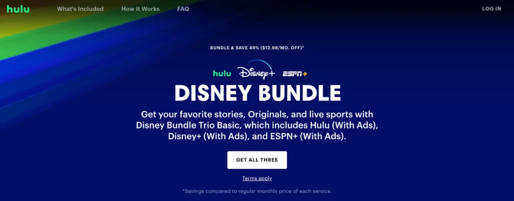
Along with the call-to-action copy, also pay attention to the look and placement of this button. It should be visible enough to draw attention, it should be placed on the first page, and the color should stand out amongst the rest of the page. With the Hulu example, the white CTA button creates a good contrast with the deep blue of the rest of the page, making it stand out.
4. Testimonials
Visitors care about social proof, especially if the product they are buying is on the pricey side. Including testimonials on your sales page is an amazing way to increase conversions. It is reported that 9 out of 10 customers trust reviews and testimonials on landing pages.

Marketing company MarketerHire has featured these three stellar client reviews on their page to establish trust and further show what they can do for you if you hire them. Adding the clients’ names and pictures adds another layer of believability and trust.
5. Key benefits section
All the work you did beforehand with writing down your value proposition will come in handy for this section. Including the product’s key benefits on your sales page is a great way to further convince your visitors of why they should choose you.
It is very important that you write down key benefits, and not simply features. Why should your potential customer care about this specific feature? Which benefits does it bring them? Keep this part short and straight to the point to not overwhelm your visitor with too many details. Generally, three key benefits should be enough.
Online course platform Thinkific has mapped out its key benefits and quickly explained why you should care about them if you wish to make money selling your online course.

6. Frequently Asked Questions section
If your product is pricey or the market is very competitive, chances are that it will be more difficult to convince your audience to take the step and buy the product. This is where an FAQ can be very useful.
What are some things that may be preventing your visitors from taking the final step? Is there any extra information that could convince them to complete the purchase? Add these to the FAQ. Addressing your buyers’ fears on your page can help increase conversion rates by up to 80%.
Because people are generally risk-averse, a common question they have is about refunds. Make sure to address this, and any other points, to make your offer appear as risk-free as possible.
Long Sales Page vs Short Sales Page
A common dilemma marketers face when creating a sales page is whether a long version or a short one will convert better.
Based on recent studies, longer landing pages lead to 220% more conversions compared to single-page ones. Especially if you are selling a pricey product, you should definitely use more copy and material to convince your visitors to finalize the purchase.
How to Create a Sales Page
Now that you know the most important elements of a high-converting sales page, you can start creating your first page. A landing page builder, such as LanderLab, is a great place to start. This is a drag-and-drop tool that requires no coding or design skills at all.
You can select one of our professional templates, created by a team of marketers and graphic designers, or simply clone your favorite landing pages (all you need to do is copy and paste their URL on LanderLab).
LanderLab is also a great tool for creating responsive designs. As of 2023, 60.9% of traffic comes from mobile devices. With a responsive design, the page will match the type of device your visitors are using. This is done automatically for you, so you do not need to take any additional steps.
A/B Testing Different Sales Pages
In order to continue improving and increasing your sales, you will need to eventually do some A/B testing. The idea is to create two different versions of a sales page, changing just one aspect, and sending it to an equal number of visitors. Then you can compare which one performed better.
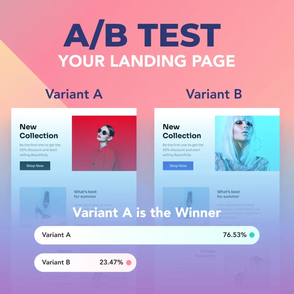
LanderLab has a built-in A/B testing function. Some things you can split-test are headlines, call-to-action buttons, and long versus short sales pages. If you want to know more about this, take a look at our A/B testing guide.
4 Common Sales Page Mistakes That Kill Conversions
Even with all the proper components in place, minor mistakes can ruin your sales page’s effectiveness. The following are the most common sales page mistakes I see people making:
- Selling multiple products at once. You should only sell ONE product on your sales page. The moment that you begin marketing any other offers or linking to other products, you are losing your visitor’s attention and giving them a renewed reason to leave without purchasing.
- Using dull, generic headlines. Headlines like “Welcome to Our Product” or “Buy This Now” serve no purpose. Your headline needs to draw attention and speak directly to the problem your visitor is facing. If your headline could work for any product in your category, it is too generic.
- Writing long paragraphs. Eventually, nobody wants to read a bunch of text on a screen. Your paragraphs should be succinct. Two to three sentences maximum. Enough white space. Make it easy to browse.
- Using stock images that make everything look fake. The moment you bring in a cheesy stock photo of two business people shaking hands in a suit, you might as well give up. Use real pictures of your real product, real customers, or at least use stock that doesn’t appear to be from 2005.
Conclusion
Before you start working on your sales page, first make sure that you fully understand your target audience and the value your product can bring to this audience. Then, use a landing page builder such as LanderLab to start designing your page.
Make sure your page has a relevant headline and sub-headline, an enticing hero image or video, a personalized call-to-action, and additional useful sections such as testimonials, key benefits, and FAQs. Finally, continue A/B testing different ideas to keep increasing your conversions.
Start Building Your Own Sales Page!
Use LanderLab to create professional, conversion-focused pages without coding. Choose a template or import your favorite design with just a URL.


