
What sets apart affiliate marketers who earn high commissions from those who can’t make their first sale? The key difference often isn’t about what offers they promote. It’s not even about the advertising budget. Instead, it’s about their landing pages. A well-made landing page can turn your below-average marketing campaigns into highly successful ones.
In this guide, we’ll show you all about affiliate landing pages — what they are, why you need them, and how to make ones that turn visitors into customers. Whether you’re a beginner or a pro affiliate, this article will surely give you some nuggets to get you started or to improve your existing affiliate landing pages.
Let’s start by understanding what affiliate landing pages are and why they’re so important if you want to succeed in the affiliate marketing business.
- Understanding Affiliate Marketing Landing Pages
- What is an Affiliate Marketing Landing Page?
- Why Are Landing Pages Crucial for Affiliate Marketing?
- The Psychology Behind Effective Landing Pages
- Types of Affiliate Landing Pages and How to Make Them
- Best Practices for Affiliate Landing Pages
- Take Your Affiliate Landing Pages to the Next Level
Understanding Affiliate Marketing Landing Pages
Doing well in affiliate marketing takes more than just picking good offers or getting eyes on your website or landing page. You need to be able to turn those visitors into customers for the affiliate program you are promoting.
That’s why affiliate landing pages are so important — they act as a bridge between your marketing efforts and the actual conversion.
What is an Affiliate Marketing Landing Page?
An affiliate landing page is a standalone web page specifically designed for your affiliate marketing campaign.
When visitors click on your tracking link from any source – whether it’s from paid ads, social media, or a search result – they land on this page before reaching the affiliate offer page.
Think of it as your digital storefront. Just as a physical store creates an environment that encourages purchases, your affiliate landing page creates an online environment that turns cold traffic warm and guides visitors toward taking action.
Unlike a regular website page, an affiliate landing page has a single focus: to convert visitors into customers or leads for your affiliate offers.
This action — what we call a “conversion” in affiliate marketing — can vary depending on the affiliate marketing program. It might be:
- Submitting contact information (a lead)
- Making a purchase (a sale)
- Starting a free trial with a credit card (a CC submit)
- Signing up for a free subscription (an opt-in)
- Submitting a PIN code for mobile content (a PIN submit)
For this reason, distracting navigation menus or unnecessary links are often removed. Almost all links and buttons send the visitor directly to the offer page. Moving visitors closer to taking your desired action is the main priority, so only essential elements are added on the page.
Throughout this article, we’ll also be referring to affiliate landing pages as landers, pre-landers, and LPs — common terms used by affiliates.
Why Are Landing Pages Crucial for Affiliate Marketing?
When you understand why landing pages matter, you’ll see how they fit into your marketing plan:
- Pre-selling Products or Affiliate Offers: Rather than sending traffic directly to offer pages, you can warm up visitors and address their concerns first. This significantly increases conversion rates.
- Capture Interest: Landing pages capture visitors’ interest and maintain it long enough for them to be interested enough to move to the affiliate offer page. It also helps increase the likelihood of conversion.
- Pre-qualifying Traffic: This ensures the visitor is a good fit for the offer. It can also help improve the quality of the traffic. If the quality of the conversions you get for an affiliate offer is high, you’ll have better chances of negotiating a better deal with your affiliate manager or with the advertiser (if you’re working directly).
- Building Trust: Media-buying affiliate marketers purchase traffic from various sources, which means there’s a high chance the offer is not related to what the visitor is viewing when the ad appears. They have no idea about the brand you are promoting. To build trust in a matter of seconds, a well-designed landing page can be used to establish credibility. Social proofing, testimonials, and valuable content are handy for this purpose.
- Tracking and Optimization: Landing pages let you track visitor behavior and optimize your affiliate marketing campaign. You can test different elements and measure what works best for your target audience.
- Compliance: Landing pages are required by some advertisers and affiliate networks.
Before diving deep, let’s clear up a common confusion: affiliate landing pages are different from regular landing pages. Both types try to convince visitors to take action, but affiliate landing pages are performance-driven.
Affiliate landing pages are not used to build brand awareness or to build a brand’s reputation. Its main goal is simply to improve the chances of the visitor performing the desired action on the offer page.
The Psychology Behind Effective Landing Pages
Understanding the psychological principles that drive visitor behavior can help you create more effective affiliate landing pages.
Here’s what research and experience tell us about how visitors interact with landing pages:
First Impressions Matter
It takes about 2.6 seconds for a visitor’s eyes to land on the area of your page that most influences their first impression. This means their eyes scan the page for something that will immediately establish trust or interest.
You have just milliseconds to convince them to stay – the first 50 milliseconds (0.05 seconds) determine whether someone will stay on your page or leave.
Visual Processing
The human brain processes images significantly faster than text. People remember:
- 80% of what they see
- 20% of what they read
- 10% of what they hear
This explains why visually appealing landing pages with relevant images and videos tend to perform better than text-heavy pages.
Trust Building Elements
Since affiliate marketing often involves promoting products to people who don’t know you, psychological trust signals are crucial:
- Social proof through customer testimonials
- Trust badges and security seals
- Logos of recognized brands or media mentions
- Real user reviews and success stories
Decision-Making Triggers
Several psychological triggers can influence visitor decisions:
- Scarcity: Limited-time offers create urgency
- Authority: Expert endorsements build credibility
- Reciprocity: Offering value (like free content) encourages engagement
- Consistency: Maintaining visual and message alignment throughout the page
- Social Proof: Showing that others have taken the desired action
The Attention Path
Effective landing pages guide visitors’ attention in a specific sequence:
- Capture attention with a compelling headline or interactive element
- Build interest through engaging content
- Create desire by highlighting benefits
- Guide toward action with clear CTAs
We’ll show you how to apply these to different types of landing pages.
Types of Affiliate Landing Pages and How to Make Them
As we previously mentioned, affiliate landing pages are unique because they serve as a bridge between your traffic source and the actual offer page.
So, while there are several types of landing pages, like product pages, sales pages, lead magnet pages, and so on, we won’t go heavy on that. We’ll instead focus on the type of landing pages that affiliates actually use and are effective for them.
The landing pages we’ll be focusing on are:
- Product Review Landing Pages
- Product Roundup Landing Pages
- Listicles
- Advertorials
- Simple Click-Through Pages
- Interactive Landing Pages
- Video Sales Letter (VSL) Pages
- Lead Generation Landing Pages
We’ll dive deep into each one and how they can be created, either from scratch or with the help of LanderLab landing page builder.
LanderLab not only provides a drag-and-drop builder to help you customize your page but also provides templates so you can make affiliate marketing pages with ease. Check out these affiliate landing page templates that you can use right away.
The majority of affiliate landing pages are Click-Through Landing Pages, which means visitors are going to view the landing page, and if all works well, they will click on the appropriate Call to Action (CTA) button and move toward the affiliate offer page.
So, for this list of affiliate landing page types, almost all are click-through pages, except for one — the lead generation page (which we will discuss further later).
There are two categories of Click-Through Landing Pages. The first one is based on content length: short form and long form. The other one is based on the number of pages: single page and multiple pages.
Short-form landing pages often don’t need you to scroll down to view the whole page — everything is placed above the fold. The long form one contains a lot of information, encouraging you to scroll down to view more of the page.
The single-page affiliate marketing landing page, as its name suggests, uses only one page and directs you to the offer page after clicking on the CTA. Multi-page landers use several pages to either make the visitor more invested in the offer or to pre-qualify the traffic.
Let’s explore the main types of affiliate landing pages and when to use each one.
1. Product Review Landing Page
This is one of the most common landing pages by affiliate marketers who run websites and mainly use organic search as a source of traffic. Product review pages work best for affiliate offers that are available long-term as you would need to put a lot of effort into creating these webpages.
Review pages dive deep into a specific product or service, helping visitors understand exactly what they’re getting before making a purchase decision.
Structure of an Effective Product Review Page
- The Opening Hook
Your product review landing page’s success mostly depends on your headline and introduction. Your headline needs to quickly catch attention by speaking to what your visitor needs or wants. It could also be one that addresses your visitors’ main pain points.
Here are some examples:
- “Is [Product Name] Worth It? An Honest Review After 6 Months of Use”
- “[Product Name] Review: The Solution to [Specific Problem]?”
- “I Tried [Product Name] for 30 Days – Here’s What Happened”
Of course, don’t forget to include your target keyword phrase for SEO purposes. You can also go with the tried and tested [Product Name] Review!
The introduction is part of the hook, so it needs to be as captivating. In your introduction, explain why readers should trust what you say. Tell them if you’ve used the product for a long time or if you’re an expert in the field – share what makes your opinion valuable right at the start.
- Quick Verdict Section
Not everyone will read your whole review, and that’s fine. That’s why you need a summary box at the top of your page. Think of it as your “quick read” section for busy visitors who need to make a fast decision.
You can place a summary box near the top for skimmers, including:
- Overall rating (stars or score out of 10)
- Key pros and cons
- Who the product is best for
- A quick verdict statement
- Early-bird special offers or time-sensitive discounts
- Primary call-to-action button
- Product Overview
Your review needs a solid foundation that answers the basic but essential questions about the product. Think of this section as setting the stage for everything that follows.
It can contain:
- What the product is
- Who makes it
- Key specifications
- Pricing details
- Available packages or options
- Special deals or bonuses
- Detailed Benefits and Features
This is where you really dig into what makes the product worth buying. Instead of just listing features, focus on explaining how each feature translates into real benefits for the user.
Break down each major feature:
- Start with the benefit to the user
- Explain how the feature delivers this benefit
- Use real-life examples or use cases
- Include relevant screenshots or product images
- Add demonstration videos where applicable
- Personal Experience Section
This is where you make your review feel real. Sharing your own experience with the product helps readers trust you and know what to expect:
- Initial impressions
- Setup process
- Learning curve
- Results achieved
- Before and after comparisons
- Specific scenarios where the product excelled
- Any challenges or drawbacks encountered
- Pros and Cons Analysis
A thorough pros and cons section is crucial for a product review landing page because it helps visitors quickly evaluate if the product meets their needs. Don’t just list random features here – organize them strategically to guide your visitor’s decision-making process.
- Strategic CTAs and Urgency Elements
When you make your product review landing page, you need to plan where to put your action buttons carefully. Unlike a regular blog post, here you want visitors to click through to where they can buy the product.
Put your main buttons at points where readers are most likely to be convinced – like after you’ve shown a great benefit, strong proof, answered a big concern, or presented the pros and cons.
But having buttons isn’t enough; you need to give people a reason to act now. This is where you add urgency.
While you shouldn’t be pushy, you should mention any real-time limits on your offer. This could be a temporary discount, an extra package that won’t last long, or a price that’s going up soon.
2. Product Roundup Landing Pages
A product roundup landing page compiles multiple related products under a specific category to help visitors make informed buying decisions. This pre-lander type taps into people’s natural desire to compare options before making a decision.
Just like the product review type of affiliate marketing landing page, this one is often optimized for search engine traffic. But instead of just SEO traffic, we’re talking PPC ads.
Structure of an Effective Product Roundup Landing Page
- Opening Section
Your opening can make or break your roundup’s success. Start with a headline that immediately tells visitors they’re in the right place. Include the category name, a clear benefit statement, and if relevant, the current year.
For example, “2025 VPN Guide: Find Your Perfect Match Based on Real Testing” works well because it combines authority with a promise of personalized help.
Your introduction should:
- Tell people what this type of product is
- Explain how you tested or checked the products
- Tell them what things you looked at to pick products
- Give a quick look at what they’ll learn
- Comparison Overview
Near the top of your page, create a quick reference section that includes:
- A comparison table showing key features
- Price ranges for different categories
- Key differences between options
- Category winners (Best Overall, Best Budget, etc.)
- Category Breakdowns
Structure your content into clear categories like:
- Premium options
- Mid-range choices
- Budget-friendly selections
- Best for specific uses
- Best for certain user types
- Product Analysis
Start by explaining what’s currently available in the market and what common features buyers can expect to find. Tell readers about the typical price ranges and explain what makes some products cost more than others, which helps set realistic expectations.
Show how people typically use these products by sharing real-life examples and situations where they work best, and make sure to point out common mistakes buyers should avoid.
- Trust Building Components
Building trust is crucial for a successful product roundup. Don’t just tell visitors to trust you – show them why they should.
Show you’re trustworthy through:
- Explaining how you tested products
- What experts think
- What real users say (social proof)
- When you last updated the page
- Certificates from the industry
- Strategic CTAs
Your call-to-action strategy for a roundup page needs to be different from a single product review. Since you’re featuring multiple products, you need multiple CTAs, but placement is crucial.
Don’t just scatter “Buy Now” buttons everywhere – think about the natural decision points in your content where visitors might want to learn more or make a purchase.
Place CTAs strategically throughout your content:
- After comparing similar products
- Near price discussions
- Following strong benefit statements
- At the end of each category section
- In your comparison tables
- Near special offer mentions
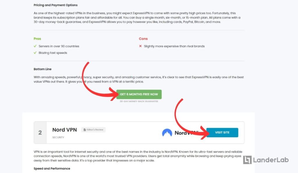
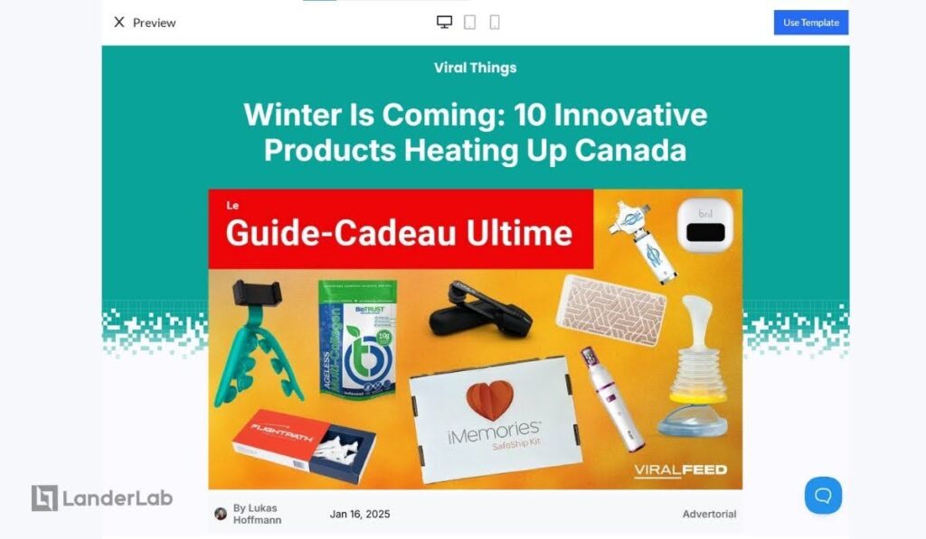
3. Listicles
Listicles are particularly powerful for affiliate marketing because they let you showcase diverse products that solve related problems or fit a broader theme, rather than just comparing similar items.
For example, instead of “10 Best Coffee Makers,” a more effective affiliate listicle might be “10 Must-Have Products for the Perfect Morning Routine” – which could include a coffee maker, a sunrise alarm clock, a meditation app subscription, a breakfast smoothie blender, etc.
This type of affiliate landing page works best for native ads, pop ads, and SEO traffic. The best thing about this type of landing page for affiliate marketing is that you can promote several products or offers on a single page. More opportunities for you!
What Makes Listicles Effective for Affiliate Marketing
- They appeal to broader interests while remaining thematically focused
- Allow you to promote products across different price points
- Give readers multiple entry points to make purchases
- Create natural opportunities to solve various related pain points
- Let you promote more than one affiliate program in one page
- Feel more editorial and less “salesy” than direct comparisons
Structure of an Effective Affiliate Listicle
- Opening Section
- Hook readers with a relatable scenario or problem
- Establish your expertise/why they should trust your recommendations
- Preview the value they’ll get from the list
- Individual Product Sections
For each item, create an engaging subheading highlighting key benefits and how it solves the pain point initially mentioned.
- Brief problem it solves
- Unique value proposition
- Key features that matter
- Real-world application
- Clear pricing & availability info
- Natural affiliate link placement
- Supporting image or video
- Product rating
- Personal experience notes when relevant
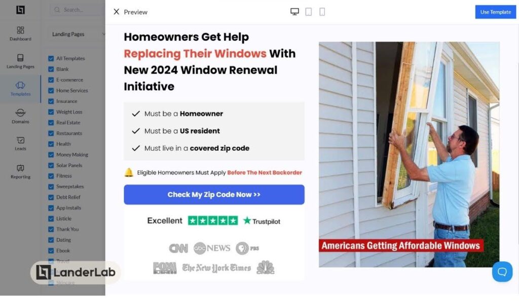
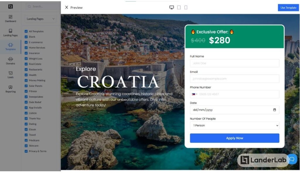
Here’s a great example of how to do it. This page is actually one of LanderLab’s templates.
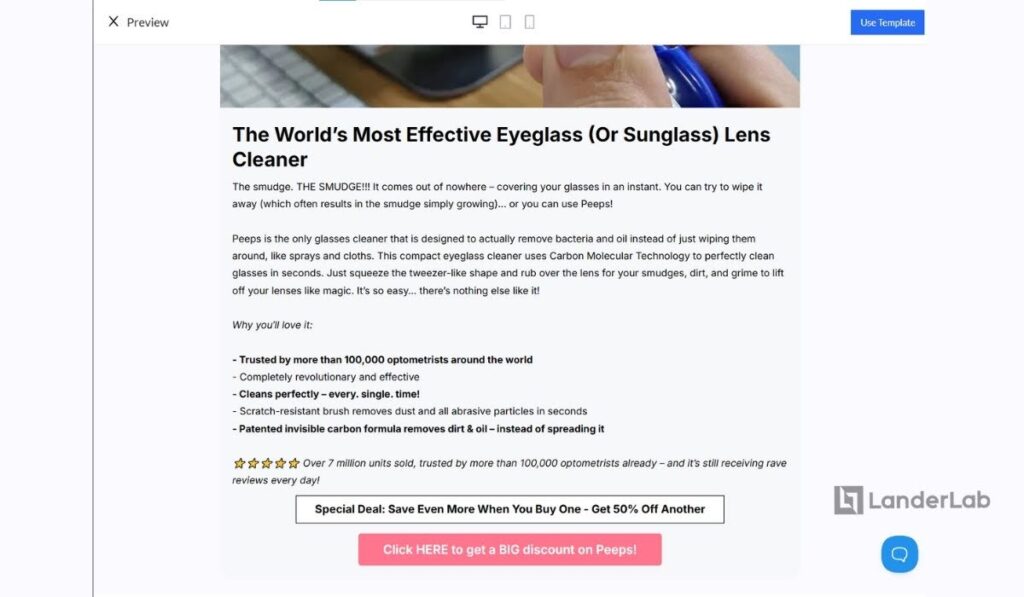
- Call to Action
You can sprinkle CTAs all throughout the page using links and buttons. As is shown in the example above, you can add a special deal CTA and a main CTA.
Place them immediately after the item mentioned since you have several products within the page, and you don’t want to confuse your readers.
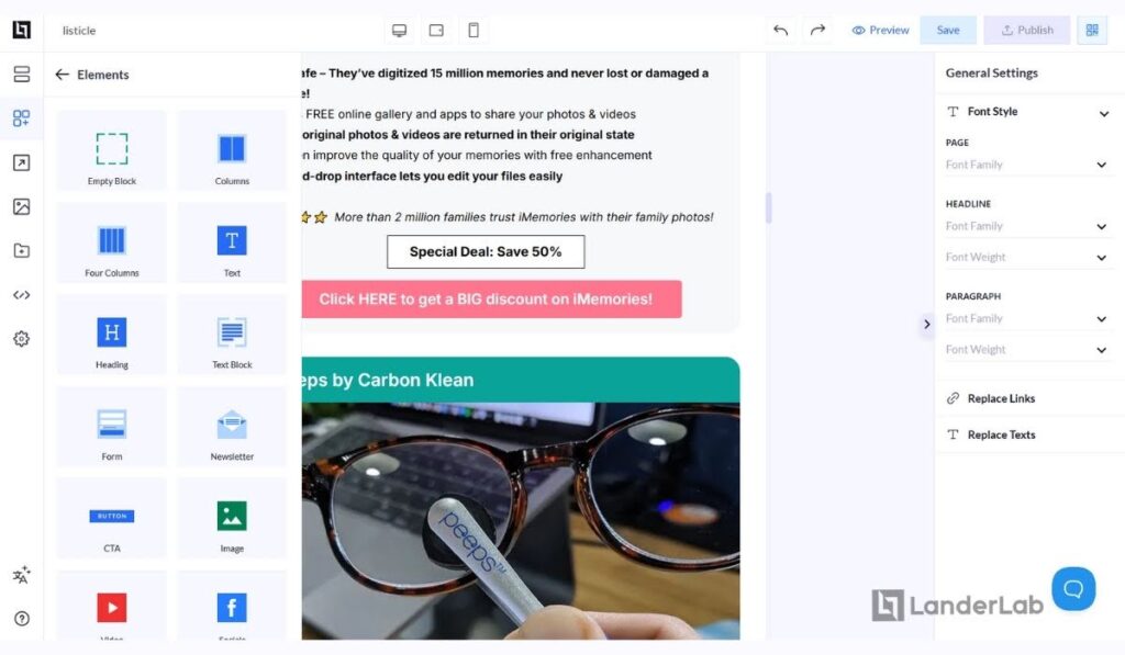
Using the drag-and-drop editor, you can quickly customize these templates to match your content and branding. The templates include all the essential sections we’ve discussed, with proper spacing and formatting already in place.
You can easily add your product images, affiliate links, and custom content blocks wherever needed.
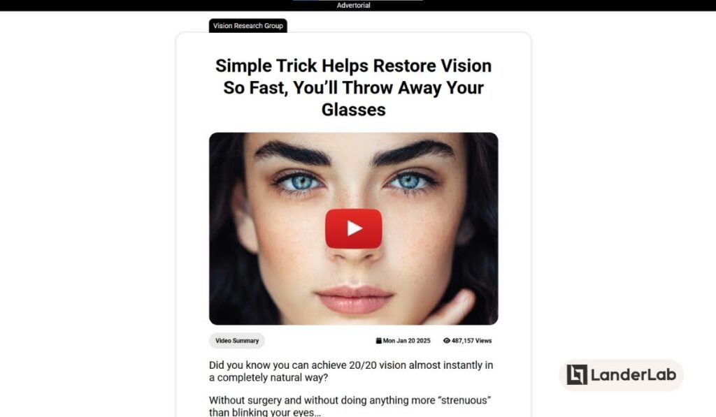
4. Advertorials
An advertorial mixes advertisement and editorial content (like a magazine article) to tell a story while promoting products or services. It’s like a blog post that naturally includes product promotions while sharing helpful information.
Its main difference with regular articles is that all its links and buttons point to the offer page and navigation menus often don’t exist.
For affiliate marketers, advertorials work well because they promote offers and products in a way that helps readers rather than just trying to sell to them. If you want to see real examples of high-converting advertorials, check out these advertorial landing page examples.
It works for most paid ad types, whether pop ads, push ads, native ads, banner ads, PPC ads, and more. The best part is that it works a lot of affiliate verticals: eCommerce, Finance (loans, credit cards, insurance), Crypto, Casino and Betting, Health and Nutra, and more.
What Makes Advertorials Unique
- They look and sound like regular articles or blog posts
- They focus first on teaching and helping, then on selling
- They build trust by telling stories and sharing real content
- They can mention multiple products without feeling pushy
- They often include stories from people who used the products
These features make advertorials work especially well for affiliate marketing. Since they don’t look like regular ads, readers are more likely to pay attention to them. You can give detailed product information and comparisons while building trust by teaching readers useful things.
This way of writing usually gets more people to engage with the content than regular ads do. That’s why advertorials work great for introducing cold traffic to affiliate products.
Structure of an Effective Advertorial
- The Hook (Opening Section)
- Start with a relatable problem or scenario
- Present a compelling statistic or fact
- Share a personal story or experience
- Draw readers in with an intriguing question
Here’s a good example of a hook:

Tip: Make sure you mimic the writing style of the traffic source, especially if you can select the publisher or website when buying traffic.
If you want your LP to resonate with any traffic source, we suggest following a news page or lifestyle page look and writing style.
- Problem and Solution Narrative
When crafting this section, think of it as telling a story that resonates with your readers.
Start by painting a picture of their challenges – perhaps it’s the frustration of trying multiple products without success or the overwhelm of too many options in the market. Build tension by describing the implications of these problems in their daily lives.
Then, smoothly transition into how you discovered the solution, making it feel like a natural progression rather than a forced pitch.
- Product Integration Journey
This is where your storytelling really shines. Instead of simply listing features and benefits, weave them into real-world scenarios. Show how the product fits into daily life or solves specific problems.
Share experiences that demonstrate the product’s value in action. You can also include pros and cons.
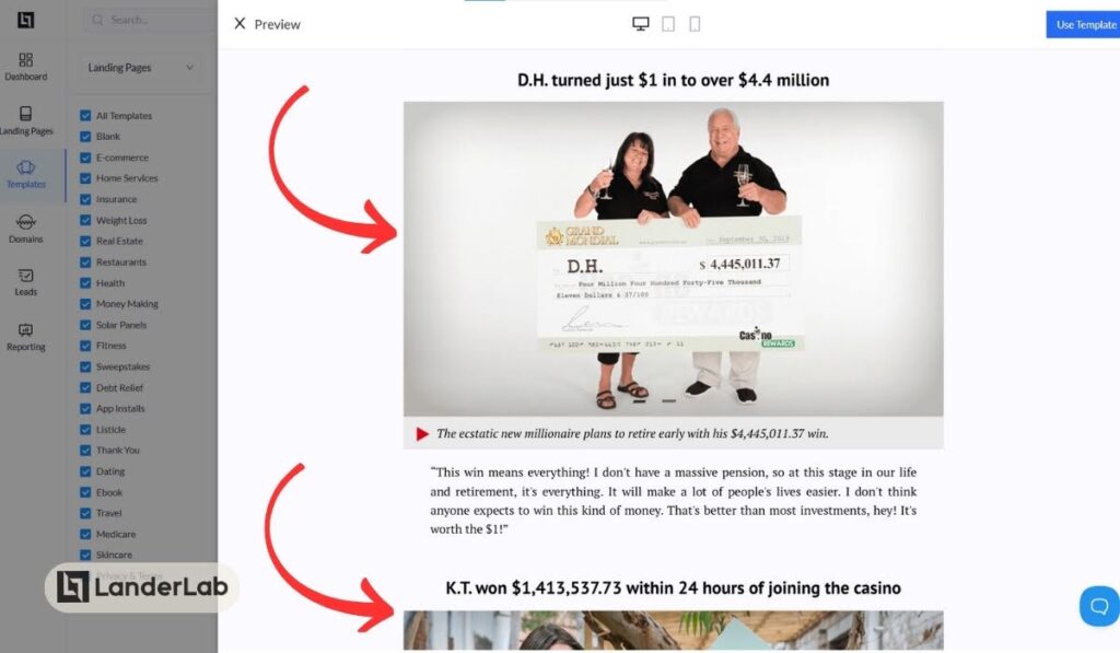
- Social Proof
- Include user testimonials
- Share success stories
- Feature expert opinions
- Add relevant statistics or data
- As Seen In or Featured By text and logos
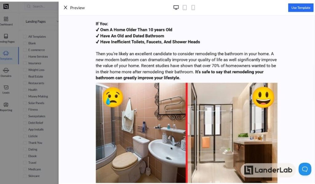
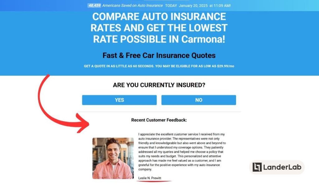
- Properly Transitioned CTA
Create a natural transition to encourage the user to learn more about the solution you presented by providing a simple call to action button. Make sure to set expectations:
- What you want the visitor to perform, like if you need them to answer some questions;
- What they expect to receive, like for our sample pre-lander, the visitors should expect to receive quotes for bathroom remodeling.
5. Simple Click-Through Page
Simple click-through landing pages are short, focused pages that work as a quick step between an ad and an affiliate offer.
These pages keep everything visible on the screen without needing to scroll down (this is called “above the fold”). They give just enough information to get people interested and trust you before sending them to the main offer page.
This type of landing page is great for impulse-based offers like Sweeps and SOI offers.
What Makes Simple Click-Through Pages Unique
- You can see everything important right away
- Uses very little text and simple design
- Has just one or two clear buttons to click
- Doesn’t ask visitors to fill out anything
- Focuses on one main benefit or promise
- Usually has one strong image or video
These pages work well for affiliate marketing because:
- They maintain momentum from the initial ad click
- Make choices easier by keeping things simple (reduces decision fatigue)
- Give just enough information to build trust or keep interest
- Can quickly show if visitors are right for the product or offer
- Easy to test and improve different approaches
- Perfect for warming up cold traffic without overwhelming them
Structure of an Effective Simple Click-Through Page
- Hero Section (Essentially The Whole Page)
Must contain these elements in a clean, balanced layout:
- Attention-grabbing headline focusing on main benefit
- Brief supporting subheadline (1-2 lines max)
- Single eye-catching visual (product shot, lifestyle image, or short video)
- Clear, prominent CTA button
- One piece of strong social proof (testimonial, stats, or trust badges)
- Visual Style
- Headline should be largest text element
- CTA button/s should use contrasting colors
- Visual element should support but not overpower the message
- White space should guide eyes to CTA
- Social proof should be easily scannable
- Message Flow
This is optional, but if you must add it, your page should tell a quick story that naturally leads visitors to click. The headline makes a clear promise, and the lines below quickly explain how you’ll keep that promise.
You can also simply add a bullet list of qualifications you expect the visitor to have. Often, these “qualifications” are broad enough to accept everyone (especially if the only requirement by the advertiser is that the user comes from a specific location and is of legal age). It’s just useful to give the visitor a feeling that they qualify, so they owe it to themselves to check it out.
The image is part of the narrative of the page and should show the process or the good result. Also, a piece of social proof (verified logo, trusted brands, etc.) can be added for instant credibility.
Here are some examples that apply this strategy:
- Using qualifications and trust badges
- Using clear and straightforward benefit

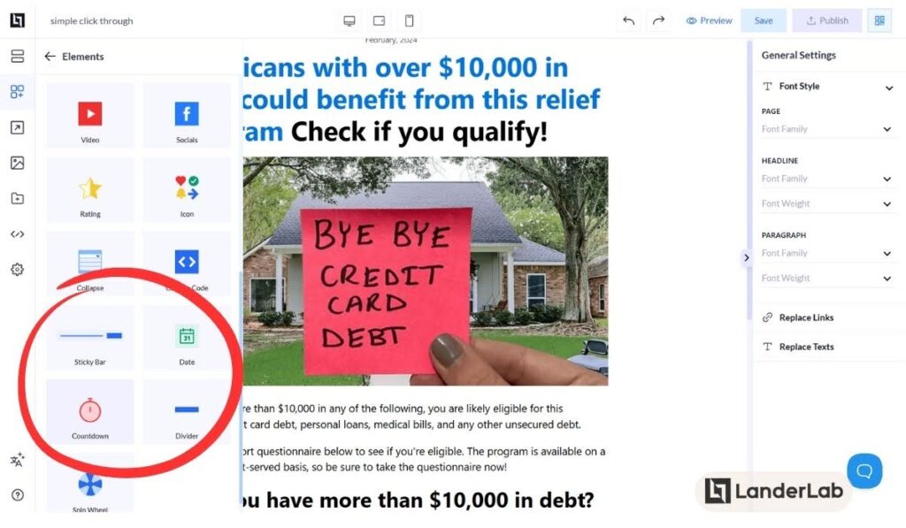
- Urgency Elements
Incorporate time-sensitive elements to drive immediate action. The goal is for the visitor to feel like he is running out of time and should click the button right away.
You can add any of the following:
- Countdown timer that starts when the visitor lands on page
- Dynamic “Offer Ends” date (usually shows 1-2 days from current visit)
- Live counter showing limited spots remaining (e.g. “Only 7 spots left!”)
- Recent sign-up notifications (“John from California just joined”)
- Scarcity indicators (“85% of spots already taken”)
6. Interactive Landing Page
Interactive landing pages transform passive browsing into an engaging experience where visitors actively participate with your content before reaching affiliate offers.
These pages use elements like animations, quizzes, calculators, and gamified components to capture attention and maintain interest longer than traditional static pages.
What Makes Interactive Pages Unique
- Dynamic elements respond to user actions
- Higher engagement through playful interactions
- Creates emotional connection through participation
- Collects behavioral data through interactions
- Warms up traffic more effectively than static pages
- Can qualify leads through interactive elements
These pages are particularly effective for affiliate marketing because:
- Higher engagement leads to better conversion rates
- Interactions build trust before presenting affiliate offers
- Interactive elements can pre-qualify visitors naturally
- Helps stand out in crowded affiliate niches
- Creates memorable experiences that encourage sharing
- Provides value before asking for the click
Structure of an Effective Interactive Landing Page
- Attention-Grabbing Entry Point
Your interactive landing page must grab attention as soon as it loads (within two seconds). It should quickly show visitors that they’re not looking at a regular, non-moving webpage.
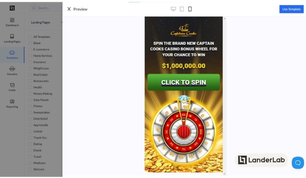
To make a strong first impression, add a main interactive feature that people will want to click or tap right away. This could be:
- An animation that moves when people move their mouse
- A wheel that spins and gives rewards
Make sure people can easily tell how to use these interactive features. Don’t make them guess what they can click on. Instead, help guide their eyes naturally by using gentle visual hints. For example:
- Buttons that softly pulse
- Elements that appear to float on the page
- Core Interactive Elements
Choose 1-2 primary interactive features:
- Prize wheel spins for special offers
- Real-time calculators showing potential benefits
- Interactive product demonstrations
- Mini-games with rewards
- “Scratch-to-reveal” special deals
- Animated comparison tools
- User Journey Flow
Start with a simple, engaging interaction that gets visitors interested. This first step should be easy to do.
After that, each new interaction should:
- Connect to what the visitor did before
- Bring them closer to your affiliate offer (a product or service you’re promoting)
- Give them something useful or valuable
Instead of pushing a sale directly, guide visitors through a journey of discovery. Let each step they take show them new ways the product or service can help them. This makes the whole experience feel more natural and helpful, rather than too focused on selling.
- Engagement Elements
Your interactive elements need to serve a clear purpose beyond mere entertainment. Whether it’s a calculator showing potential savings, a quiz helping users find the right product, or an animated demo illustrating benefits, each interaction should move visitors closer to converting.
Include micro-rewards for participation, like unlocking special offers or accessing exclusive content, to maintain engagement until they reach the offer page.
- Urgency Features
- Real-time countdown timers for special deals
- Dynamic visitor counters showing recent actions
- “Spots remaining” indicators for limited offers
- Time-sensitive bonus reveals
- Progressive unlocking of better offers
- Social Proofing
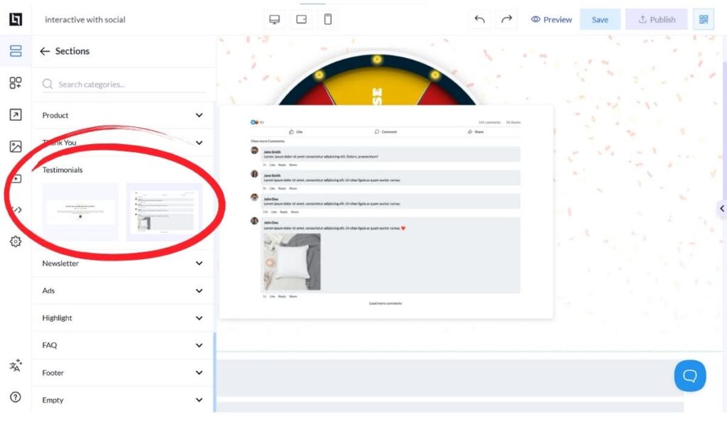
Visitors need to build trust, and they won’t be able to do that to an affiliate program landing page whose brand they’ve never seen before. So, how can you make the user trust you on the spot? Through social proofing via reviews or even comments from familiar social media.
Even something that looks remotely like it’s from social media can prove to be useful. Here’s a good example of an affiliate landing page imitating the look of a popular social network to earn the user’s trust:
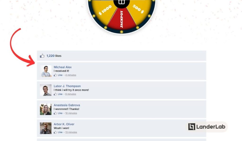
There are some landing page builders that not only provide interactive elements, but social proofing items like the one shown above. All you have to do is drag the item to the page and edit the placeholders to create authentic-looking comments or reviews.
Like the Simple Click-Through Page, an Interactive Landing Page works great for Casino, Sweeps, and other Lead Gen offers.
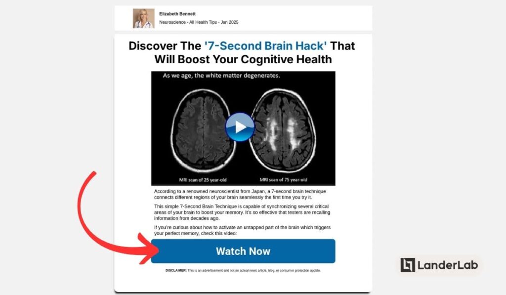
7. Video Sales Letter Landing Page
Video has become one of the best ways to connect with potential customers. For affiliate marketers, Video Sales Letter (VSL) landing pages offer a powerful way to present offers and build connections with viewers. These special pages use video as their main tool to share your message and get people to take action. Here’s a helpful guide on how to build a high-converting video landing page.
What Makes VSL Pages Unique
Video landing pages are particularly effective for affiliate marketers because:
- Higher Engagement: Videos keep attention better than text, so site visitors spend more time on your page
- Better Explanation: You can show how complex products or services work through video
- Emotional Connection: Video allows you to build trust and rapport more effectively, especially if you’re using stories to connect with your audience
- Increased Conversions: Well-crafted VSLs often convert better than text-only pages
- Mobile Optimized: Many people watch videos on their phones, and these pages work great on mobile devices
Video Landing Pages work best for Health and Nutra, iGaming, Apps and Online Games, Finance, and Adult verticals.
Structure of an Effective VSL Landing Page
A VSL landing page that gets good results usually has these key parts:
- The Video Part
- Placed at the top where it’s easy to see (hero section or above the fold)
- Starts playing automatically (when allowed) to catch attention right away
- Easy-to-use controls and clear video quality
- Right length for what you’re selling (3-5 minutes for less expensive items, longer for premium products)
Quick note: Not all advertising platforms allow landing pages with videos that play automatically, so many VSLs have the video paused. When they do allow auto-playing, most of the time, the audio is muted.
- Supporting Parts
- Eye-catching headline that works with the video (often even states the word “video”)
- Short text that strengthens main points
- Clear buttons telling people what to do next
- Elements that show trustworthiness and other people’s positive experiences
- Design that works well on all devices
Often, there are not a lot of elements on the page — just the video and a few supporting parts. So there won’t be a lot of text that sometimes you don’t even need to scroll down (or scroll too far down) to view the whole page.
- Video Content Order
- Opening hook (First 10-15 seconds to get attention)
- Shows the problem
- Presents the solution
- Lists benefits and features
- Shows what others say about it
- Tells people what to do next
- Removes risk (like guarantees)
- Final encouragement to take action
- CTA Supports the Video
Instead of being the main focus of the landing page, buttons encourage users to watch the video. If the video does not play automatically, the CTA may show “Watch the Video” or something similar.
What about the CTA that takes the user to the actual affiliate offer? These sometimes appear only when the video has been watched fully or has been viewed up to a certain point.
Note: Using videos as promotional tools can be so effective that we’ve seen times when a successful affiliate marketer creates a landing page that just imitates the look of a VSL page. The CTA can instead take you to another page that has the actual video that promotes the offer.
8. Lead Generation Landing Page
Lead generation landing pages are specialized pages designed to collect visitor information. As we’ve previously mentioned, this is the only affiliate landing page type that is not focused on click-throughs but on lead collection.
For affiliate marketers, these pages act as powerful tools to build an email list while promoting affiliate products, essentially creating two revenue streams: immediate affiliate commissions and long-term email marketing opportunities.
Sometimes, affiliates directly connect these landing pages to affiliate networks, direct advertisers, or lead collection platforms via Zapier, API or even webhooks.
Quick Tip: Having a custom webhook can make your lead generation life so much easier! If you don’t know how to use it or how to create one for your lead gen landing page, LanderLab can save your affiliate marketing campaign! All you need to do is reach out to LanderLab’s support team from within the dashboard and discuss your needs.
What Makes Lead Gen Pages Unique
- They require an exchange of information rather than just promoting an offer
- Can range from simple email collection to multi-step qualification forms
- Often integrate directly with email marketing platforms, CRM, an lead collection systems
- Focus on building a relationship before pushing affiliate offers
- Allow for future remarketing and ongoing promotion opportunities
Lead gen pages are particularly valuable for affiliate marketers because:
- They help build owned marketing assets (email lists) rather than relying solely on third-party platforms
- Enable better targeting and segmentation of potential customers
- Create multiple opportunities to promote different affiliate offers over time
- Help establish authority in your niche through valuable content offerings
- Allow for testing different offers and messaging to optimize conversions
Structure of an Effective Lead Gen Page
- The Value Proposition
This section must immediately communicate what visitors will get in exchange for their information. It needs to:
- Present a compelling offer that solves a specific problem
- Create urgency or scarcity when appropriate
- Use clear, benefit-focused headlines
- Form Section
The heart of your lead generation page:
- Keep initial fields minimal (2-3 fields often convert best)
- Consider multi-step or multi-page forms if you need more information instead of providing one large form in a single-page
- Place the form above the fold for simple offers
- Use contrasting colors for the submission button
- Include clear privacy assurances near the form (or at least a link to the privacy policy)
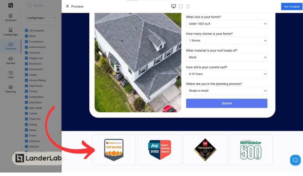
Here’s an example of an affiliate landing page with just one form field:
Here’s an example of an affiliate landing page with several form fields:
- Trust Elements
Build confidence in your offer with:
- Social proof (testimonials, subscriber counts)
- Trust badges and security certificates
- Preview of the lead magnet
- Money-back or satisfaction guarantees
- Credibility indicators (as seen in, featured by, top rated)
You can make it a big part of your page, like featuring extensive testimonials, or it can be just a small section, but still prominent like this below:
- Benefit Breakdown
Your lead gen page needs to tell a clear story. Here’s how to do it:
First, show that you understand what problems your visitors are facing right now. Then show them how your free content (lead magnet) or offer will help solve these problems.
Give them a clear picture of how their life or business will improve after they use your solution. Be very specific about what results they can expect to get. When you do this, visitors can connect with your message emotionally and imagine themselves succeeding with your help.
You can write this section in two ways: either as a detailed explanation or as a simple list of bullet points. But my suggestion is you test both and see which converts better.
- Footer Elements
Close with supporting information:
- FAQ section for common questions
- Links to privacy policy and terms
- Additional contact methods
- Social proof reinforcement
- Secondary call to action
Best Practices for Affiliate Landing Pages
Creating a high-converting affiliate landing page isn’t just about following a template – it’s about understanding and applying proven strategies that work. Before diving into best practices, take a look at these common landing page mistakes so you don’t fall into the same traps.
Here’s a unified list of best practices to apply on your affiliate landing page:
1. Have Clear and Focused Messaging
Your landing page needs a single, clear purpose. Each element on your page should support your main conversion goal. This means:
- Writing headlines that immediately communicate value or address pain points
- Using subheadings that support and expand on your main message
- Keeping your copy focused on benefits rather than just features
- Making sure every image and element serves a purpose
2. Your Design Should Focus on Conversion
How your page looks plays a big role in its success. Create CTA buttons that stand out by using contrasting colors, but keep your overall design simple and neat. Leave enough space between different parts of your page to make it easy to read and understand.
Remove any navigation menu that might distract visitors from your main message. And use visual hints throughout the page to naturally guide people’s eyes to important parts.
You can create professional-looking landing pages, but I’m letting you in on a secret: even simple landing pages that look like they were made by an amateur can also convert well. The key here is to test different landing page designs.
3. Your Landing Page Should Load Fast
It takes mere seconds for a visitor to close the browser window or hit the back button. If your page doesn’t load fast enough, expect to lose a lot of traffic and conversions.
Any kind of media attached to the page (such as image or video) should be optimized for fast loading. Limit the use of complex website tools that might slow things down.
Choose good hosting services and enable CDN to help improve your page load speed, especially if you are promoting internationally.
And don’t forget—they should be mobile responsive!
4. Build Trust Right Away
Since you’re often promoting products to people who don’t know you, building trust is very important. Show trust symbols and security badges that prove your reliability. Display logos of known companies you work with to build credibility.
Include customer feedback with photos whenever possible, and share where your product has been featured in the press. Place customer reviews and success stories strategically throughout your page, and put trust-building elements near your action buttons to encourage clicks.
5. Place Action Buttons Wisely
Your Call-to-Action buttons need careful planning. Place your main buttons where people see them first, and add more buttons at natural points throughout longer pages.
Use words that encourage action and make the buttons big enough to click easily on phones. Test different button colors and phrases to find what works best, but always ensure they stand out visually from the rest of your page content.
6. Create a Sense of Urgency
Consider adding countdown clocks for time-limited offers and displaying real-time stock levels. Show how many spots are available for limited-capacity offers, and use special pricing that has a clear deadline.
Showing pop-ups of recent purchases and highlighting special bonus offers can also encourage quick decision-making.
7. Check Your Competitors
Have a look at how other marketers are promoting a similar affiliate offer. Start by using tools like AdPlexity to find a successful affiliate landing page in the same vertical or niche. Look closely at campaigns that have been running for a long time, as these are likely the most successful ones.
You’ll often notice patterns in how successful pages are set up, especially when they’re promoting similar products to yours. See what kind of trust-building elements they use to convince visitors, and notice which websites they get their visitors from.
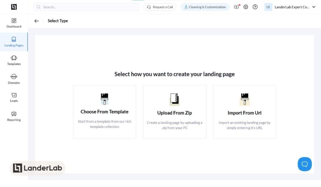
If you see a landing page you like, you can add it to LanderLab via URL or by importing directly from the spy tool. In case you already have a zip file of the landing page, you can upload it to LanderLab, too.
This lets you quickly adapt winning designs while adding your own unique elements and improvements.
8. Test and Optimize
We cannot make it any clearer: continuous improvement should be part of your strategy.
Try different versions of your headlines, buttons, and pictures to see what works best. Test various page types and note the data for each. A/B testing is key!
Watch how people use your page and track important metrics like click-through rates (CTR), conversion rates, and ROI.
High CTR but low conversion rates? The page must be good, but it doesn’t match the offer. Low CTR but high ROI? Check the source of traffic or marketing channel — there might be a mismatch somewhere.
Always use data to make informed improvements to your page.
Take Your Affiliate Landing Pages to the Next Level
Making good affiliate landing pages might look hard at first, but it doesn’t have to be. Once you understand the different types of pages and follow what works, you can create pages that easily get that conversion.
The key is having the right tools for the job. While there are many landing page builders available, the unique challenges of affiliate marketing require specialized solutions. You need a good landing page builder that understands how affiliate campaigns work, offers templates optimized for different traffic sources, and includes features specifically designed for affiliate marketers.
Start applying the strategies we’ve covered in this guide, and don’t be afraid to experiment with different landing page types and elements. With the right approach and tools, you can create high-converting landing pages that not only capture attention but drive real results for your affiliate campaigns.


