Most affiliates and media buyers send cold traffic straight to an offer page and wonder why their CVR is trash.
The problem isn’t the offer. It isn’t the targeting. It’s that you’re asking a stranger to make a decision before they’re ready.
Presell pages fix that. This guide covers every format worth using, real vertical-specific examples broken down by what actually makes them convert, and how to pick the right one for your traffic source and offer type.
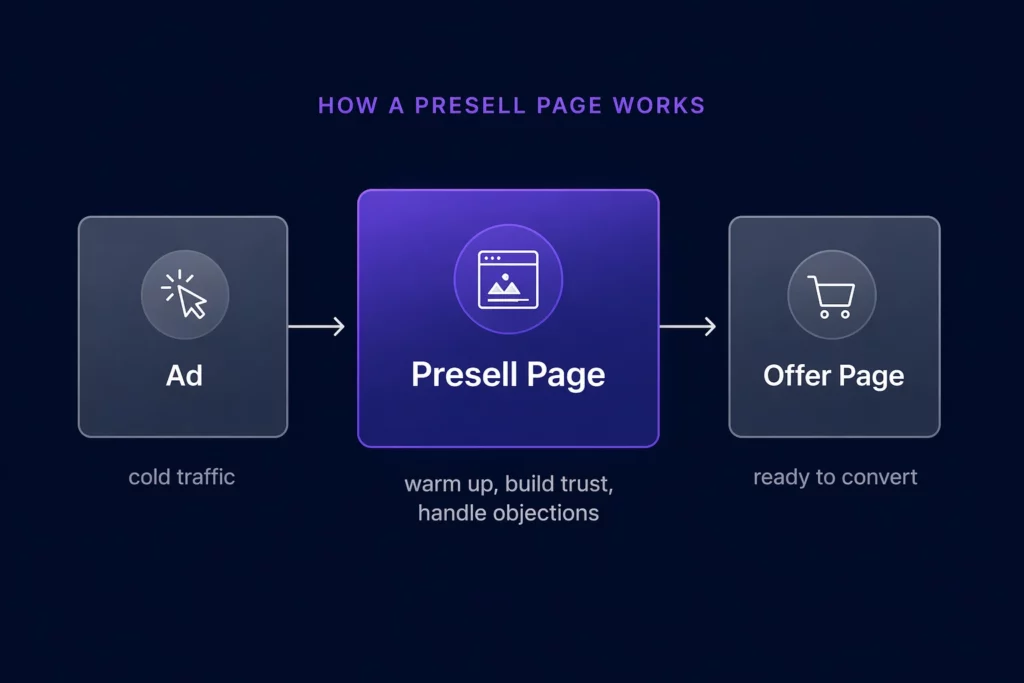
What Is a Presell Page?
A presell page is a landing page that sits between your ad and your offer. Its job is not to sell. Its job is to warm up cold traffic so that by the time a visitor reaches the actual sales page or lead form, they’re already halfway convinced.
Think of it as the bridge between a click and a conversion. You’ve already paid for the click. The presell page is where you earn the right to ask for the sale.
In affiliate marketing, it’s sometimes called a bridge page or a pre-lander. In native advertising, it’s often an advertorial. In lead gen, it shows up as a multi-step quiz.
The format varies by vertical and traffic source, but the core purpose is the same: reduce the resistance a cold visitor feels before they encounter your offer.
The data backs this up. According to research, 96% of buyers aren’t ready to buy even after clicking on an ad. A well-built presell page addresses that gap directly.
Why Presell Pages Work
Cold traffic is suspicious by default. Someone scrolling Facebook or clicking a native ad wasn’t looking for your offer. They were doing something else entirely. Sending that person straight to a sales page is like proposing on a first date.
Presell pages work because they meet visitors at their current level of awareness. Instead of assuming someone is ready to buy, you give them context, build credibility, address objections, and create desire before the ask ever comes up.
The practical results are significant. According to a Tier 11 case study, using presell pages increased ROAS by 77%.
For affiliate marketers specifically, a well-built presell page can double or triple conversion rates compared to sending traffic directly to a sales page.
There’s also a platform compliance angle. A bridge page helps you avoid getting shut down by Google or Facebook Ads for including an affiliate link directly in your ad. Direct linking to affiliate offers is increasingly flagged by ad platforms. A presell page gives you a compliant middle layer that also improves conversions.
The 5 Types of Presell Pages (and When to Use Each)
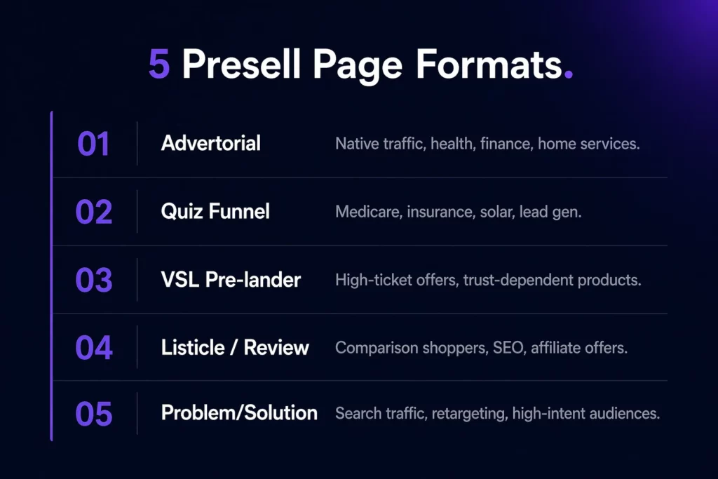
1. The Advertorial
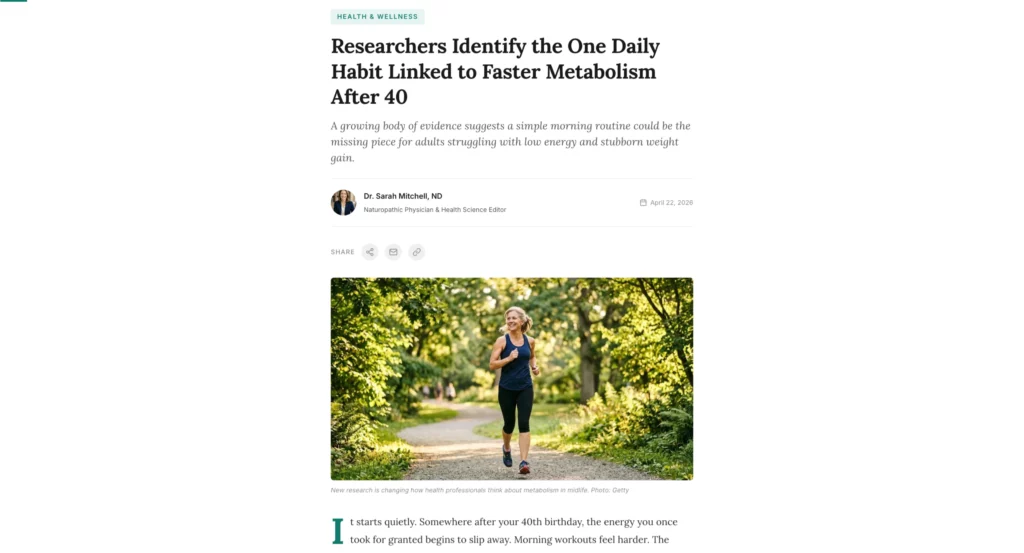
An advertorial looks like editorial content. It reads like an article, review, or news story, but it’s designed to build desire for a specific offer. This is the dominant format in native advertising and one of the most effective formats for health, finance, and home services verticals.
What makes it work: it bypasses ad blindness. A reader in content-consumption mode engages differently from someone who knows they’re being sold to. The advertorial exploits that mode by delivering value first and making the pitch feel like a natural conclusion rather than an interruption.
When to use it: native traffic, Facebook, and Meta for health and finance offers, any vertical where social proof and storytelling drive conversions. Works especially well for supplements, insurance, solar, and debt consolidation.
What to include: a compelling headline that matches your ad, a relatable protagonist story or problem setup, credibility signals (expert quotes, statistics, before/after), a natural transition to the offer, and a clear CTA that doesn’t feel abrupt.
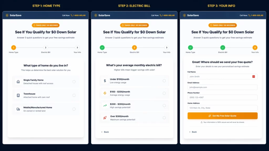
2. The Quiz Funnel
A quiz funnel collects information from visitors through a series of questions before routing them to a personalized result or offer.
It’s the highest-engagement presell format available because it creates active participation rather than passive reading.
Quiz funnels work particularly well for lead generation because they qualify intent before asking for contact information.
By the time someone reaches the opt-in form, they’ve already invested time answering questions and are psychologically committed to seeing their result.
When to use it: Medicare, insurance, solar, real estate, debt consolidation, home services, any vertical where lead quality matters more than raw lead volume. Also highly effective for higher-ticket affiliate offers that need more nurturing.
What to include: 4-8 questions that feel relevant and personalized, a progress bar so visitors know how close they are to their result, a results page that delivers genuine value before the offer, and conditional logic that routes different visitor types to different offers or messaging.
3. The VSL Pre-lander
A VSL pre-lander uses video as the primary preselling mechanism. The page is typically minimal: a headline, a video, and a CTA below the fold that only appears after a certain watch time or automatically after the video ends.
When to use it: high-ticket offers, complex products that need demonstration, and any offer where trust is the primary barrier. Also effective when your target audience skews older and responds better to video than text.
What to include: a headline that generates enough curiosity to start the video, the video itself (typically 3-15 minutes, depending on the offer’s complexity), social proof elements around the video, and a CTA that appears at the moment of maximum engagement.
4. The Listicle / Review Page
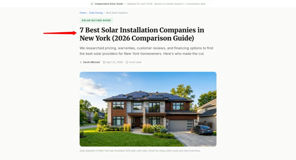
A listicle presell page is framed as a “best of” or comparison article. It reviews multiple options in a category, positions your primary offer favorably within the comparison, and sends warm, pre-qualified traffic to the winning pick.
This format works because it feels like independent editorial content rather than an ad. A reader who arrives on “7 best solar installation companies in New York” is already in buying mode. They’ve decided to buy. They just haven’t decided who from. The listicle guides that decision.
The example below is a real solar listicle presell page.
Notice how it leads with geographic specificity, a named author, a publication date, and an editorial promise (“We researched pricing, warranties, customer reviews, and financing options”). Every element builds credibility before the visitor reads a single word of the actual rankings.
When to use it: affiliate offers where the visitor is in comparison mode, SEO traffic, and any vertical with multiple competing products. Common in finance, software, home services, and supplements.
What to include: genuine comparison criteria that visitors actually care about, honest pros and cons for each option (partial objectivity builds more trust than pure promotion), clear winner positioning for your primary offer, and individual CTAs for each entry reviewed.
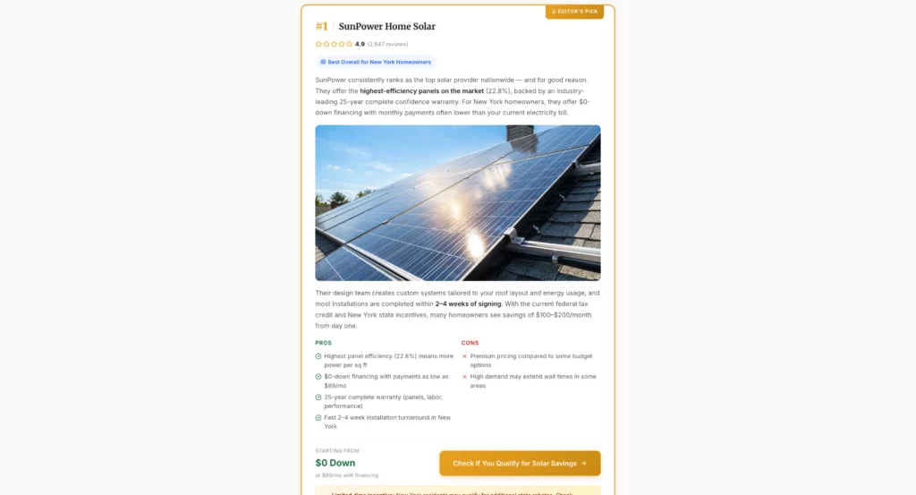
Each company card in a well-built listicle includes a ranking number, star rating with review count, a pros/cons split, a starting price, and a single CTA.
The “Editor’s Pick” badge on the top-ranked entry signals the recommendation without being heavy-handed about it. The visitor feels like they’re reading an independent review, not being sold to.
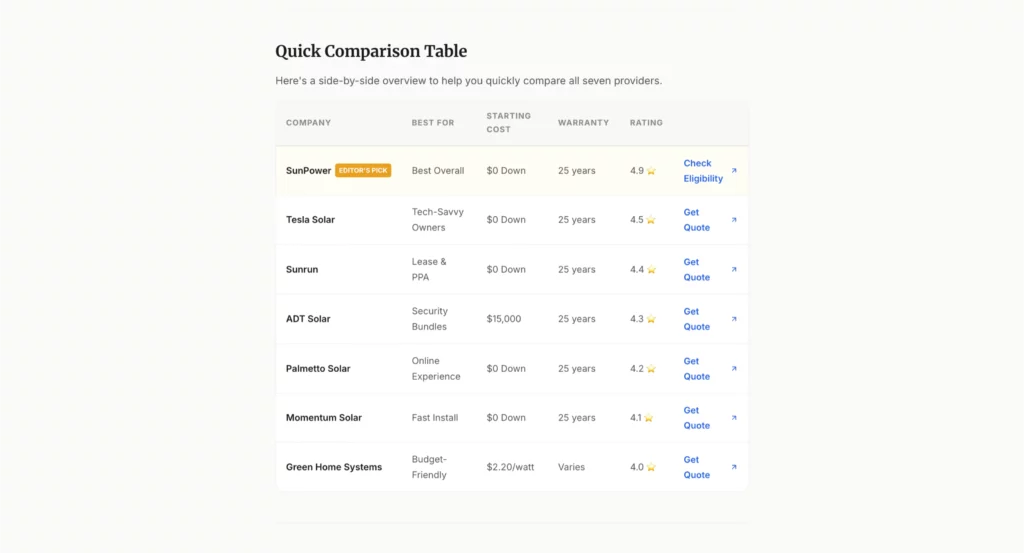
A comparison table at the bottom ties the whole page together. It lets comparison shoppers scan all options at a glance without having to reread every card. The top pick is visually distinguished by a badge, reinforcing the recommendation one final time before the visitor makes their decision.
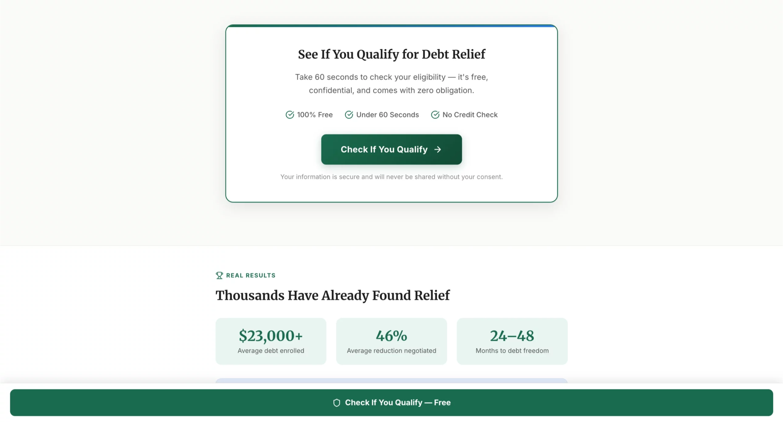
5. The Problem/Solution Page
The problem/solution page leads with the visitor’s pain point, amplifies it enough to create urgency, then introduces the offer as the specific solution. It’s the most direct presell format and works best when your traffic is already problem-aware.
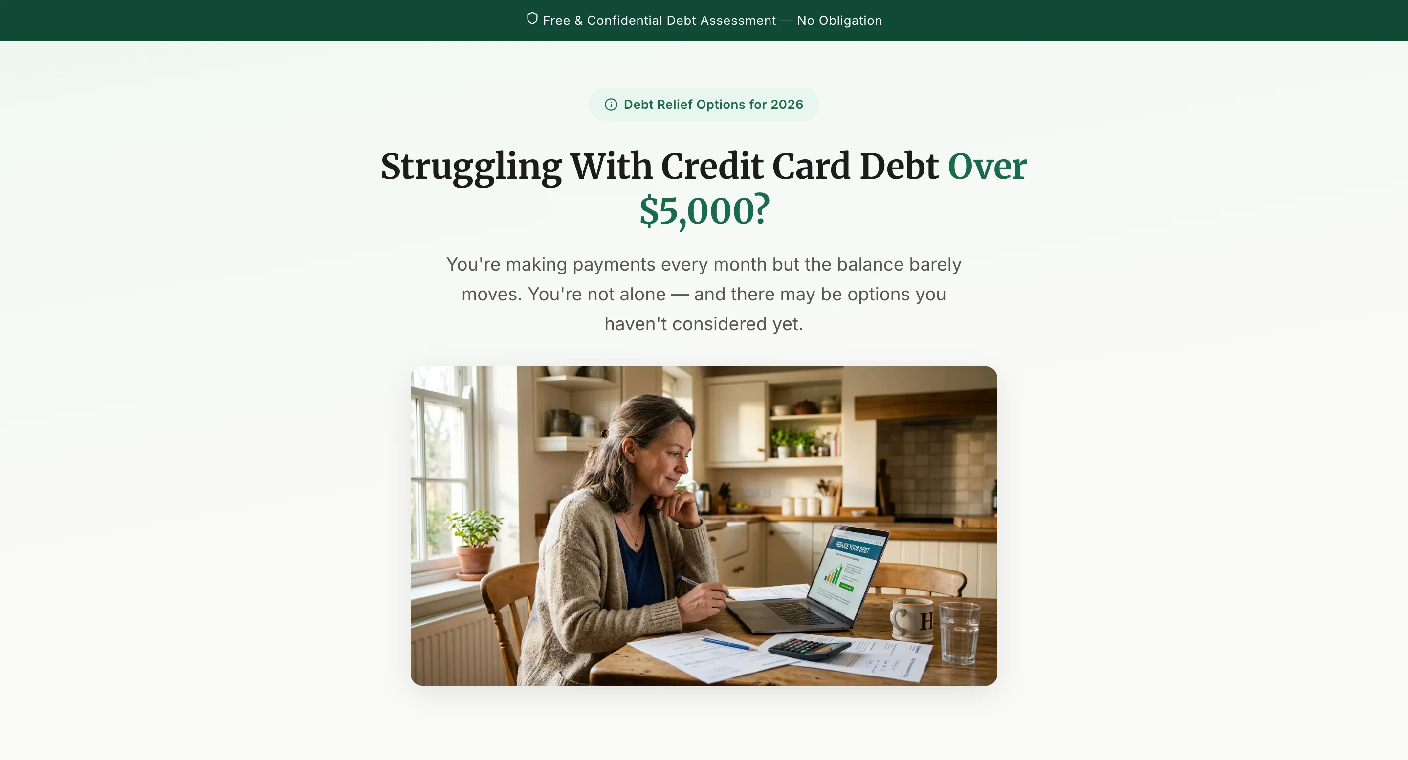
The example below is a debt consolidation presell page.
Study how it’s structured: the hero doesn’t lead with the product or the company.
It leads with the exact problem the visitor already has. “Struggling With Credit Card Debt Over $5,000?” is not a headline about debt relief.
It’s a headline about the reader’s life. That’s the difference between a page that converts and one that doesn’t.
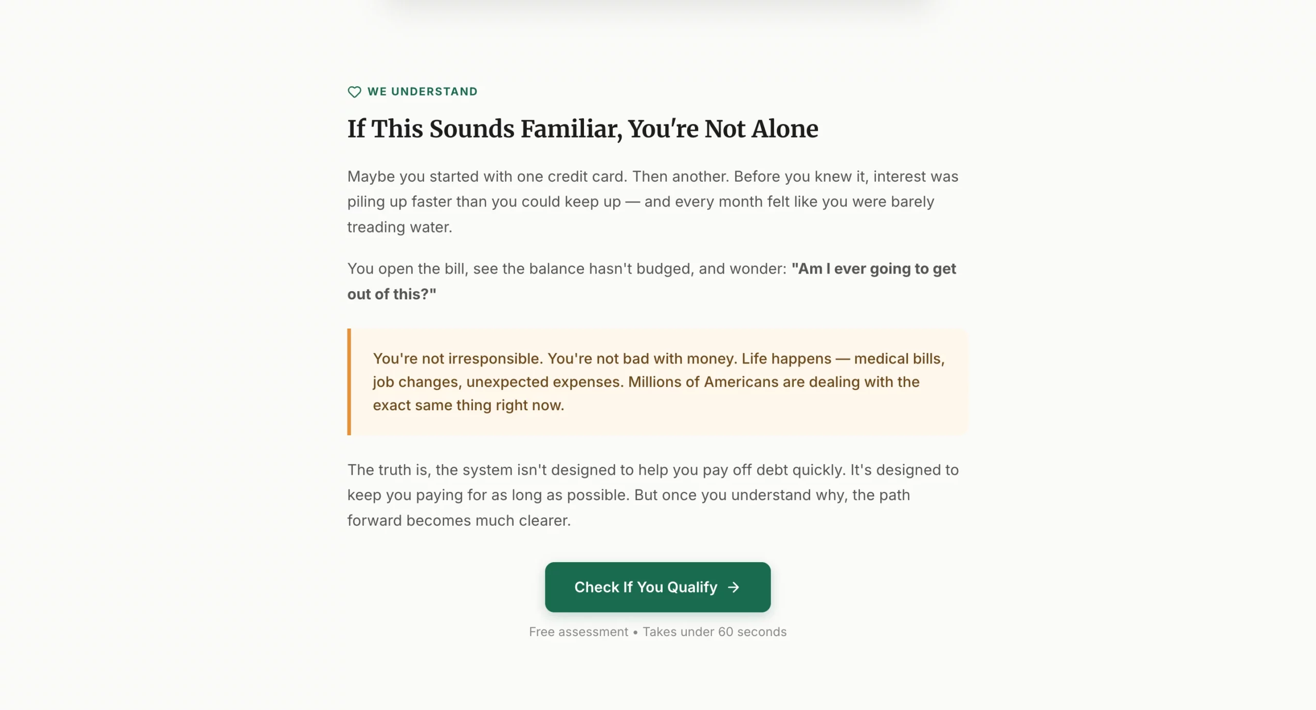
After the hook, the page shifts into validation. It names the experience: you’re making payments, the balance barely moves, you feel stuck. This section exists purely to make the visitor feel understood before any solution is introduced.
That emotional alignment is what keeps problem-aware traffic on the page long enough to convert.
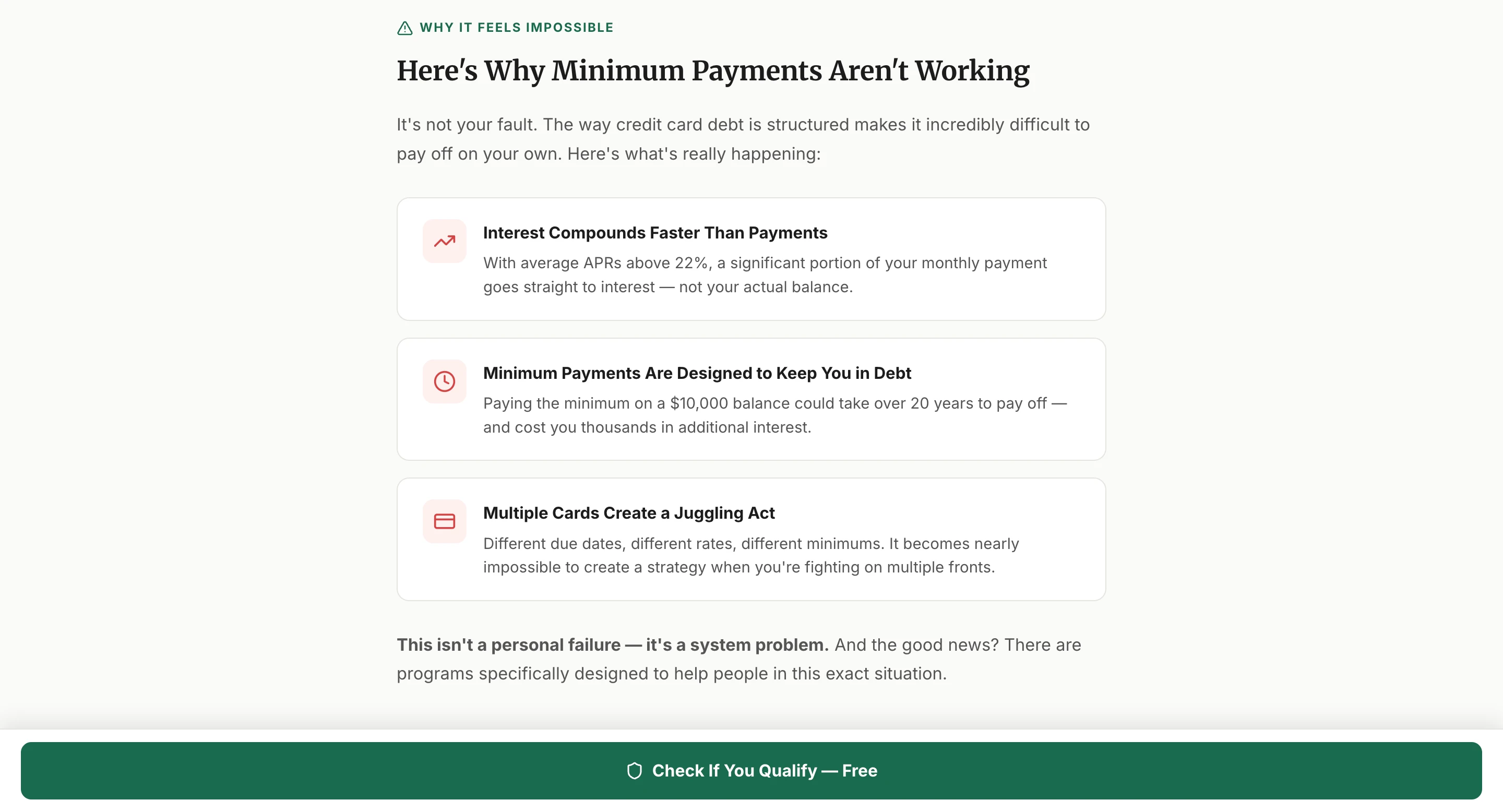
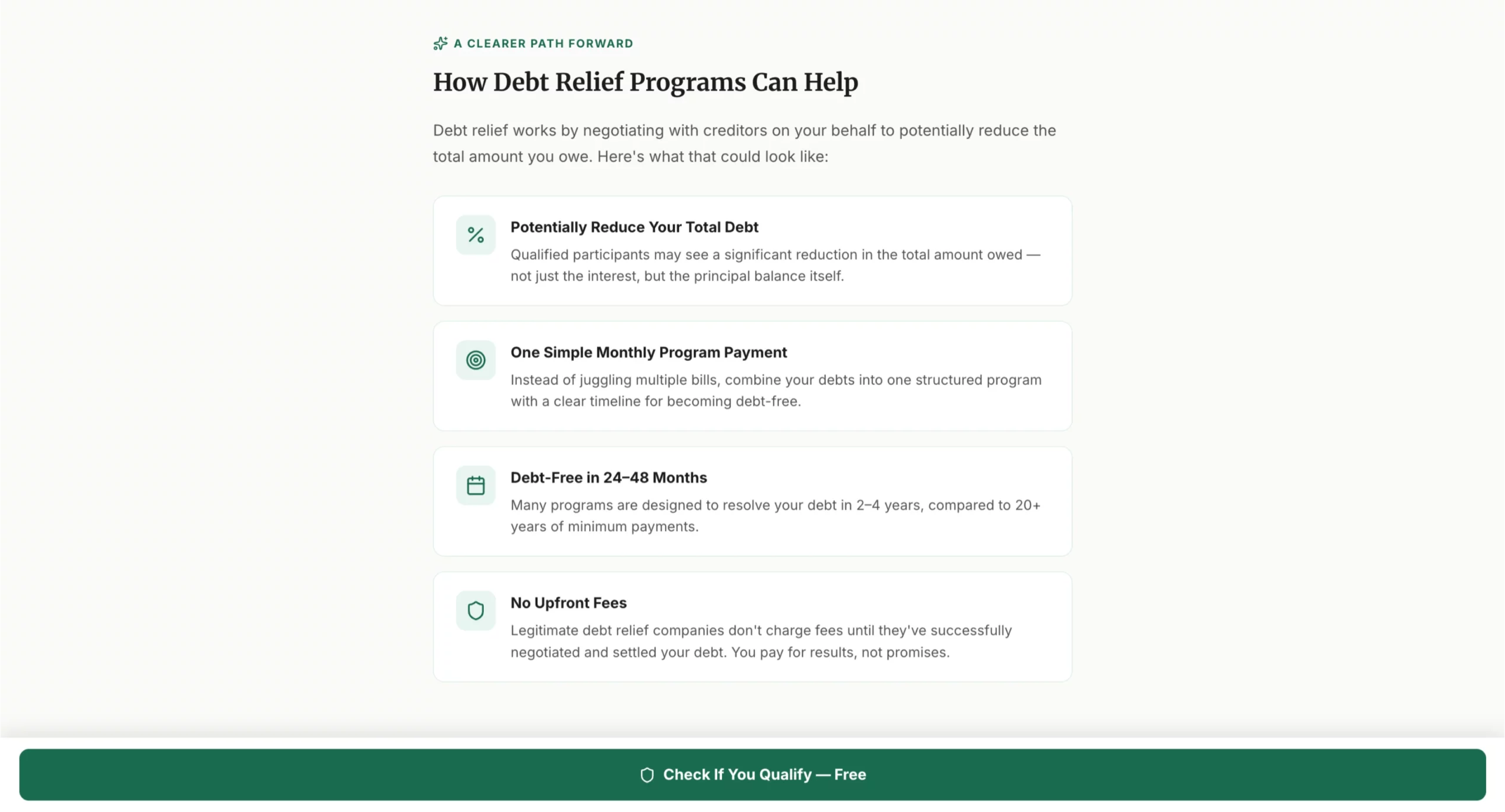
The problem amplification section explains why the situation is happening, not just that it is.
By explaining the mechanics of compound interest and minimum payment structure, the page shifts the blame from the visitor to the system. That reframe reduces shame, increases trust, and makes the visitor more receptive to the solution that follows.
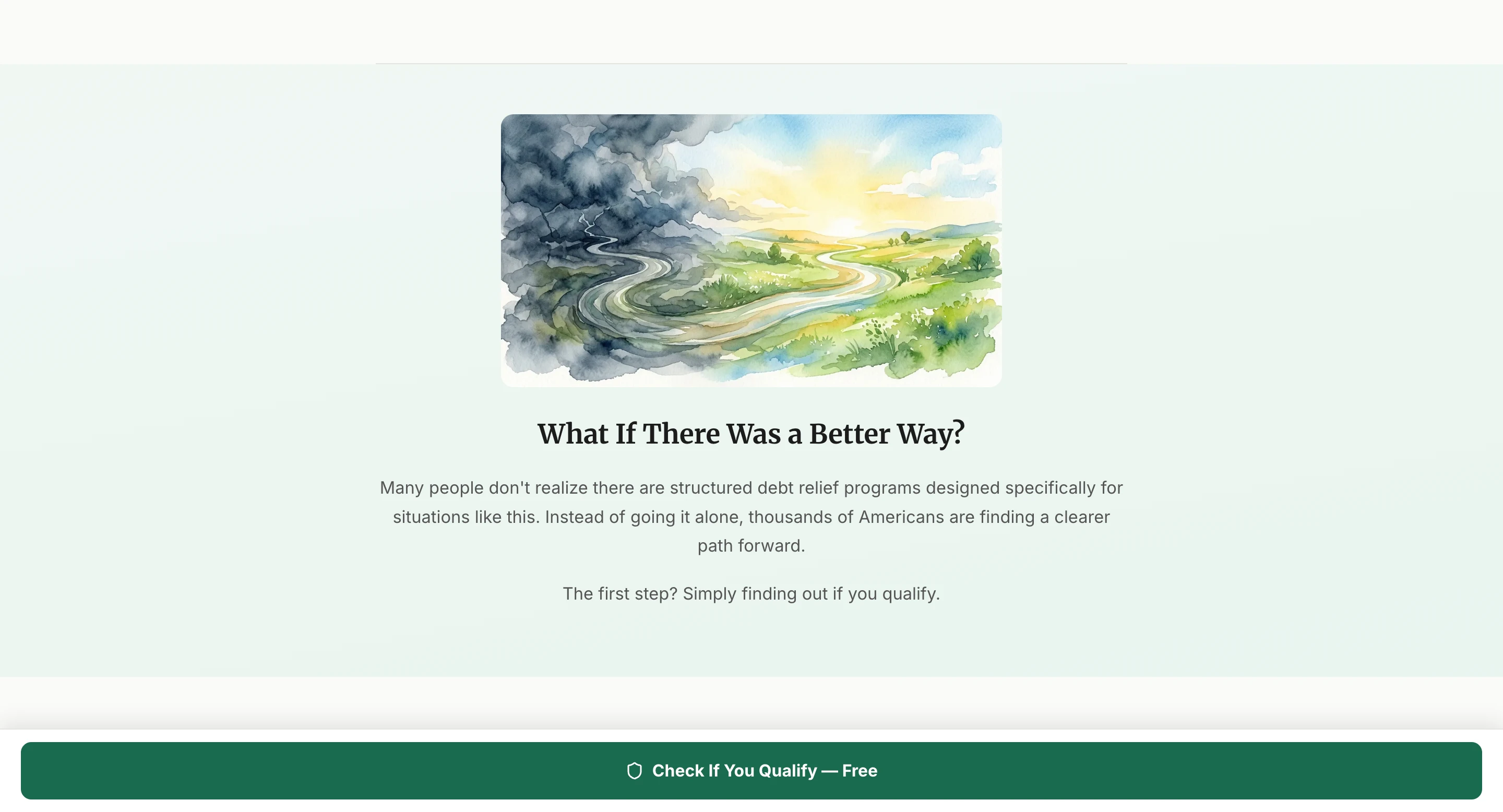
The pivot from problem to solution is handled with a single transitional question: “What if there was a better way?”
It’s simple, but it does the structural work of closing the problem loop and opening the solution frame. The watercolor image of a path from storm to sunlight visually reinforces the emotional shift.
Social proof and specific numbers appear before the lead form. “$23,000+ average debt enrolled,” “46% average reduction negotiated,” “24-48 months to debt freedom.”
These stats answer the visitor’s unspoken question: Does this actually work? The CTA (“Check If You Qualify”) consistently frames the next step as eligibility verification rather than a sales commitment.
The solution section explains exactly how the program works before requesting contact information.
Visitors who understand the mechanism convert at higher rates because they’re not trying to figure out what they’re signing up for while simultaneously deciding whether to trust you.
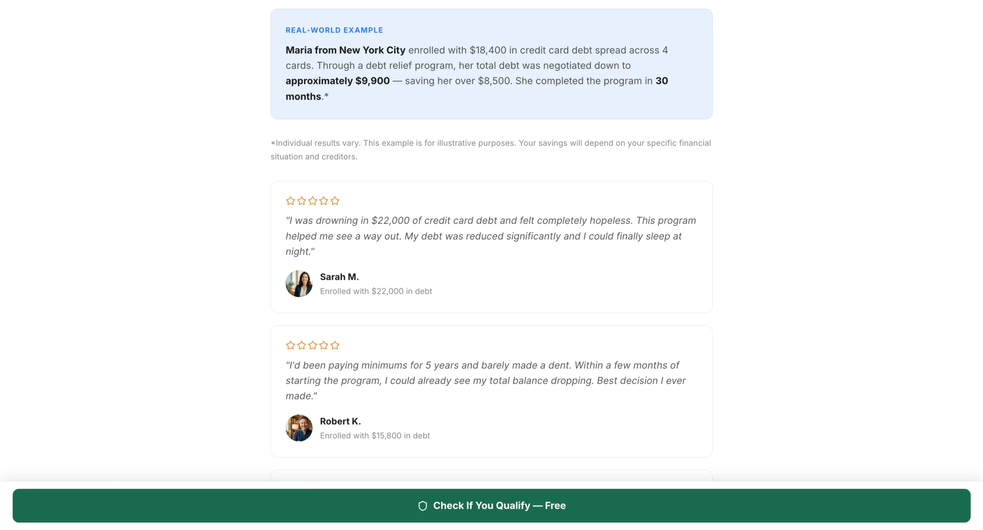
Testimonials in the problem/solution format are most effective when they mirror the visitor’s starting situation exactly. “I was drowning in $22,000 of credit card debt” and “I’d been paying minimums for 5 years” are more persuasive than generic praise because they make the prospect think, “That’s me.”
The specific enrollment debt amounts listed under each name add a level of detail that generic testimonials lack.
When to use it: search traffic, retargeting campaigns, and any audience that already knows they have a problem and is actively looking for solutions. Works well for debt, health, home services, and B2B software.
What to include: a headline that names the exact problem, empathy-driven copy that validates the visitor’s experience, a clear pivot from problem to solution, a mechanism explanation before the ask, specific social proof with measurable outcomes, and a CTA that frames the next step as low-commitment eligibility verification rather than a purchase decision.
Presell Page Examples Broken Down by Vertical
Insurance and Medicare: The Quiz Funnel
Medicare campaigns are among the most competitive in paid traffic. The audience is older, skeptical of ads, and dealing with a genuinely complex decision. Sending cold traffic directly to a lead form produces poor lead quality because visitors don’t understand what they’re signing up for.
The quiz funnel solves this. A typical Medicare quiz asks, “Are you currently enrolled in Medicare?” What coverage gaps are you concerned about? What state do you live in? Are you interested in plans with $0 premiums?
By the time someone reaches the lead form, they’ve self-selected as a qualified prospect and feel the form is personalized to their situation. Lead quality improves significantly. CPL goes up, but cost per acquisition goes down because close rates improve.
What makes it work: the questions mirror what an insurance agent would ask in a real consultation. The visitor feels understood, not processed.
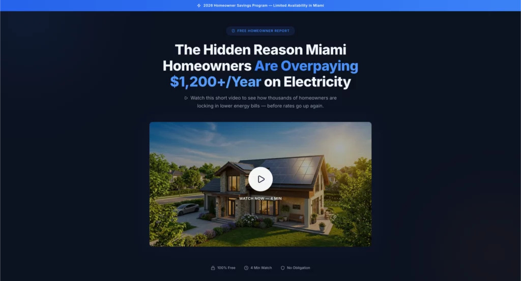
Solar: The Advertorial with Savings Calculator
Solar presell pages that perform well typically open with a local angle. Something like “California homeowners are eliminating their electricity bills with this program” performs better than generic solar messaging because it creates geographic relevance immediately.
The best solar advertorials include a savings calculator embedded partway through the page. The visitor inputs their monthly electricity bill and gets an estimated annual savings figure. By the time they reach the lead form, they have a personalized financial reason to convert.
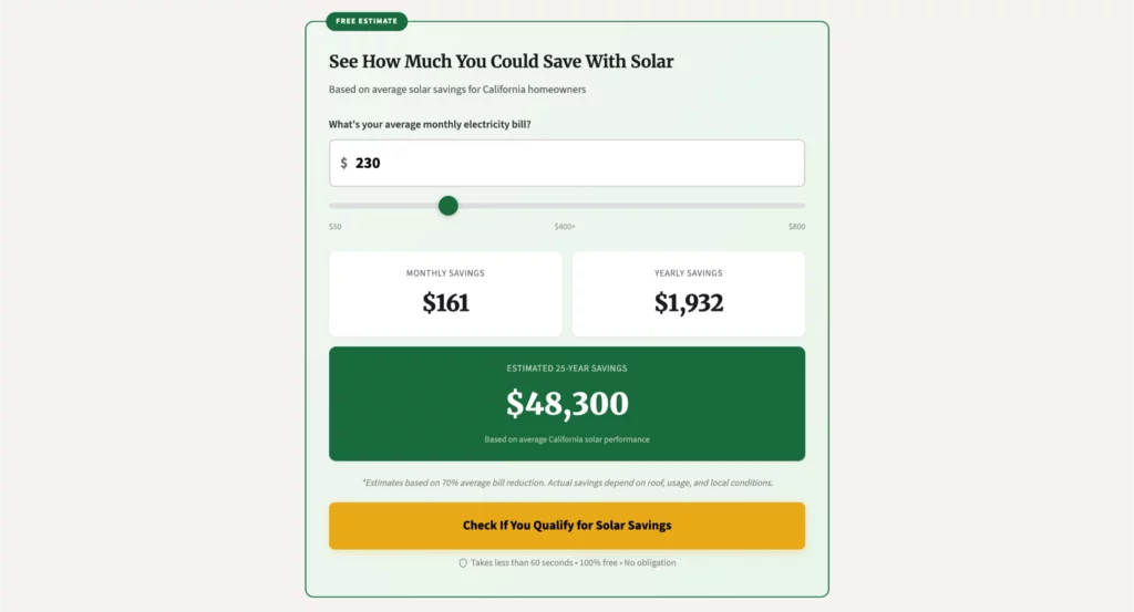
What makes it work: the calculator transforms an abstract benefit (save money on electricity) into a specific number (you could save $2,340 per year). Specificity converts. Generally doesn’t.
Home Services (Roofing): The Problem/Solution Page
Roofing leads from paid traffic are expensive precisely because the intent is high. Someone clicking a roofing ad after a storm, or someone noticing damage, isn’t browsing. They have an immediate problem.
The most effective roofing presell pages lead with urgency: water damage compounds fast, insurance claims have deadlines, and unaddressed roof damage drops home values.
The problem section is short. The solution section moves quickly to proof: photos of completed jobs, local testimonials, and certifications.
What makes it work: roofing customers care about two things: will this person actually fix my roof, and will they show up? Presell pages that lead with local social proof (photos of actual jobs in the area, not stock images) address both concerns before the lead form appears.
Debt Consolidation: The Listicle / Review Format
Debt consolidation traffic from native ads responds well to the listicle format because visitors are, by nature, comparison shoppers. They’ve already decided they need help. They’re evaluating options.
A “5 best debt relief programs for [year]” style page positions the primary offer as the top pick while maintaining enough apparent objectivity to be credible. The key is including genuine cons for each option, even the one you’re promoting. Partial honesty builds more trust than unqualified praise.
What makes it work: compliance language matters enormously in finance. The best debt consolidation presell pages include clear disclosures, realistic expectations, and FTC-compliant claims. Pages that overpromise get flagged by ad platforms and produce low-quality leads who churn.
High Ticket Affiliate Offers: The VSL Pre-Lander
For affiliate offers above $500, text-based presell pages often underperform compared to video. The reason is simple: high-ticket purchases require more trust than a three-minute page read can establish.
VSL pre-landers for high-ticket offers typically run 8-15 minutes.
The video is usually a founder story or case study format: here’s the problem I had, here’s what I tried that didn’t work, here’s what finally worked, and here’s how you can get the same result. The offer is introduced in the final third of the video.
What makes it work: video creates familiarity. By the end of a 10-minute founder story, a viewer feels like they know the person. That familiarity lowers the psychological barrier to a high-ticket purchase in a way text rarely can.
What Every High-Converting Presell Page Has in Common
Across all five formats and every vertical, the presell pages that convert share a handful of structural elements.
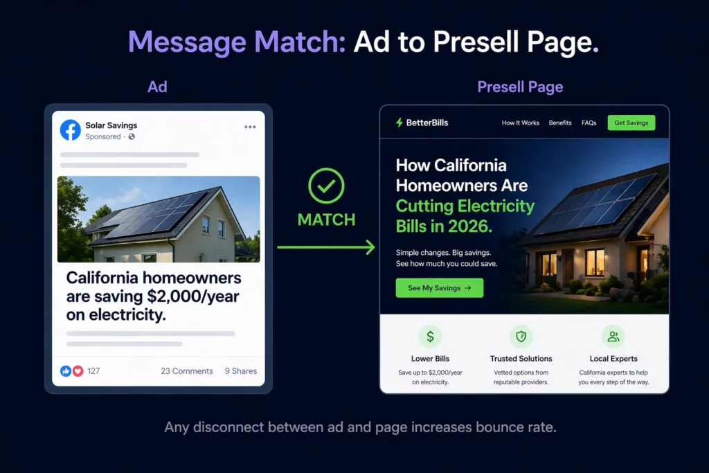
Message match with the ad. The presell page headline should mirror the language and promise of the ad that brought the visitor there. Any disconnect between ad and page creates doubt and increases bounce rates.
If your ad says “California homeowners are saving $2,000 a year on electricity,” your presell page headline should reference California, homeowners, and savings in the first five seconds.
A single goal. Presell pages with multiple CTAs, navigation menus, or competing offers convert poorly. Every element on the page should point toward one next action. Remove everything that doesn’t serve that goal.
Social proof that’s specific and local. Generic testimonials don’t move conversion rates. Specific testimonials with names, locations, and measurable outcomes do. “Sarah from Phoenix saved $187 on her first month’s electricity bill.” “Great service, highly recommend” every time.
Speed. Presell pages running on paid traffic live and die by load time. Every second of load time reduces conversions. Mobile load time, especially. If your presell page takes more than three seconds to load on mobile, you’re paying for traffic that bounces before the page renders.
A CTA that doesn’t feel like a trap. The transition from presell content to offer should feel natural. The best CTAs frame the next step as a continuation of the value already delivered. “See if you qualify” performs better than “Buy now” on a presell page because it maintains the conversational tone rather than switching into sales mode.
How to Build a Presell Page That Actually Converts
Match your format to your traffic source. Native traffic responds to advertorials and listicles. Facebook and Meta traffic converts better with quiz funnels and problem/solution pages. Search traffic, where intent is already established, can handle more direct problem/solution pages with shorter copy. Don’t default to the format you’re most comfortable with. Match format to channel.
Define the one objection you need to overcome. Every offer has a primary objection that prevents cold traffic from converting. For insurance, it’s “I don’t trust that this is legitimate.” For solar, it’s “I don’t know if my home qualifies.” For high-ticket programs, it’s “I don’t believe this will work for me specifically.” Your presell page should be built around overcoming that one objection, not all possible objections at once.
Write the transition first. The hardest part of a presell page is the moment when you move from content to offer. Write that transition before you write anything else. If you can make it feel natural, the rest of the page will follow logically.
Build and test variants. The first version of any presell page is a hypothesis, not a final answer. Run at least two variants against each other: different headlines, different formats, different CTA copy. Give each variant enough traffic to reach statistical significance before calling a winner.
Track downstream, not just clicks. A presell page that generates clicks but no conversions on the offer is failing even if the CTR looks good. Track conversion rates on the offer page, segmented by presell page variant. The metric that matters is cost per acquisition, not click-through rate.
Building Presell Pages at Scale
Running paid traffic across multiple verticals means you need multiple presell page variants: different angles, different formats, different geographic versions. Building each one from scratch in a traditional page builder is slow and expensive.
LanderLab was built specifically for this workflow. You can generate a presell page from a single prompt, import and clone competitor pages instantly, and run split tests natively without needing separate testing software.
The AI quiz funnel builder creates complete multi-step flows, including conditional logic and results pages, which means a Medicare or insurance quiz funnel that would take days to build manually can be live in minutes.
For media buyers running campaigns across solar, insurance, home services, and debt consolidation simultaneously, the ability to quickly build and test presell pages is the real competitive advantage. The best offer with the slowest iteration speed loses to a mediocre offer with fast testing.
Frequently Asked Questions: Presell Pages
What is a presell page?
A presell page is a landing page that sits between your ad and your offer. Its job is to warm up cold traffic so that by the time a visitor reaches the actual sales page or lead form, they’re already halfway convinced. It’s also called a bridge page, pre-lander, or advertorial, depending on the vertical and traffic source.
The core purpose is always the same: reduce the resistance a cold visitor feels before they encounter your offer.
What’s the difference between a presell page and a landing page?
A landing page is designed to convert traffic directly, typically with a lead form, a purchase button, or a sign-up CTA. A presell page is designed to warm up traffic before sending it to a landing page or offer.
The presell page doesn’t ask for the sale. It builds the trust, context, and desire that make the sale possible on the next page. In a paid traffic funnel, the sequence is typically: ad, presell page, landing page, or offer.
What are the main types of presell pages?
The five main presell page formats are: the advertorial (editorial-style content that builds desire), the quiz funnel (interactive questions that qualify and personalize), the VSL pre-lander (video-first page for high-ticket offers), the listicle or review page (comparison-style content that positions your offer as the top pick), and the problem/solution page (leads with the visitor’s pain point and introduces the offer as the solution).
The right format depends on your traffic source, vertical, and the primary objection you need to overcome.
Do presell pages actually improve conversion rates?
Yes, significantly. For affiliate marketers specifically, a well-built presell page can double or triple conversion rates compared to sending traffic directly to a sales page.
Tier 11 reported using presell pages that increased ROAS by 77%. The improvement comes from matching the visitor’s awareness level, handling objections before they reach the offer, and creating trust before the ask. Cold traffic that’s been warmed up by a presell page converts at dramatically higher rates than cold traffic sent directly to an offer.
What should a presell page include?
Every high-converting presell page has five things in common: message match with the ad that brought the visitor there, a single clear goal with no competing CTAs or navigation, specific social proof with measurable outcomes rather than generic testimonials, fast load time especially on mobile, and a CTA that frames the next step as low-commitment (“see if you qualify” rather than “buy now”).
Beyond those fundamentals, the specific elements depend on the format: advertorials need a strong story arc; quiz funnels need conditional logic; VSL pages need a compelling video hook; listicles need honest pros and cons; and problem/solution pages need a clear pivot from problem to solution.
What is the best presell page format for affiliate marketing?
It depends on your traffic source and offer type. For native traffic, advertorials perform best because they match the editorial environment. For Facebook and Meta traffic, quiz funnels and problem/solution pages convert well because they create engagement before the ask.
For high-ticket offers above $500, VSL pre-landers tend to outperform text-based formats because video builds the trust required for high-ticket purchases. For SEO traffic in comparison mode, listicle or review pages work best. The most important rule is to match your presell page format to the channel and the visitor’s level of awareness.
How long should a presell page be?
There’s no universal answer. Length should match the amount of trust required to convert the visitor. For low-ticket offers or highly problem-aware traffic, shorter pages (500-800 words) work fine.
For higher-ticket offers, complex products, or cold traffic with low awareness, longer pages (1,500-3,000 words) give you the space to build the credibility required. Quiz funnels sidestep the length question entirely by making the visitor an active participant rather than a passive reader. The right length is whatever it takes to overcome the primary objection and make the next step feel like the obvious choice.
How do I build a presell page fast?
The fastest way to build a presell page is to use a tool designed specifically for paid-traffic workflows. LanderLab lets you generate a presell page from a single prompt, clone competitor pages instantly with the URL importer, and build complete quiz funnels with conditional logic without writing any code.
For media buyers running campaigns across multiple verticals, the ability to quickly build and test presell pages is the real competitive advantage. The best offer with the slowest iteration speed loses to a mediocre offer with fast testing.
The Bottom Line
Presell pages are not optional for paid traffic at scale. Cold traffic doesn’t convert on a sales page. It converts when it’s been warmed up, when objections have been addressed, and when the offer feels like the logical next step rather than an interruption.
The format you choose depends on your vertical, your traffic source, and the primary objection you need to overcome. Quiz funnels for lead gen.
Advertorials for native. VSL pre-landers for high-ticket. Listicles for comparison shoppers. Problem/solution for high-intent search traffic.
Pick the right format, build it fast, and test relentlessly. That’s the entire playbook.


