Most landing page articles show you pretty screenshots and call it a day.
This one is different. Every example below is built around a specific conversion principle, with a breakdown of exactly what makes it work and a ready-to-use AI prompt so you can build the same page in LanderLab in minutes.
Whether you are running paid social, search, or lead gen campaigns, these are the pages worth modeling. Not sure which type of landing page fits your campaign? Start there first.
What Makes a Landing Page the Best?
Before the best landing page examples, a quick framework. The best landing pages share four traits:
- Message match: The page continues exactly what the ad promised. Same offer, same language, same energy.
- A single goal: One action. One CTA. No navigation pulls the visitor away.
- Friction removal: Every element either builds trust or moves the visitor toward the action. Nothing else.
- Speed: Fast load, fast comprehension. The visitor knows what to do within three seconds of landing.
Every example below nails at least three of these. The best ones nail all four. If you want to see what breaking these rules looks like in practice, here are the most common landing page mistakes to avoid.
The Best Landing Page Examples (And What You Can Steal From Each)
Every example below includes an AI prompt you can paste directly into LanderLab. Describe your page, and the AI builds it for you: headline, copy, form structure, and layout, all matched to the angle you specified.
1. The Solar Quote Page That Qualifies Before It Converts
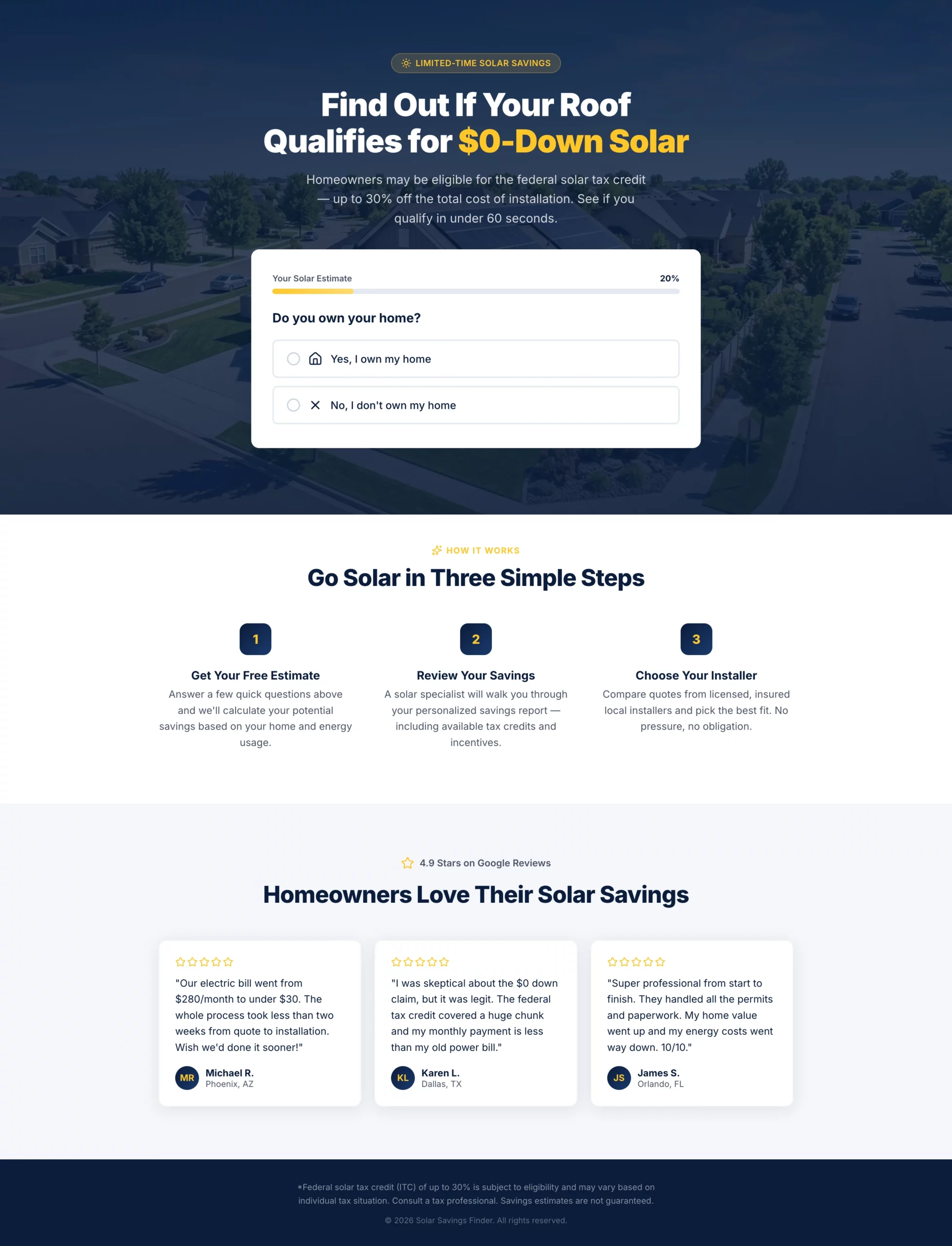
What it does well: The headline leads with the federal tax credit angle without overpromising. The multi-step quiz filters out renters and low-intent visitors before they reach the contact form, so the leads that come through are genuinely qualified. The progress bar keeps completion rates high by making the form feel short even when it is not.
Why it converts: Solar is a considered purchase. Visitors need to feel like they are getting something (a personalized estimate) rather than just filling out a form for a sales call. This page delivers that framing throughout.
What to steal: Use a disqualifying question early in your form. If your offer only works for homeowners, ask about home ownership in step one. Every unqualified lead you filter out saves your sales team time and improves your cost per conversion.
Create a solar lead gen landing page targeting homeowners in US sunbelt states. Hero section: Bold headline "Find Out If Your Roof Qualifies for $0-Down Solar" with a subheadline mentioning the federal tax credit (up to 30%) without overpromising. Background is a clean aerial shot of a suburban home with solar panels. No navigation. Form: Multi-step quiz with progress bar. - Step 1: "Do you own your home?" (Yes / No — if No, show a soft exit message) - Step 2: "What is your average monthly electricity bill?" (dropdown: under $75, $75-$150, $150-$250, $250+) - Step 3: "What type of roof do you have?" (Asphalt shingle, Tile, Metal, Not sure) - Step 4: "What is your zip code?" (text input) - Step 5: Name, phone, email with CTA button "Check My Savings" Below the form: Three trust badges — "No obligation estimate," "Licensed & insured installers," "Federal tax credit available." Below the fold: A short "How it works" section with three steps (Get your estimate, Review your savings, Choose your installer). Then a row of five-star Google reviews with first name, city, and review text. Color scheme: Deep navy and solar yellow. CTA button in yellow with dark text. Mobile-first layout.
2. The Medicare Page That Feels Like Guidance, Not a Sales Pitch
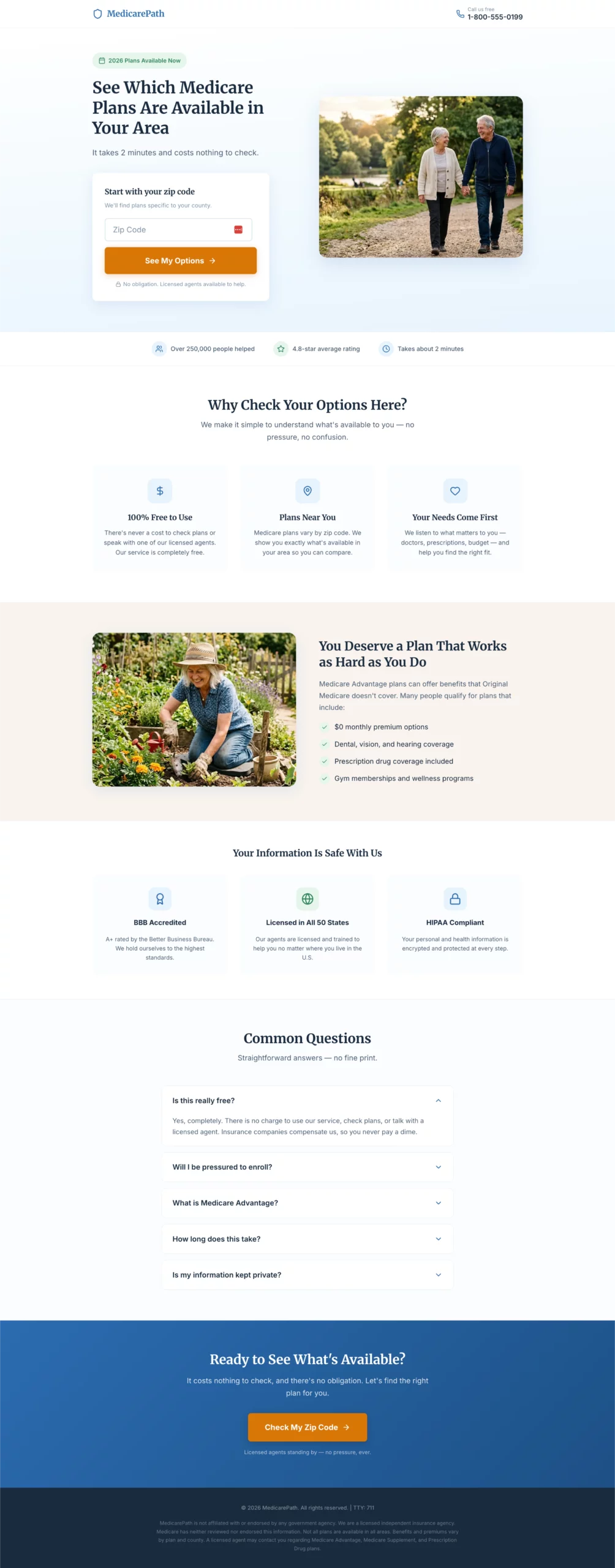
What it does well: Large fonts, plain language, and a warm tone throughout. The page is designed around the audience, not around what looks impressive in a portfolio. Every design decision reduces cognitive load for a visitor who may not be comfortable with complex digital interfaces.
Why it converts: Medicare pages fail when they feel like insurance sales. This one feels like a helpful resource. The entry point is a zip code field with no commitment implied, which keeps the barrier to starting extremely low.
What to steal: Match your page’s reading level and design density to your actual audience. A Medicare page and a SaaS page are selling to completely different people. Design for who is actually landing, not for what you think looks professional.
Create a Medicare Advantage lead gen page targeting adults 64 to 72 years old. Design philosophy: Large, readable fonts (minimum 18px body). Clean and uncluttered. No jargon. Warm and reassuring tone. The page should feel like a helpful resource, not a sales pitch. Hero section: Headline "See Which Medicare Plans Are Available in Your Area." Subheadline: "Free to check. No obligation. Licensed agents ready to help." Hero layout: large warm photo of an active senior couple on the left, form on the right. Form: Single step, all fields visible at once. No multi-step, no quiz. - Zip code - Date of birth (month/year dropdowns) - Name - Phone number - Best time to call (morning / afternoon / evening — dropdown) - CTA button: "Show Me My Options" - Small note below button: "Your information is kept private. We do not sell your data." Trust section directly below the form: BBB accreditation badge, "Licensed in all 50 states," HIPAA compliance note, "100% free service." Below the fold: Three-column benefit section — "No cost to you," "Compare multiple plans," "Local licensed agents." Then a plain-language FAQ: "Is this really free?", "Will I be pressured to enroll?", "What is Medicare Advantage?" Color scheme: Soft blue and white. Minimum 18px body font throughout. No small print above the fold.
3. The Auto Insurance Page That Leads With Savings, Not Coverage
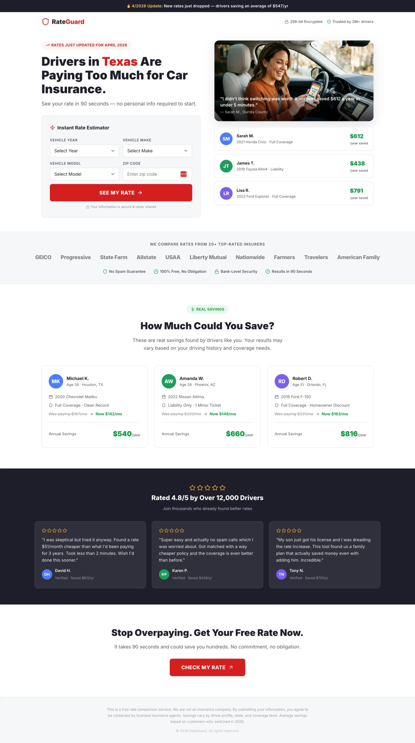
What it does well: The headline speaks to the outcome (save money), not the process (compare quotes). The split hero with example savings amounts on the right gives the visitor a concrete number to anchor to before they even start the form. Step one asks for a zip code only, which is the lowest-friction entry point.
Why it converts: The fake loading screen after form completion (“Searching 20+ insurers…”) is a small detail that pays off. It builds anticipation and signals that something real is happening in the background, which increases perceived value before the visitor lands on the results or redirect page.
What to steal: Show social proof with specific numbers. “Sarah saved $612/year” is more convincing than “customers save hundreds.” Real amounts from real-seeming people create the comparison the visitor is already making in their head.
Create an auto insurance lead gen landing page. The primary angle is savings, not coverage. Hero section: Headline "Drivers in [State] Are Paying Too Much for Car Insurance." Subheadline: "See your rate in 90 seconds — no personal info required to start." Split layout: headline and calculator on the left, a savings graphic showing example amounts (e.g., "Sarah saved $612/year") on the right. Form: Instant rate estimator format. All fields visible above the fold, no steps, no progression. - Vehicle year (dropdown) - Vehicle make (dropdown) - Vehicle model (dropdown) - Zip code - CTA button: "See My Rate" in bold red After clicking CTA, show a loading animation: "Searching 20+ insurers for your best rate..." for 2 seconds, then reveal a contact capture: name, email, phone with a secondary CTA "Show Me My Rates." Trust elements directly below the CTA: Carrier logo strip (20+ insurers), "No spam guarantee," "Free, no obligation," security badge. Below the fold: "How much could you save?" section with three anonymized real-looking savings examples by driver profile. Then a five-star review strip. Color scheme: White background, bold red CTA buttons, dark charcoal text. Fast and clean.
[[city]] and [[region]]. A headline like “Drivers in Texas Are Paying Too Much” updates itself based on the visitor’s location, with no manual setup needed.4. The Legal Page That Sells Eligibility, Not Legal Services
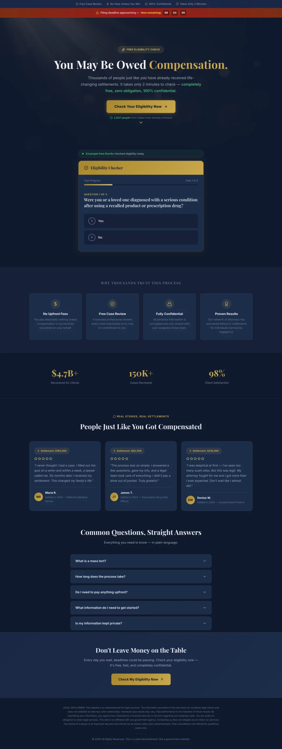
What it does well: The page never mentions lawyers or legal fees above the fold. The entire framing is about eligibility and compensation that the visitor may already be owed. The soft exit for disqualified visitors recovers leads that would otherwise bounce completely.
Why it converts: People in legal situations are not shopping for attorneys. They are looking to find out if they have a case. Answer that question first, and the form submission follows naturally. Pages that lead with law firm credentials consistently underperform pages that lead with “you may qualify.”
What to steal: The soft exit message for disqualified visitors. Instead of losing them, present a secondary CTA: “You may not qualify for this specific claim, but our team can review your situation.” This recovers a percentage of visitors who would otherwise leave with nothing.
Create a mass tort legal lead gen page. The angle is eligibility, not legal services. The visitor should feel like they are checking if they qualify for money they may already be owed, not hiring a lawyer. Hero section: Headline "You May Be Owed Compensation." Subheadline: "Thousands of people affected by [product/drug/event] have received settlements. Find out if you qualify in 2 minutes." Dark background with a professional but approachable feel. No stock photos of courtrooms or gavels. Form: Eligibility quiz format, yes/no questions only until the final step. - Step 1: "Were you or a loved one diagnosed with [condition] after using [product]?" (Yes / No) - Step 2: "Was the diagnosis within the last [X] years?" (Yes / No) - Step 3: "Have you already filed a claim for this?" (Yes / No / Not sure) - Step 4: Name, phone, email. CTA: "Check My Eligibility" If the visitor answers No to Step 1 or 2, show a soft exit message: "Based on your answers, you may not qualify for this claim, but our team can review your situation. Would you like a free consultation anyway?" with a secondary CTA. Trust elements: "Free case review," "No fees unless you win," "Confidential," attorney badge or bar association logo. Below the fold: Short plain-language FAQ: "What is a mass tort?", "How long does it take?", "Do I need to pay anything upfront?" Legal disclaimer at the bottom. Color scheme: Dark navy or charcoal with gold accents.
5. The Roofing Page That Leads With Insurance, Not Replacement
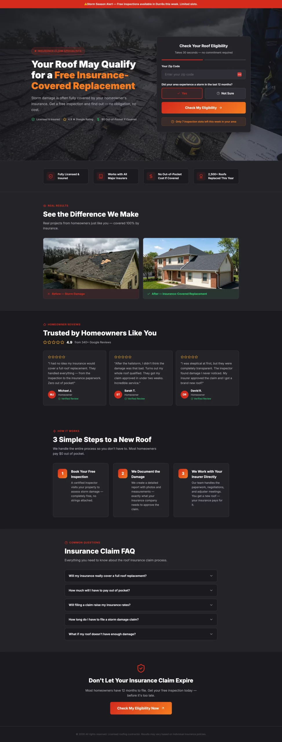
What it does well: Most roofing pages sell roof replacement. This one sells the idea that insurance may already cover it. That reframe changes the visitor’s calculation entirely. Instead of focusing on cost, they are considering whether they are leaving money on the table. The urgency element (limited inspection slots this week) pushes the decision without feeling forced because the scarcity is plausible.
Why it converts: The insurance angle removes the biggest objection in roofing lead gen: price. When the visitor believes their insurer may cover it, cost is no longer the reason not to book an inspection.
What to steal: Identify the single biggest objection your audience has and build the page around removing it, not around your product features. For roofing, the objection is cost. For solar, it is a commitment. Find yours and make it the hero of your page.
Create a roofing lead gen landing page targeting homeowners in storm-affected areas. Angle: Urgency around insurance claims, not just roof replacement. Many homeowners do not know their insurance may cover storm damage. Hero section: Headline "Your Roof May Qualify for a Free Insurance-Covered Replacement." Subheadline: "Storm damage is often fully covered. Get a free inspection and find out." Hero image: close-up of storm-damaged shingles or a roofer inspecting a residential roof. No navigation. Form: Two-step. - Step 1: Zip code + "Did your area experience a storm in the last 12 months?" (Yes / Not sure). CTA: "Check My Eligibility" - Step 2: Full form — name, address, phone, best time for inspection (morning / afternoon / weekend). CTA: "Book My Free Inspection" Urgency element: "We have [X] inspection slots available this week in your area." Trust elements: Before/after roof photos, Google review strip with star ratings, "Licensed & insured," "Works with all major insurance providers," "No out-of-pocket cost if covered." Below the fold: Three-step process — "1. Book your free inspection. 2. We document the damage. 3. We work with your insurer directly." Then a short FAQ on the insurance claim process. Color scheme: Dark charcoal and red or orange. Mobile-first.
6. The HVAC Page That Uses Seasonal Urgency Without Feeling Pushy
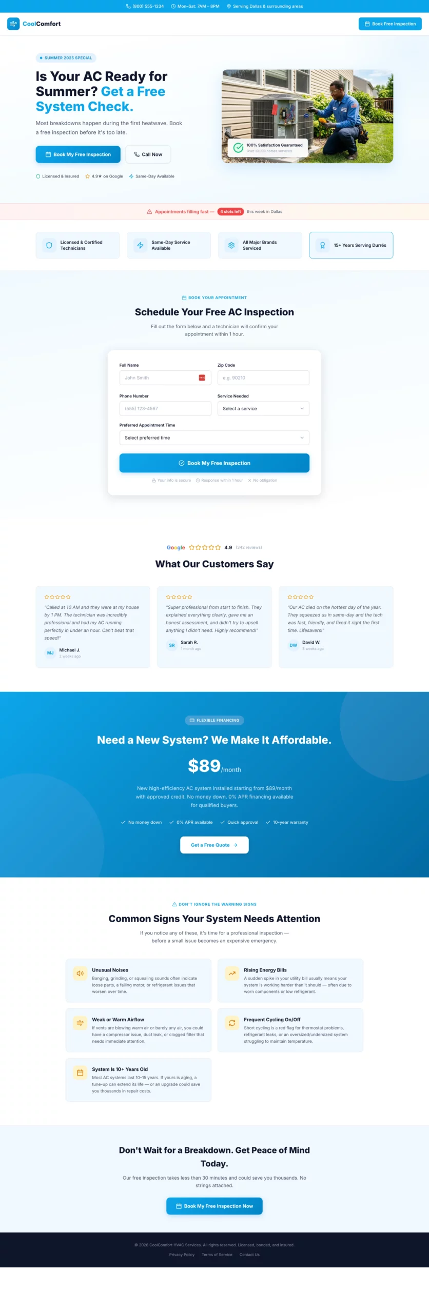
What it does well: The seasonal angle (“most breakdowns happen during the first heatwave”) creates urgency that feels logical rather than manufactured. The financing section below the fold is well-placed: it addresses the cost objection without leading with it, keeping the above-the-fold experience clean and benefit-focused.
Why it converts: HVAC purchases are reactive. People book when they are worried something will break, not when they think they might save money. This page activates that worry early and positions the inspection as cheap insurance against a bigger problem.
What to steal: Frame your offer as prevention, not purchase. “Book before the season hits” converts better than “get a new system” in any service vertical where the pain of inaction outweighs the cost of the service.
Create an HVAC lead gen landing page. Angle varies by season — use summer framing (AC repair/replacement) or winter framing (heating tune-up/emergency repair).
Hero section: Headline "Is Your AC Ready for Summer? Get a Free System Check." Subheadline: "Most breakdowns happen during the first heatwave. Book a free inspection before it's too late." Split layout: headline and CTA on the left, photo of a technician working on an outdoor AC unit on the right.
Form: Single step to keep friction low for a service booking.
- Name, zip code, phone, service type (AC tune-up, AC repair, new installation, not sure), preferred appointment time (morning / afternoon / first available). CTA: "Book My Free Inspection"
Urgency element: "Appointments filling fast — [X] slots left this week in your area."
Trust elements: "Licensed & certified technicians," "Same-day service available," "All major brands serviced," five-star Google review strip with quotes mentioning speed and professionalism.
Below the fold: Financing offer section ("New system from $X/month with approved credit"). Then a "Common signs your system needs attention" section with four to five bullet points.
Color scheme: Sky blue and white for summer. Deep orange and dark grey for winter. Clean and professional.
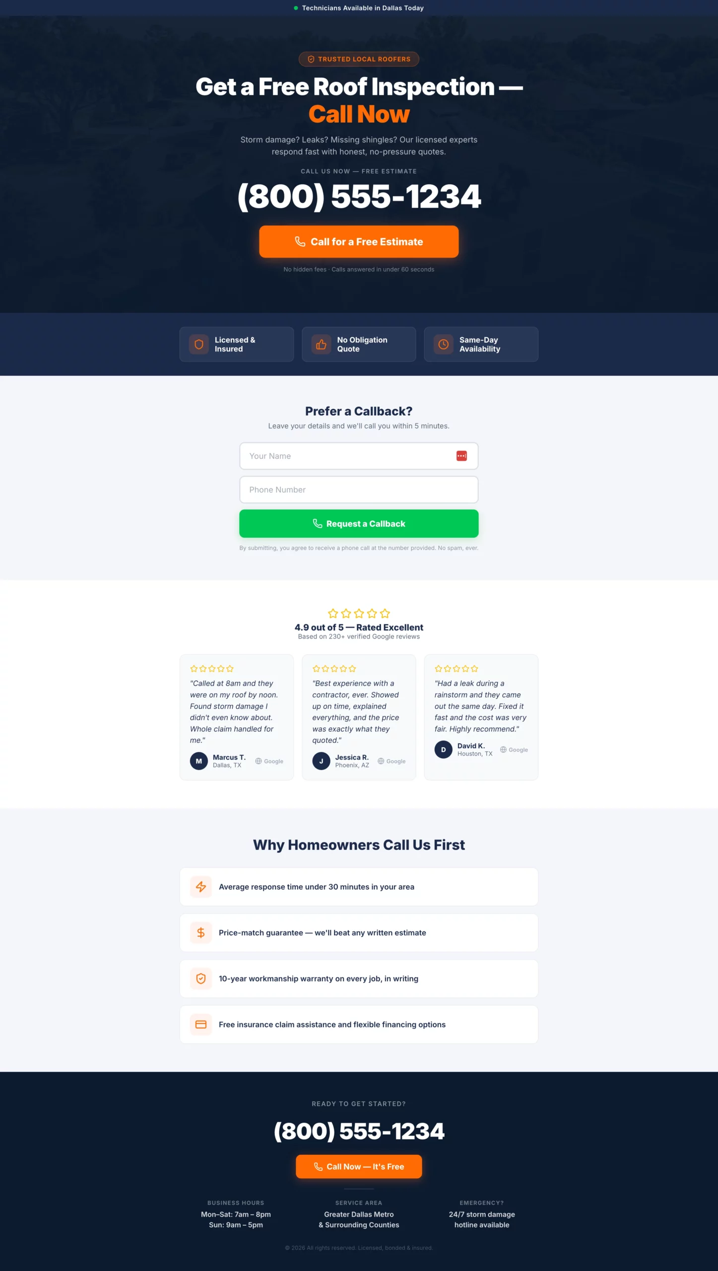
7. The Emergency Plumbing Page With One Job: Get the Phone to Ring
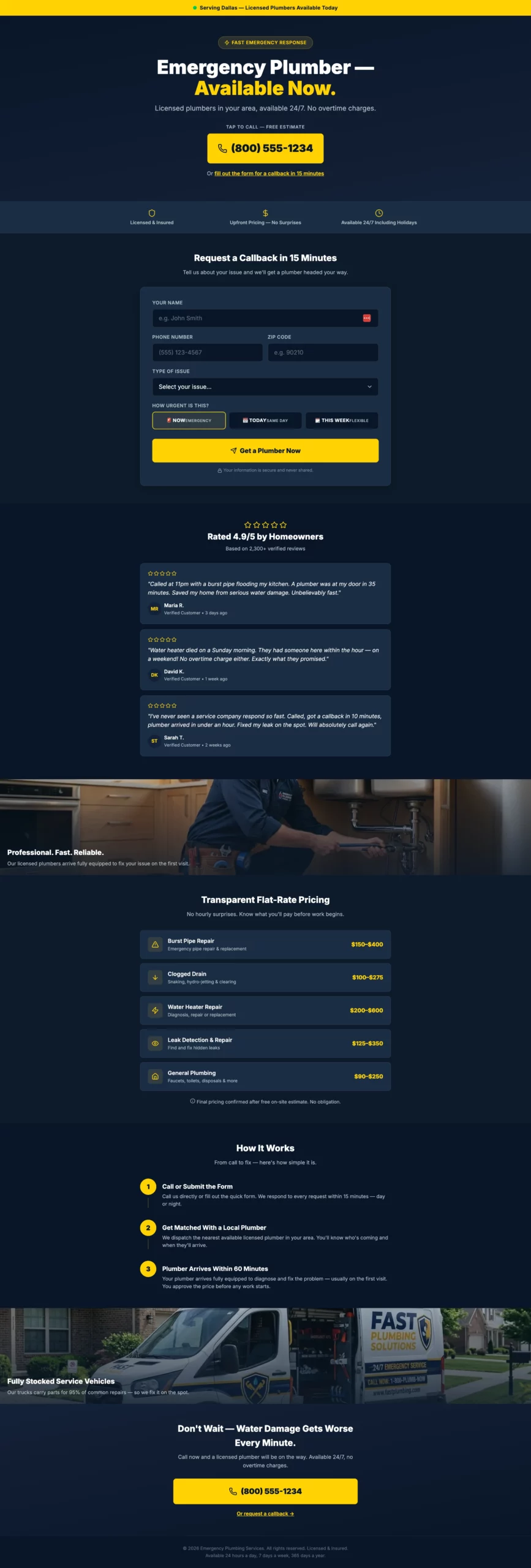
What it does well: The phone number is the hero element. Not the headline, not the logo, not a hero image. The number. Everything else on the page exists to support that one action. The secondary form path (callback in 15 minutes) captures visitors who hesitate to call but are still interested.
Why it converts: Emergency plumbing traffic is among the highest-intent traffic in any vertical. The visitor has an active problem right now. The job of the page is not to sell them, it is to get out of their way and make calling as fast as possible.
What to steal: The dual CTA structure. A primary CTA (call now) for hot visitors and a secondary CTA (callback form) for warm ones. You capture both without cluttering the page or diluting the primary action.
Create a plumbing lead gen page targeting homeowners with urgent plumbing issues. Angle: Emergency response speed. The visitor has a problem right now and needs confidence that help is coming fast. Hero section: Headline "Emergency Plumber — Available Now." Subheadline: "Licensed plumbers in your area, available 24/7. No overtime charges." Large click-to-call phone number directly below the headline. Secondary CTA below the number: "Or fill out the form for a callback in 15 minutes." Form (secondary path): Name, phone, zip code, issue type (burst pipe, clogged drain, water heater, leak, other), urgency (emergency now / today / this week). CTA: "Get a Plumber Now." Trust elements: "Licensed & insured," "Upfront pricing — no surprises," "Available 24/7 including holidays," five-star review strip with quotes specifically mentioning fast response times. Above the fold, include a small banner: "Serving [City/Region] — Plumbers available today." Below the fold: Service list with flat-rate pricing ranges for common jobs. Then a "How it works" section: Call or submit, get matched with a local plumber, plumber arrives within [X] hours. Color scheme: Dark navy and bright yellow. Mobile-first — most visitors will be on a phone with an active leak.
8. The Debt Page That Opens With Relief, Not Shame
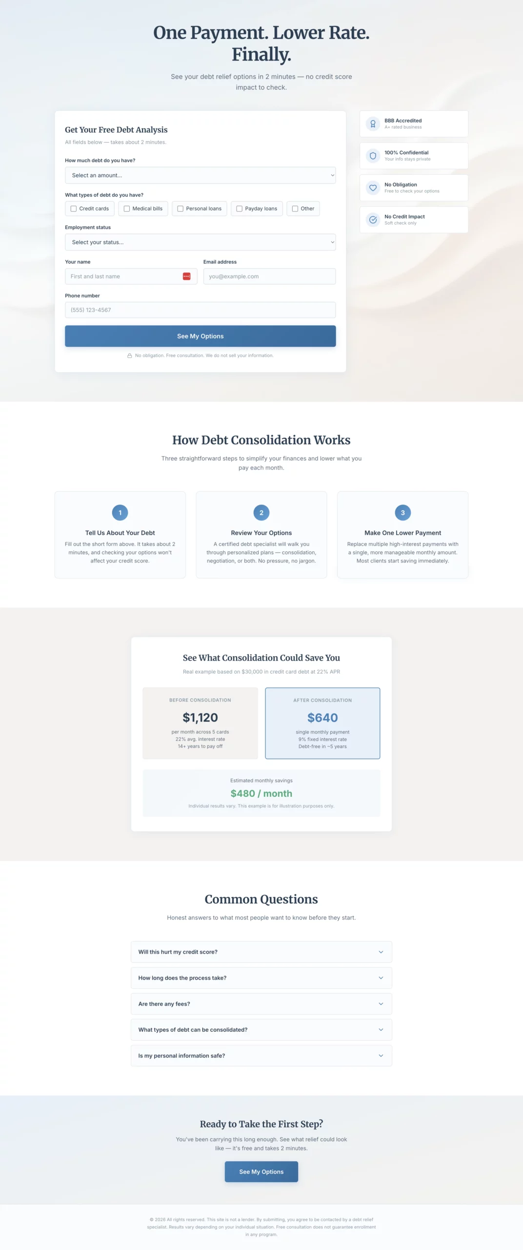
What it does well: The headline is benefit-first and emotionally resonant. “One Payment. Lower Rate. Finally.” speaks directly to how the visitor feels, not what the product does. There is no red anywhere on the page, which is a deliberate choice: red signals alarm, and this audience is already stressed enough.
Why it converts: Debt is an emotional topic. Visitors in this situation are not looking for financial education. They are looking for a way out. Copy that acknowledges the emotional state before presenting the solution consistently outperforms copy that leads with product mechanics.
What to steal: Color psychology in context. Calm blue and warm grey are not just aesthetic choices here. They are conversion choices. For any high-stress vertical, your color palette is part of your message match.
Create a debt consolidation lead gen page. The emotional angle is relief and control, not shame. The visitor is already stressed. The page should feel like a lifeline, not a judgment. Hero section: Headline "One Payment. Lower Rate. Finally." Subheadline: "See your debt relief options in 2 minutes — no credit score impact to check." Soft, warm abstract visual. No navigation. Form: Single page, all fields visible at once. No steps, no quiz. Layout should feel calm and approachable, not overwhelming. - Debt amount (dropdown: under $10k, $10k-$20k, $20k-$40k, $40k-$75k, $75k+) - Debt types (checkboxes: Credit cards, Medical bills, Personal loans, Payday loans, Other) - Employment status (dropdown: Full-time, Part-time, Self-employed, Not currently employed) - Name - Email - Phone - CTA button: "See My Options" - Small note below: "No obligation. Free consultation. We do not sell your information." If debt amount is under $10k, show an inline note after selection: "Our programs work best for $10,000 or more. You may still qualify — submit to find out." Trust elements beside the form: BBB accreditation, "Confidential," "No obligation consultation," "Does not affect your credit score." Below the fold: "How debt consolidation works" in three plain steps. A concrete savings example. FAQ covering credit score impact, timeline, fees. Color scheme: Soft blue, white, warm grey. No red anywhere.
9. The Life Insurance Page That Removes the Biggest Objection Upfront
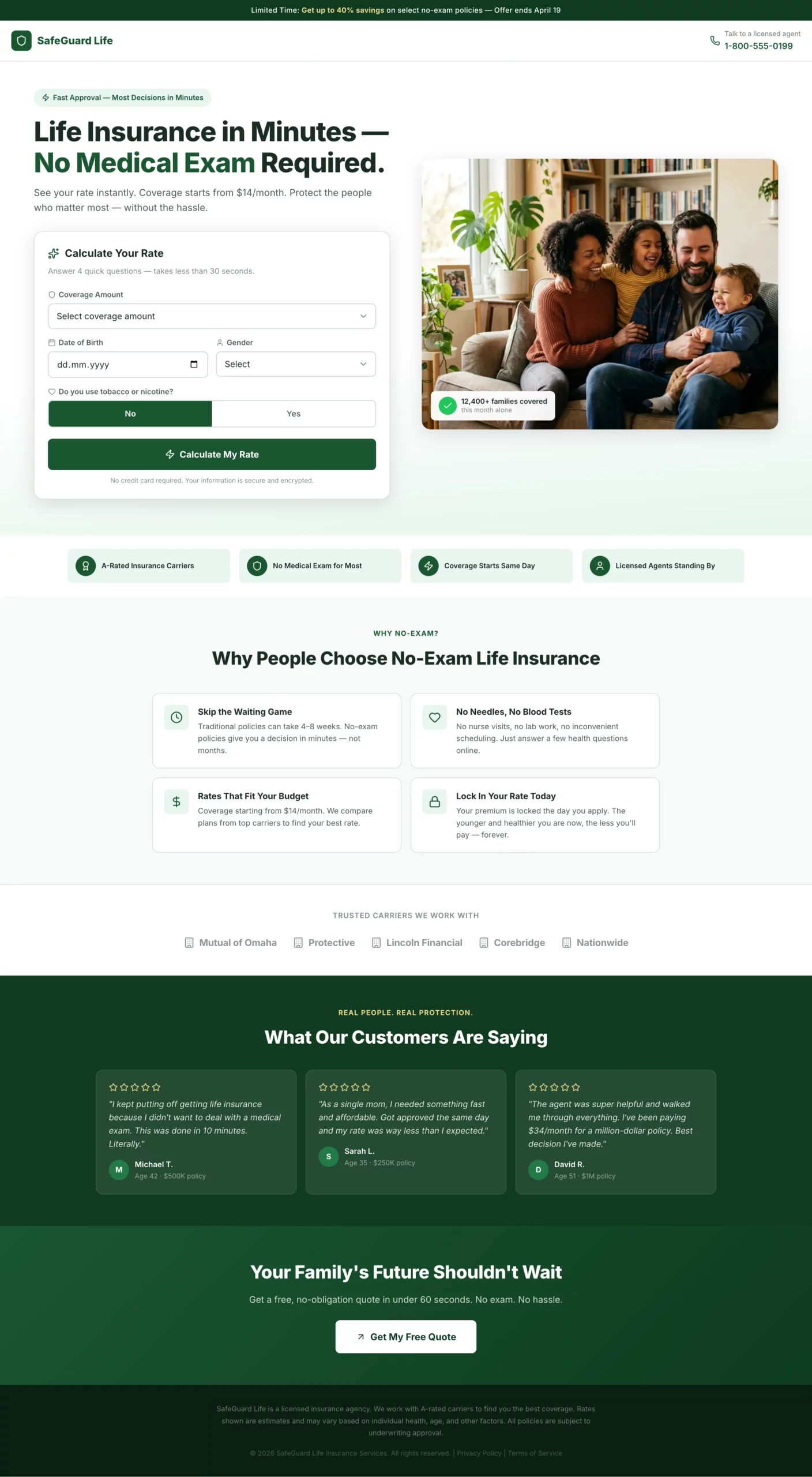
What it does well: “No medical exam required” is the headline hook, not the product name. The page leads with the thing that historically stops people from applying for life insurance, removes it immediately, and then collects data progressively across six steps. The results screen at the end, which shows a monthly rate estimate, makes the visitor feel like they got something before committing to a call with an agent.
Why it converts: The perceived effort required to obtain life insurance is the primary conversion barrier. This page addresses that perception in the first sentence and never lets it creep back in. Every step is framed around “finding your best rate” rather than “giving us your information.”
What to steal: Frame your form fields around the visitor’s benefit. “Height and weight to find your best rate” converts better than just asking for height and weight. The reframe costs nothing and removes friction at the step where most visitors drop off.
Create a life insurance lead gen page targeting adults 30 to 60 years old. Angle: fast approval, no medical exam required. Hero section: Headline "Life Insurance in Minutes — No Medical Exam Required." Subheadline: "See your rate instantly. Coverage starts from $X/month." Clean split layout: headline and rate calculator on the left, warm family photo (not staged stock) on the right. Form: Instant rate calculator format. All fields visible at once above the fold, framed as "calculate your rate" not "fill out a form." - Coverage amount (slider or dropdown: $100k, $250k, $500k, $1M+) - Date of birth - Gender (Male / Female / Prefer not to say) - Smoker? (Yes / No toggle) - CTA button: "Calculate My Rate" After clicking CTA, show an instant rate estimate on the same page (e.g., "Your estimated rate: from $X/month"). Below the estimate, show a contact capture: name, email, phone with CTA "Lock In My Rate." Trust elements below the calculator: "A-rated carriers," "No medical exam for most applicants," "Coverage starts same day," licensed agent badge. Below the fold: "Why people choose no-exam life insurance" — four short bullets. Carrier logo strip. Five-star review strip with quotes about ease and speed. Color scheme: Deep green and white. Clean, confident, trustworthy. Mobile-first.
10. The Pay Per Call Page That Makes Calling the Only Logical Next Step
What it does well: The phone number is in a 48px font. That is not a coincidence. Every other element on the page is subordinate to that number. The secondary form path captures warm visitors who want help but are not ready to call immediately, without cluttering the primary conversion path.
Why it converts: Pay-per-call traffic arrives with high intent and a short attention span. The page has one job: to make calling the path of least resistance. Any element that does not serve that job is a conversion leak.
What to steal: If you are running pay-per-call on mobile, make your click-to-call button a full-width tap target. The difference in tap accuracy between a full-width button and a centered narrow button is measurable in conversion rate.
Create a pay per call landing page for a high-intent service vertical (home services, insurance, legal — adapt as needed). Design philosophy: This page has one job. Get the phone to ring. Every design decision should serve that goal. Hero section: Service-specific headline in large type. Example: "Get a Free Roof Inspection — Call Now." Directly below: phone number in the largest font on the page (minimum 48px on desktop, full-width tap target on mobile). Below the number: a single click-to-call button with high-contrast color. CTA text: "Call for a Free Estimate." Below the hero: Three trust bullets in icon + text format. Examples: "Licensed & insured," "No obligation," "Same-day availability." Keep each to five words maximum. Secondary conversion path: A simple two-field form below the trust bullets — name and phone number only. CTA: "Request a Callback." No email field. Below the fold: Five-star Google review strip with three reviews, first name and city only. Then a short "Why call us" section with three to four one-line bullet points. Footer: Phone number repeated in large text. Business hours. Service area. Color scheme: Dark header with high-contrast CTA. Mobile is the primary design target.
11. The Home Decor Pre-Lander That Trades a Quiz for an Email
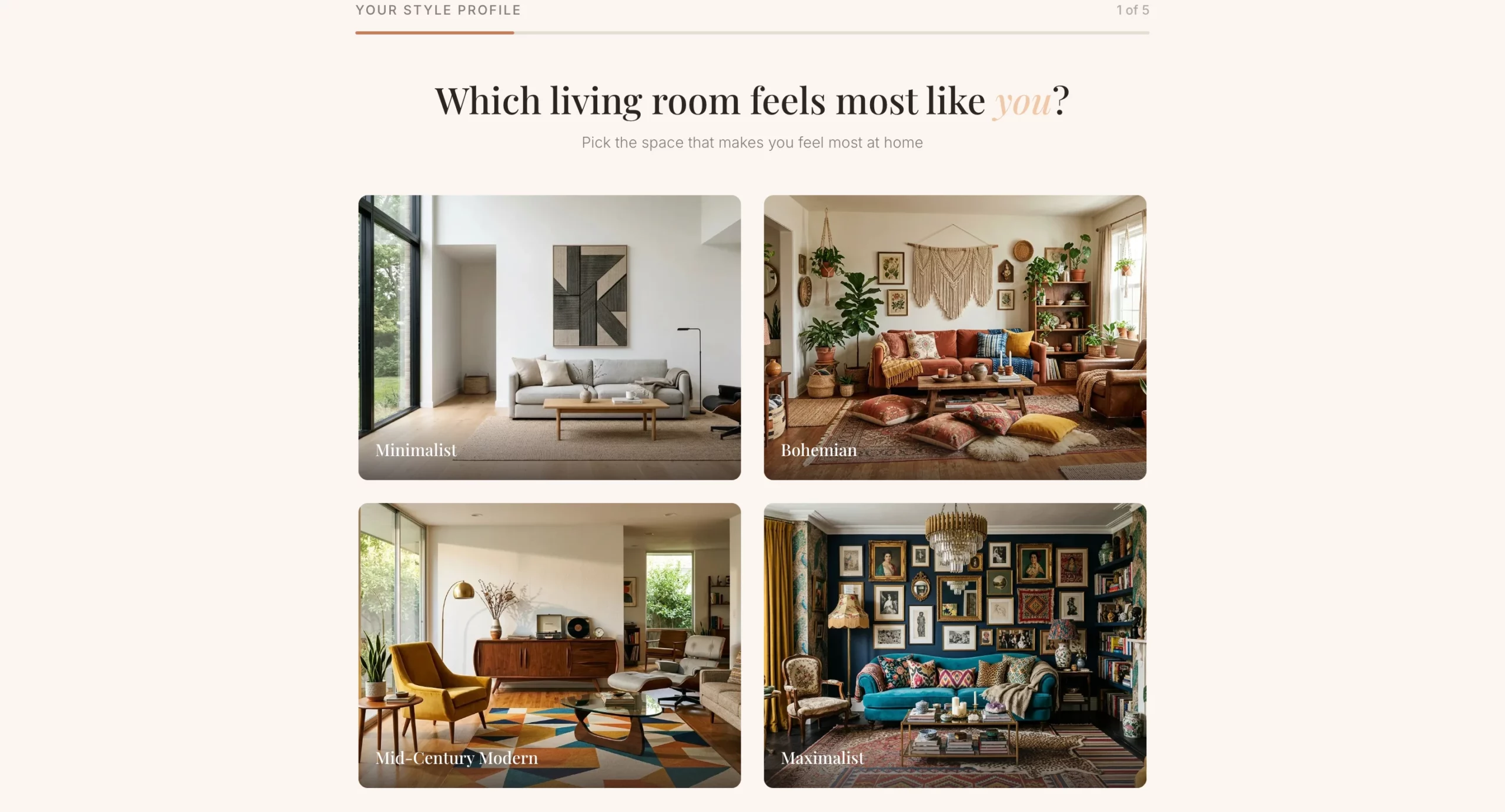
What it does well: The email gate appears after the quiz, not before. By the time the visitor reaches the results screen, they have already invested time and are genuinely curious about their style result. That investment dramatically increases the percentage who hand over their email compared to a cold opt-in form.
Why it converts: Personalization is the conversion mechanism here. The visitor is not providing their email address to receive the newsletter. They are giving you their email to get their personalized mood board. That framing changes the transaction entirely.
What to steal: The post-quiz offer. Instead of ending at the results screen, use it as a natural handoff to a discount or product collection. The visitor is in a positive, engaged state at that moment, which makes it the best time to present an offer.
Create a home decor lead gen pre-lander using a style quiz format. The goal is to capture an email before sending the visitor to a product collection or offer page.
Angle: Personalization. The visitor discovers their design style and gets curated recommendations in exchange for their email.
Hero section: Headline "What's Your Home Design Style?" Subheadline: "Take our 60-second quiz and get a free personalized mood board + exclusive discount." Clean, editorial layout. High-quality lifestyle imagery of a beautifully decorated living room. No navigation.
Quiz flow (one question per screen with visual answer options where possible):
- Q1: "Which living room feels most like you?" (four image options: minimalist, bohemian, mid-century modern, maximalist)
- Q2: "What is your go-to color palette?" (four color swatches with labels)
- Q3: "Which material do you love most?" (Wood / Marble / Linen / Metal)
- Q4: "What is your biggest decorating challenge?" (Small space, No cohesive style, On a budget, Starting from scratch)
- Q5: "Where should we send your personalized mood board?" (Name + email field). CTA: "Show My Results"
Results page: Show a style name ("Your style is Modern Bohemian") with a description and three to four curated product recommendations. Include a discount code for first purchase.
Color scheme: Warm neutrals — cream, terracotta, warm grey. Editorial and aspirational feel.
12. The Home Renovation Page That Captures Visitors Who Are Still Planning
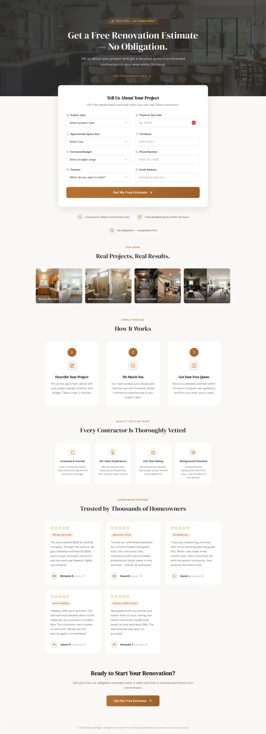
What it does well: The form includes a timeline question and handles the “just researching” answer with a nurture path instead of a dead end. Most lead gen pages treat early-stage visitors as low value. This one captures them with a planning guide offer and follows up when they are ready, which means no lead is left on the table.
Why it converts: Home renovation is a long consideration cycle. Most visitors are not ready to book a contractor the day they land on your page. A page that only converts ready-to-book visitors is leaving a significant percentage of its traffic unconverted. The nurture path recovers those visitors.
What to steal: Add a timeline question to any form where purchase intent varies widely. Then build different follow-up paths for each answer. The data also helps you prioritize your sales team’s time on hot leads.
Create a home renovation lead gen page targeting homeowners planning a major renovation project (kitchen, bathroom, basement, full home). Angle: Free project estimate with no commitment. The visitor is in the planning phase and shopping around. Hero section: Headline "Get a Free Renovation Estimate — No Obligation." Subheadline: "Tell us about your project and get a detailed quote from licensed contractors in your area within 24 hours." Hero image: beautiful renovated kitchen or bathroom. No navigation. Form: Single page, all fields visible at once. Clean two-column layout so it does not feel long. Left column: - Project type (dropdown: Kitchen, Bathroom, Basement, Addition, Full home, Other) - Approximate space size (dropdown: Under 100 sq ft, 100-300 sq ft, 300-500 sq ft, 500+ sq ft, Not sure) - Estimated budget (dropdown: Under $10k, $10k-$30k, $30k-$75k, $75k-$150k, $150k+, Not sure yet) - Timeline (dropdown: ASAP, 1-3 months, 3-6 months, Just researching) Right column: - Property zip code - Name - Phone - Email - CTA button: "Get My Free Estimate" (full width, spans both columns) If Timeline is "Just researching," show an inline note: "No problem — we will send you a free planning guide and follow up when you are ready." Trust elements below the form: "Licensed & vetted contractors only," "Free detailed quote within 24 hours," "No obligation," portfolio image strip of before/after projects. Below the fold: "How it works" in three steps. Contractor vetting badges. Five-star reviews with project types mentioned. Color scheme: Warm white, charcoal, muted brass or terracotta accent. Premium but approachable.
13. The Health Advertorial That Reads Like an Article, Not an Ad
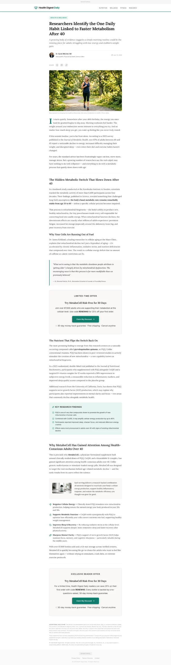
What it does well: The publication-style header and author byline do the heavy lifting on credibility before the visitor reads a single word of copy. The product is introduced at the natural midpoint of the content, after the problem has been thoroughly built.
By that point, the reader is already nodding along, and the product introduction feels like a recommendation, not a pitch.
Why it converts: Advertorial pages bypass the instinctive ad-skepticism most people bring to landing pages. The visitor is in reading mode, not evaluation mode. That shift in mental state is worth more than almost any headline or offer change you could make to a standard page.
What to steal: The mid-page CTA placement. Do not wait until the bottom to present your offer. Place a CTA after the problem is established and before the solution is fully explained. That is the highest-intent moment in the content flow.
Create a health advertorial landing page in a news article format to warm up cold paid social traffic before sending to a product offer page.
Format: Styled to look like an editorial health article. Include a publication-style header with a credible outlet name (e.g., "Health Digest Daily"), a category tag ("Health & Wellness"), a byline with a named author and credentials, and a publish date.
Headline: Curiosity-gap or discovery angle. Example: "Researchers Identify the One Daily Habit Linked to Faster Metabolism After 40."
Opening hook: Two to three paragraphs describing a relatable problem (low energy, stubborn weight, poor sleep) in conversational, empathetic language. No product mention yet.
Middle section: Introduce a discovery tied to a specific mechanism (a nutrient, a habit, a compound). Include a pull quote styled like a researcher or doctor statement. Use subheadings to break up content. 400 to 600 words total for this section.
Product introduction: Natural transition — "This is why [product name] has gained attention among health-conscious adults over 40." One paragraph introducing the product, followed by three to four benefit bullets.
CTA block: "Try [Product] Risk-Free for 30 Days." Include a discount or limited offer. CTA button: "Claim My Discount."
Second CTA block mid-page after the pull quote.
Footer: "Advertorial" disclosure at top and bottom. Standard legal disclaimer about results.
Color scheme: Clean white, editorial black text, one accent color matching the product brand. Should feel like content, not an ad.
14. The Finance Advertorial That Opens With a Story, Not a Product
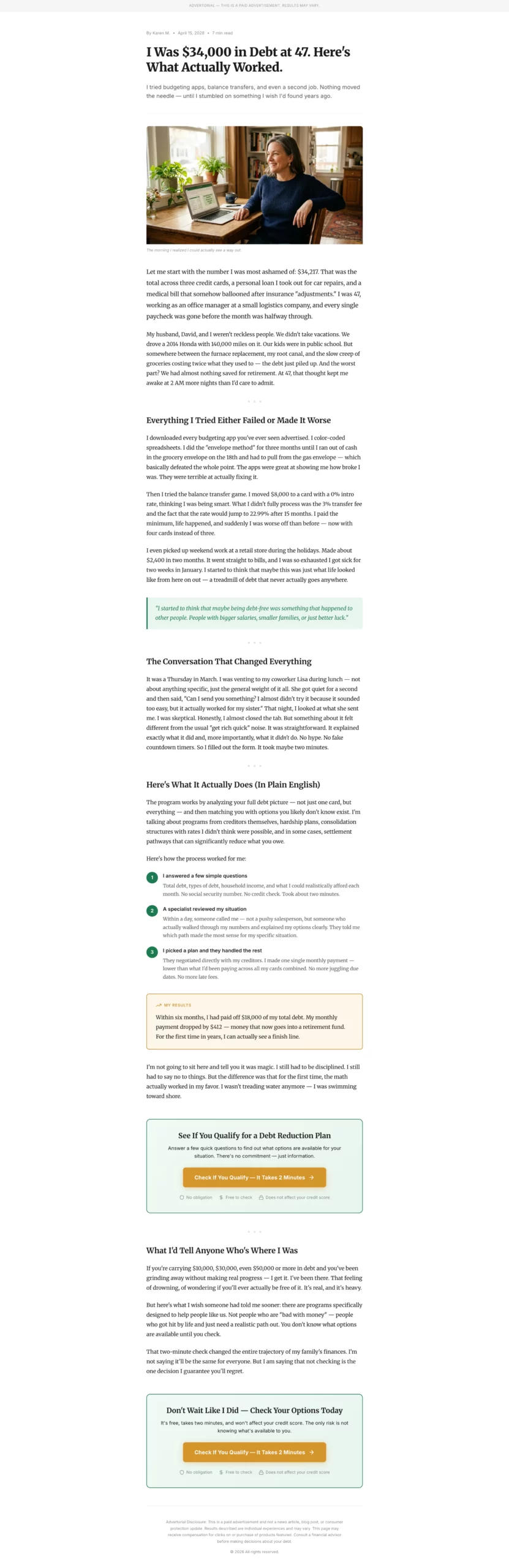
What it does well: Specific numbers in the opening (debt amount, age, job type) create credibility without requiring proof. “I was $34,000 in debt at 47” is more believable than “I was deeply in debt.” The problem build section, where the narrator tries and fails with conventional advice, is where the reader emotionally commits. By the time the solution appears, the reader is rooting for the narrator.
Why it converts: Financial advertorials outperform standard pages for debt and credit offers because the audience is emotionally activated. They are not looking for a product. They are looking for permission to believe a solution exists. A story that mirrors their experience gives them that permission.
What to steal: The “tried and failed” paragraph. Before introducing your solution, acknowledge what the reader has already tried. This signals that you understand their situation and differentiates your solution from what they have already dismissed.
Create a personal finance advertorial landing page in a first-person story format. Target audience: adults 35 to 55 dealing with debt, savings shortfall, or retirement anxiety. Format: Personal essay style, not news article. Written in first person as a relatable narrator who discovered a solution to a financial problem. Headline: Story-hook format. Example: "I Was $34,000 in Debt at 47. Here Is What Actually Worked." Opening: Two paragraphs establishing the narrator's situation. Specific details (debt amount, age, job type) make it credible. Conversational, honest tone. Problem build: Two to three paragraphs describing the frustration of trying and failing with conventional advice (budgeting apps, balance transfers, etc.). Turning point: One paragraph introducing the discovery. Keep it vague enough to create curiosity. Solution section: Explain the mechanism or service in plain language. Use a numbered list or short paragraphs. Include a concrete result: "Within six months, I had paid off $18,000 and my monthly payment dropped by $400." CTA block: "Check If You Qualify — It Takes 2 Minutes." Frame it as checking eligibility, not signing up. CTA button in a contrasting color. Trust elements: "No obligation," "Free to check," "Does not affect your credit score." Second CTA at the bottom. Disclosure: "This is a paid advertisement. Results may vary." at top and bottom. Color scheme: Clean white background, dark readable text, one warm accent color (green or gold). Reads like a blog post.
15. The Home Services Advertorial That Educates Before It Asks
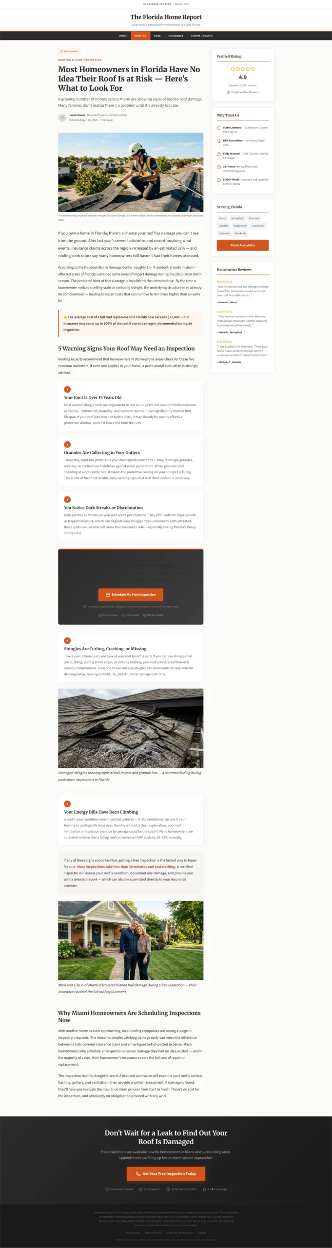
What it does well: The warning-style headline creates problem awareness in visitors who may not have been actively shopping for a service. The listicle format (5 signs your roof may need inspection) educates and qualifies simultaneously. By the time the visitor reaches the CTA, they have self-identified as someone with the problem your service solves.
Why it converts: Problem-unaware traffic is the hardest to convert with a standard landing page because the visitor does not yet know they need what you are selling. An educational advertorial moves them from unaware to aware within the page itself, making the CTA feel like a natural next step rather than an interruption.
What to steal: The embedded CTA after item three in a listicle. Do not wait until the end of the content to present your offer. Visitors who are already nodding along at item three are at peak receptiveness. That is where you put the button.
Create a home services advertorial landing page targeting homeowners who may not know they have a problem. Best used for roofing, HVAC, plumbing, or pest control verticals. Format: Educational article style with a warning or discovery headline. Headline example: "Most Homeowners in [State] Have No Idea Their Roof Is at Risk — Here Is What to Look For." Opening: Two paragraphs establishing the scope of the problem using real-feeling statistics or seasonal context. "After last year's hailstorms, insurance claims in [region] increased by X%." Conversational but informative tone. Middle section: List format — "5 Signs Your Roof May Need Inspection." Each sign is two to three sentences with a practical description. This educates the reader and qualifies them simultaneously. Transition: "If any of these sound familiar, getting a free inspection is the fastest way to know for sure. Most inspections take less than 30 minutes and cost nothing." CTA block after sign number 3: "Book a Free Roof Inspection in Your Area." Include a note: "Licensed inspectors. No obligation. Most insurers cover the cost of damage found." Second CTA at the bottom of the page. Trust elements: Contractor license badges, Google rating, "Serving [City/Region]." Footer: Disclosure that this is a sponsored post. Standard legal language. Color scheme: Clean white, charcoal text, one warm accent (orange or red). Feels like helpful local journalism.
16. The SaaS Free Trial Page With Zero Hesitation
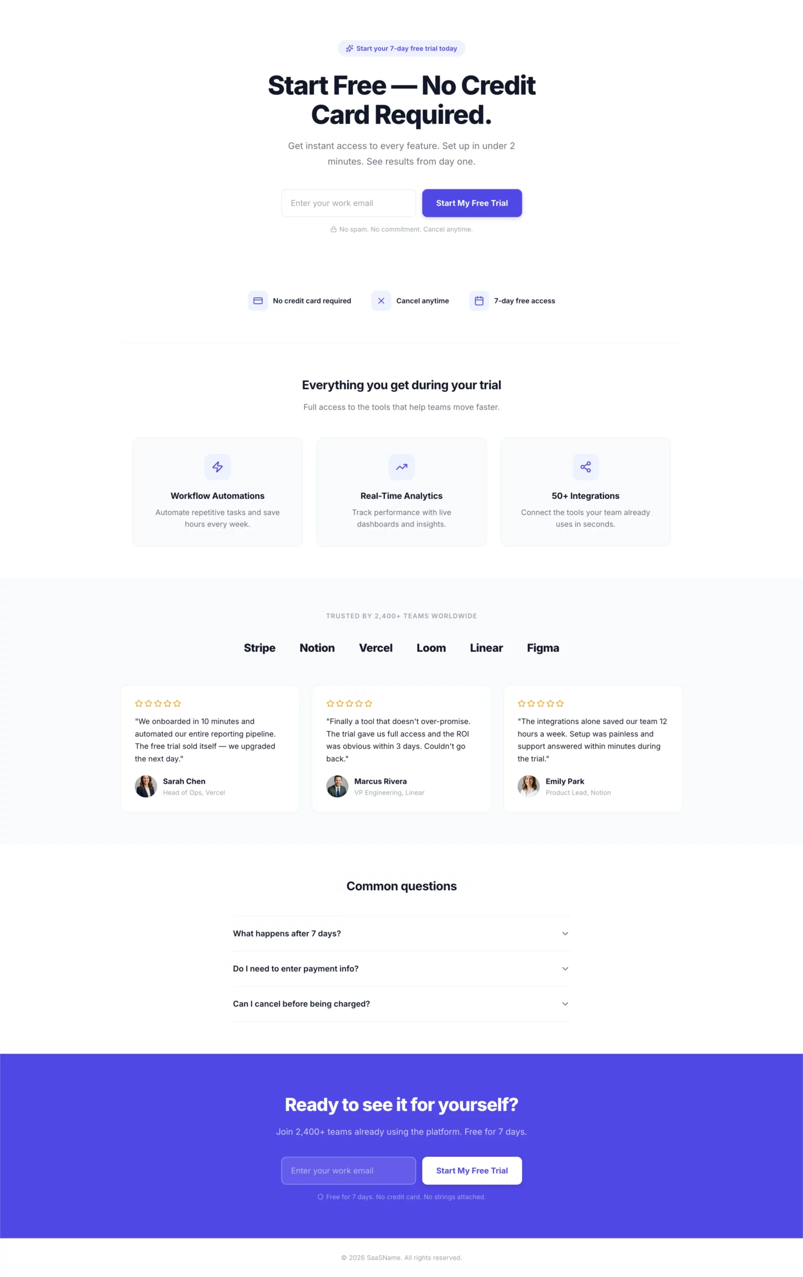
What it does well: One field. One button. The headline and CTA match the ad exactly. “Start free, no credit card required” removes the two biggest objections in a single line. There is nothing else to decide on this page.
Why it converts: The visitor clicked for a free trial. The page confirms a free trial. The only step is entering an email. Every additional field, every navigation link, every secondary offer is a decision point that costs you conversions. This page has none of those.
What to steal: The trust icons below the form. “No credit card, cancel anytime, 7-day free access” answers the three questions every free trial visitor is silently asking before they type their email. Put the answers right there.
Create a SaaS free trial landing page. Hero section: Headline "Start Free — No Credit Card Required." Single email input field with a bold CTA button: "Start My Free Trial." Clean white layout with one bold accent color. No navigation. Below the form: Three trust icons in a horizontal row. - Icon 1: "No credit card required" - Icon 2: "Cancel anytime" - Icon 3: "7-day free access" Below the trust icons: Three-column feature highlights showing what the visitor gets access to during the trial. Keep each to one line of copy. Below the fold: Social proof section — logos of recognizable companies using the product, or a testimonial strip with headshots, names, and company names. FAQ section: Three questions addressing common hesitations — "What happens after 7 days?", "Do I need to enter payment info?", "Can I cancel before being charged?" Footer CTA: Repeat the email form and button. Color scheme: Clean white background, one bold accent color for CTA and highlights. Minimal. Fast. No distractions.
17. BONUS: The Health Quiz Funnel That Gates the Results Behind an Email
What it does well: The email gate comes at the results screen, not at the entry point. By the time the visitor reaches it, they have already answered six questions and are genuinely curious about their result. That investment makes them far more likely to hand over an email than a cold opt-in would. The commitment question at the end also pre-qualifies lead quality before they hit your follow-up sequence.
Why it converts: Quiz funnels consistently outperform standard lead gen forms for cold traffic because they build engagement before asking for anything. The visitor is doing something (answering questions) rather than being asked to give something (their contact info). That shift changes the conversion dynamic entirely.
What to steal: The commitment question as a final pre-qualifier. It does not affect form completion rate but gives your follow-up team a signal about which leads to prioritize. “Very committed” respondents are a different sales conversation than “just exploring.”
Step 1: Build the landing page in LanderLab
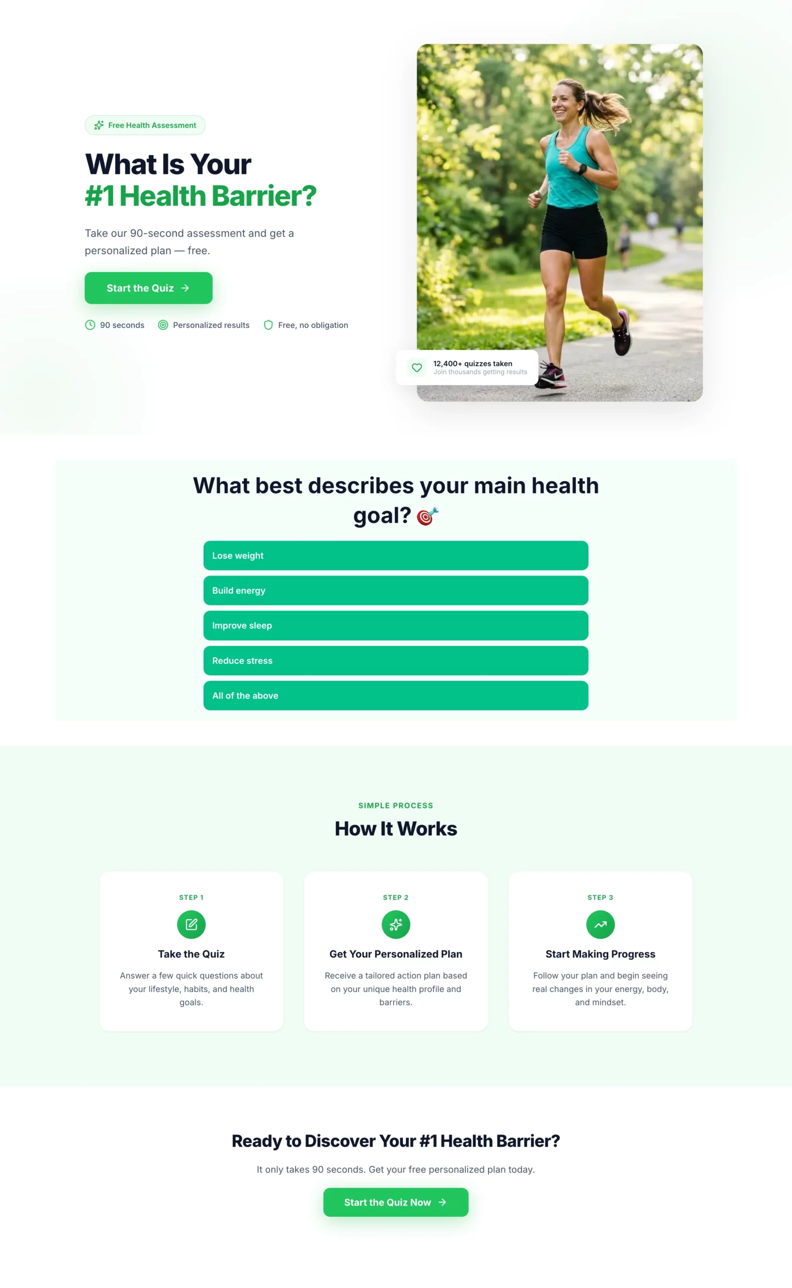
Create a landing page for a health and wellness quiz funnel. This page introduces the quiz and gets the visitor to click through to it. Hero section: Headline "What Is Your #1 Health Barrier?" Subheadline: "Take our 90-second assessment and get a personalized plan — free." Single CTA button: "Start the Quiz." Clean, energetic design with a motivating health-focused visual. No navigation. Below the CTA: Three short trust bullets — "90 seconds," "Personalized results," "Free, no obligation." Below the fold: Brief "how it works" section — Take the quiz, Get your personalized plan, Start making progress. Keep it to three steps with icons. Color scheme: Bright and motivating. Greens and whites. Bold CTA button.
Step 2: Build the quiz in LanderLab’s quiz builder
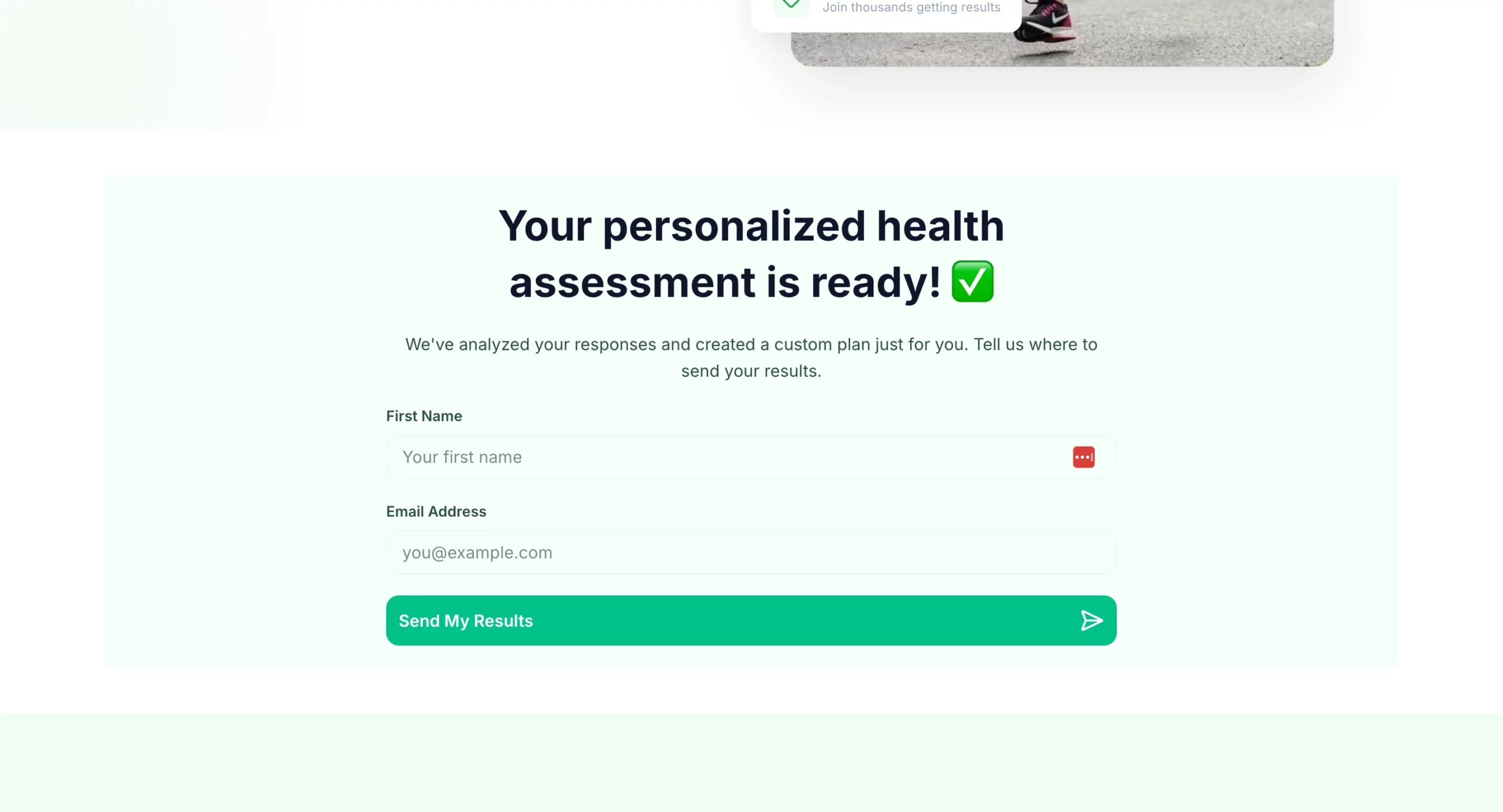
Create a health and wellness quiz funnel that qualifies visitors and captures an email before showing results. Quiz questions (one per screen, progress bar throughout): - Q1: "What best describes your main health goal?" (Lose weight, Build energy, Improve sleep, Reduce stress, All of the above) - Q2: "How would you describe your current diet?" (Mostly healthy, Hit or miss, Could be better, Pretty poor) - Q3: "How often do you exercise?" (Daily, 3-4x per week, 1-2x per week, Rarely, Never) - Q4: "How many hours of sleep do you get on average?" (Under 5, 5-6, 7-8, More than 8) - Q5: "What has held you back from reaching your health goals?" (No time, No motivation, Tried and failed, Not sure where to start, Cost) - Q6: "How committed are you to making a change in the next 30 days?" (Very committed, Somewhat, Just exploring) Results gate: "Your personalized health assessment is ready. Where should we send it?" Name + email field. CTA: "Send My Results." Results page: Personalized summary based on quiz answers. Transition into offer: free consultation, product recommendation, or program signup. CTA above the fold on results page. Design: Bright and motivating. Progress bar visible throughout. Mobile-first. One question per screen with large tap targets for answer options.
18. BONUS: The Financial Assessment Quiz That Feels Like Help, Not a Sales Funnel
What it does well: The quiz never mentions a specific product. It frames itself as a financial assessment tool, which means the visitor answers honestly rather than filtering their responses to avoid a sales pitch. By the results page, the visitor has self-diagnosed their financial situation and is primed to receive recommendations that feel like tailored advice rather than an upsell.
Why it converts: Financial products are high-consideration purchases where trust is the primary barrier. A quiz that spends seven questions demonstrating understanding of the visitor’s situation builds more trust in two minutes than most product pages build in their entire scroll depth.
What to steal: The multi-offer results page. Instead of sending the visitor to a single product, the results page presents two to three recommendations based on their answers. This increases the chances of a match and makes the recommendations feel genuinely personalized.
Step 1: Build the landing page in LanderLab
Create a landing page for a financial assessment quiz funnel. This page introduces the quiz and gets the visitor to click through. No product mention yet. Hero section: Headline "Are You On Track Financially?" Subheadline: "Answer 7 quick questions and find out where you stand — and what to do next." Single CTA button: "Take the Free Assessment." Clean, professional design. No navigation. Below the CTA: Three short trust bullets — "Takes 2 minutes," "Free, no obligation," "No impact to your credit score." Below the fold: Brief reassurance section — "This is not a sales pitch. It is a free tool to help you understand your options." Then a three-step how it works: Answer 7 questions, Get your personalized summary, Review your options at no cost. Color scheme: Professional and trustworthy. Navy and white or charcoal and green. Mobile-first.
Step 2: Build the quiz in LanderLab’s quiz builder
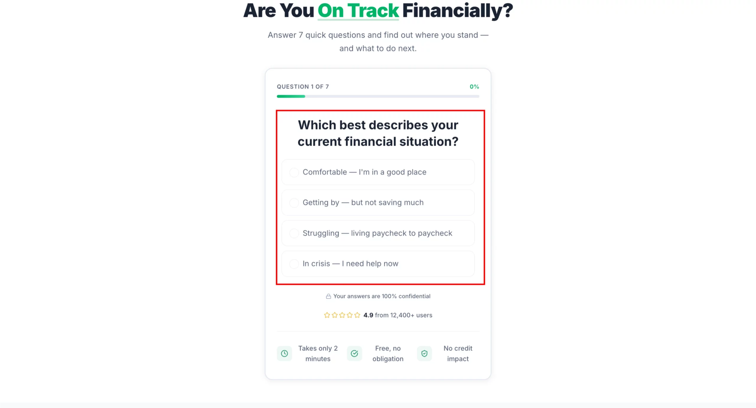
Create a financial needs assessment quiz that qualifies visitors for debt relief, insurance, or investment products. The quiz feels like a helpful tool, not a lead form. Quiz questions (one per screen, progress bar throughout): - Q1: "Which best describes your current financial situation?" (Comfortable, Getting by, Struggling, In crisis) - Q2: "Do you have more than $10,000 in unsecured debt?" (Yes / No / Not sure) - Q3: "Are you currently saving for retirement?" (Yes, regularly / Sometimes / Not yet) - Q4: "Do you have life insurance?" (Yes, enough coverage / Yes, but not sure if it is enough / No) - Q5: "What is your biggest financial concern right now?" (Debt, Retirement savings, Monthly expenses, Unexpected emergencies, All of the above) - Q6: "What is your household income range?" (Under $30k, $30k-$60k, $60k-$100k, $100k+, Prefer not to say) - Q7: "How soon are you looking to address your financial situation?" (Immediately, In the next 3 months, Just researching) Results gate: "Your financial assessment is complete. Where should we send your personalized action plan?" Name + email + phone (optional). CTA: "Get My Plan." Results page: Personalized summary with two to three recommended actions based on answers. Each recommendation links to a relevant offer (debt consolidation, life insurance quote, retirement consultation). Include urgency where relevant. Design: Professional and trustworthy. Navy and white or charcoal and green. Progress bar clearly visible. No jargon. Reassuring tone throughout.
How to Build Any of These Pages in Minutes
Every example above came with a prompt you can paste directly into LanderLab.
The AI landing page builder takes your brief and generates a complete page: headline, subhead, body copy, form structure, CTA, and layout, already matched to the angle you described.
You are not starting from a blank template. You are starting from a page that already understands your offer.
From there, duplicate it, adjust the angle, and you have a matched variant for every ad you are running.
If you want to see what that looks like, try LanderLab free and build your first page from one of the prompts above.
Build any of these pages in minutes
Paste the prompt. Get a fully matched landing page. Launch today.
Quick Reference: Landing Page Best Practices
The Bottom Line
The best landing pages are not the prettiest ones. They are the ones built around a single clear promise, delivered to the right person, at the right moment, with as little friction as possible between the click and the conversion.
Every example above follows that logic. Some are minimal. Some are long. Some lead with emotion, some with math. What they all share is intentionality: every element on the page exists for a reason.
The fastest way to apply any of this is to pick the example that matches your current campaign, use the prompt to build it in LanderLab, and test it against whatever you are running now.
Your next best landing page example is one prompt away.


