Google Ads landing page examples are everywhere. Most of them show you the same enterprise software brands with the same generic observations. That is not useful if you are trying to understand what actually makes a page convert for your specific vertical and visitor type.
You just paid for that click. The search query was specific. The ad matched it. The visitor clicked. Now they have landed somewhere, and in the next three seconds they will decide whether to stay or leave.
Most advertisers spend weeks optimizing the ad and almost no time on what happens after the click. That is backward. The ad determines whether someone shows up. The landing page determines whether they convert.
This article shows seven real Google Ads landing page examples pulled from live searches in May 2026 across the categories of weight loss, fitness, real estate, dental implants, project management, home services, and Medicare.
For each one: the actual search query, the actual sponsored result, the actual landing page, and a breakdown of the specific conversion principle that makes it work.
The last two Google Ads landing page examples were built in LanderLab and show how the same principles apply to lead gen campaigns in which the advertiser has no brand recognition and every conversion must be earned entirely on the page.
What Makes Google Ads Landing Page Examples Worth Studying
Two things determine conversion rate on Google Ads traffic more than anything else.
Message match. Google’s Quality Score includes a landing page experience component that measures how closely your page matches the visitor’s search. Pages that mirror the ad’s promise score higher, pay less per click, and rank better in the auction. Pages that deliver something generic cost more and convert less.
Answering the implicit question. Every Google Ads visitor arrives with a declared intent and an implicit question. The declared intent is the keyword they searched. The implicit question is the real barrier between clicking and converting. The pages that convert best answer that question in the first viewport before asking for anything.
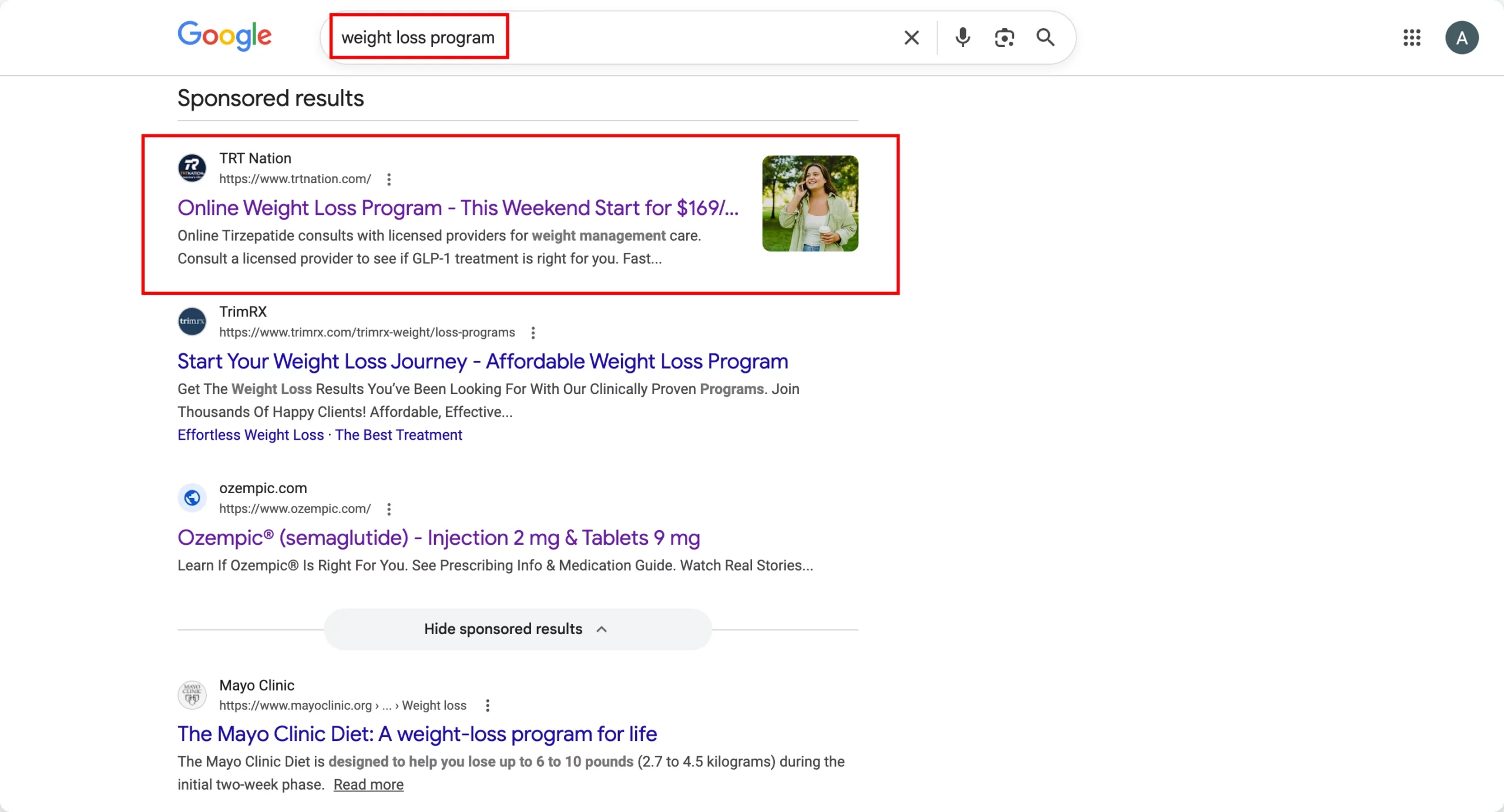
1. TRT Nation – Weight Loss Program
Search keyword: “weight loss program”
Conversion principle: Urgency + transparent pricing + risk-framed benefits
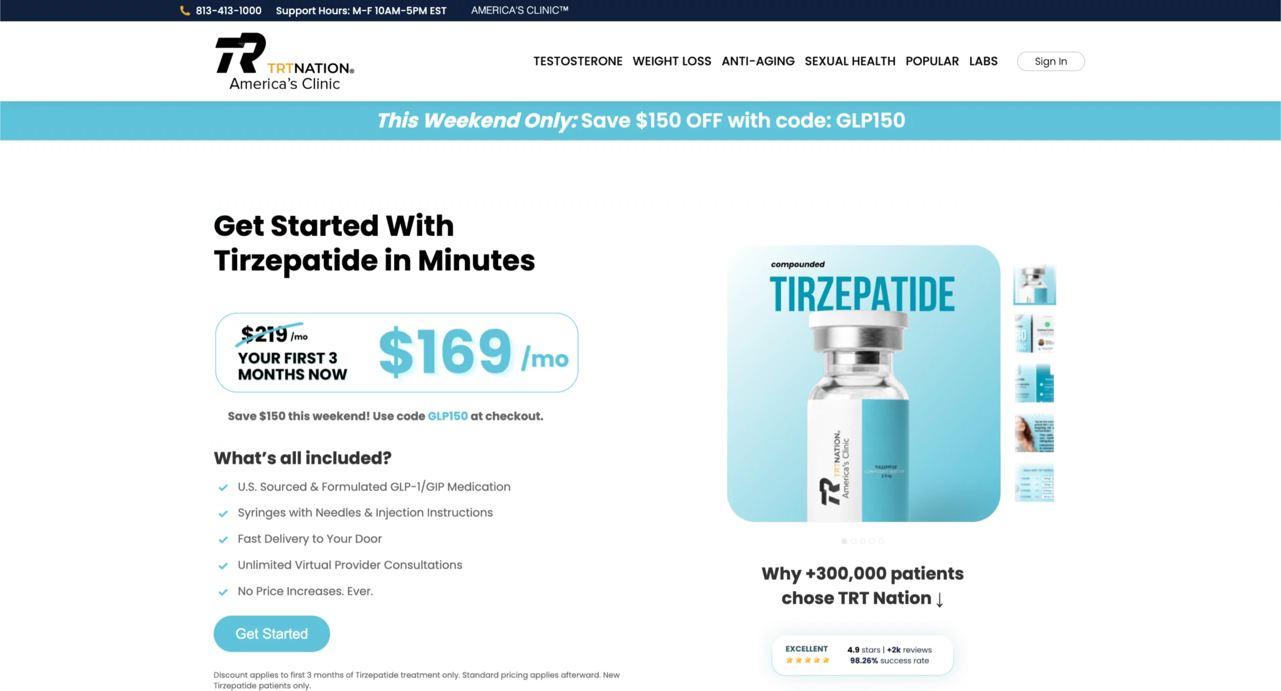
The ad headline sets the expectation: “This Weekend Start for $169.” The landing page confirms it immediately with a “This Weekend Only: Save $150 OFF” urgency bar and a pricing box showing $219 crossed out with $169/mo in large type.
The message match between the ad and the page is exact.
The “What’s all included?” section below the pricing answers the visitor’s implicit question: what am I actually paying for?
A visitor considering a GLP-1 weight-loss program wants to know whether the medication, supplies, and consultations are included or if the monthly price is just the starting point.
The checklist (medication, syringes, delivery, unlimited virtual consultations, no price increases) addresses every component of that concern before the CTA.
The “Why +300,000 patients chose TRT Nation” section with 4.9 stars and 98.26% success rate appears below the fold, reinforcing the decision for visitors who scrolled past the CTA without converting.
What to apply: When your ad leads with a specific price or offer, the landing page must confirm that exact figure in the first viewport. Any discrepancy between the ad’s promise and what the page shows creates doubt that kills conversions. The benefit checklist format works specifically for offers with multiple components where the visitor’s implicit question is “what exactly am I getting?”
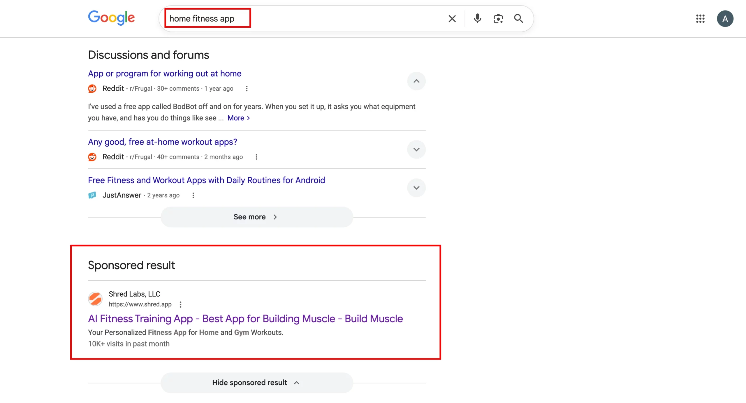
2. Shred – Home Fitness App
Search keyword: “home fitness app”
Conversion principle: Social proof above the headline + AI personalization as the differentiator
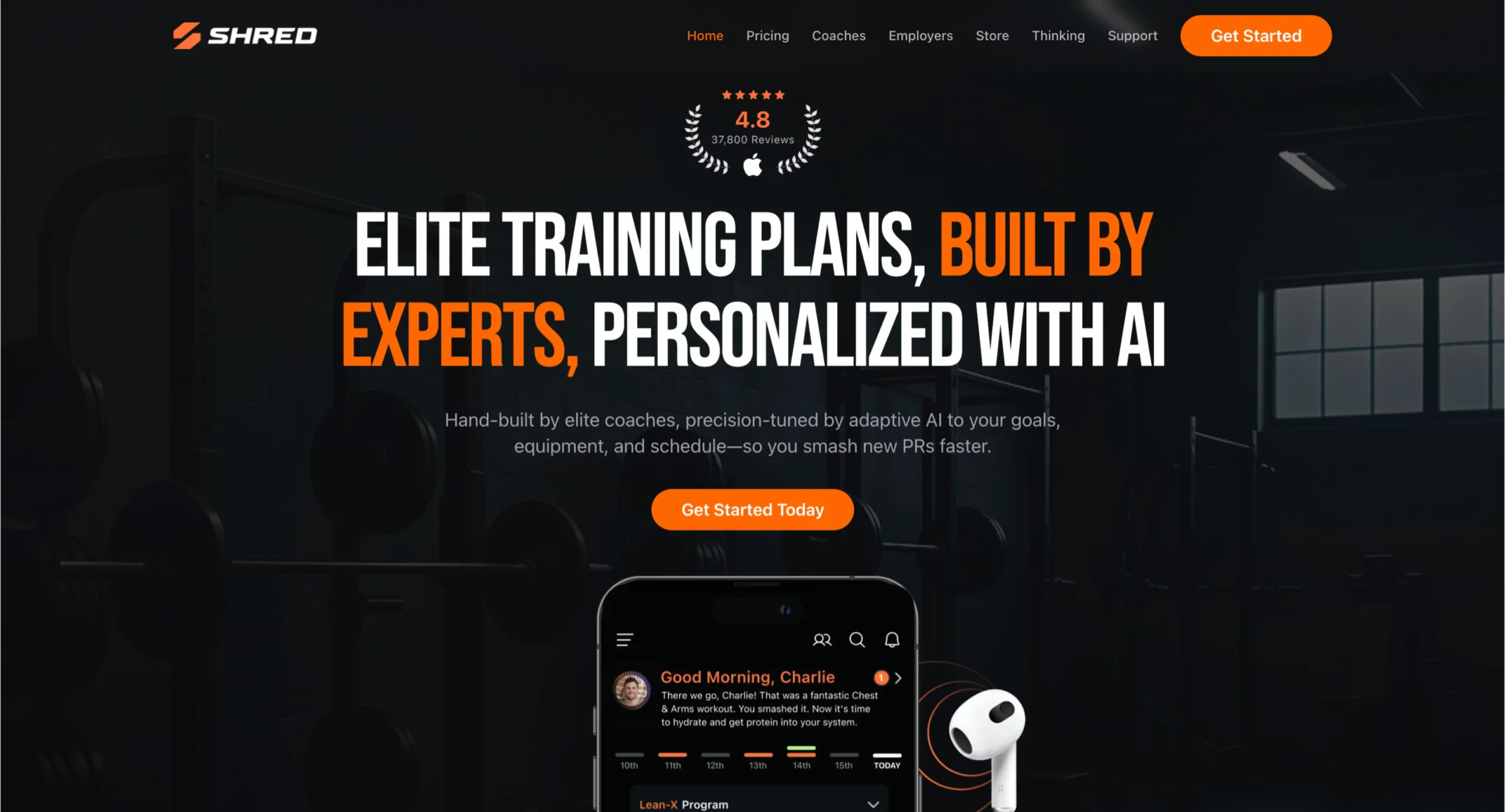
Shred’s page breaks the conventional rule of leading with the headline by placing the review score (4.8 stars, 37,800 reviews) above it.
This placement is deliberate. A visitor who searched “home fitness app” has never heard of Shred. Their first implicit question is “Is this legitimate?” The review count answers that before they read a single word of copy.
The headline “Elite Training Plans, Built by Experts, Personalized with AI” uses a three-part structure that addresses three distinct visitor objections simultaneously: the plans are elite (quality), built by experts (credibility), and personalized with AI (relevant to my specific situation).
The app mockup showing “Good Morning, Charlie” with a personalized workout confirmation makes the personalization claim concrete rather than abstract.
What to apply: For app and software categories where the visitor has no brand recognition of the advertiser, social proof above the headline reduces the legitimacy barrier before the visitor engages with the value proposition.
The review count does not need to come from a recognized platform, as long as the number is specific and credible.
3. Realtor.com – Sell My House Fast
Search keyword: “sell my house fast”
Conversion principle: The address input as the entire above-the-fold experience
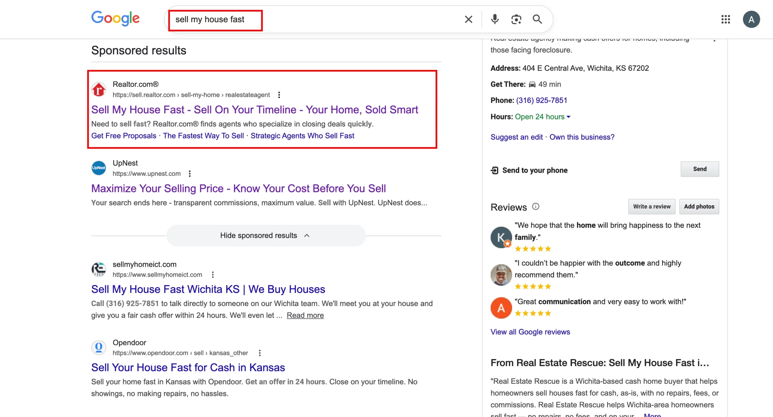
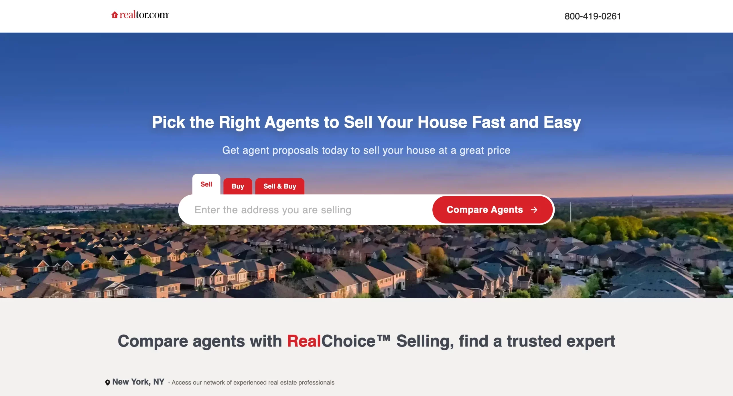
Realtor.com’s landing page demonstrates the most aggressive version of a principle that appears across high-converting transactional pages: the tool is the landing page.
A visitor who searched “sell my house fast” does not need to be convinced that selling a house is a good idea. They want to know what their house is worth and who can sell it quickly.
The page opens with a single address input field, a “Compare Agents” CTA, and tabs for Sell, Buy, and Sell & Buy. There is no headline to read, no value proposition, no trust signals. The page’s entire job above the fold is to get the visitor to type their address.
The geo-detection showing “New York, NY” in the subheading is a small but meaningful detail. It confirms to the visitor that the service is localized to their area without requiring them to input their location separately.
What to apply: For services where the output is specific to the visitor’s address, property, or location, making the input field the hero element removes the friction layer between intent and action entirely. The visitor came to find out something specific. Give them the tool to find it as the first action rather than asking them to read about the tool first.
4. Nuvia Smiles – Dental Implants
Search keyword: “dental implants”
Conversion principle: Quiz funnel as the conversion mechanism + eligibility framing
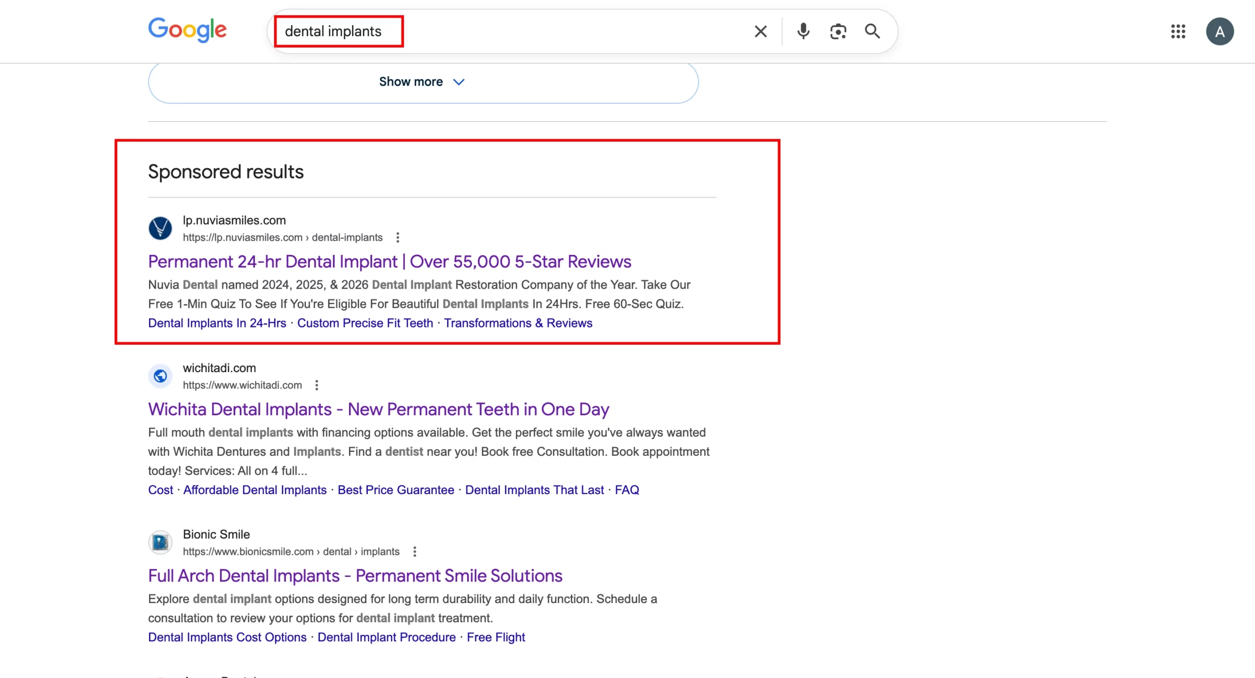
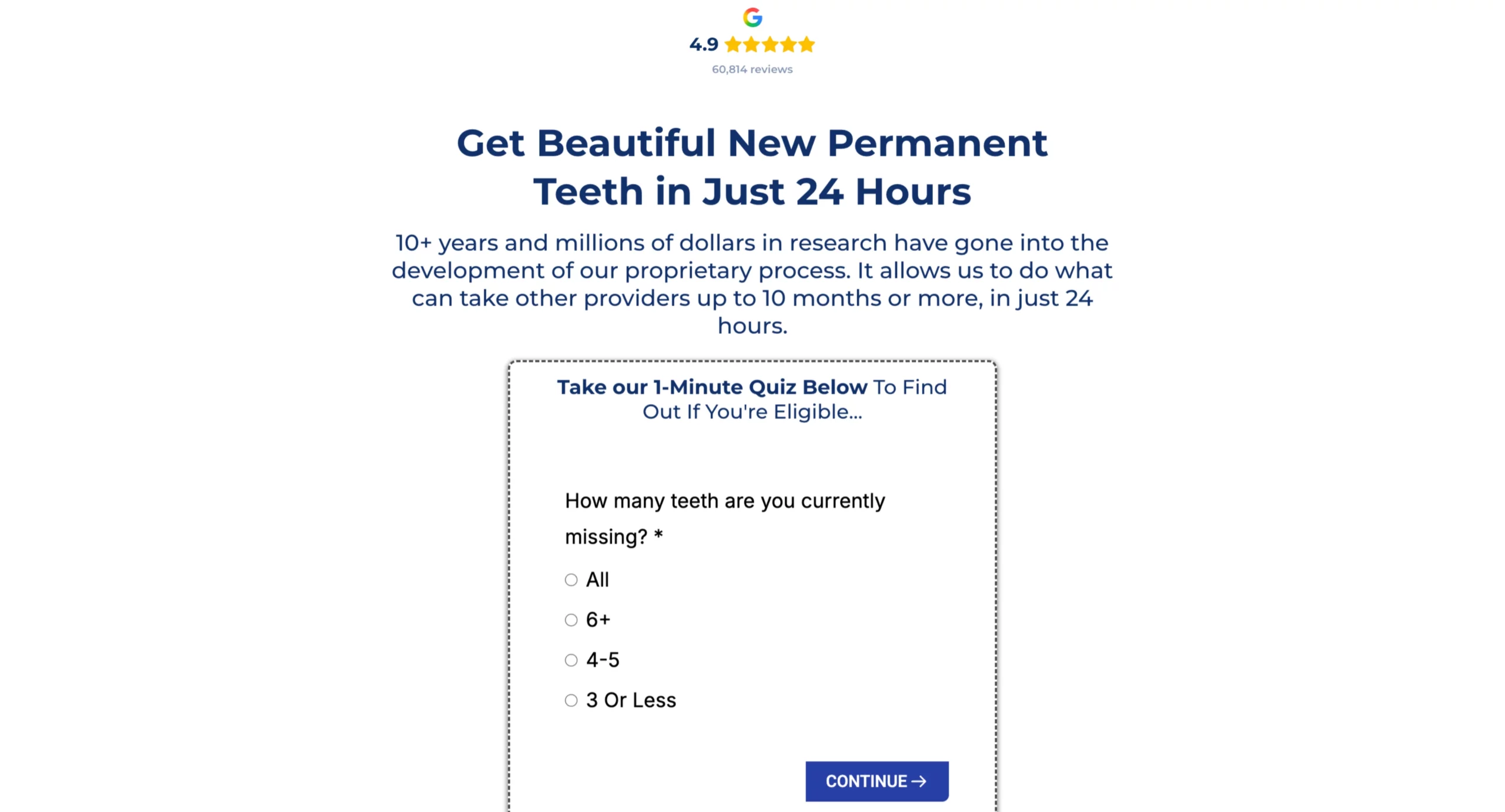
Nuvia’s page is one of the strongest examples in this article of a quiz funnel used correctly for a high-consideration purchase.
Dental implants are expensive, the process is complex, and not everyone is a candidate. The visitor’s implicit question is not just “can you do this,” but “am I even eligible for this?” Nuvia’s page answers both by making an eligibility quiz the conversion action rather than a contact form.
The Google review widget (4.9 stars, 60,814 reviews) appears above the headline, establishing legitimacy before the visitor reads anything.
The headline leads with the outcome (“Beautiful New Permanent Teeth”) and the timeframe (“in Just 24 Hours”), which directly mirrors the ad’s “Permanent 24-hr Dental Implant” promise.
The first quiz question, “How many teeth are you currently missing?” begins the qualification process without requesting personal information.
The visitor answers a question about their own situation before the page asks for anything in return.
By the time the quiz reaches the contact details section, the visitor has provided multiple answers and received implicit confirmation that they qualify.
What to apply: For high-consideration purchases where eligibility or fit is a genuine question, a quiz that starts with situational questions (not contact fields) converts better than a standard lead form because it addresses the visitor’s self-qualification concern before asking for personal information.
The quiz answer becomes the reason to continue, rather than the ad being the only reason to stay.
5. Wrike – Project Management Software
Search keyword: “project management software”
Conversion principle: Enterprise logo bar above the headline + feature demonstration over description
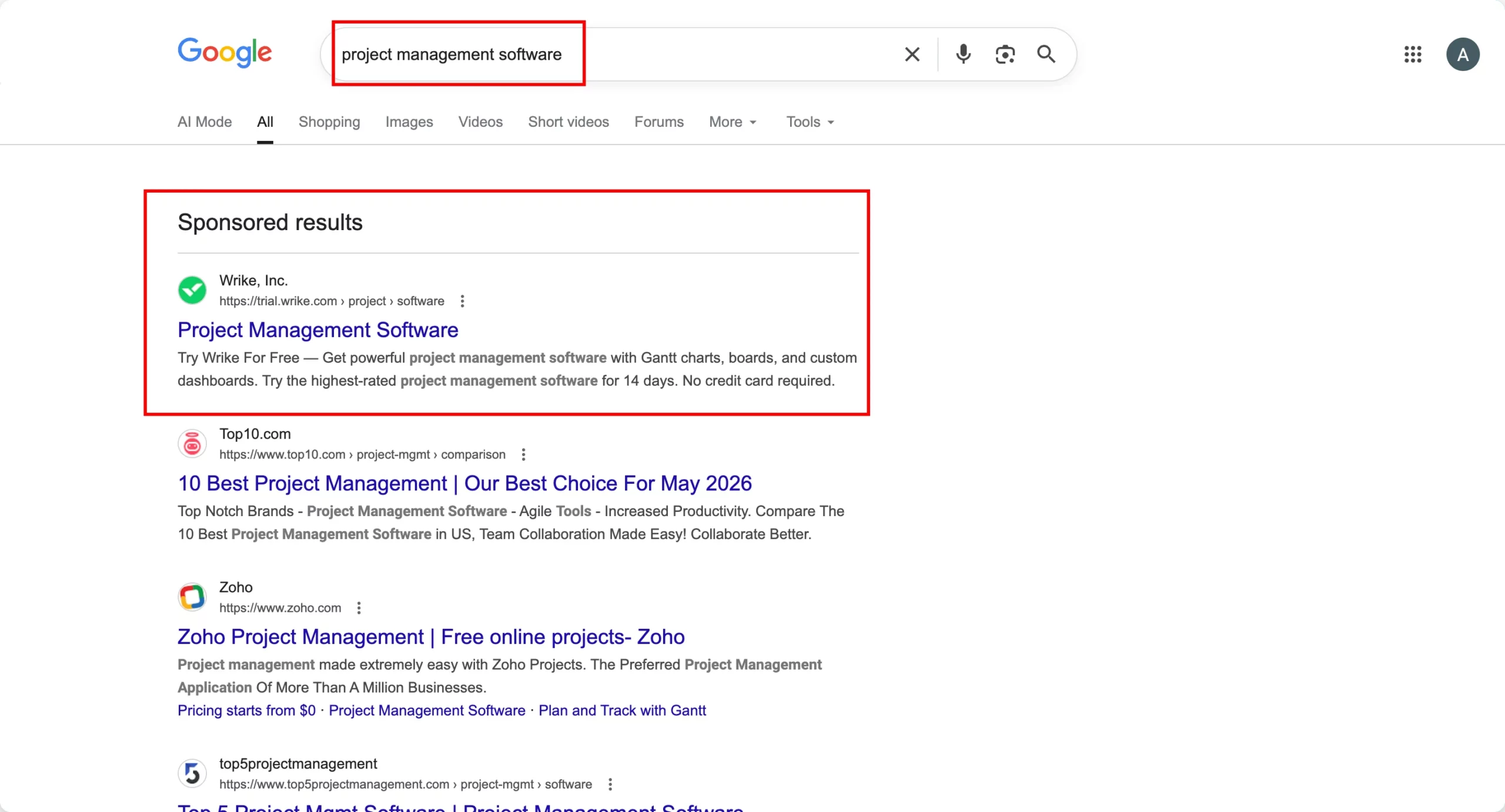
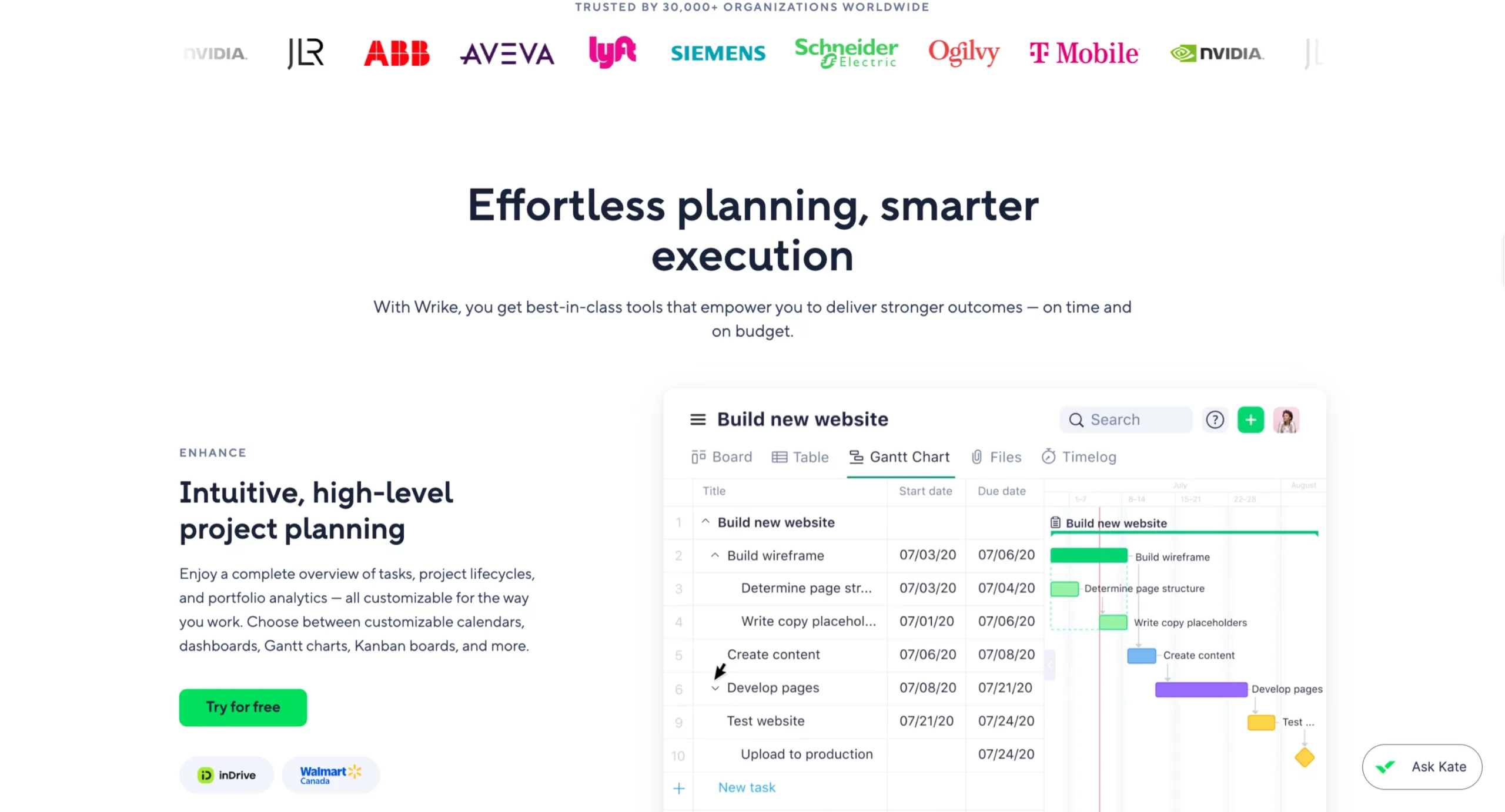
Wrike’s landing page leads with an enterprise logo bar (NVIDIA, Lyft, Siemens, Schneider Electric, T-Mobile, Ogilvy) positioned above the headline.
This placement answers the first implicit question a B2B visitor has when landing on a tool they may not recognize: do real organizations use this?
The headline “Effortless planning, smarter execution” is deliberately generic, which is the right choice for a broad category keyword. The page is not trying to win on a specific use case. It is trying to win on credibility and product demonstration.
The Gantt chart screenshot does more to convert than the headline because it shows the visitor exactly what the product looks like in use within a recognizable workflow.
The “Try for free” CTA paired with “No credit card required” in the ad description and repeated on the page removes the primary objection for SaaS free trial conversion.
The “Ask Kate” AI assistant in the bottom-right corner provides instant support for visitors with specific questions before they commit to a trial.
What to apply: On broad category keywords where the visitor is comparison shopping, enterprise logos above the headline do the same conversion work as specific testimonials in other contexts: they answer the “is this a real, trusted solution” question before the visitor engages with the product description.
The product screenshot is more persuasive than feature copy because it shows rather than tells.
6. Home Services Roofing – Built in LanderLab
Search keyword: “roof inspection Denver”
Conversion principle: Response time certainty + local trust signals above the fold
The first five examples are established brands with existing recognition. The next two demonstrate how the same conversion principles apply to lead-gen campaigns where the advertiser has no brand recognition advantage and every conversion must be earned entirely on the page.
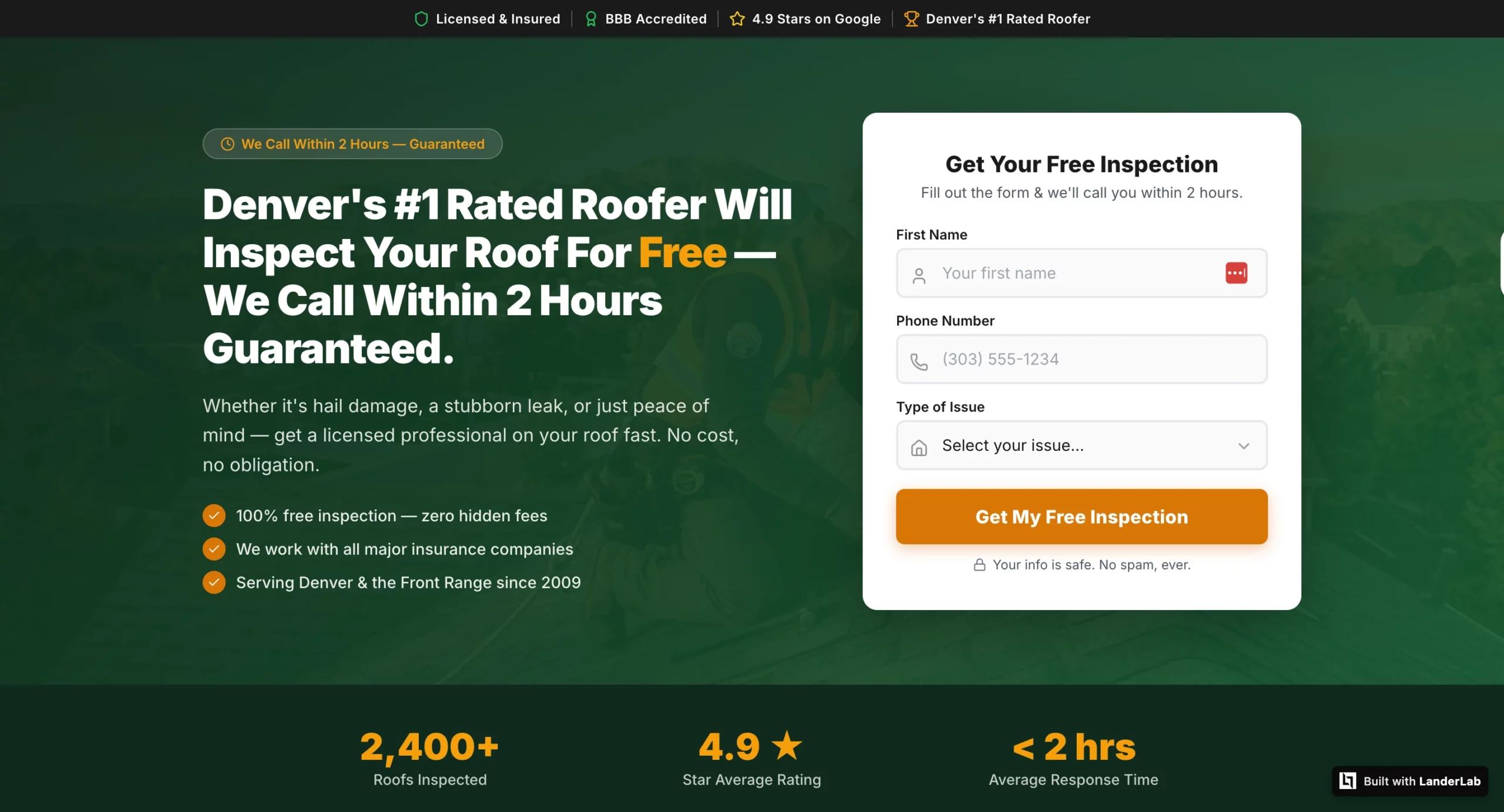
Home services Google Ads traffic is highly competitive. A visitor who searched “roof inspection Denver” has typically opened multiple tabs simultaneously. The page that wins the lead answers two questions fastest: when will someone call, and is this actually a local contractor?
The trust bar (Licensed & Insured, BBB Accredited, 4.9 Stars on Google, Denver’s #1 Rated Roofer) addresses local legitimacy before the headline.
The response time badge (“We Call Within 2 Hours – Guaranteed”) sits above the headline, answering the timing question before the visitor reads the offer. The headline then reinforces both: free inspection, 2-hour callback, guaranteed.
The three-field form (First Name, Phone Number, Type of Issue) is lean by design. The dropdown qualifies the lead for the sales team without adding form friction.
The “Your info is safe. No spam, ever.” reassurance below the CTA addresses the data privacy concern that causes home services leads to hesitate.
The stats bar at the bottom (2,400+ Roofs Inspected, 4.9 Star Average Rating, Under 2 Hours Average Response Time) validates the headline’s response time promise with aggregate data rather than individual testimonials.
What to apply: On local service keywords where the visitor is evaluating multiple providers simultaneously, the two questions that determine which page wins the lead are response time and local legitimacy.
Both need to be answered above the fold before the form. This page was built in LanderLab from a single AI prompt in minutes.
7. Medicare Supplement Plans – Built in LanderLab
Search keyword: “Medicare supplement plans”
Conversion principle: Compliance-first structure for skeptical high-stakes audiences
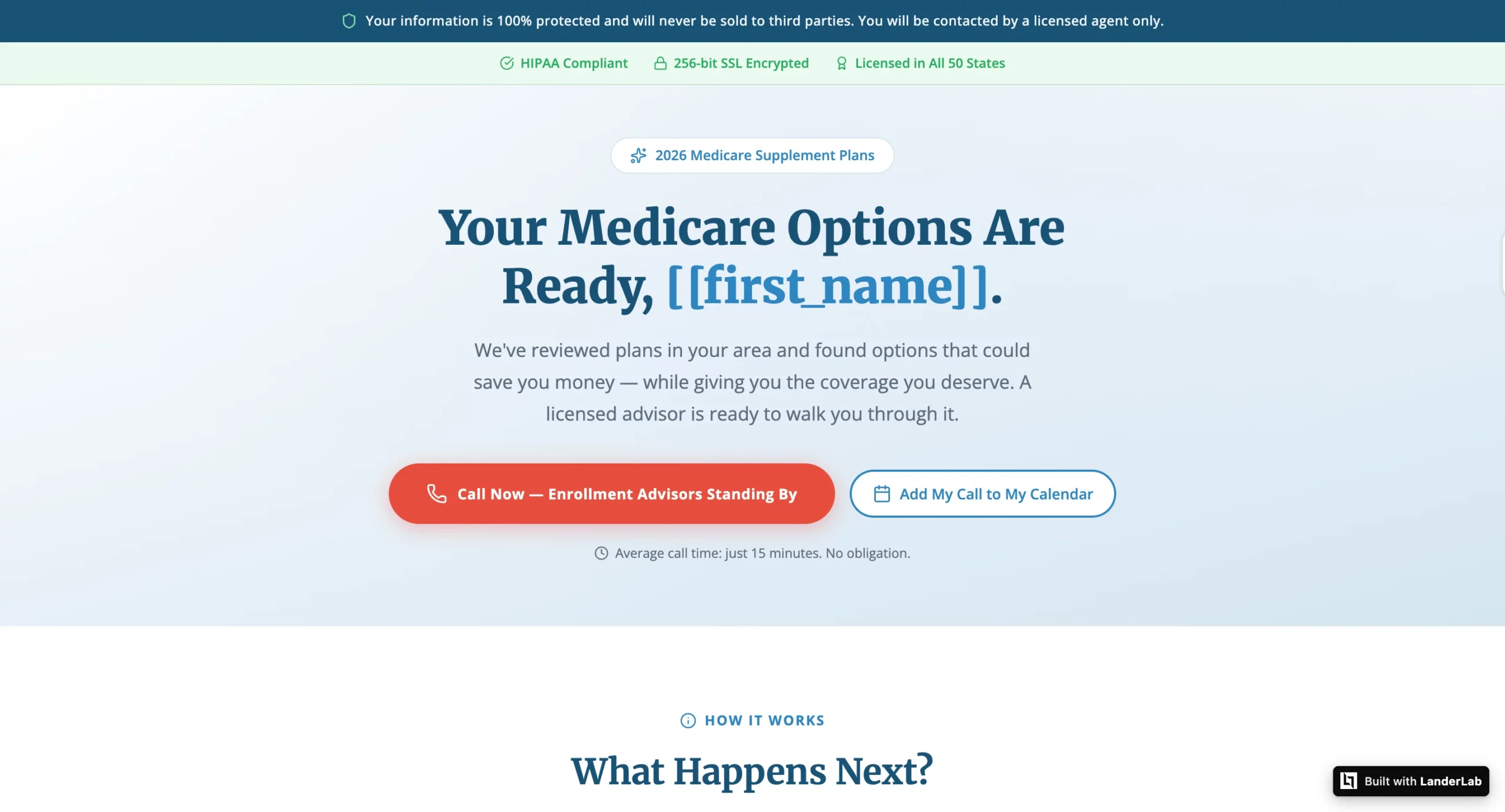
Medicare Google Ads visitors are one of the most skeptical audiences in paid search. Older adults who have experienced aggressive insurance lead-gen operations know their information is often sold to multiple call centers. That fear is the primary conversion barrier, and this page addresses it as the very first thing the visitor sees.
The compliance statement (“Your information is 100% protected and will never be sold to third parties. You will be contacted by a licensed agent only.”) appears in a dedicated bar before the logo, before the navigation, before everything. This is not standard footer disclaimer copy. It is the most strategically positioned element on the page.
The secondary trust bar (HIPAA Compliant, 256-bit SSL Encrypted, Licensed in All 50 States) reinforces the compliance message with specific technical and regulatory credentials that a Medicare-eligible visitor will recognize as meaningful.
The personalized headline (“Your Medicare Options Are Ready, [[first_name]].”) uses LanderLab’s dynamic token system to address the visitor by name using data captured earlier in the funnel.
The dual CTAs (Call Now and Add My Call to My Calendar) serve two different visitor types: those ready to call immediately and those who want to schedule a specific time.
The “Average call time: just 15 minutes. No obligation.” copy below the CTAs sets expectations that reduce both form abandonment and no-answer rates on the follow-up call.
What to apply: For sensitive verticals where the visitor’s primary concern is data privacy, the compliance statement must appear before the headline, not after it and not in the footer.
The visitor’s first question is “is this safe?” and the page needs to answer it before asking for anything. This page was built in LanderLab from a single AI prompt.
The Pattern Across All Seven Google Ads Landing Page Examples
Each of these pages, from TRT Nation to a Medicare landing page built in LanderLab, demonstrates the same underlying principle in a different context: the page identifies the visitor’s primary implicit question and answers it before asking them to take action.
TRT Nation’s visitor wants to know if the price in the ad is real and what it includes. Shred’s visitor wants to know if the app is legitimate before engaging. Realtor.com’s visitor wants to start the process immediately without reading a pitch. Nuvia’s visitor wants to know if they qualify before giving personal information.
Wrike’s visitor wants to know if real organizations trust the product. The roofing visitor wants to know when someone will call and if they are local. The Medicare visitor wants to know their data is safe.
None of these questions are stated in the search query. But every one of them is the real barrier between a click and a conversion. The pages that perform best on Google Ads are the ones that identify that specific question for their specific visitor and answer it in the first viewport.
How to Build Google Ads Landing Page Examples Like These
The brand examples in this article have in-house design teams and development resources. The two lead gen examples were built in LanderLab using a single AI prompt each.
LanderLab’s AI landing page builder generates complete pages from a campaign brief: the vertical, the audience, the offer, and the specific conversion principle to lead with. The AI produces a page with copy, layout, form, and thank-you page matched to those parameters without touching code.
For quiz funnel campaigns like the Nuvia dental implants example, the AI quiz funnel builder generates multi-step eligibility flows with conditional routing and dynamic tokens, producing personalized results without building separate pages for each answer path.
The Bottom Line
Every example in this article was pulled from a live Google search. The brands running these ads are spending real money on every click. The pages they send that traffic to are not accidents.
Every element- the urgency bar on TRT Nation, the review count above the headline on Shred, the address input on Realtor.com, the eligibility quiz on Nuvia, the enterprise logo bar on Wrike, the compliance statement on the Medicare page- is a deliberate answer to the specific question that the visitor is asking at that moment.
That is the discipline behind a converting Google Ads landing page. Not clever copy. Not a beautiful design. Knowing what question your specific visitor is asking when they land, and answering it before you ask them to do anything.
The ad gets the click. The page earns the conversion.


")