Most CRO guides are made for UX teams with long testing cycles, their own developers, and a Hotjar subscription they know how to use.
Most media buyers are in a different spot. They have live campaigns, a daily budget, and a landing page that either works or it doesn’t.
When the cost per lead goes up, the first reaction is to adjust the ads. But usually, the ads aren’t the real issue.
Landing page CRO for paid traffic is not the same discipline as CRO for a SaaS product or an ecommerce store.
The timeline is compressed, the traffic is paid and therefore finite, and the consequences of testing wrong are immediate.
A bad A/B test on organic traffic might waste a few weeks. A bad test on a $10,000 per month Google Ads campaign costs real money while you wait for answers.
This guide looks at landing page CRO for paid traffic: what to check before making changes, what to test first, how to run tests that give real results, and how even small CVR gains can add up quickly.
What Landing Page CRO Actually Means for Paid Traffic
Conversion rate optimization is the process of increasing the percentage of visitors who complete a desired action on your landing page without increasing your ad spend.
That definition seems simple, but what it means in practice is not.
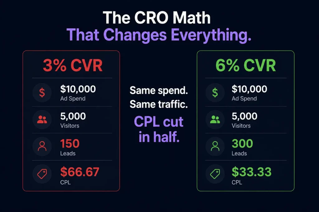
Every percentage-point increase in CVR directly reduces CPL. Here’s what that looks like in real numbers:
| Monthly Ad Spend | Traffic | CVR | Leads | CPL |
|---|---|---|---|---|
| $10,000 | 5,000 | 3% | 150 | $66.67 |
| $10,000 | 5,000 | 4.5% | 225 | $44.44 |
| $10,000 | 5,000 | 6% | 300 | $33.33 |
With the same spend and the same traffic, raising CVR from 3% to 6% cuts your CPL in half. You don’t need to change bids, audiences, or creative.
That’s why landing page CRO is one of the best ways for media buyers to get more from their budget.
It makes every campaign that uses that page more efficient, and the benefits keep adding up as long as the improved page remains live.
Read the Page Before You Touch It
Making changes based on instinct is probably the most common CRO error in paid traffic.
That is because there are some changes marketers are sure will solve the problem, even though they have never checked whether that is true.
For instance, they may change something just because it “feels right.” And sometimes it does feel right; however, other times they do not realize that the problem lies elsewhere, so making unnecessary adjustments is not only a waste of time and effort but also a risk of spending money on the wrong things.
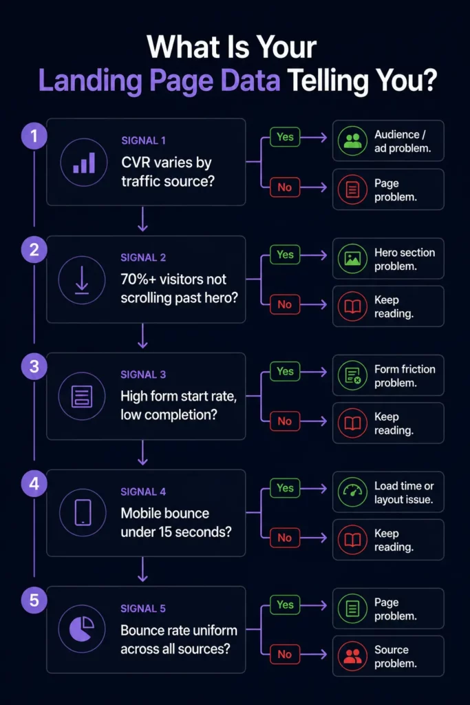
So, before making any adjustments, take a closer look at the data first; it can tell you what the problem is and how to address it.
Conversion rate by traffic source. While there is a general figure indicating how well your page converts, that figure alone might mean nothing, since it is the sum of several sources: Google Ads, Meta, email, and organic.
This means that your page can convert well with one type of visitor and fail to convert with another, despite having the same design and message.
What this means: if you notice that your best-performing traffic source converts twice as much as other sources, the problem must be with the audience.
In most cases, you are spending money on the wrong people, which means fixing the page will get you nowhere unless you fix the audience first.
Scroll depth. Low scroll depth is a clear sign that your visitors are ignoring everything below the hero section. That means your form, testimonials, and next steps are largely ignored by most of your visitors.
What it means: a problem with the scroll depth does not have anything to do with the content below the fold.
Instead, it means that visitors do not find the top part of the landing page worth their time, so they simply stop scrolling and leave.
Thus, before changing the form or testimonials, test the above-the-fold content first.
Form start rate vs. form completion rate. When looking for problems with conversion rates, it is crucial to separate form-start rates from completion rates, since each has distinct causes.
For example, a low form start rate (less than 20-30%) indicates that your visitors are not sufficiently persuaded to fill out your forms.
However, a high start rate and a low completion rate indicate that the problem lies within the form rather than above it.
Some common reasons for such results include the form having too many fields, asking for a phone number before earning the visitor’s trust, unclear field labels, and a poor mobile keyboard experience.
To know for certain what exactly the problem is, watch session recordings of your form abandonment and find the “drop-off field.”
Time on page by device. If your mobile visitors spend less than 15 seconds on the page before leaving, it’s likely a load time problem and nothing else.
Meanwhile, visitors on desktop who spend 2 or more minutes reading the page but still do not convert indicate a problem with your CTA placement or the value proposition near it.
Qualitative and quantitative data. While using heatmap tools to understand how people use your page is helpful, they won’t tell you why they behave the way they do.
However, Microsoft Clarity offers free session recordings that will show you exactly what went wrong when visitors used the landing page.
Run the tool for at least two weeks prior to making any changes, as you should base all your decisions on data first.
Traffic quality check. Landing pages often have traffic quality issues that appear as CRO issues in most conversion rate dashboards. For instance, visitors bouncing in under 5 seconds means that your page is not relevant to them.
That is because CRO cannot help you persuade the visitors who should never see your page in the first place. The diagnostic question here is whether your bounce rate varies by source.
The Five Elements Worth Testing First
Not all CRO tests are equal. Some elements have a structural impact on whether a visitor converts. Others are cosmetic and produce minimal or inconsistent results.
In paid traffic specifically, where testing time is compressed, and every visitor costs money, you cannot afford to spend three weeks A/B testing button colors.
These five elements, in order of typical impact on paid traffic landing pages, are where testing time should be spent.
1. The Headline
The headline determines whether the visitor reads the rest of the page. If it fails, nothing else matters. It is the single highest-leverage test available on any landing page and should always be the first test you run.
Three headline angles worth testing against each other:
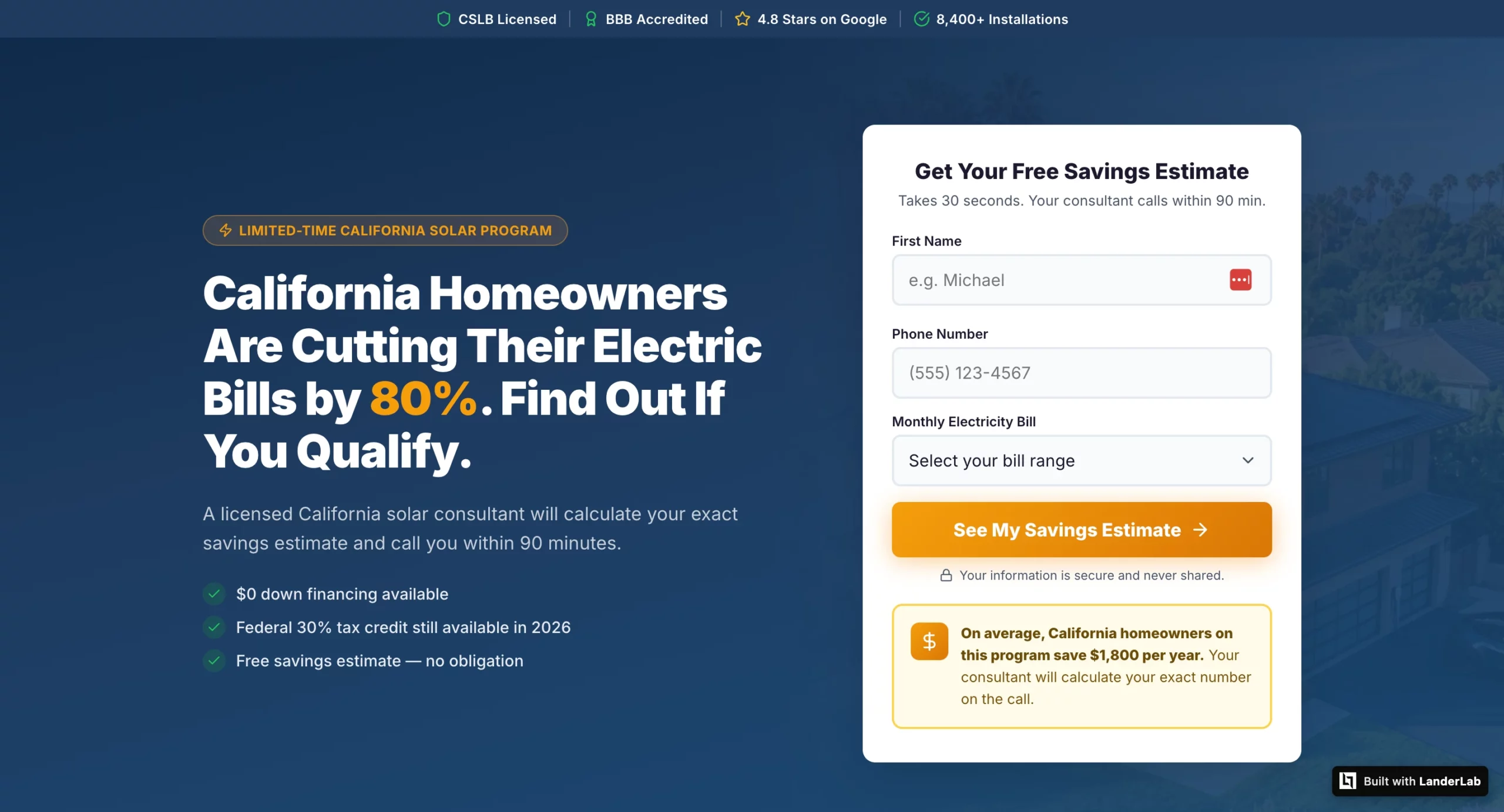
Outcome-specific: “California Homeowners Are Cutting Their Electric Bills by 80%. Find Out If You Qualify.” Name the specific result and create a qualification mechanism that attracts higher-intent visitors.
Problem-focused: “Still Paying Too Much for Electricity? Here’s What Your Neighbors Already Know.” Leads with the pain rather than the solution, which works well for audiences who haven’t yet acknowledged they have a problem.
Curiosity-driven: “The Medicare Plan Most Enrollees Don’t Know They Qualify For.” Works for audiences who need to be pulled into the funnel rather than pushed.
Test outcome-specific first. It consistently outperforms on paid traffic because the visitor already has intent. They clicked an ad. They are looking for a reason to stay, not a reason to explore.
2. CTA Copy and Placement
“Submit” is the worst CTA in paid traffic. It tells the visitor what they are doing, not what they are getting. “Get My Free Roofing Estimate” tells them what happens next and frames it as a benefit rather than a transaction.
The highest-performing CTA formulas for lead gen:
“Get My [Specific Deliverable]” consistently outperforms generic CTAs because it confirms exactly what the visitor is about to receive.
“See My [Personalized Result]” works especially well for quiz funnels where the CTA implies the answer is already waiting.
“Claim My Free [Offer]” adds a possession frame that makes the offer feel like it already belongs to the visitor.
Placement matters as much as copy. The CTA should appear above the fold on every device, repeat after the social proof section, and appear one final time at the very bottom of the page for visitors who scrolled all the way through before deciding.
3. Form Length and Field Order
Every field you add to a form reduces conversion rate. This is one of the most consistently demonstrated findings in landing page research and one of the most consistently ignored.
The question is not “what information do we want?” It is “What is the minimum we need to start a conversation?”
For home services and insurance lead gen, name and phone number are enough to make the first contact. Everything else can be captured on the call. A two-field form routinely outperforms a five-field form by 30-50% on raw conversion rate.
Field order matters almost as much as field count. Ask for the name and phone number before asking for the email. Ask for non-sensitive information before sensitive information.
Do not ask for date of birth, income, or insurance details until you have established enough trust that those fields feel reasonable.
Multi-step forms are the best solution when you genuinely need more information.
Breaking a seven-field form into a three-step flow, where each step asks two or three questions, reduces perceived friction dramatically, even though the total amount of information requested is identical.
4. Social Proof Type and Placement
Social proof on a landing page is not one thing. Testimonials, review counts, trust badges, certifications, and named customer logos all serve different functions and perform differently depending on where they appear.
The highest-impact placement for paid traffic pages is immediately below the headline or directly adjacent to the form.
Social proof at the bottom of the page is better than none, but it only reaches visitors who have already scrolled. The visitors who need convincing most are the ones who haven’t scrolled yet.
For vertical-specific social proof, specificity is everything. A testimonial that reads “Great service, very professional” is nearly worthless.
A testimonial that reads “James from Denver sent his inspector out within 3 hours, and we had a written estimate before dinner” is driving real conversion.
It confirms the response-time promise, confirms local presence, and names a specific outcome.
Test moving one strong, specific testimonial from below the fold to directly beneath your headline before testing anything else on the page.
It is one of the fastest CVR improvements available and requires zero copy changes.
5. Hero Image or Video
The hero visual is the last of the five because it is the most time-consuming to test and produces the most variable results. In some verticals, it matters enormously. In others, it barely registers.
The general principle: images of real people outperform stock photography, images that reflect the visitor’s demographic outperform generic imagery, and images that show the outcome of the offer (a family in front of solar panels, a homeowner shaking hands with a contractor) outperform product or process imagery.
Video in the hero section is the highest-upside test on this list, but also the hardest to execute well.
A 60-90 second video from the person who will be calling, explaining what happens next, consistently improves answer rates for sales calls and reduces lead drop-off between form submission and first contact.
The execution bar is higher because a bad video hurts more than no video.
How to Run a Test That Produces Usable Results
Most A/B tests in paid traffic produce inconclusive results, not because the variants were bad, but because the tests were set up incorrectly. Three mistakes account for the majority of wasted testing cycles.
Testing on too little traffic. Most teams dramatically underestimate how much traffic a valid A/B test requires. The math is less forgiving than it looks.
To detect a 2-percentage-point improvement on a page converting at 3% (from 3% to 5%) with 80% statistical power and 95% confidence, you need approximately 1,500 visitors per variant, or 3,000 total.
At 1,000 monthly visitors with a 50/50 traffic split, that is a 13-week test. At 500 monthly visitors, it has been over six months.
The numbers get harder if you are looking for a smaller lift.
Detecting a 1-percentage-point improvement (from 3% to 4%) requires over 5,000 visitors per variant, which is effectively untestable for most paid-traffic campaigns at typical budgets.
The practical rules:
Under 1,000 monthly visitors to a single page: you cannot run statistically valid A/B tests in a reasonable timeframe.
Consolidate traffic to fewer pages before testing, or accept that you are making directional decisions rather than statistically significant ones.
Focus your changes on high-impact elements where the effect size is likely large enough to show up in smaller samples, headline, and form length above everything else.
1,000 to 3,000 monthly visitors: you can run tests, but only one at a time, and only on changes likely to produce a meaningful lift.
Use a sample size calculator (free at abtestguide.com/calc) to set your minimum sample size before launching each test.
Over 3,000 monthly visitors: you have enough traffic to run a proper testing program.
Set a testing cadence, one active test at a time, and work through the priority order: headline first, then CTA, then form, then social proof placement.
Testing multiple elements simultaneously. Changing the headline, the CTA, and the form length at the same time tells you whether the combination improved CVR.
It tells you nothing about which change was responsible. If the variant loses, you do not know what to fix. If it wins, you do not know what to keep. Test one element at a time, always.
The only exception is a full-page redesign tested against the control, which is valid as long as you treat it as a directional signal rather than a diagnostic one.
Ending tests too early. A variant that leads after the first 100 visitors will not necessarily lead after 1,000.
Early results are noisy. Ending a test the moment one variant pulls ahead is called peeking, and it produces a high rate of false positives.
Set your minimum sample size before the test starts, write it down, and do not look at results until that threshold is reached.
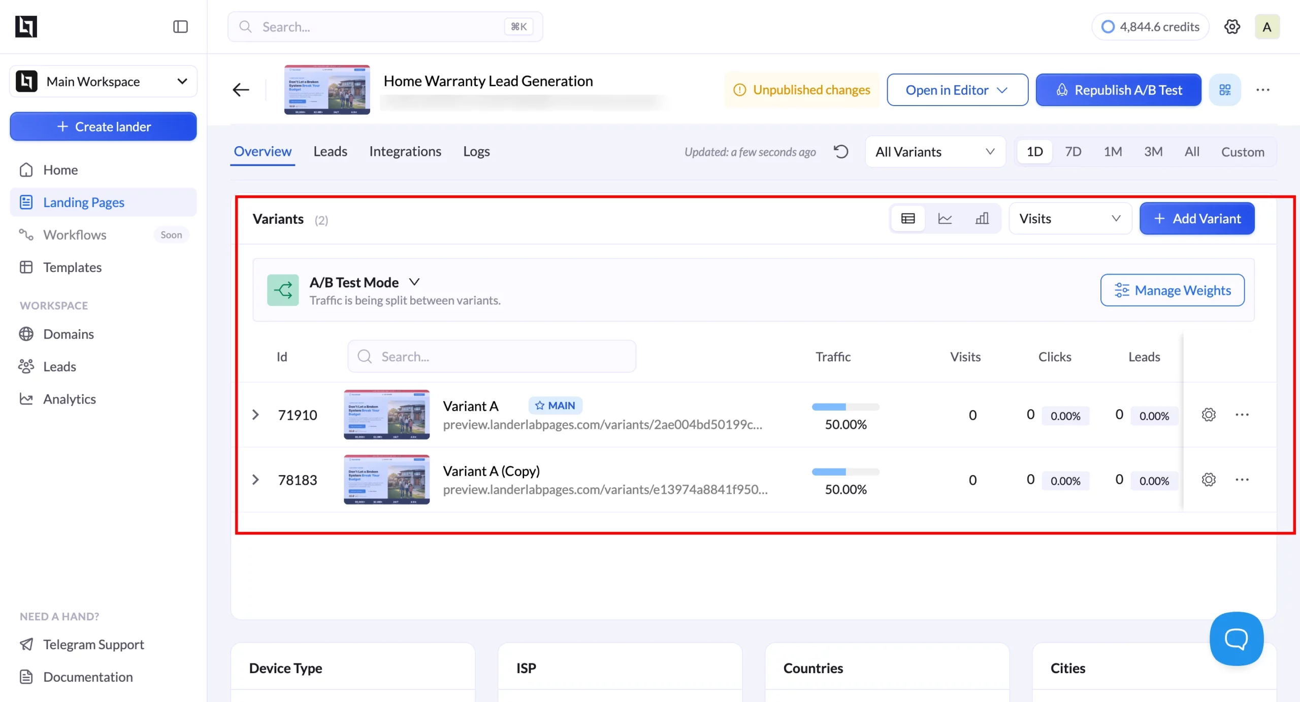
LanderLab’s built-in split testing removes the setup friction that keeps most teams from testing at all.
You create a variant within the same funnel, set the traffic split, and track the results in the same dashboard, without configuring a third-party tool or managing two separate pages that can drift out of sync.
Landing Page CRO by Vertical
The highest-leverage CRO moves vary by vertical because visitors’ psychology, primary objections, and decision timelines differ. Generic CRO advice applies everywhere and moves the needle nowhere in particular.
What follows is vertical-specific, based on the conversion patterns that consistently separate high-performing pages from average ones in each category.
Home Services (Roofing, HVAC, Plumbing)
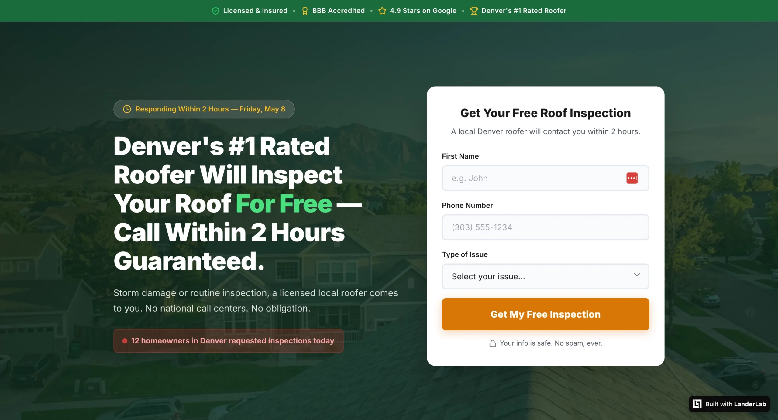
The primary conversion killer in home services is uncertainty about response time. The visitor’s unspoken question is: if I give you my number, when does someone actually call, and will it be a real local contractor or a national call center routing my lead to whoever bids the highest?
Move 1: Add a specific response time promise above the fold. “A licensed Denver roofer calls within 2 hours” outperforms “Get a free estimate” consistently because it answers the visitor’s actual question.
Vague copy about “we’ll be in touch soon” produces leads who have already called three competitors by the time your sales team dials.
Test these headline frames against each other:
- “[City] Homeowners: Get a Free Roof Inspection Within 24 Hours” (urgency + local)
- “A Licensed [City] Roofer Will Call You Within 2 Hours” (response time promise)
- “Storm Damage? [City]’s Highest-Rated Roofer Responds Within 2 Hours” (problem + social proof + response time)
Move 2: Local trust signals above the fold. A city name in the headline, a local phone number (not a toll-free number), and a BBB badge or Google review count with a specific number (“4.9 stars, 312 reviews”) do more conversion work in home services than in almost any other vertical. The visitor needs to know immediately that they are calling a real local contractor, not a lead aggregator.
Move 3: A phone number as a secondary CTA alongside the form. Emergency service verticals have a segment of leads who want to call immediately rather than wait for a callback.
A prominently placed, tappable phone number with “Call Now” copy captures those leads before they close the tab. This is not a competing CTA. It is a parallel path for a different lead type.
Solar
Solar visitors have usually seen multiple ads and multiple landing pages before the one they are currently on. The primary objection is not “do I want solar” but “is this specific offer worth my time, and is this company legitimate enough to give my information to?”
Move 1: Personalize the savings estimate using quiz funnel data. A landing page that shows “Based on your $280 monthly electricity bill, you could save approximately $2,100 per year” converts at a meaningfully higher rate than one that promises generic savings.
A landing page that shows ‘Based on your $280 monthly electricity bill, you could save approximately $2,100 per year’ converts at a meaningfully higher rate than one that promises generic savings. The specific number gives the visitor a concrete financial reason to answer the sales call.
Move 2: State-specific trust signals for geo-targeted campaigns. Generic solar pages convert worse than geo-specific ones because solar incentives, net metering policies, and installer availability vary by state and visitors know this.
A California campaign page that mentions NEM 3.0, the federal ITC, and California-specific installer credentials outperforms a generic “save on solar” page even if the underlying offer is identical.
Move 3: A savings callout box above the form. A visually distinct callout box near the form that states a specific financial figure (“California homeowners on this program save an average of $1,800 per year”) gives the visitor one last reason to submit before they second-guess. The callout works because it interrupts the decision moment with a specific number rather than a generic benefit statement.
Insurance and Medicare
The primary conversion killer in insurance is the fear that personal information will be sold to multiple call centers and trigger an immediate flood of calls from unknown numbers. This is not an irrational fear.
Many lead gen operations in insurance do exactly this, and visitors have been burned before.
Move 1: Compliance statement before the headline. “Your information is 100% protected and will never be sold to third parties. You will be contacted by a licensed agent only.”
That one line, positioned above the headline and the form, addresses the primary objection before it forms. In testing, moving this statement from the footer to the top of the page consistently lifts CVR in insurance verticals by more than any headline or form change.
Move 2: Age and state specificity in testimonials. A Medicare lead needs to see testimonials from people who are the same age and in the same state, not generic five-star reviews. “Dorothy M., age 71, Florida: I had no idea I was overpaying by $140 a month until my advisor found me a plan with $0 premium and dental included” is doing conversion work.
A generic “great service, very professional” review is not. The demographic match is what makes the social proof credible.
Move 3: Conditional thank you pages based on enrollment status. A visitor who indicates they are 65 and currently uninsured needs entirely different messaging than a visitor who is 72 and already enrolled.
The uninsured visitor needs enrollment urgency. The enrolled visitor needs plan comparison and savings framing. Sending both to the same thank you page leaves significant CVR on the table.
LanderLab’s conditional routing handles this within the same funnel without building separate pages.
Legal Services
Legal pages have the most trust-building work to do of any vertical. The visitor just shared sensitive personal information about an accident or legal situation with a firm they found through an ad.
Their primary concern before converting is whether their information is safe, and their primary concern after converting is whether anyone credible will actually call them.
Move 1: Attorney-client privilege stated explicitly before the headline. Not in the footer. Not in a tooltip. Not in small print. Before the visitor reads anything else, they need to know their information is legally protected.
“Your information is protected by attorney-client privilege,” at the very top of the page, addresses the trust barrier that prevents many accident victims from submitting at all.
Move 2: A named attorney with photo, credentials, and bar membership in the hero. “Attorney Michael J. Harrison will personally review your case details and call you within 4 business hours” converts better than any generic law firm copy because it transforms an anonymous incoming call into a call from a specific credentialed person the visitor has already seen and started to trust. Generic firm branding (a logo, a tagline, a stock photo of a courthouse) does not accomplish this.
Move 3: Settlement amounts as the primary social proof format. For personal injury verticals, dollar amounts recovered are more persuasive than any other form of testimonial.
“$185,000 Settlement – Car Accident, Denver CO” displayed as the headline above a testimonial card outperforms a five-star review with no outcome data because it proves the firm actually delivers the result the visitor wants. The outcome number is the proof. The testimonial text is secondary.
The Mistakes That Make CRO Data Useless
Broken conversion tracking. The most expensive CRO mistake is running tests on a page with misconfigured conversion tracking.
If your conversion tags are not firing correctly, your test results will measure noise rather than performance. Verify Google Ads conversion tags with Tag Assistant and Meta Pixel Lead events with Pixel Helper before running any test.
A broken pixel on a high-traffic page can silently corrupt weeks of data.
Testing a page with a traffic quality problem. If visitors are bouncing within 5 seconds at a high rate, the page is probably not the problem.
The audience is. CRO cannot fix a mismatch between who is clicking the ad and what the page is offering. Diagnose the traffic quality problem before running page tests, or you will spend weeks optimizing a page for the wrong audience.
Seasonal and external interference. A landing page test running across a holiday period, a competitor’s sale, or a major news event will produce results that cannot be replicated under normal conditions.
Control for external variables by running tests in comparable time windows and noting any significant external events that occurred during the test period.
Never verifying the winning variant at scale. A variant that wins at a 50/50 traffic split sometimes underperforms when rolled out to 100% of traffic. Run a verification period after declaring a winner before deprioritizing further testing on that element. The verification catch rate is higher than most teams expect.
The Compounding Math of Incremental CRO Wins
CRO is not something you do once and be done with it. CRO is an ongoing cycle in which success builds on previous success.
A team that increases CVR by 20% across four sequential tests does not achieve an 80% increase overall. In reality, the increase will be 107% because it applies to the previously improved CVR.
In practice, a roofing marketing campaign that achieves a 3% conversion rate and reaches 6% after four sequential tests on headline, form, social proof, and CTA, respectively, doubles the performance of its dollar spend going forward.
The spending is not going up. The audience is not getting better. The page performs.
Teams with the best CPL economics for paid traffic do not necessarily have the largest budgets. They have a testing process and follow-through in reading the data. They test, and they test smartly.
Their competitors keep running the same page that was launched six months ago, and wonder why CPL keeps going up. The problem starts from diagnosing the page itself, which can be done by measuring the scroll depth, form gaps between start and completion, and CVR by traffic source.
The data tells us what to test. The test results inform us what to optimize.
One test at a time. Minimum sample size known before launching. And no peeking, please.
The CPL increase achieved via just one successful test makes all the time spent worth it times ten.


