2026 年 18 個最佳登陸頁範例(附可建立每一個的 AI 提示詞)
大多數登陸頁文章只給你看漂亮的截圖就結束了。這篇不一樣。以下每個範例都圍繞一條具體的轉換原則展開,詳細拆解它為何有效,並附上可直接使用的 AI 提示詞,讓你幾分鐘就能在 LanderLab 中建立出同樣的頁面。

大多數登陸頁文章只給你看漂亮的截圖就結束了。
這篇不一樣。以下每個範例都圍繞一條具體的轉換原則展開,詳細拆解它為何有效,並附上可直接使用的 AI 提示詞,讓你幾分鐘就能在 LanderLab 中建立出同樣的頁面。
無論你投放的是付費社群、搜尋還是名單開發廣告,這些都是值得借鏡的頁面。不確定哪種登陸頁類型適合你的廣告活動?先從那裡開始。
什麼樣的登陸頁才算最佳?
在看最佳登陸頁範例之前,先了解一個簡單的框架。最佳登陸頁有四個共同特點:
- 訊息一致性(message match):頁面完全延續廣告所承諾的內容。同樣的優惠、同樣的語言、同樣的氣勢。
- 單一目標:一個動作,一個 CTA。沒有會把訪客拉走的導覽。
- 消除阻力:每個元素要不是建立信任,就是推動訪客朝行動邁進。除此之外別無他物。
- 速度:載入快,理解快。訪客在落地後三秒內就知道該做什麼。
以下的每個範例至少做到了其中三點,最好的則四點全中。如果你想看看違反這些規則在實際中是什麼樣子,這裡有最應避免的登陸頁常見錯誤。
最佳登陸頁範例(以及你能從每個範例中借鏡什麼)
以下每個範例都附有一則 AI 提示詞,你可以直接貼到 LanderLab 中。描述你的頁面,AI 就會替你建立:標題、文案、表單結構和版面配置,全部符合你指定的切入角度。
1. 先篩選再轉換的太陽能報價頁
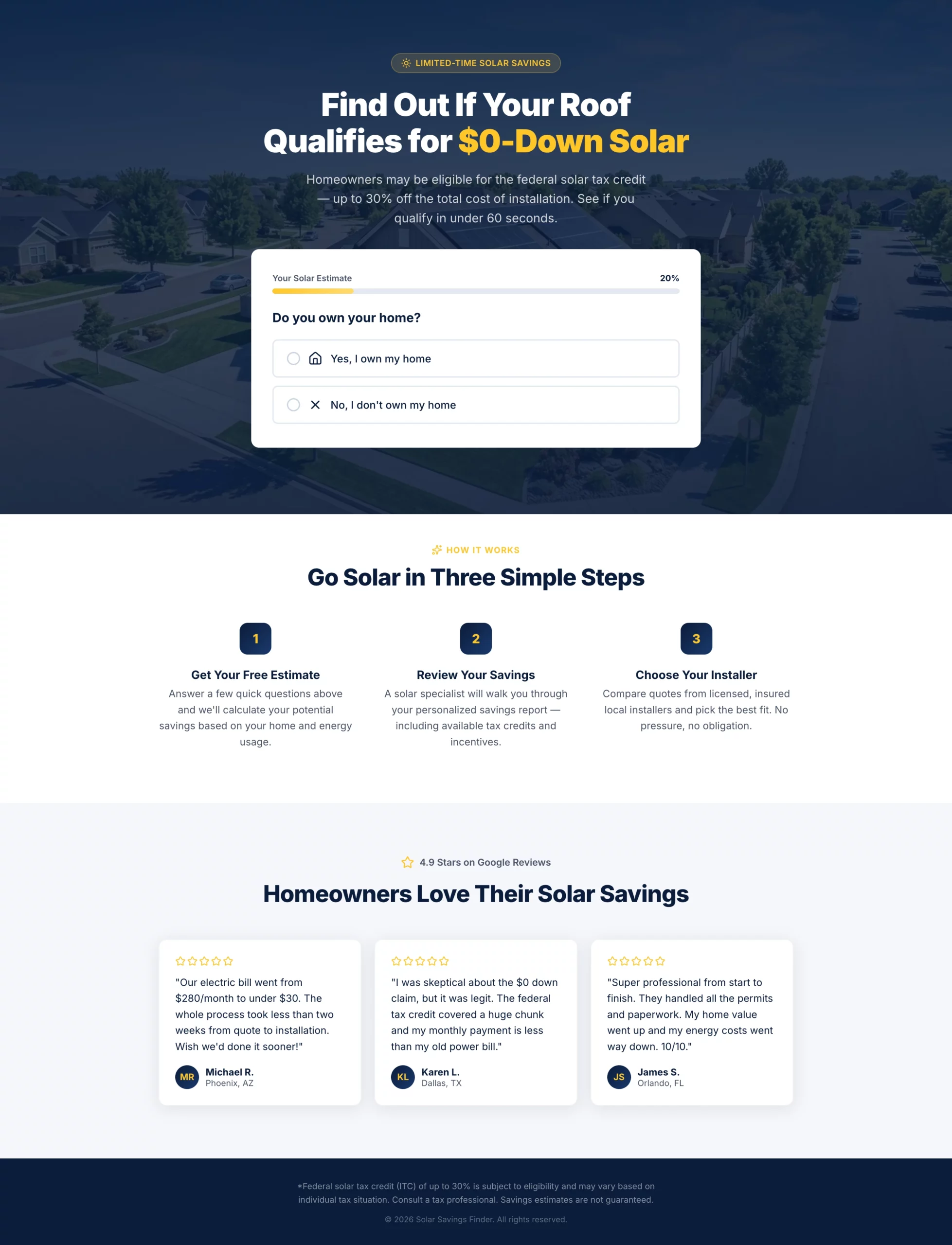
亮點:標題以聯邦稅額抵減作為切入點,卻沒有誇大承諾。多步驟問卷會在訪客抵達聯絡表單之前就篩掉租屋者和意願低的訪客,因此通過的名單都是真正合格的。進度條讓表單即使很長也顯得很短,進而維持較高的完成率。
轉換原因:太陽能是需要慎重考慮的購買。訪客需要感覺自己得到了某樣東西(一份個人化估算),而不只是為了一通業務電話去填表。這個頁面自始至終都在傳達這種框架。
可借鏡之處:在表單的早期使用一個排除性問題。如果你的優惠只適用於屋主,就在第一步詢問是否擁有房產。你每篩掉一筆不合格名單,都能替業務團隊節省時間,並改善每次轉換的成本。
複製
Create a solar lead gen landing page targeting homeowners in US sunbelt states.

Hero section: Bold headline "Find Out If Your Roof Qualifies for $0-Down Solar" with a subheadline mentioning the federal tax credit (up to 30%) without overpromising. Background is a clean aerial shot of a suburban home with solar panels. No navigation.

Form: Multi-step quiz with progress bar.
- Step 1: "Do you own your home?" (Yes / No — if No, show a soft exit message)
- Step 2: "What is your average monthly electricity bill?" (dropdown: under $75, $75-$150, $150-$250, $250+)
- Step 3: "What type of roof do you have?" (Asphalt shingle, Tile, Metal, Not sure)
- Step 4: "What is your zip code?" (text input)
- Step 5: Name, phone, email with CTA button "Check My Savings"

Below the form: Three trust badges — "No obligation estimate," "Licensed & insured installers," "Federal tax credit available."

Below the fold: A short "How it works" section with three steps (Get your estimate, Review your savings, Choose your installer). Then a row of five-star Google reviews with first name, city, and review text.

Color scheme: Deep navy and solar yellow. CTA button in yellow with dark text. Mobile-first layout.
2. 像指引而非推銷的 Medicare 頁面
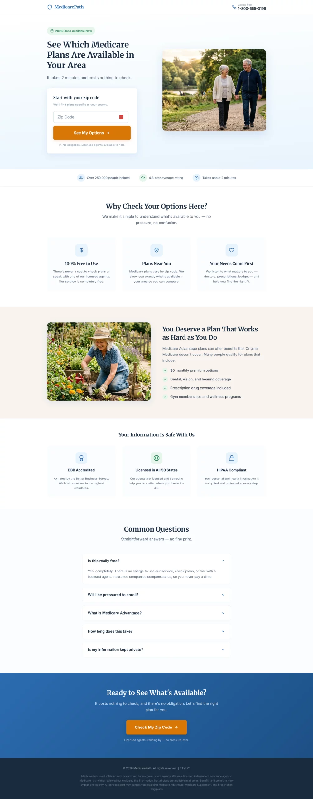
亮點:大字體、平易近人的語言,以及始終溫暖的語氣。頁面是圍繞受眾設計的,而不是圍繞在作品集裡看起來多驚豔。每一個設計決定,都在為可能不習慣複雜數位介面的訪客降低認知負擔。
轉換原因:Medicare 頁面一旦讓人覺得像在推銷保險就會失敗。這個頁面則像一份實用的資源。入口是一個郵遞區號輸入欄,沒有任何承諾的暗示,使開始的門檻維持在極低水準。
可借鏡之處:讓頁面的閱讀難度和設計密度與你的真實受眾相符。Medicare 頁面和 SaaS 頁面面向的是截然不同的人。要為真正抵達頁面的人來設計,而不是為你認為看起來專業的樣子來設計。
複製
Create a Medicare Advantage lead gen page targeting adults 64 to 72 years old.

Design philosophy: Large, readable fonts (minimum 18px body). Clean and uncluttered. No jargon. Warm and reassuring tone. The page should feel like a helpful resource, not a sales pitch.

Hero section: Headline "See Which Medicare Plans Are Available in Your Area." Subheadline: "Free to check. No obligation. Licensed agents ready to help." Hero layout: large warm photo of an active senior couple on the left, form on the right.

Form: Single step, all fields visible at once. No multi-step, no quiz.
- Zip code
- Date of birth (month/year dropdowns)
- Name
- Phone number
- Best time to call (morning / afternoon / evening — dropdown)
- CTA button: "Show Me My Options"
- Small note below button: "Your information is kept private. We do not sell your data."

Trust section directly below the form: BBB accreditation badge, "Licensed in all 50 states," HIPAA compliance note, "100% free service."

Below the fold: Three-column benefit section — "No cost to you," "Compare multiple plans," "Local licensed agents." Then a plain-language FAQ: "Is this really free?", "Will I be pressured to enroll?", "What is Medicare Advantage?"

Color scheme: Soft blue and white. Minimum 18px body font throughout. No small print above the fold.
3. 主打省錢而非保障範圍的汽車保險頁面
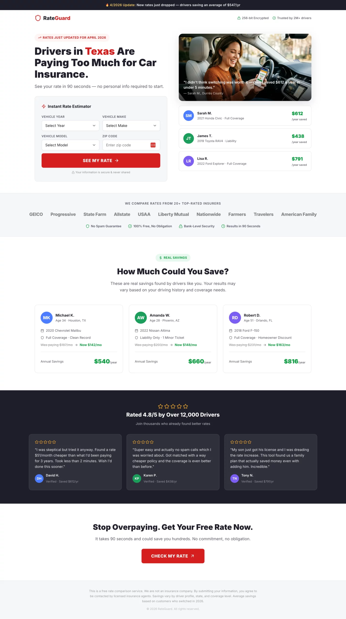
亮點:標題談的是結果(省錢),而不是過程(比較報價)。右側帶有範例節省金額的分欄首屏,讓訪客在開始填寫表單之前就有了一個具體數字作為錨點。第一步只要求填寫郵遞區號,這是阻力最小的入口。
轉換原因:表單提交後的假載入畫面(「正在搜尋 20+ 家保險公司…」)是個有回報的小細節。它營造期待感,並表示後台正在進行真實的處理,讓訪客在抵達結果頁或轉址頁之前提升感知價值。
可借鏡之處:用具體數字展示社會認同。「Sarah 每年省下 $612」比「客戶能省下數百元」更有說服力。來自看似真實的人的真實金額,營造出訪客心裡本來就在做的比較。
複製
Create an auto insurance lead gen landing page. The primary angle is savings, not coverage.

Hero section: Headline "Drivers in [State] Are Paying Too Much for Car Insurance." Subheadline: "See your rate in 90 seconds — no personal info required to start." Split layout: headline and calculator on the left, a savings graphic showing example amounts (e.g., "Sarah saved $612/year") on the right.

Form: Instant rate estimator format. All fields visible above the fold, no steps, no progression.
- Vehicle year (dropdown)
- Vehicle make (dropdown)
- Vehicle model (dropdown)
- Zip code
- CTA button: "See My Rate" in bold red

After clicking CTA, show a loading animation: "Searching 20+ insurers for your best rate..." for 2 seconds, then reveal a contact capture: name, email, phone with a secondary CTA "Show Me My Rates."

Trust elements directly below the CTA: Carrier logo strip (20+ insurers), "No spam guarantee," "Free, no obligation," security badge.

Below the fold: "How much could you save?" section with three anonymized real-looking savings examples by driver profile. Then a five-star review strip.

Color scheme: White background, bold red CTA buttons, dark charcoal text. Fast and clean.
[[city]] 和 [[region]] 等動態標記,自動個人化標題與文案。像「德州的駕駛人付太多了」這樣的標題,會依訪客的位置自動更新,不需要任何手動設定。4. 賣資格而非法律服務的法律頁面
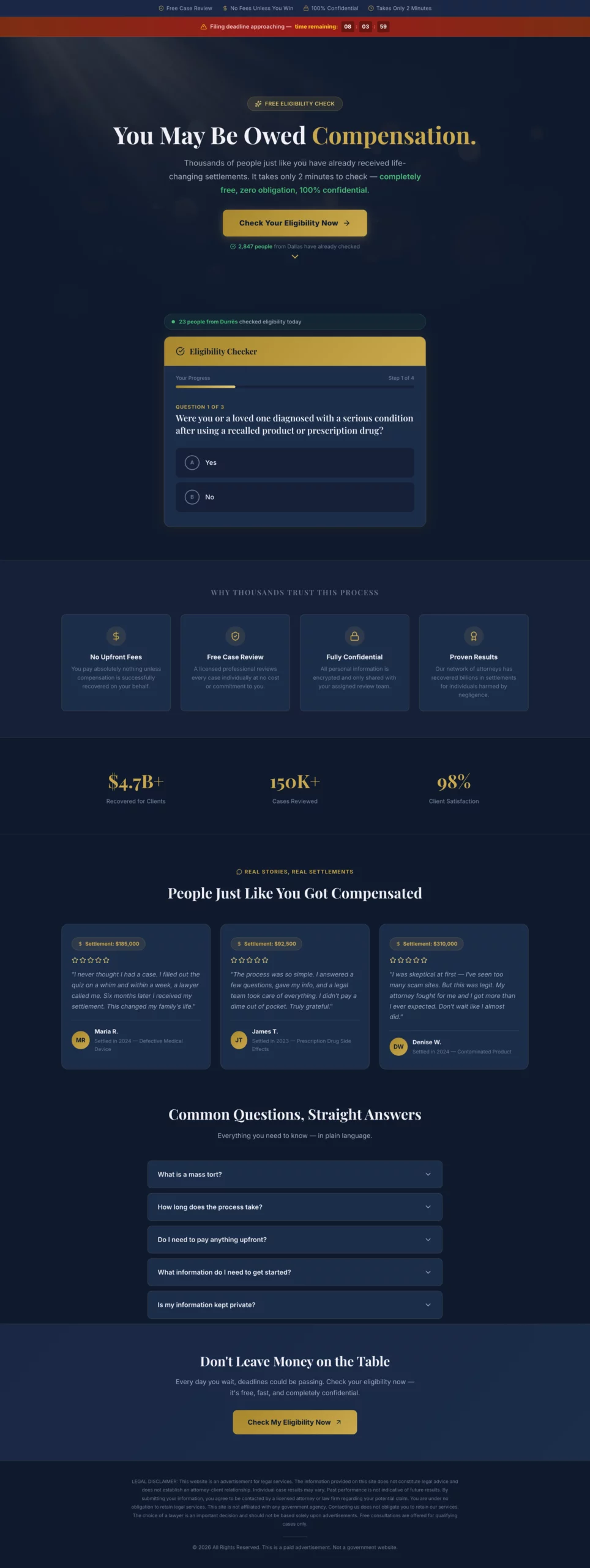
亮點:頁面在首屏從未提及律師或律師費。整體框架圍繞資格,以及訪客可能本來就應得的賠償。為被判定不合格的訪客設置的「軟出口」,會挽回原本會徹底跳出的名單。
轉換原因:身處法律問題中的人並不是在找律師,而是想弄清楚自己有沒有案子。先回答這個問題,表單提交自然會隨之而來。以律師事務所資歷開場的頁面,表現始終不如以「你可能符合資格」開場的頁面。
可借鏡之處:為不合格訪客準備的軟出口訊息。與其失去他們,不如顯示一個次要 CTA:「你可能不符合這項具體索賠的資格,但我們的團隊可以審查你的情況。」這樣可以挽回一部分原本會空手而去的訪客。
複製
Create a mass tort legal lead gen page. The angle is eligibility, not legal services. The visitor should feel like they are checking if they qualify for money they may already be owed, not hiring a lawyer.

Hero section: Headline "You May Be Owed Compensation." Subheadline: "Thousands of people affected by [product/drug/event] have received settlements. Find out if you qualify in 2 minutes." Dark background with a professional but approachable feel. No stock photos of courtrooms or gavels.

Form: Eligibility quiz format, yes/no questions only until the final step.
- Step 1: "Were you or a loved one diagnosed with [condition] after using [product]?" (Yes / No)
- Step 2: "Was the diagnosis within the last [X] years?" (Yes / No)
- Step 3: "Have you already filed a claim for this?" (Yes / No / Not sure)
- Step 4: Name, phone, email. CTA: "Check My Eligibility"

If the visitor answers No to Step 1 or 2, show a soft exit message: "Based on your answers, you may not qualify for this claim, but our team can review your situation. Would you like a free consultation anyway?" with a secondary CTA.

Trust elements: "Free case review," "No fees unless you win," "Confidential," attorney badge or bar association logo.

Below the fold: Short plain-language FAQ: "What is a mass tort?", "How long does it take?", "Do I need to pay anything upfront?"

Legal disclaimer at the bottom. Color scheme: Dark navy or charcoal with gold accents.
5. 主打保險而非更換的屋頂頁面
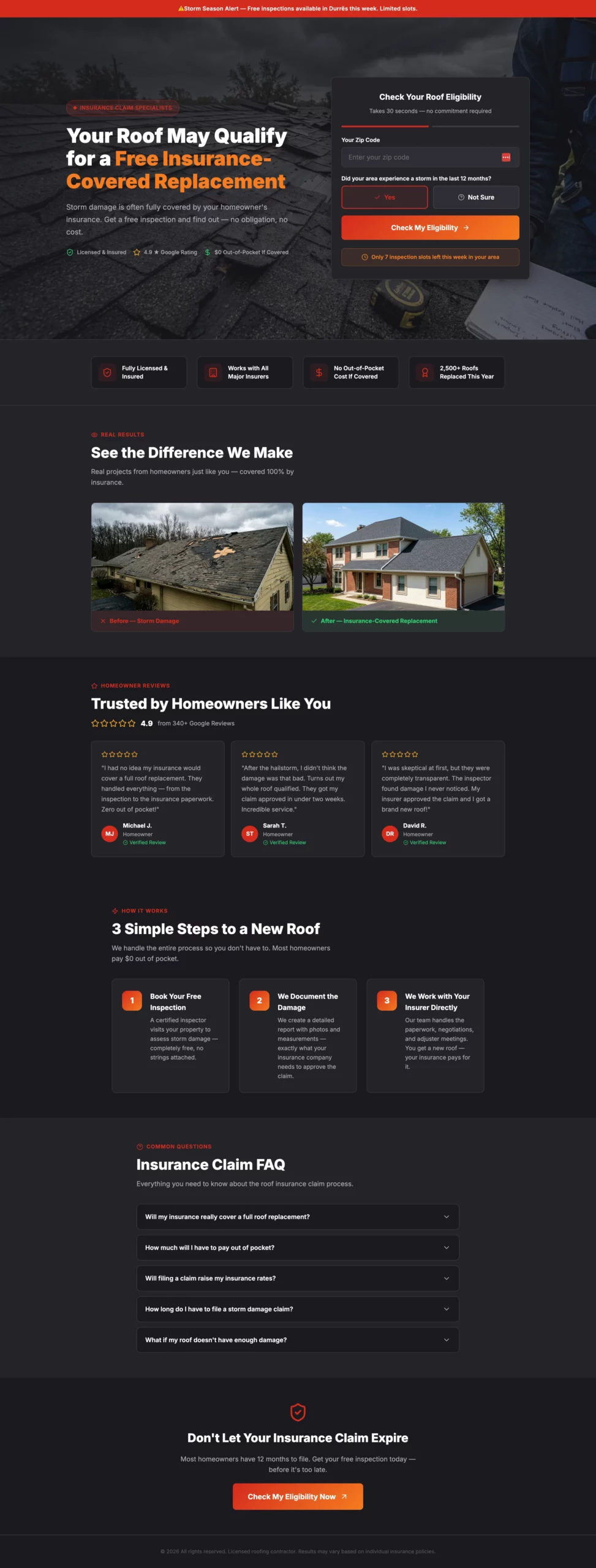
亮點:大多數屋頂頁面賣的是更換屋頂。這個頁面賣的是「保險可能已經涵蓋」這個想法。這種重新定位徹底改變了訪客的盤算。他們不再關注費用,而是在考慮自己是不是把錢白白留在了桌上。急迫感元素(本週檢查名額有限)推動決策卻不顯得被迫,因為這種稀缺性是可信的。
轉換原因:保險這個角度消除了屋頂名單開發中最大的異議:價格。當訪客相信自己的保險公司可能會承擔時,費用就不再是不預約檢查的理由。
可借鏡之處:找出受眾最大的那一個異議,圍繞消除它來建立頁面,而不是圍繞你的產品功能。對屋頂來說,異議是費用。對太陽能來說,則是長期綁約。找到你的那一個,讓它成為頁面的主角。
複製
Create a roofing lead gen landing page targeting homeowners in storm-affected areas.

Angle: Urgency around insurance claims, not just roof replacement. Many homeowners do not know their insurance may cover storm damage.

Hero section: Headline "Your Roof May Qualify for a Free Insurance-Covered Replacement." Subheadline: "Storm damage is often fully covered. Get a free inspection and find out." Hero image: close-up of storm-damaged shingles or a roofer inspecting a residential roof. No navigation.

Form: Two-step.
- Step 1: Zip code + "Did your area experience a storm in the last 12 months?" (Yes / Not sure). CTA: "Check My Eligibility"
- Step 2: Full form — name, address, phone, best time for inspection (morning / afternoon / weekend). CTA: "Book My Free Inspection"

Urgency element: "We have [X] inspection slots available this week in your area."

Trust elements: Before/after roof photos, Google review strip with star ratings, "Licensed & insured," "Works with all major insurance providers," "No out-of-pocket cost if covered."

Below the fold: Three-step process — "1. Book your free inspection. 2. We document the damage. 3. We work with your insurer directly." Then a short FAQ on the insurance claim process.

Color scheme: Dark charcoal and red or orange. Mobile-first.
6. 利用季節性急迫感卻不顯得咄咄逼人的空調暖氣頁面
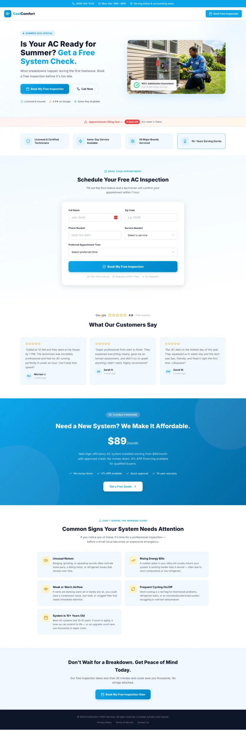
亮點:季節性切入點(「大多數故障發生在第一波熱浪期間」)營造出的急迫感顯得合乎邏輯,而不是刻意製造。首屏下方的分期付款區塊位置恰當:它回應了費用異議,卻沒有以此開場,讓首屏體驗維持簡潔、以利益為中心。
轉換原因:空調暖氣的購買是被動觸發的。人們是在擔心設備會壞時才預約,而不是在覺得可以省錢時。這個頁面及早喚起這種擔憂,並把檢查定位成防範更大問題的廉價保險。
可借鏡之處:把你的優惠定位成預防,而不是購買。在任何「不作為的痛苦大於服務成本」的服務業,「旺季來臨前預約」都比「換一套新系統」轉換得更好。
複製
Create an HVAC lead gen landing page. Angle varies by season — use summer framing (AC repair/replacement) or winter framing (heating tune-up/emergency repair).

Hero section: Headline "Is Your AC Ready for Summer? Get a Free System Check." Subheadline: "Most breakdowns happen during the first heatwave. Book a free inspection before it's too late." Split layout: headline and CTA on the left, photo of a technician working on an outdoor AC unit on the right.

Form: Single step to keep friction low for a service booking.
- Name, zip code, phone, service type (AC tune-up, AC repair, new installation, not sure), preferred appointment time (morning / afternoon / first available). CTA: "Book My Free Inspection"

Urgency element: "Appointments filling fast — [X] slots left this week in your area."

Trust elements: "Licensed & certified technicians," "Same-day service available," "All major brands serviced," five-star Google review strip with quotes mentioning speed and professionalism.

Below the fold: Financing offer section ("New system from $X/month with approved credit"). Then a "Common signs your system needs attention" section with four to five bullet points.

Color scheme: Sky blue and white for summer. Deep orange and dark grey for winter. Clean and professional.
7. 只有一個任務的緊急水電頁面:讓電話響起來
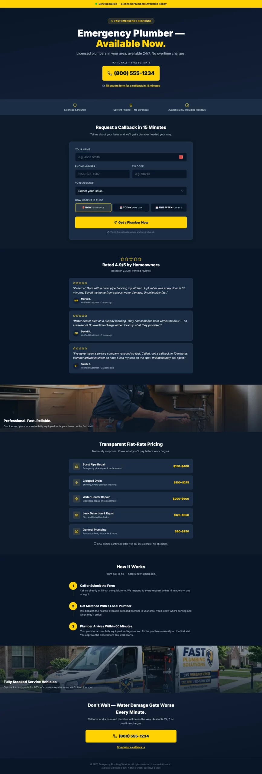
亮點:電話號碼是主角元素。不是標題,不是標誌,也不是首屏圖片。就是號碼。頁面上的其他一切都是為了支撐這一個動作。次要的表單路徑(15 分鐘內回電)可以接住那些猶豫要不要打電話、但仍有興趣的訪客。
轉換原因:緊急水電的流量是所有產業中購買意圖最高的流量之一。訪客此刻正面臨一個迫切的問題。頁面的任務不是向他們推銷,而是讓開道路,讓撥打電話盡可能快。
可借鏡之處:雙 CTA 結構。主要 CTA(立即來電)面向「熱」訪客,次要 CTA(回電表單)面向「溫」訪客。你可以同時接住兩類訪客,而不會讓頁面雜亂,也不會稀釋主要動作。
複製
Create a plumbing lead gen page targeting homeowners with urgent plumbing issues.

Angle: Emergency response speed. The visitor has a problem right now and needs confidence that help is coming fast.

Hero section: Headline "Emergency Plumber — Available Now." Subheadline: "Licensed plumbers in your area, available 24/7. No overtime charges." Large click-to-call phone number directly below the headline. Secondary CTA below the number: "Or fill out the form for a callback in 15 minutes."

Form (secondary path): Name, phone, zip code, issue type (burst pipe, clogged drain, water heater, leak, other), urgency (emergency now / today / this week). CTA: "Get a Plumber Now."

Trust elements: "Licensed & insured," "Upfront pricing — no surprises," "Available 24/7 including holidays," five-star review strip with quotes specifically mentioning fast response times.

Above the fold, include a small banner: "Serving [City/Region] — Plumbers available today."

Below the fold: Service list with flat-rate pricing ranges for common jobs. Then a "How it works" section: Call or submit, get matched with a local plumber, plumber arrives within [X] hours.

Color scheme: Dark navy and bright yellow. Mobile-first — most visitors will be on a phone with an active leak.
8. 以解脫而非羞愧開場的債務頁面
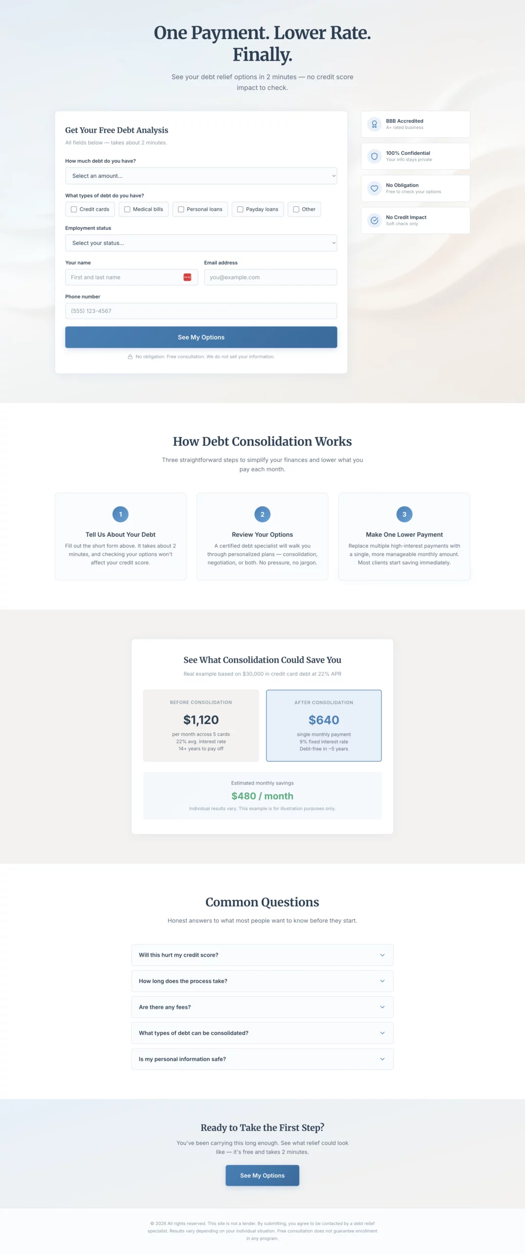
亮點:標題把利益放在最前,並能引發情感共鳴。「一次還款。更低利率。終於。」直接說出訪客的感受,而不是產品的功能。頁面上沒有任何紅色,這是刻意的選擇:紅色代表警報,而這類受眾本來就已經壓力夠大。
轉換原因:債務是個情緒化的話題。處於這種處境的訪客並不是在尋找金融知識,而是在尋找出路。先體察情緒狀態、再提出解決方案的文案,始終優於以產品機制開場的文案。
可借鏡之處:結合情境的色彩心理學。平靜的藍色和溫暖的灰色在這裡不只是審美選擇,而是轉換選擇。在任何高壓產業,你的配色方案都是訊息一致性的一部分。
複製
Create a debt consolidation lead gen page. The emotional angle is relief and control, not shame. The visitor is already stressed. The page should feel like a lifeline, not a judgment.

Hero section: Headline "One Payment. Lower Rate. Finally." Subheadline: "See your debt relief options in 2 minutes — no credit score impact to check." Soft, warm abstract visual. No navigation.

Form: Single page, all fields visible at once. No steps, no quiz. Layout should feel calm and approachable, not overwhelming.
- Debt amount (dropdown: under $10k, $10k-$20k, $20k-$40k, $40k-$75k, $75k+)
- Debt types (checkboxes: Credit cards, Medical bills, Personal loans, Payday loans, Other)
- Employment status (dropdown: Full-time, Part-time, Self-employed, Not currently employed)
- Name
- Email
- Phone
- CTA button: "See My Options"
- Small note below: "No obligation. Free consultation. We do not sell your information."

If debt amount is under $10k, show an inline note after selection: "Our programs work best for $10,000 or more. You may still qualify — submit to find out."

Trust elements beside the form: BBB accreditation, "Confidential," "No obligation consultation," "Does not affect your credit score."

Below the fold: "How debt consolidation works" in three plain steps. A concrete savings example. FAQ covering credit score impact, timeline, fees.

Color scheme: Soft blue, white, warm grey. No red anywhere.
9. 一開始就消除最大異議的人壽保險頁面
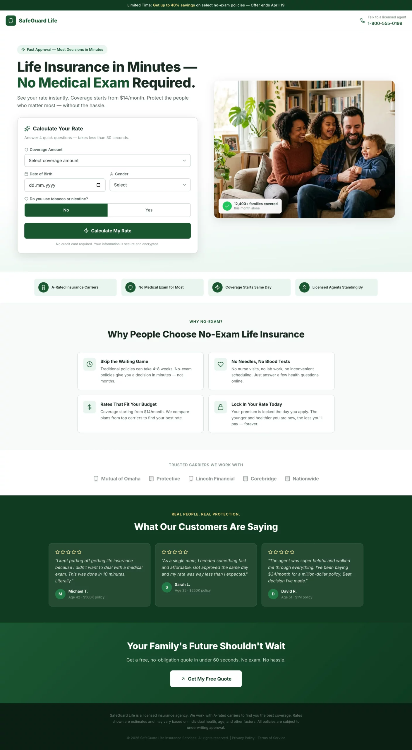
亮點:標題的鉤子是「無需體檢」,而不是產品名稱。頁面一開始就點出歷來讓人不敢申請人壽保險的那個障礙,立即消除它,然後透過六個步驟逐步蒐集資料。最後的結果畫面會顯示月費估算,讓訪客在承諾與顧問通話之前,就覺得自己已經得到了一些東西。
轉換原因:人們覺得購買人壽保險要費很大力氣,這是首要的轉換障礙。這個頁面在第一句話就化解了這種認知,並且再也不讓它冒出來。每一步都被設定為「找到你的最佳費率」,而不是「把你的資料給我們」。
可借鏡之處:圍繞訪客的利益來設定你的表單欄位。「填寫身高和體重,找到你的最佳費率」,比單純詢問身高和體重轉換得更好。這種重新表述不花一毛錢,卻能消除大多數訪客流失的那一步的阻力。
複製
Create a life insurance lead gen page targeting adults 30 to 60 years old. Angle: fast approval, no medical exam required.

Hero section: Headline "Life Insurance in Minutes — No Medical Exam Required." Subheadline: "See your rate instantly. Coverage starts from $X/month." Clean split layout: headline and rate calculator on the left, warm family photo (not staged stock) on the right.

Form: Instant rate calculator format. All fields visible at once above the fold, framed as "calculate your rate" not "fill out a form."
- Coverage amount (slider or dropdown: $100k, $250k, $500k, $1M+)
- Date of birth
- Gender (Male / Female / Prefer not to say)
- Smoker? (Yes / No toggle)
- CTA button: "Calculate My Rate"

After clicking CTA, show an instant rate estimate on the same page (e.g., "Your estimated rate: from $X/month"). Below the estimate, show a contact capture: name, email, phone with CTA "Lock In My Rate."

Trust elements below the calculator: "A-rated carriers," "No medical exam for most applicants," "Coverage starts same day," licensed agent badge.

Below the fold: "Why people choose no-exam life insurance" — four short bullets. Carrier logo strip. Five-star review strip with quotes about ease and speed.

Color scheme: Deep green and white. Clean, confident, trustworthy. Mobile-first.
10. 讓撥打電話成為唯一合乎邏輯的下一步的按通話付費頁面
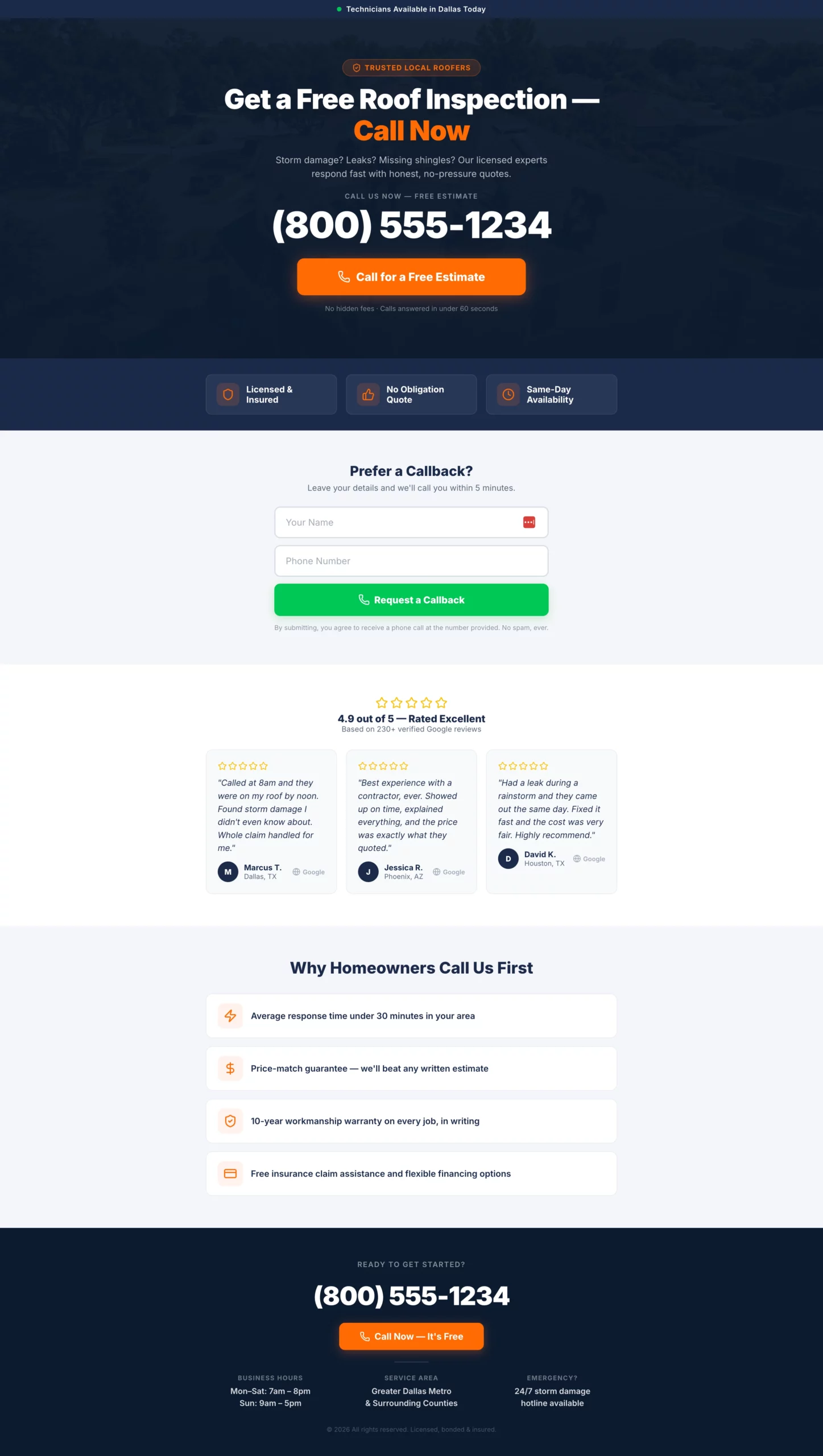
亮點:電話號碼使用 48 px 的字級。這不是巧合。頁面上的其他所有元素都從屬於這個號碼。次要的表單路徑接住那些想要協助、但還沒準備好立刻打電話的溫訪客,同時不會讓主要轉換路徑變得雜亂。
轉換原因:按通話付費的流量帶著很高的意圖和很短的注意力而來。頁面只有一個任務:讓撥打電話成為阻力最小的路徑。任何不服務於這個任務的元素,都是轉換漏洞。
可借鏡之處:如果你在手機上投放按通話付費,就把一鍵撥號按鈕做成滿版寬度的點擊區域。滿版按鈕與置中窄按鈕在點擊準確率上的差異,可以在轉換率中量測出來。
複製
Create a pay per call landing page for a high-intent service vertical (home services, insurance, legal — adapt as needed).

Design philosophy: This page has one job. Get the phone to ring. Every design decision should serve that goal.

Hero section: Service-specific headline in large type. Example: "Get a Free Roof Inspection — Call Now." Directly below: phone number in the largest font on the page (minimum 48px on desktop, full-width tap target on mobile). Below the number: a single click-to-call button with high-contrast color. CTA text: "Call for a Free Estimate."

Below the hero: Three trust bullets in icon + text format. Examples: "Licensed & insured," "No obligation," "Same-day availability." Keep each to five words maximum.

Secondary conversion path: A simple two-field form below the trust bullets — name and phone number only. CTA: "Request a Callback." No email field.

Below the fold: Five-star Google review strip with three reviews, first name and city only. Then a short "Why call us" section with three to four one-line bullet points.

Footer: Phone number repeated in large text. Business hours. Service area.

Color scheme: Dark header with high-contrast CTA. Mobile is the primary design target.
11. 用問卷換取電子郵件的居家裝飾預登陸頁
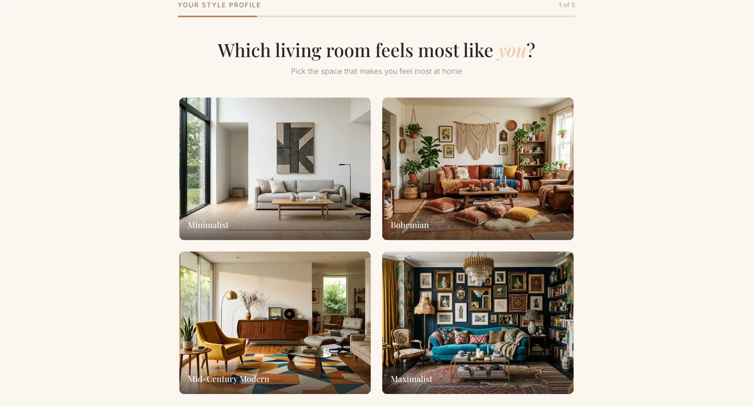
亮點:電子郵件蒐集出現在問卷之後,而不是之前。訪客抵達結果畫面時,已經投入了時間,並且真心好奇自己的風格結果。與冷冰冰的訂閱表單相比,這種投入顯著提高了交出電子郵件的比例。
轉換原因:個人化是這裡的轉換機制。訪客提供電子郵件地址不是為了收到電子報,而是為了取得屬於自己的個人化靈感板。這種框架徹底改變了這筆交換的性質。
可借鏡之處:問卷之後的優惠。不要止步於結果畫面,而是把它當作通往折扣或商品系列的自然銜接。此刻訪客處於正面、投入的狀態,是呈現優惠的最佳時機。
複製
Create a home decor lead gen pre-lander using a style quiz format. The goal is to capture an email before sending the visitor to a product collection or offer page.

Angle: Personalization. The visitor discovers their design style and gets curated recommendations in exchange for their email.

Hero section: Headline "What's Your Home Design Style?" Subheadline: "Take our 60-second quiz and get a free personalized mood board + exclusive discount." Clean, editorial layout. High-quality lifestyle imagery of a beautifully decorated living room. No navigation.

Quiz flow (one question per screen with visual answer options where possible):
- Q1: "Which living room feels most like you?" (four image options: minimalist, bohemian, mid-century modern, maximalist)
- Q2: "What is your go-to color palette?" (four color swatches with labels)
- Q3: "Which material do you love most?" (Wood / Marble / Linen / Metal)
- Q4: "What is your biggest decorating challenge?" (Small space, No cohesive style, On a budget, Starting from scratch)
- Q5: "Where should we send your personalized mood board?" (Name + email field). CTA: "Show My Results"

Results page: Show a style name ("Your style is Modern Bohemian") with a description and three to four curated product recommendations. Include a discount code for first purchase.

Color scheme: Warm neutrals — cream, terracotta, warm grey. Editorial and aspirational feel.
12. 接住仍在規劃階段訪客的居家翻新頁面
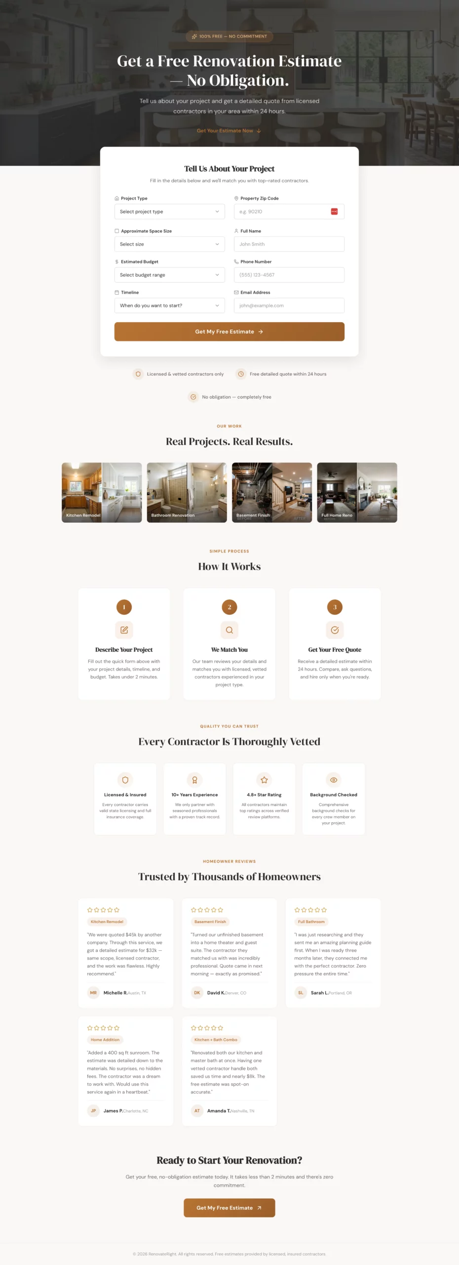
亮點:表單包含一個時程問題,對於「只是隨便看看」的回答,會提供培養路徑,而不是死胡同。大多數名單開發頁面把早期階段的訪客視為低價值。這個頁面透過提供規劃指南來接住他們,並在他們準備好時跟進,這代表沒有任何名單被遺漏。
轉換原因:居家翻新的考慮週期很長。大多數訪客不會在來到你頁面的當天就準備好預約施工方。只轉換準備預約的訪客的頁面,會讓很大比例的流量沒有被轉換。培養路徑可以挽回這些訪客。
可借鏡之處:在購買意圖差別很大的任何表單中,加入一個時程問題。然後為每個答案設計不同的跟進路徑。這些資料還能幫你把業務團隊的時間集中在熱名單上。
複製
Create a home renovation lead gen page targeting homeowners planning a major renovation project (kitchen, bathroom, basement, full home).

Angle: Free project estimate with no commitment. The visitor is in the planning phase and shopping around.

Hero section: Headline "Get a Free Renovation Estimate — No Obligation." Subheadline: "Tell us about your project and get a detailed quote from licensed contractors in your area within 24 hours." Hero image: beautiful renovated kitchen or bathroom. No navigation.

Form: Single page, all fields visible at once. Clean two-column layout so it does not feel long.
Left column:
- Project type (dropdown: Kitchen, Bathroom, Basement, Addition, Full home, Other)
- Approximate space size (dropdown: Under 100 sq ft, 100-300 sq ft, 300-500 sq ft, 500+ sq ft, Not sure)
- Estimated budget (dropdown: Under $10k, $10k-$30k, $30k-$75k, $75k-$150k, $150k+, Not sure yet)
- Timeline (dropdown: ASAP, 1-3 months, 3-6 months, Just researching)

Right column:
- Property zip code
- Name
- Phone
- Email
- CTA button: "Get My Free Estimate" (full width, spans both columns)

If Timeline is "Just researching," show an inline note: "No problem — we will send you a free planning guide and follow up when you are ready."

Trust elements below the form: "Licensed & vetted contractors only," "Free detailed quote within 24 hours," "No obligation," portfolio image strip of before/after projects.

Below the fold: "How it works" in three steps. Contractor vetting badges. Five-star reviews with project types mentioned.

Color scheme: Warm white, charcoal, muted brass or terracotta accent. Premium but approachable.
13. 讀起來像文章而非廣告的健康業配文
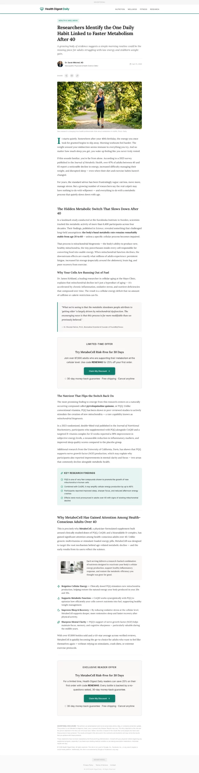
亮點:出版物風格的頁首和作者署名,在訪客讀到任何一句文案之前,就承擔了建立可信度的大部分工作。產品在內容的自然中點處才被引入,此時問題已被充分鋪陳。
到那時,讀者已經在點頭認同,產品介紹感覺更像一種推薦,而不是推銷。
轉換原因:業配文頁面繞過了大多數人帶到登陸頁上的本能的廣告懷疑。訪客處於閱讀模式,而不是評估模式。這種心理狀態的轉變,價值超過你在標準頁面上能做的幾乎所有標題或優惠改動。
可借鏡之處:頁面中段的 CTA 位置。不要等到最底部才呈現你的優惠。在問題確立之後、解決方案完整說明之前放置 CTA。那是內容流中意圖最高的時刻。
複製
Create a health advertorial landing page in a news article format to warm up cold paid social traffic before sending to a product offer page.

Format: Styled to look like an editorial health article. Include a publication-style header with a credible outlet name (e.g., "Health Digest Daily"), a category tag ("Health & Wellness"), a byline with a named author and credentials, and a publish date.

Headline: Curiosity-gap or discovery angle. Example: "Researchers Identify the One Daily Habit Linked to Faster Metabolism After 40."

Opening hook: Two to three paragraphs describing a relatable problem (low energy, stubborn weight, poor sleep) in conversational, empathetic language. No product mention yet.

Middle section: Introduce a discovery tied to a specific mechanism (a nutrient, a habit, a compound). Include a pull quote styled like a researcher or doctor statement. Use subheadings to break up content. 400 to 600 words total for this section.

Product introduction: Natural transition — "This is why [product name] has gained attention among health-conscious adults over 40." One paragraph introducing the product, followed by three to four benefit bullets.

CTA block: "Try [Product] Risk-Free for 30 Days." Include a discount or limited offer. CTA button: "Claim My Discount."

Second CTA block mid-page after the pull quote.

Footer: "Advertorial" disclosure at top and bottom. Standard legal disclaimer about results.

Color scheme: Clean white, editorial black text, one accent color matching the product brand. Should feel like content, not an ad.
14. 以故事而非產品開場的理財業配文
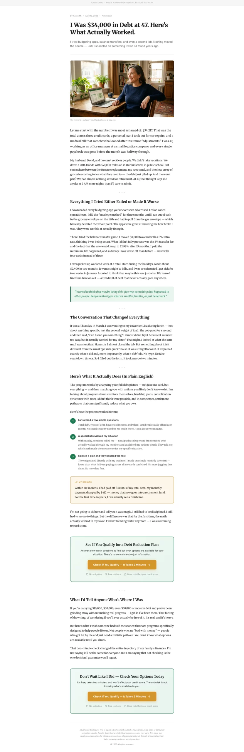
亮點:開頭的具體數字(債務金額、年齡、工作類型)不需要證據就能建立可信度。「47 歲時我背了 $34,000 的債」比「我債台高築」更可信。問題鋪陳部分中,敘述者嘗試常規建議卻失敗,讀者就是在這裡產生情感投入的。等到解決方案出現時,讀者已經在為敘述者加油了。
轉換原因:在債務和信貸類優惠上,理財業配文的表現優於標準頁面,因為受眾的情緒已被調動起來。他們並不是在找產品,而是在找一個可以相信存在解決辦法的許可。一個映照他們經歷的故事,就給了他們這個許可。
可借鏡之處:「試過但失敗了」這一段。在引入你的解決方案之前,先承認讀者已經嘗試過的事情。這表示你理解他們的處境,也讓你的方案與他們已經否定過的做法區分開來。
複製
Create a personal finance advertorial landing page in a first-person story format. Target audience: adults 35 to 55 dealing with debt, savings shortfall, or retirement anxiety.

Format: Personal essay style, not news article. Written in first person as a relatable narrator who discovered a solution to a financial problem.

Headline: Story-hook format. Example: "I Was $34,000 in Debt at 47. Here Is What Actually Worked."

Opening: Two paragraphs establishing the narrator's situation. Specific details (debt amount, age, job type) make it credible. Conversational, honest tone.

Problem build: Two to three paragraphs describing the frustration of trying and failing with conventional advice (budgeting apps, balance transfers, etc.).

Turning point: One paragraph introducing the discovery. Keep it vague enough to create curiosity.

Solution section: Explain the mechanism or service in plain language. Use a numbered list or short paragraphs. Include a concrete result: "Within six months, I had paid off $18,000 and my monthly payment dropped by $400."

CTA block: "Check If You Qualify — It Takes 2 Minutes." Frame it as checking eligibility, not signing up. CTA button in a contrasting color.

Trust elements: "No obligation," "Free to check," "Does not affect your credit score."

Second CTA at the bottom.

Disclosure: "This is a paid advertisement. Results may vary." at top and bottom.

Color scheme: Clean white background, dark readable text, one warm accent color (green or gold). Reads like a blog post.
15. 先說明再提出請求的居家服務業配文
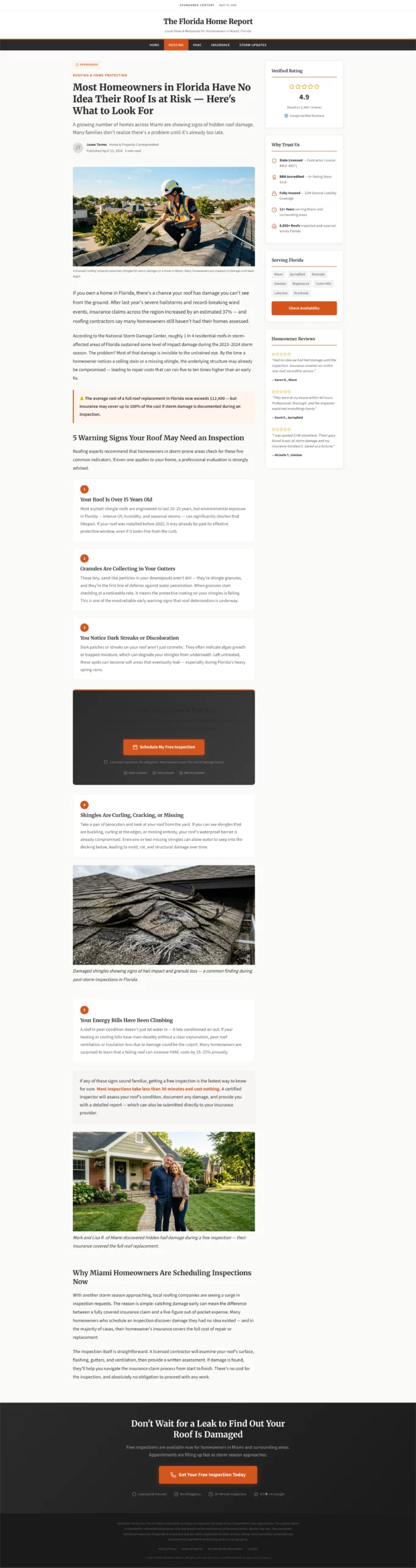
亮點:警示風格的標題,為可能並未主動尋找服務的訪客喚起問題意識。清單體格式(你的屋頂可能需要檢查的 5 個跡象)同時起到教育和篩選的作用。等訪客抵達 CTA 時,他們已經認定自己就是遇到了你的服務所能解決的那個問題的人。
轉換原因:對問題毫無意識的流量,是標準登陸頁最難轉換的,因為訪客還不知道自己需要你所賣的東西。教育型業配文在頁面內部就把他們從無意識帶到有意識,讓 CTA 感覺像是自然的下一步,而不是打擾。
可借鏡之處:嵌在清單體第三點之後的 CTA。不要等到內容結尾才呈現你的優惠。讀到第三點時已經在點頭的訪客,接受度正處於顛峰。按鈕就該放在那裡。
複製
Create a home services advertorial landing page targeting homeowners who may not know they have a problem. Best used for roofing, HVAC, plumbing, or pest control verticals.

Format: Educational article style with a warning or discovery headline.

Headline example: "Most Homeowners in [State] Have No Idea Their Roof Is at Risk — Here Is What to Look For."

Opening: Two paragraphs establishing the scope of the problem using real-feeling statistics or seasonal context. "After last year's hailstorms, insurance claims in [region] increased by X%." Conversational but informative tone.

Middle section: List format — "5 Signs Your Roof May Need Inspection." Each sign is two to three sentences with a practical description. This educates the reader and qualifies them simultaneously.

Transition: "If any of these sound familiar, getting a free inspection is the fastest way to know for sure. Most inspections take less than 30 minutes and cost nothing."

CTA block after sign number 3: "Book a Free Roof Inspection in Your Area." Include a note: "Licensed inspectors. No obligation. Most insurers cover the cost of damage found."

Second CTA at the bottom of the page.

Trust elements: Contractor license badges, Google rating, "Serving [City/Region]."

Footer: Disclosure that this is a sponsored post. Standard legal language.

Color scheme: Clean white, charcoal text, one warm accent (orange or red). Feels like helpful local journalism.
16. 毫無猶豫的 SaaS 免費試用頁
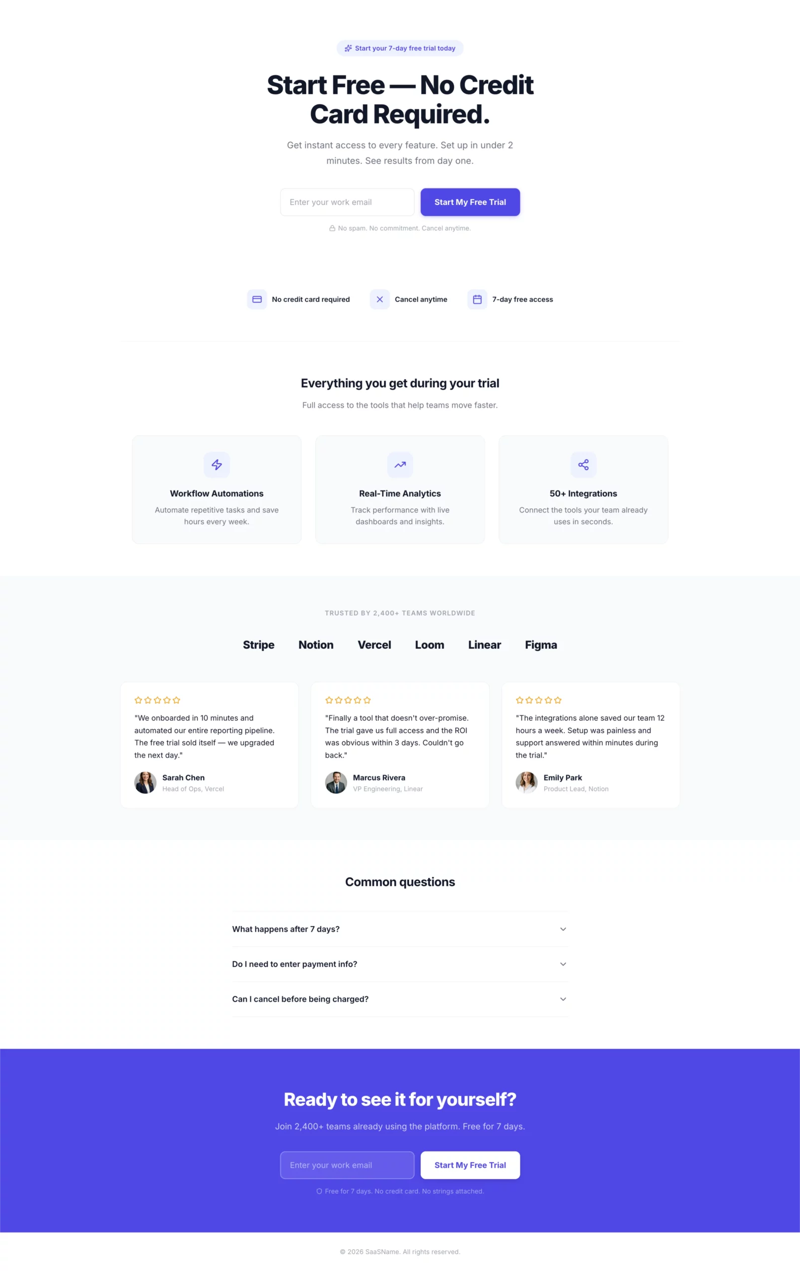
亮點:一個欄位。一個按鈕。標題和 CTA 與廣告完全一致。「免費開始,無需信用卡」一句話就消除了兩大異議。這個頁面上沒有其他需要決定的事。
轉換原因:訪客點擊是為了免費試用。頁面確認了免費試用。唯一的步驟就是輸入電子郵件。每多一個欄位、每一個導覽連結、每一個次要優惠,都是讓你損失轉換的決策點。這個頁面一個都沒有。
可借鏡之處:表單下方的信任圖示。「無需信用卡,隨時取消,7 天免費使用」回答了每位免費試用訪客在輸入電子郵件前心裡默默提出的三個問題。把答案放在那個位置。
複製
Create a SaaS free trial landing page.

Hero section: Headline "Start Free — No Credit Card Required." Single email input field with a bold CTA button: "Start My Free Trial." Clean white layout with one bold accent color. No navigation.

Below the form: Three trust icons in a horizontal row.
- Icon 1: "No credit card required"
- Icon 2: "Cancel anytime"
- Icon 3: "7-day free access"

Below the trust icons: Three-column feature highlights showing what the visitor gets access to during the trial. Keep each to one line of copy.

Below the fold: Social proof section — logos of recognizable companies using the product, or a testimonial strip with headshots, names, and company names.

FAQ section: Three questions addressing common hesitations — "What happens after 7 days?", "Do I need to enter payment info?", "Can I cancel before being charged?"

Footer CTA: Repeat the email form and button.

Color scheme: Clean white background, one bold accent color for CTA and highlights. Minimal. Fast. No distractions.
17. 加碼範例:把結果鎖在電子郵件後面的健康問卷漏斗
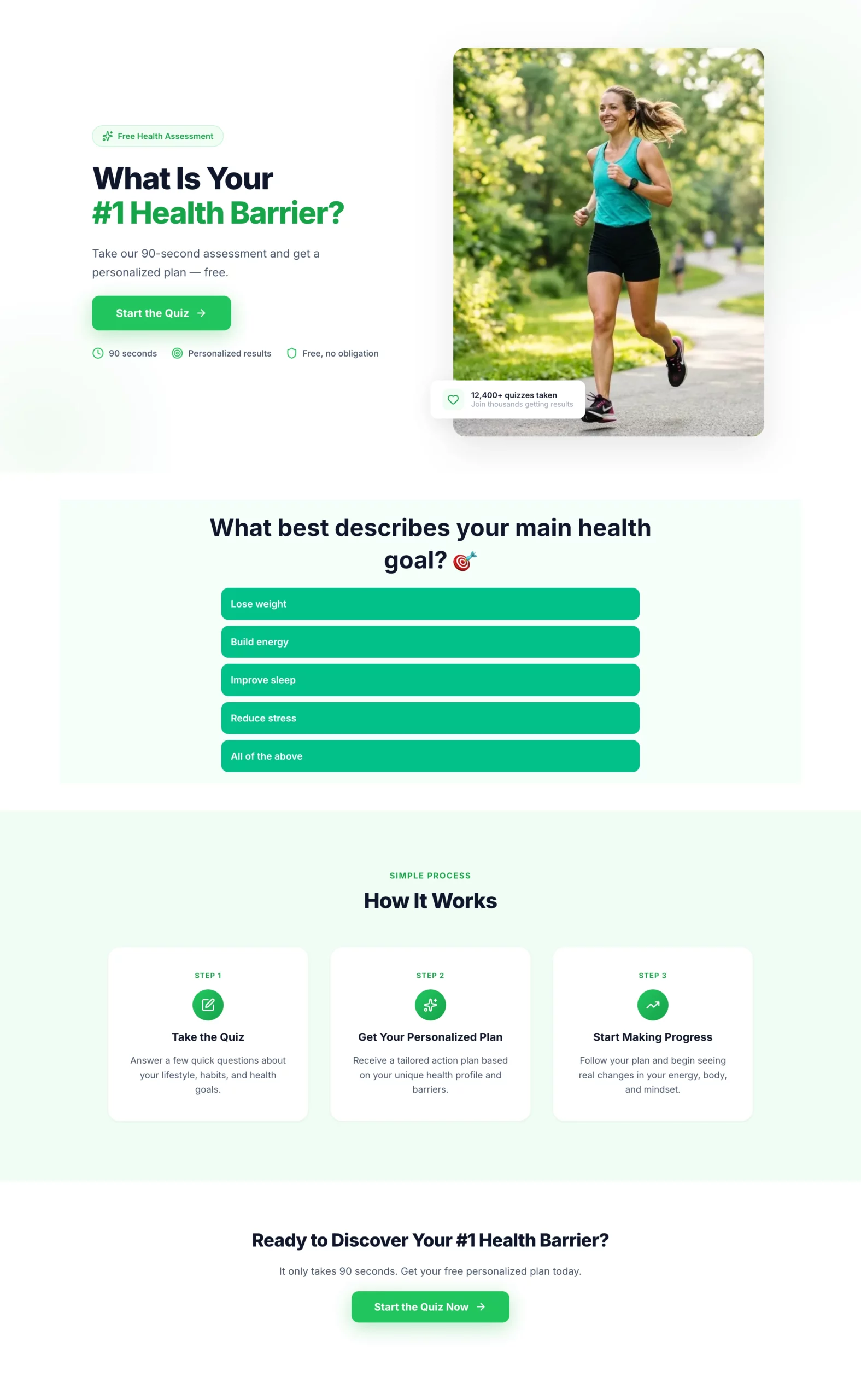
亮點:電子郵件蒐集出現在結果畫面,而不是入口。訪客抵達這裡時,已經回答了六個問題,並真心好奇自己的結果。這種投入使他們比面對冷冰冰的訂閱表單時更願意交出電子郵件。末尾的投入程度問題,還會在名單進入你的跟進序列之前,預先篩選名單的品質。
轉換原因:對於冷流量,問卷漏斗始終優於標準名單開發表單,因為它在索取任何東西之前就先建立了互動。訪客是在做一件事(回答問題),而不是被要求給出什麼(聯絡資訊)。這種轉變徹底改變了轉換的動態。
可借鏡之處:把投入程度問題當作最後的預先篩選。它不會影響表單完成率,但能為你的跟進團隊提供訊號,判斷優先處理哪些名單。「非常認真」的受訪者與「只是了解一下」的受訪者,需要完全不同的業務溝通。
步驟 1:在 LanderLab 中建立登陸頁
複製
Create a landing page for a health and wellness quiz funnel. This page introduces the quiz and gets the visitor to click through to it.

Hero section: Headline "What Is Your #1 Health Barrier?" Subheadline: "Take our 90-second assessment and get a personalized plan — free." Single CTA button: "Start the Quiz." Clean, energetic design with a motivating health-focused visual. No navigation.

Below the CTA: Three short trust bullets — "90 seconds," "Personalized results," "Free, no obligation."

Below the fold: Brief "how it works" section — Take the quiz, Get your personalized plan, Start making progress. Keep it to three steps with icons.

Color scheme: Bright and motivating. Greens and whites. Bold CTA button.
步驟 2:在 LanderLab 的問卷建置器中建立問卷
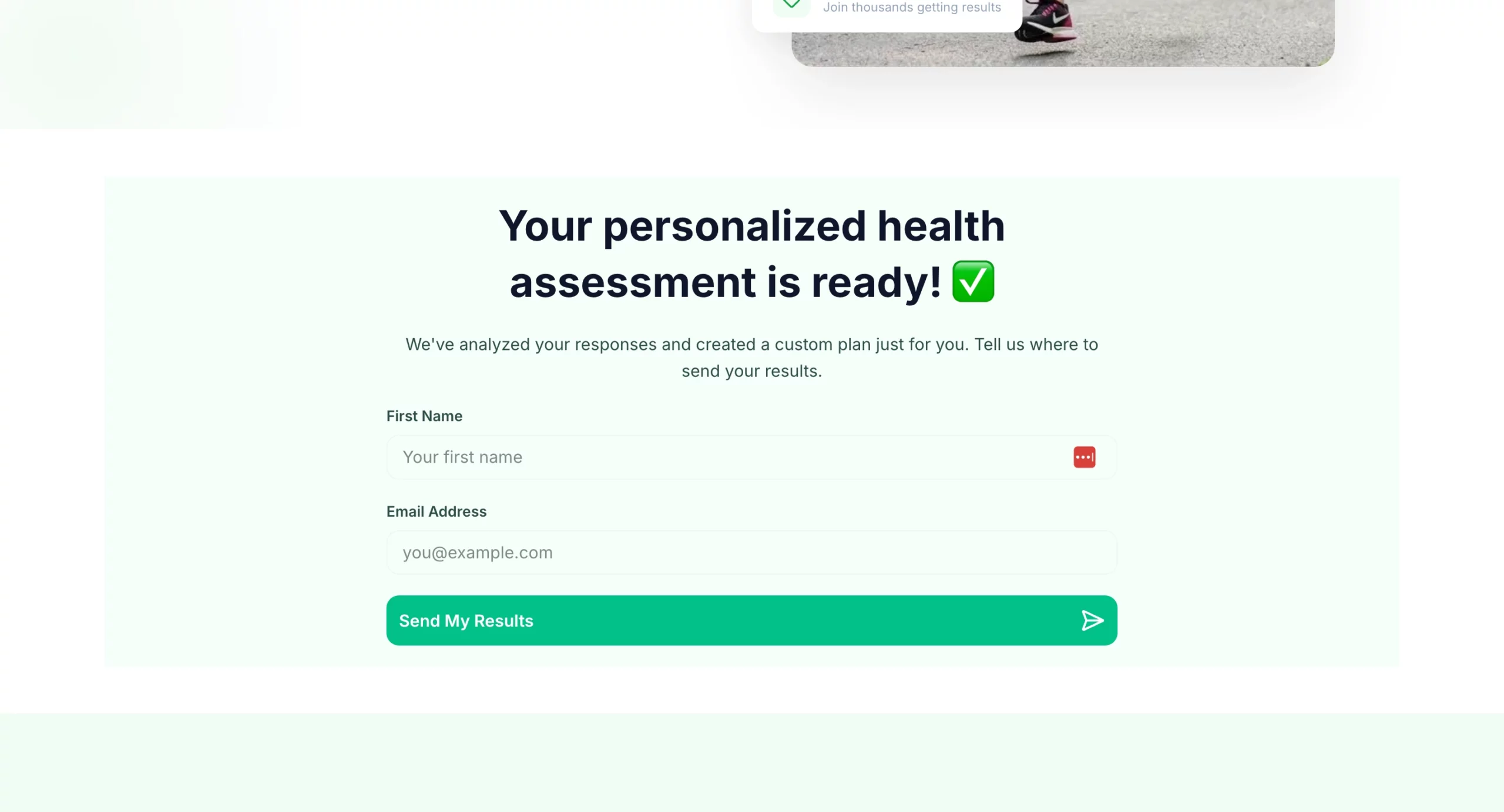
複製
Create a health and wellness quiz funnel that qualifies visitors and captures an email before showing results.

Quiz questions (one per screen, progress bar throughout):
- Q1: "What best describes your main health goal?" (Lose weight, Build energy, Improve sleep, Reduce stress, All of the above)
- Q2: "How would you describe your current diet?" (Mostly healthy, Hit or miss, Could be better, Pretty poor)
- Q3: "How often do you exercise?" (Daily, 3-4x per week, 1-2x per week, Rarely, Never)
- Q4: "How many hours of sleep do you get on average?" (Under 5, 5-6, 7-8, More than 8)
- Q5: "What has held you back from reaching your health goals?" (No time, No motivation, Tried and failed, Not sure where to start, Cost)
- Q6: "How committed are you to making a change in the next 30 days?" (Very committed, Somewhat, Just exploring)

Results gate: "Your personalized health assessment is ready. Where should we send it?" Name + email field. CTA: "Send My Results."

Results page: Personalized summary based on quiz answers. Transition into offer: free consultation, product recommendation, or program signup. CTA above the fold on results page.

Design: Bright and motivating. Progress bar visible throughout. Mobile-first. One question per screen with large tap targets for answer options.
18. 加碼範例:像協助而不是銷售漏斗的財務評估問卷
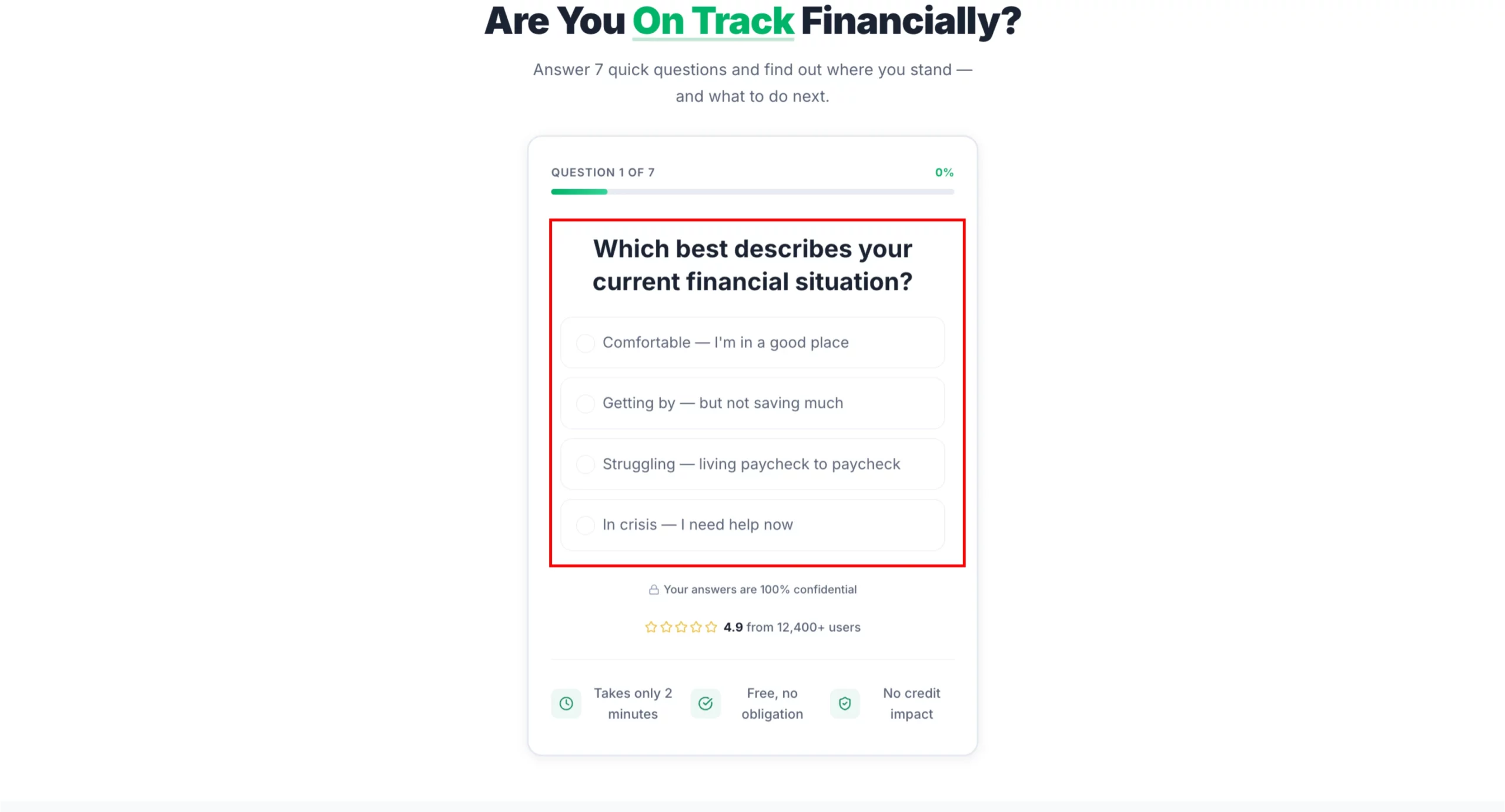
亮點:這份問卷從不提及具體產品。它把自己定位為財務評估工具,所以訪客會如實回答,而不是為了避免銷售推介而修飾答案。到結果頁時,訪客已經自己診斷出了財務狀況,並準備好接受那些感覺像量身打造的建議、而不是追加銷售的推薦。
轉換原因:金融產品屬於需要深思熟慮的購買,信任是首要障礙。一份用七個問題來展示自己理解訪客處境的問卷,在兩分鐘內建立的信任,比大多數產品頁在整個捲動深度中建立的還要多。
可借鏡之處:多優惠的結果頁。結果頁不是把訪客送往單一產品,而是根據他們的回答呈現兩到三個推薦。這增加了配對的機會,也讓推薦顯得真正個人化。
步驟 1:在 LanderLab 中建立登陸頁
複製
Create a landing page for a financial assessment quiz funnel. This page introduces the quiz and gets the visitor to click through. No product mention yet.

Hero section: Headline "Are You On Track Financially?" Subheadline: "Answer 7 quick questions and find out where you stand — and what to do next." Single CTA button: "Take the Free Assessment." Clean, professional design. No navigation.

Below the CTA: Three short trust bullets — "Takes 2 minutes," "Free, no obligation," "No impact to your credit score."

Below the fold: Brief reassurance section — "This is not a sales pitch. It is a free tool to help you understand your options." Then a three-step how it works: Answer 7 questions, Get your personalized summary, Review your options at no cost.

Color scheme: Professional and trustworthy. Navy and white or charcoal and green. Mobile-first.
步驟 2:在 LanderLab 的問卷建置器中建立問卷
複製
Create a financial needs assessment quiz that qualifies visitors for debt relief, insurance, or investment products. The quiz feels like a helpful tool, not a lead form.

Quiz questions (one per screen, progress bar throughout):
- Q1: "Which best describes your current financial situation?" (Comfortable, Getting by, Struggling, In crisis)
- Q2: "Do you have more than $10,000 in unsecured debt?" (Yes / No / Not sure)
- Q3: "Are you currently saving for retirement?" (Yes, regularly / Sometimes / Not yet)
- Q4: "Do you have life insurance?" (Yes, enough coverage / Yes, but not sure if it is enough / No)
- Q5: "What is your biggest financial concern right now?" (Debt, Retirement savings, Monthly expenses, Unexpected emergencies, All of the above)
- Q6: "What is your household income range?" (Under $30k, $30k-$60k, $60k-$100k, $100k+, Prefer not to say)
- Q7: "How soon are you looking to address your financial situation?" (Immediately, In the next 3 months, Just researching)

Results gate: "Your financial assessment is complete. Where should we send your personalized action plan?" Name + email + phone (optional). CTA: "Get My Plan."

Results page: Personalized summary with two to three recommended actions based on answers. Each recommendation links to a relevant offer (debt consolidation, life insurance quote, retirement consultation). Include urgency where relevant.

Design: Professional and trustworthy. Navy and white or charcoal and green. Progress bar clearly visible. No jargon. Reassuring tone throughout.
如何在幾分鐘內建立上述任何一個頁面
上面的每個範例都附帶了可以直接貼到 LanderLab 的提示詞。
AI 登陸頁建置器會根據你的需求簡述產生完整頁面:標題、副標題、內文文案、表單結構、CTA 和版面配置,並已符合你描述的切入角度。
你不是從空白範本開始,而是從一個已經理解你優惠的頁面開始。
接著複製頁面、調整切入角度,就能為你投放的每則廣告準備好對應的版本。
如果你想看看效果,免費試用 LanderLab,用上面的某則提示詞建立你的第一個頁面。
速查表:登陸頁最佳實務
| 原則 | 實際意義 |
|---|---|
| 訊息一致性(message match) | 頁面標題在語言和意圖上呼應廣告標題 |
| 單一 CTA | 每個頁面只有一個動作。移除導覽和次要連結 |
| 優惠位於首屏 | 核心承諾無需捲動即可看到 |
| 盡量少的表單欄位 | 只詢問你需要的內容。每多一個欄位,完成率就會下降 |
| 社會認同的位置 | 評價和標誌放在 CTA 之前,而不是埋在底部 |
| 行動優先 | 大多數付費流量落在手機上。先為那塊螢幕設計 |
| 貼合受眾的設計 | 設計的複雜度和文案語氣應與你要銷售的對象相符 |
| 每個廣告角度對應一個頁面 | 切勿把多個廣告角度的流量導向同一個頁面 |
總結
最好的登陸頁不是最漂亮的,而是圍繞一個清楚的承諾打造,在正確的時間傳達給正確的人,並讓點擊到轉換之間的阻力盡可能小。
上面的每個範例都遵循這一邏輯。有的極簡,有的很長。有的以情感切入,有的以數字切入。它們的共同點是用心:頁面上的每個元素都有其存在的理由。
應用這一切的最快方式,是選出與你目前廣告活動最相符的範例,用提示詞在 LanderLab 中建立它,並與你現在正在投放的頁面進行測試比較。
你的下一個最佳登陸頁範例,只差一則提示詞。