2026年のベストランディングページ18選(AIプロンプトで同じページを作成)
ランディングページに関する記事の多くは、きれいなスクリーンショットを見せて終わりです。この記事は違います。以下の事例は、それぞれ具体的なコンバージョンの原則に基づき、何が効いているのかを詳しく分析したうえで、すぐに使えるAIプロンプトも用意しています。同じページをLanderLabで数分で作れます。

ランディングページに関する記事の多くは、きれいなスクリーンショットを見せて終わりです。
この記事は違います。以下の事例は、それぞれ具体的なコンバージョンの原則に基づき、何が効いているのかを詳しく分析したうえで、すぐに使えるAIプロンプトも用意しています。同じページをLanderLabで数分で作れます。
ペイドソーシャル、検索、リード獲得のどのキャンペーンを運用している場合でも、参考にする価値のあるページばかりです。キャンペーンに合うランディングページの種類が分からない場合は、まずそちらから確認してください。
ベストなランディングページの条件とは?
ベストなランディングページの事例を見る前に、簡単な枠組みを押さえておきましょう。優れたランディングページには、次の4つの共通点があります。
- メッセージマッチ:広告で約束した内容をそのまま引き継ぎます。同じオファー、同じ言葉、同じ熱量です。
- 単一の目標:行動は1つ、CTAも1つ。訪問者を別の場所へ連れ出すナビゲーションはありません。
- 摩擦の除去:すべての要素が、信頼を築くか、訪問者を行動へ近づけるかのどちらかです。それ以外はありません。
- スピード:読み込みが速く、理解も速い。訪問者は到着から3秒以内に、何をすべきか分かります。
以下の事例はいずれも、このうち少なくとも3つを満たしています。ベストなものは4つすべてを満たしています。これらのルールを破るとどうなるかを知りたい場合は、避けるべきランディングページのよくある間違いをご覧ください。
ベストなランディングページの事例(それぞれから学べること)
以下の事例にはすべて、LanderLabにそのまま貼り付けられるAIプロンプトが付いています。ページの内容を説明するだけで、見出し、コピー、フォーム構成、レイアウトまで、指定した切り口に合わせてAIが作成します。
1. コンバージョン前にリードを見極める太陽光見積もりページ
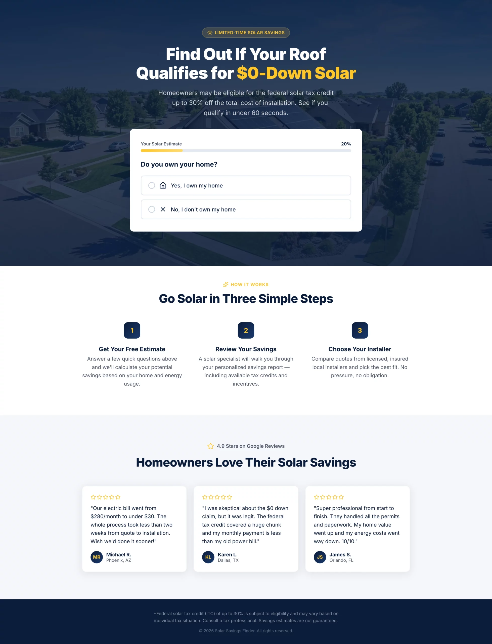
優れている点:見出しは、誇張せずに連邦税額控除を前面に出しています。複数ステップのクイズが、問い合わせフォームに到達する前に賃貸住まいの人や購入意欲の低い訪問者を絞り込むため、通過したリードは本当に見込みの高いものになります。進捗バーは、実際は長いフォームでも短く感じさせ、完了率を高く保ちます。
コンバージョンする理由:太陽光発電はじっくり検討して買うものです。訪問者は、営業電話のためにフォームを埋めるだけだと感じるのではなく、何か(パーソナライズされた試算)を受け取れると感じる必要があります。このページは、その見せ方を最初から最後まで貫いています。
真似したい点:フォームの早い段階で、対象外を判定する質問を入れましょう。オファーが持ち家の人にしか成り立たないなら、最初のステップで住宅の所有について尋ねます。対象外のリードを1件ふるい落とすたびに、営業チームの時間が節約され、コンバージョン単価も改善します。
コピー
Create a solar lead gen landing page targeting homeowners in US sunbelt states.

Hero section: Bold headline "Find Out If Your Roof Qualifies for $0-Down Solar" with a subheadline mentioning the federal tax credit (up to 30%) without overpromising. Background is a clean aerial shot of a suburban home with solar panels. No navigation.

Form: Multi-step quiz with progress bar.
- Step 1: "Do you own your home?" (Yes / No — if No, show a soft exit message)
- Step 2: "What is your average monthly electricity bill?" (dropdown: under $75, $75-$150, $150-$250, $250+)
- Step 3: "What type of roof do you have?" (Asphalt shingle, Tile, Metal, Not sure)
- Step 4: "What is your zip code?" (text input)
- Step 5: Name, phone, email with CTA button "Check My Savings"

Below the form: Three trust badges — "No obligation estimate," "Licensed & insured installers," "Federal tax credit available."

Below the fold: A short "How it works" section with three steps (Get your estimate, Review your savings, Choose your installer). Then a row of five-star Google reviews with first name, city, and review text.

Color scheme: Deep navy and solar yellow. CTA button in yellow with dark text. Mobile-first layout.
2. 売り込みではなく案内のように感じられるMedicareページ
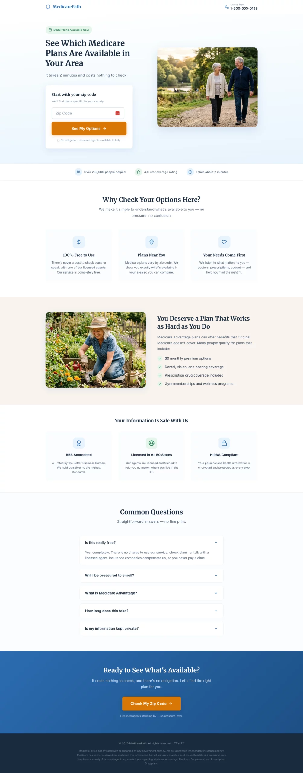
優れている点:大きな文字、平易な言葉、全体を通した温かいトーン。ポートフォリオで見栄えがするものではなく、ターゲット層を軸に設計されたページです。デザイン上の判断はすべて、複雑なデジタルインターフェースに慣れていないかもしれない訪問者の認知的な負担を減らすためのものです。
コンバージョンする理由:Medicareのページは、保険の営業のように感じられると失敗します。このページは役に立つ情報源のように感じられます。入り口は郵便番号の入力欄で、何かを約束させる印象がなく、始めるハードルが極めて低く保たれています。
真似したい点:ページの読みやすさのレベルとデザインの密度を、実際のターゲット層に合わせましょう。Medicareのページと、SaaSのページとでは、売る相手がまったく違います。プロフェッショナルに見えると自分が思うものではなく、実際に訪れる人に向けて設計してください。
コピー
Create a Medicare Advantage lead gen page targeting adults 64 to 72 years old.

Design philosophy: Large, readable fonts (minimum 18px body). Clean and uncluttered. No jargon. Warm and reassuring tone. The page should feel like a helpful resource, not a sales pitch.

Hero section: Headline "See Which Medicare Plans Are Available in Your Area." Subheadline: "Free to check. No obligation. Licensed agents ready to help." Hero layout: large warm photo of an active senior couple on the left, form on the right.

Form: Single step, all fields visible at once. No multi-step, no quiz.
- Zip code
- Date of birth (month/year dropdowns)
- Name
- Phone number
- Best time to call (morning / afternoon / evening — dropdown)
- CTA button: "Show Me My Options"
- Small note below button: "Your information is kept private. We do not sell your data."

Trust section directly below the form: BBB accreditation badge, "Licensed in all 50 states," HIPAA compliance note, "100% free service."

Below the fold: Three-column benefit section — "No cost to you," "Compare multiple plans," "Local licensed agents." Then a plain-language FAQ: "Is this really free?", "Will I be pressured to enroll?", "What is Medicare Advantage?"

Color scheme: Soft blue and white. Minimum 18px body font throughout. No small print above the fold.
3. 補償内容ではなく節約額で訴求する自動車保険ページ
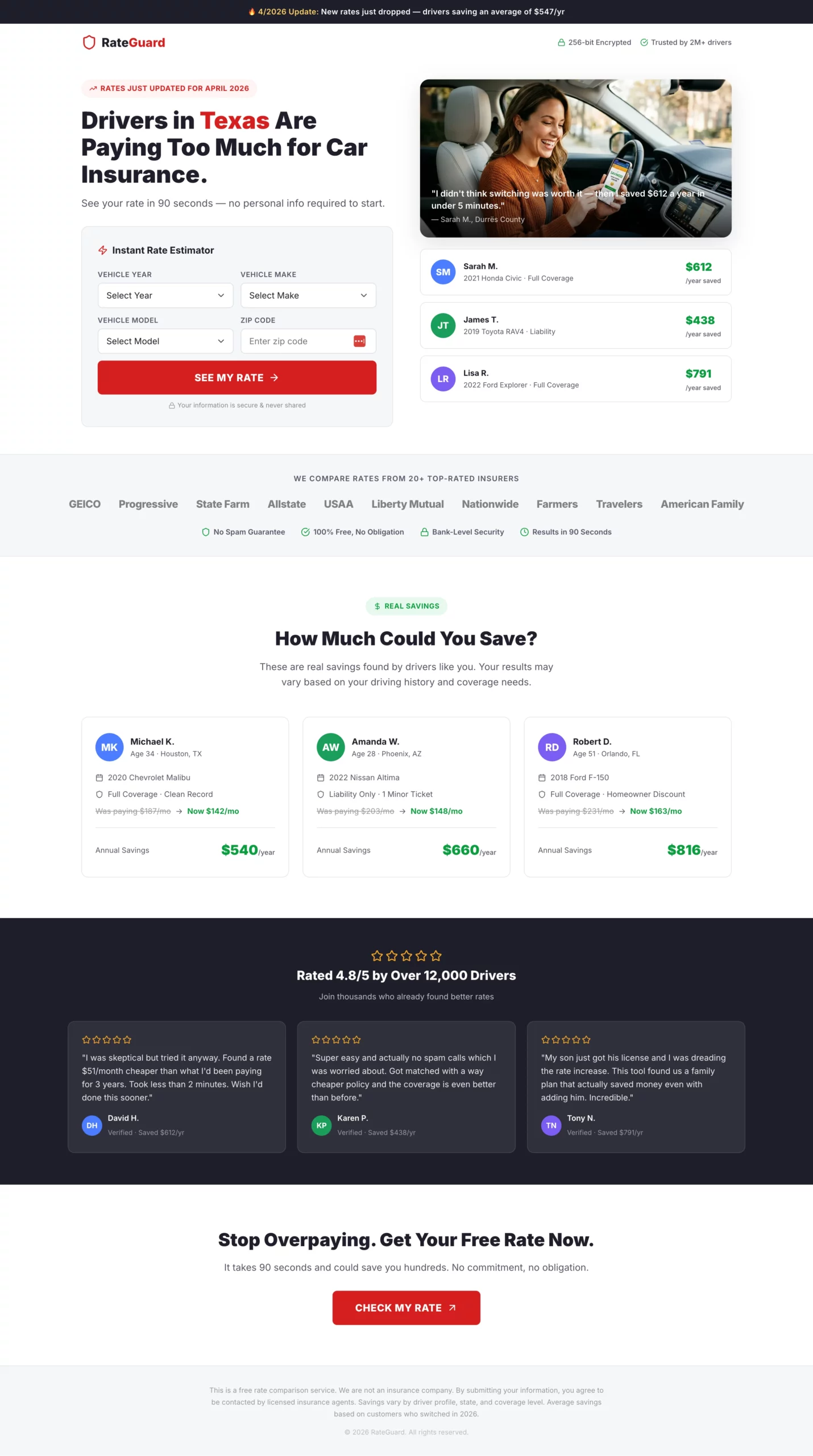
優れている点:見出しは、プロセス(見積もりの比較)ではなく、結果(お金の節約)を語っています。右側にある節約額の例を示した分割ヒーローが、フォームを始める前から具体的な数字を訪問者に示して基準にさせます。最初のステップは郵便番号だけを尋ねる、最も摩擦の少ない入り口です。
コンバージョンする理由:フォーム完了後の偽の読み込み画面(「20社以上の保険会社を検索中…」)は、小さいながら効果のある工夫です。期待感を高め、裏側で実際に何かが動いていることを示すため、訪問者が結果ページやリダイレクト先に着く前から体感価値が高まります。
真似したい点:ソーシャルプルーフには具体的な数字を使いましょう。「お客様は数百ドル節約」よりも「Sarahさんは年間$612節約」のほうが説得力があります。実在しそうな人の実際の金額が、訪問者がすでに頭の中で行っている比較を形にします。
コピー
Create an auto insurance lead gen landing page. The primary angle is savings, not coverage.

Hero section: Headline "Drivers in [State] Are Paying Too Much for Car Insurance." Subheadline: "See your rate in 90 seconds — no personal info required to start." Split layout: headline and calculator on the left, a savings graphic showing example amounts (e.g., "Sarah saved $612/year") on the right.

Form: Instant rate estimator format. All fields visible above the fold, no steps, no progression.
- Vehicle year (dropdown)
- Vehicle make (dropdown)
- Vehicle model (dropdown)
- Zip code
- CTA button: "See My Rate" in bold red

After clicking CTA, show a loading animation: "Searching 20+ insurers for your best rate..." for 2 seconds, then reveal a contact capture: name, email, phone with a secondary CTA "Show Me My Rates."

Trust elements directly below the CTA: Carrier logo strip (20+ insurers), "No spam guarantee," "Free, no obligation," security badge.

Below the fold: "How much could you save?" section with three anonymized real-looking savings examples by driver profile. Then a five-star review strip.

Color scheme: White background, bold red CTA buttons, dark charcoal text. Fast and clean.
[[city]]や[[region]]といったダイナミックトークンを使って、見出しやコピーを自動でパーソナライズします。「テキサスのドライバーは払いすぎています」のような見出しは、手動の設定なしで、訪問者の所在地に応じて自動的に切り替わります。4. 法律サービスではなく適格性を訴求する法律ページ
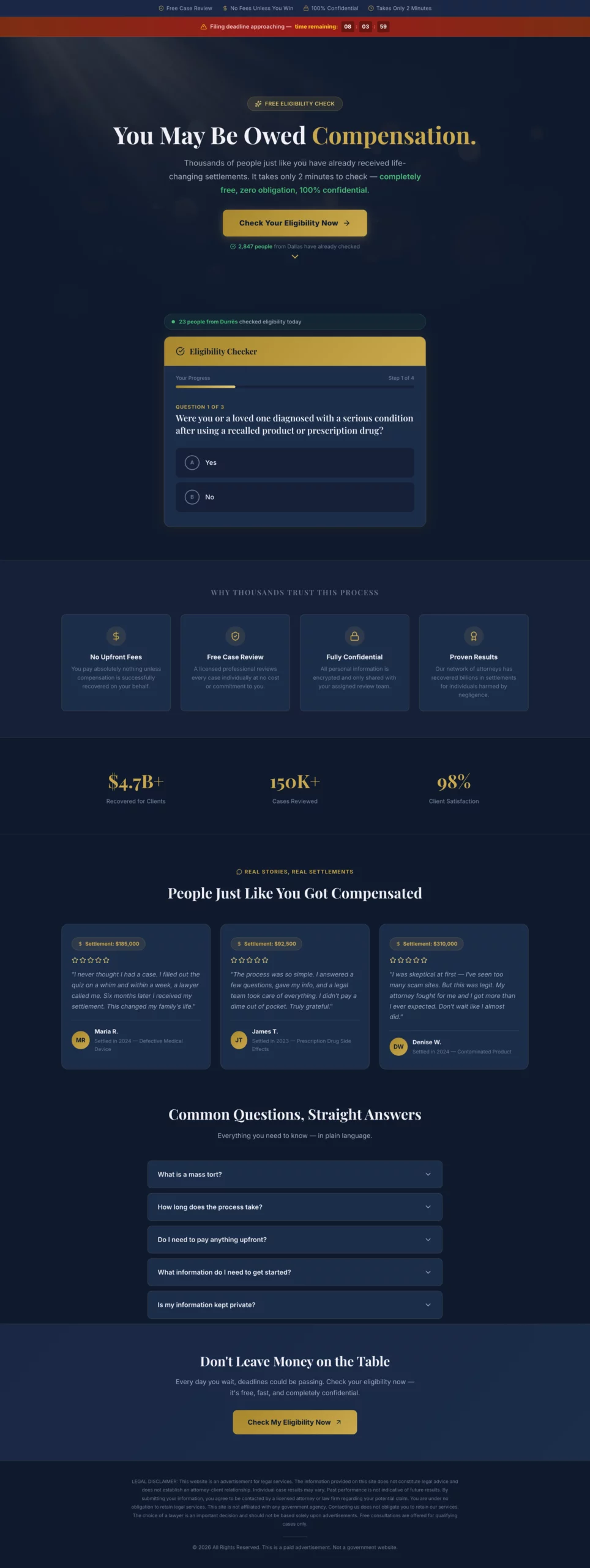
優れている点:このページは、ファーストビューで弁護士や弁護士費用に一切触れません。全体の切り口は、適格性と、訪問者がすでに受け取る権利があるかもしれない補償です。対象外になった訪問者向けのソフトな離脱導線が、そのままなら完全に離脱していたはずのリードを取り戻します。
コンバージョンする理由:法的な状況にある人は、弁護士を探しているわけではありません。自分に訴えを起こせるかどうかを知りたいのです。まずその問いに答えれば、フォームの送信は自然についてきます。法律事務所の実績から始めるページは、「受け取れる可能性があります」から始めるページに比べ、一貫して成果が劣ります。
真似したい点:対象外となった訪問者へのソフトな離脱メッセージ。訪問者を失う代わりに、2つ目のCTAを見せます。「今回の請求の対象外かもしれませんが、当社のチームがあなたの状況を確認します。」これにより、何も得られないまま去っていたはずの訪問者の一部を取り戻せます。
コピー
Create a mass tort legal lead gen page. The angle is eligibility, not legal services. The visitor should feel like they are checking if they qualify for money they may already be owed, not hiring a lawyer.

Hero section: Headline "You May Be Owed Compensation." Subheadline: "Thousands of people affected by [product/drug/event] have received settlements. Find out if you qualify in 2 minutes." Dark background with a professional but approachable feel. No stock photos of courtrooms or gavels.

Form: Eligibility quiz format, yes/no questions only until the final step.
- Step 1: "Were you or a loved one diagnosed with [condition] after using [product]?" (Yes / No)
- Step 2: "Was the diagnosis within the last [X] years?" (Yes / No)
- Step 3: "Have you already filed a claim for this?" (Yes / No / Not sure)
- Step 4: Name, phone, email. CTA: "Check My Eligibility"

If the visitor answers No to Step 1 or 2, show a soft exit message: "Based on your answers, you may not qualify for this claim, but our team can review your situation. Would you like a free consultation anyway?" with a secondary CTA.

Trust elements: "Free case review," "No fees unless you win," "Confidential," attorney badge or bar association logo.

Below the fold: Short plain-language FAQ: "What is a mass tort?", "How long does it take?", "Do I need to pay anything upfront?"

Legal disclaimer at the bottom. Color scheme: Dark navy or charcoal with gold accents.
5. 交換ではなく保険を前面に出す屋根工事ページ
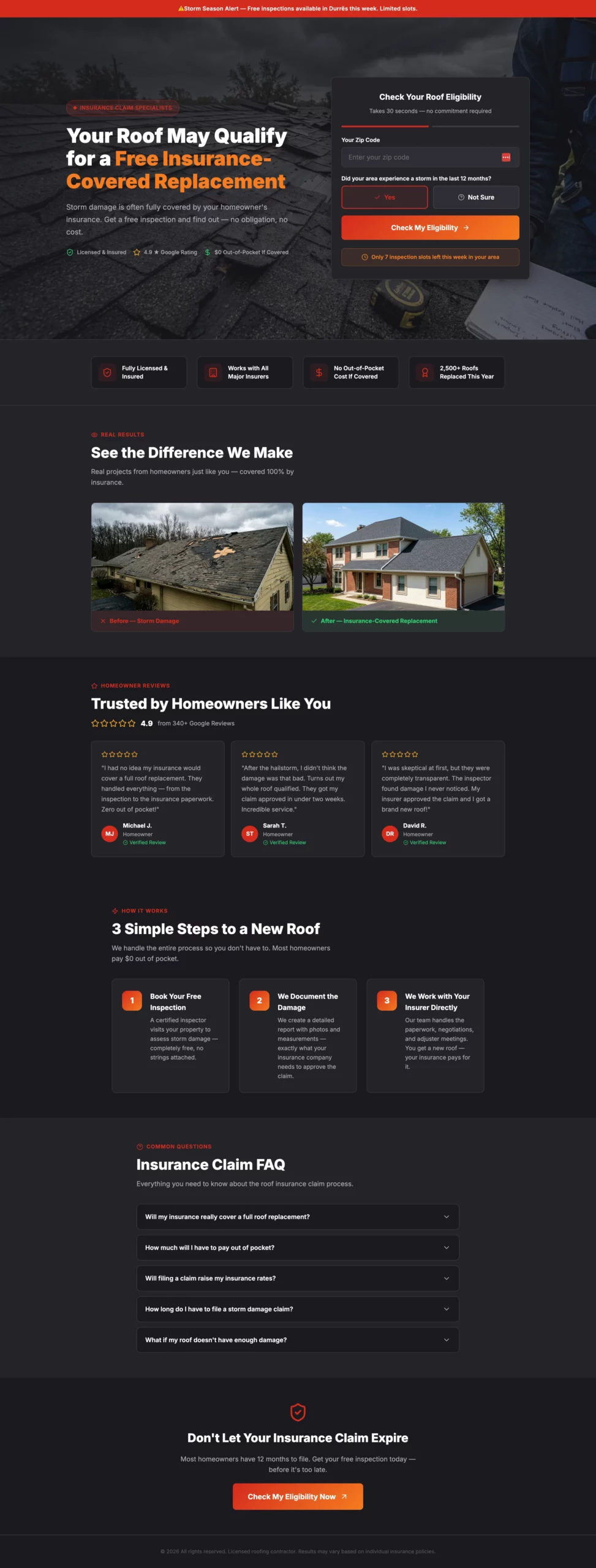
優れている点:ほとんどの屋根工事ページは屋根の交換を売ります。このページは、保険がすでに費用をカバーしてくれるかもしれない、という考え方を売っています。この切り替えが訪問者の損得勘定を根本から変えます。費用に目を向ける代わりに、お金を取りこぼしていないかと考えるのです。緊急性の要素(今週は点検枠に限りがある)は、希少性に説得力があるため、押しつけがましくなく決断を後押しします。
コンバージョンする理由:保険という切り口が、屋根工事のリード獲得における最大の懸念である価格を取り除きます。保険会社が負担してくれるかもしれないと訪問者が信じれば、費用はもはや点検を予約しない理由になりません。
真似したい点:ターゲット層が抱える最大の懸念を1つ見つけ、製品の特徴ではなく、それを取り除くことを軸にページを構成しましょう。屋根工事なら懸念は費用。太陽光なら、それは契約の縛りです。自分のものを見つけて、ページの主役にしてください。
コピー
Create a roofing lead gen landing page targeting homeowners in storm-affected areas.

Angle: Urgency around insurance claims, not just roof replacement. Many homeowners do not know their insurance may cover storm damage.

Hero section: Headline "Your Roof May Qualify for a Free Insurance-Covered Replacement." Subheadline: "Storm damage is often fully covered. Get a free inspection and find out." Hero image: close-up of storm-damaged shingles or a roofer inspecting a residential roof. No navigation.

Form: Two-step.
- Step 1: Zip code + "Did your area experience a storm in the last 12 months?" (Yes / Not sure). CTA: "Check My Eligibility"
- Step 2: Full form — name, address, phone, best time for inspection (morning / afternoon / weekend). CTA: "Book My Free Inspection"

Urgency element: "We have [X] inspection slots available this week in your area."

Trust elements: Before/after roof photos, Google review strip with star ratings, "Licensed & insured," "Works with all major insurance providers," "No out-of-pocket cost if covered."

Below the fold: Three-step process — "1. Book your free inspection. 2. We document the damage. 3. We work with your insurer directly." Then a short FAQ on the insurance claim process.

Color scheme: Dark charcoal and red or orange. Mobile-first.
6. 押しつけがましくならずに季節の緊急性を使うHVACページ
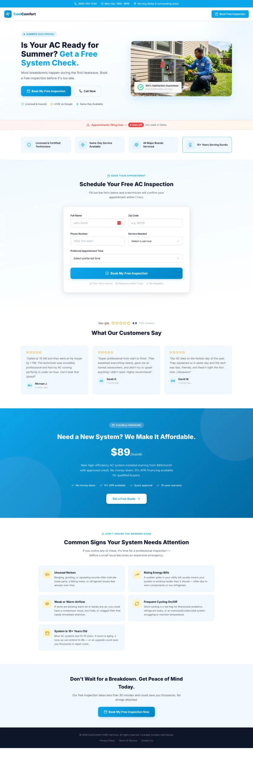
優れている点:季節という切り口(「故障の多くは最初の猛暑のときに起こります」)が、作為的ではなく筋の通った緊急性を生み出しています。ファーストビューの下にあるファイナンスのセクションは配置が絶妙です。費用の懸念に触れつつ、そこから語り始めないので、ファーストビューは簡潔でメリット中心のまま保たれます。
コンバージョンする理由:HVACの購入は受け身で行われます。人は、お金を節約できそうだと思ったときではなく、何かが壊れそうで心配なときに予約します。このページはその不安を早い段階で喚起し、点検を、より大きな問題に備える安価な保険として位置づけます。
真似したい点:オファーを購入ではなく予防として打ち出しましょう。何もしない痛みがサービスの費用を上回るあらゆるサービス業で、「新しいシステムを手に入れる」より「シーズンが来る前に予約」のほうがコンバージョンします。
コピー
Create an HVAC lead gen landing page. Angle varies by season — use summer framing (AC repair/replacement) or winter framing (heating tune-up/emergency repair).

Hero section: Headline "Is Your AC Ready for Summer? Get a Free System Check." Subheadline: "Most breakdowns happen during the first heatwave. Book a free inspection before it's too late." Split layout: headline and CTA on the left, photo of a technician working on an outdoor AC unit on the right.

Form: Single step to keep friction low for a service booking.
- Name, zip code, phone, service type (AC tune-up, AC repair, new installation, not sure), preferred appointment time (morning / afternoon / first available). CTA: "Book My Free Inspection"

Urgency element: "Appointments filling fast — [X] slots left this week in your area."

Trust elements: "Licensed & certified technicians," "Same-day service available," "All major brands serviced," five-star Google review strip with quotes mentioning speed and professionalism.

Below the fold: Financing offer section ("New system from $X/month with approved credit"). Then a "Common signs your system needs attention" section with four to five bullet points.

Color scheme: Sky blue and white for summer. Deep orange and dark grey for winter. Clean and professional.
7. 目的はひとつ、電話を鳴らすことだけの緊急配管ページ
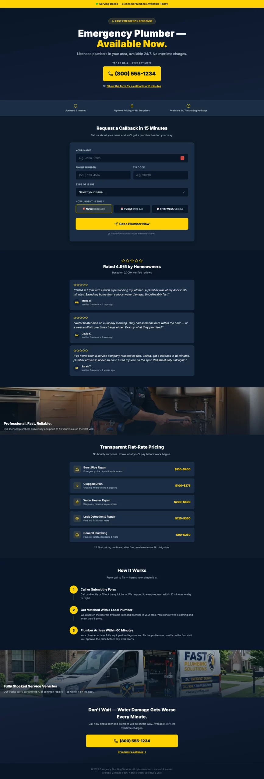
優れている点:電話番号が主役です。見出しでも、ロゴでも、ヒーロー画像でもなく、番号です。ページ上のほかのすべては、その1つの行動を支えるために存在します。2つ目の導線であるフォーム(15分以内に折り返し)が、電話をかけるのをためらうものの関心はある訪問者を受け止めます。
コンバージョンする理由:緊急配管のトラフィックは、あらゆる業種のなかでも購入意欲が最も高い部類です。訪問者は今まさに問題を抱えています。ページの役割は売り込むことではなく、邪魔をせず、できるだけ早く電話をかけられるようにすることです。
真似したい点:2つのCTAの構成。購入意欲の高い訪問者向けの主要なCTA(今すぐ電話)と、温度感がやや低い訪問者向けの副次的なCTA(折り返しフォーム)です。ページを散らかしたり、主要な行動を薄めたりせずに、両方を獲得できます。
コピー
Create a plumbing lead gen page targeting homeowners with urgent plumbing issues.

Angle: Emergency response speed. The visitor has a problem right now and needs confidence that help is coming fast.

Hero section: Headline "Emergency Plumber — Available Now." Subheadline: "Licensed plumbers in your area, available 24/7. No overtime charges." Large click-to-call phone number directly below the headline. Secondary CTA below the number: "Or fill out the form for a callback in 15 minutes."

Form (secondary path): Name, phone, zip code, issue type (burst pipe, clogged drain, water heater, leak, other), urgency (emergency now / today / this week). CTA: "Get a Plumber Now."

Trust elements: "Licensed & insured," "Upfront pricing — no surprises," "Available 24/7 including holidays," five-star review strip with quotes specifically mentioning fast response times.

Above the fold, include a small banner: "Serving [City/Region] — Plumbers available today."

Below the fold: Service list with flat-rate pricing ranges for common jobs. Then a "How it works" section: Call or submit, get matched with a local plumber, plumber arrives within [X] hours.

Color scheme: Dark navy and bright yellow. Mobile-first — most visitors will be on a phone with an active leak.
8. 恥ずかしさではなく安心感から始まる借金ページ
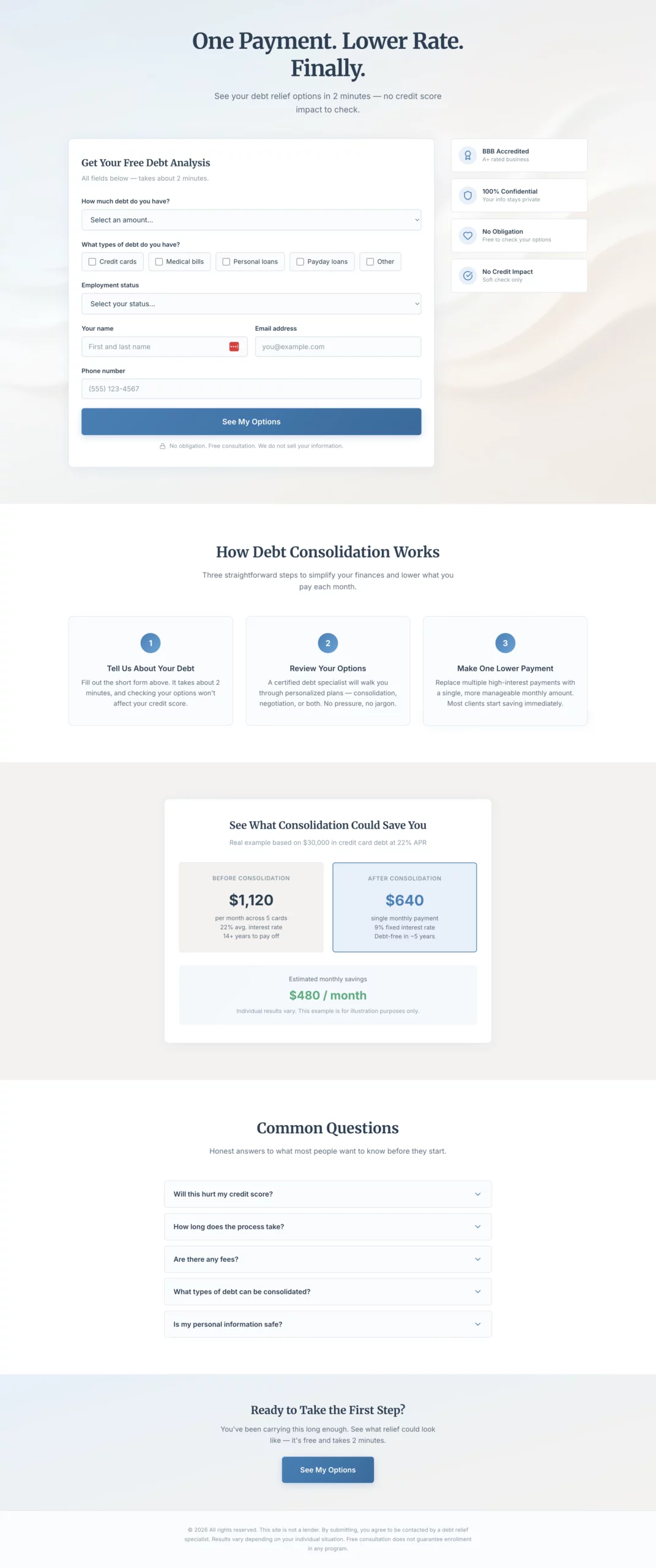
優れている点:見出しはベネフィットを先頭に置き、感情に響きます。「支払いは1つに。金利は低く。ようやく。」は、製品が何をするかではなく、訪問者がどう感じているかに直接語りかけています。ページのどこにも赤が使われていないのは意図的な選択です。赤は警報を意味し、このターゲット層はすでに十分ストレスを抱えているからです。
コンバージョンする理由:借金は感情に関わる話題です。この状況にいる訪問者が探しているのは、金融の知識ではなく、抜け出す方法です。解決策を示す前に感情の状態を受け止めるコピーは、製品の仕組みから入るコピーよりも一貫して成果を上げます。
真似したい点:文脈に合わせた色彩心理。落ち着いた青と温かみのあるグレーは、ここでは単なる美的な選択ではありません。コンバージョンのための選択です。ストレスの大きい業種では、配色もメッセージマッチの一部です。
コピー
Create a debt consolidation lead gen page. The emotional angle is relief and control, not shame. The visitor is already stressed. The page should feel like a lifeline, not a judgment.

Hero section: Headline "One Payment. Lower Rate. Finally." Subheadline: "See your debt relief options in 2 minutes — no credit score impact to check." Soft, warm abstract visual. No navigation.

Form: Single page, all fields visible at once. No steps, no quiz. Layout should feel calm and approachable, not overwhelming.
- Debt amount (dropdown: under $10k, $10k-$20k, $20k-$40k, $40k-$75k, $75k+)
- Debt types (checkboxes: Credit cards, Medical bills, Personal loans, Payday loans, Other)
- Employment status (dropdown: Full-time, Part-time, Self-employed, Not currently employed)
- Name
- Email
- Phone
- CTA button: "See My Options"
- Small note below: "No obligation. Free consultation. We do not sell your information."

If debt amount is under $10k, show an inline note after selection: "Our programs work best for $10,000 or more. You may still qualify — submit to find out."

Trust elements beside the form: BBB accreditation, "Confidential," "No obligation consultation," "Does not affect your credit score."

Below the fold: "How debt consolidation works" in three plain steps. A concrete savings example. FAQ covering credit score impact, timeline, fees.

Color scheme: Soft blue, white, warm grey. No red anywhere.
9. 最大の懸念を最初に取り除く生命保険ページ
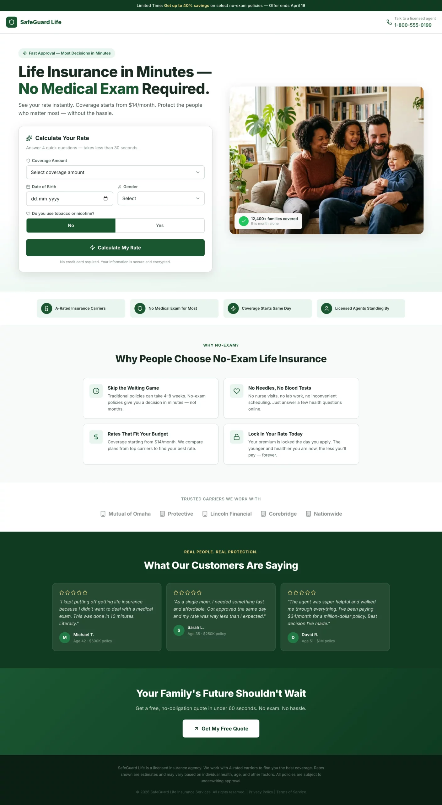
優れている点:見出しのフックは商品名ではなく、「健康診断は不要」です。ページは、これまで生命保険の申し込みをためらわせてきた要因から始め、すぐに取り除き、そのあと6つのステップで少しずつデータを集めます。最後の結果画面には月額料金の目安が表示され、担当者との通話に進む前から、訪問者は何かを手に入れたと感じられます。
コンバージョンする理由:生命保険の加入に手間がかかるという思い込みが、最大のコンバージョンの壁です。このページは最初の一文でその思い込みに対処し、二度と再燃させません。どのステップも、「情報を提供する」ではなく「あなたに最適な料金を見つける」という枠組みで語られています。
真似したい点:フォーム項目を、訪問者のメリットの文脈で見せましょう。ただ身長と体重を尋ねるよりも、「最適な料金を見つけるための身長と体重」と書くほうがコンバージョンします。この言い換えは費用がかからず、多くの訪問者が離脱するステップの摩擦を取り除きます。
コピー
Create a life insurance lead gen page targeting adults 30 to 60 years old. Angle: fast approval, no medical exam required.

Hero section: Headline "Life Insurance in Minutes — No Medical Exam Required." Subheadline: "See your rate instantly. Coverage starts from $X/month." Clean split layout: headline and rate calculator on the left, warm family photo (not staged stock) on the right.

Form: Instant rate calculator format. All fields visible at once above the fold, framed as "calculate your rate" not "fill out a form."
- Coverage amount (slider or dropdown: $100k, $250k, $500k, $1M+)
- Date of birth
- Gender (Male / Female / Prefer not to say)
- Smoker? (Yes / No toggle)
- CTA button: "Calculate My Rate"

After clicking CTA, show an instant rate estimate on the same page (e.g., "Your estimated rate: from $X/month"). Below the estimate, show a contact capture: name, email, phone with CTA "Lock In My Rate."

Trust elements below the calculator: "A-rated carriers," "No medical exam for most applicants," "Coverage starts same day," licensed agent badge.

Below the fold: "Why people choose no-exam life insurance" — four short bullets. Carrier logo strip. Five-star review strip with quotes about ease and speed.

Color scheme: Deep green and white. Clean, confident, trustworthy. Mobile-first.
10. 電話をかけることを唯一の自然な次のステップにするペイパーコールページ
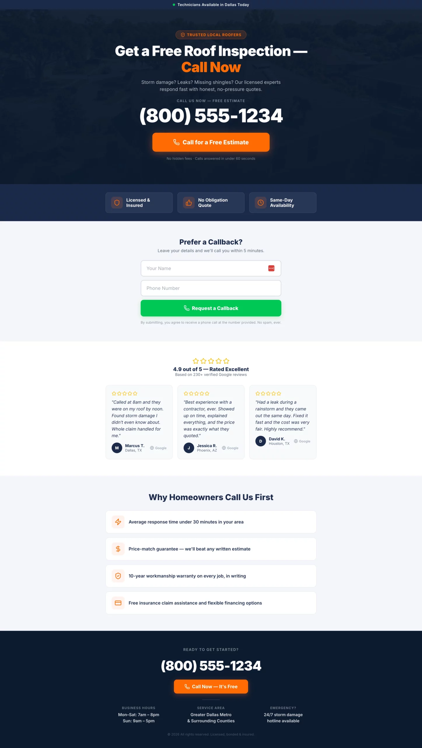
優れている点:電話番号は48pxの文字サイズです。これは偶然ではありません。ページ上のほかのすべての要素は、その番号に従属しています。2つ目の導線であるフォームは、助けは欲しいがすぐには電話できない温度感の訪問者を受け止め、主要なコンバージョンの導線を散らかしません。
コンバージョンする理由:ペイパーコールのトラフィックは、購入意欲が高く、集中力は短い状態で訪れます。ページの役割はひとつ、電話をかけることを最も楽な選択肢にすることです。その役割に貢献しない要素は、すべてコンバージョンの漏れになります。
真似したい点:モバイルでペイパーコールを運用するなら、タップして電話するボタンを横幅いっぱいのタップ領域にしましょう。横幅いっぱいのボタンと、中央寄せの細いボタンとの間のタップ精度の差は、コンバージョン率で測定できるレベルです。
コピー
Create a pay per call landing page for a high-intent service vertical (home services, insurance, legal — adapt as needed).

Design philosophy: This page has one job. Get the phone to ring. Every design decision should serve that goal.

Hero section: Service-specific headline in large type. Example: "Get a Free Roof Inspection — Call Now." Directly below: phone number in the largest font on the page (minimum 48px on desktop, full-width tap target on mobile). Below the number: a single click-to-call button with high-contrast color. CTA text: "Call for a Free Estimate."

Below the hero: Three trust bullets in icon + text format. Examples: "Licensed & insured," "No obligation," "Same-day availability." Keep each to five words maximum.

Secondary conversion path: A simple two-field form below the trust bullets — name and phone number only. CTA: "Request a Callback." No email field.

Below the fold: Five-star Google review strip with three reviews, first name and city only. Then a short "Why call us" section with three to four one-line bullet points.

Footer: Phone number repeated in large text. Business hours. Service area.

Color scheme: Dark header with high-contrast CTA. Mobile is the primary design target.
11. クイズとメールアドレスを交換するインテリア雑貨のプレランダー
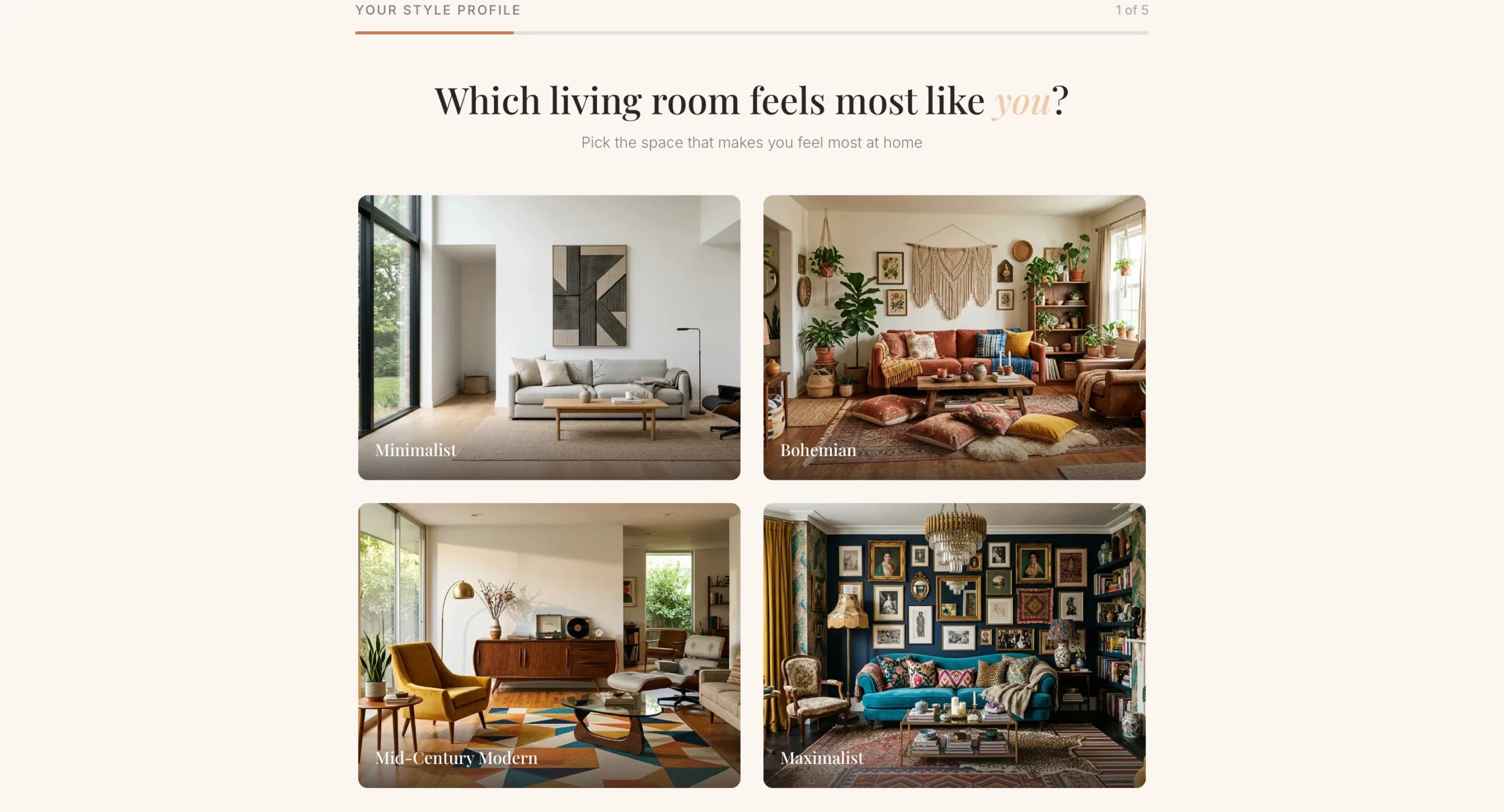
優れている点:メールアドレスの入力は、クイズの前ではなく後に表示されます。訪問者が結果画面に到達するころには、すでに時間をかけており、自分のスタイルの診断結果に本気で興味を持っています。その投資のおかげで、いきなり表示するオプトインフォームに比べ、メールアドレスを渡す人の割合が大幅に高まります。
コンバージョンする理由:ここでのコンバージョンの仕組みはパーソナライズです。訪問者は、ニュースレターを受け取るためにメールアドレスを渡すのではありません。自分専用のムードボードを手に入れるために渡すのです。この見せ方が、取引の意味をまったく変えます。
真似したい点:クイズ後のオファー。結果画面で終わらせずに、割引や商品コレクションへの自然な橋渡しとして活用しましょう。その瞬間、訪問者は前向きで関与の深い状態にあり、オファーを提示するのに最適なタイミングです。
コピー
Create a home decor lead gen pre-lander using a style quiz format. The goal is to capture an email before sending the visitor to a product collection or offer page.

Angle: Personalization. The visitor discovers their design style and gets curated recommendations in exchange for their email.

Hero section: Headline "What's Your Home Design Style?" Subheadline: "Take our 60-second quiz and get a free personalized mood board + exclusive discount." Clean, editorial layout. High-quality lifestyle imagery of a beautifully decorated living room. No navigation.

Quiz flow (one question per screen with visual answer options where possible):
- Q1: "Which living room feels most like you?" (four image options: minimalist, bohemian, mid-century modern, maximalist)
- Q2: "What is your go-to color palette?" (four color swatches with labels)
- Q3: "Which material do you love most?" (Wood / Marble / Linen / Metal)
- Q4: "What is your biggest decorating challenge?" (Small space, No cohesive style, On a budget, Starting from scratch)
- Q5: "Where should we send your personalized mood board?" (Name + email field). CTA: "Show My Results"

Results page: Show a style name ("Your style is Modern Bohemian") with a description and three to four curated product recommendations. Include a discount code for first purchase.

Color scheme: Warm neutrals — cream, terracotta, warm grey. Editorial and aspirational feel.
12. まだ計画段階の訪問者も取り込む住宅リフォームページ
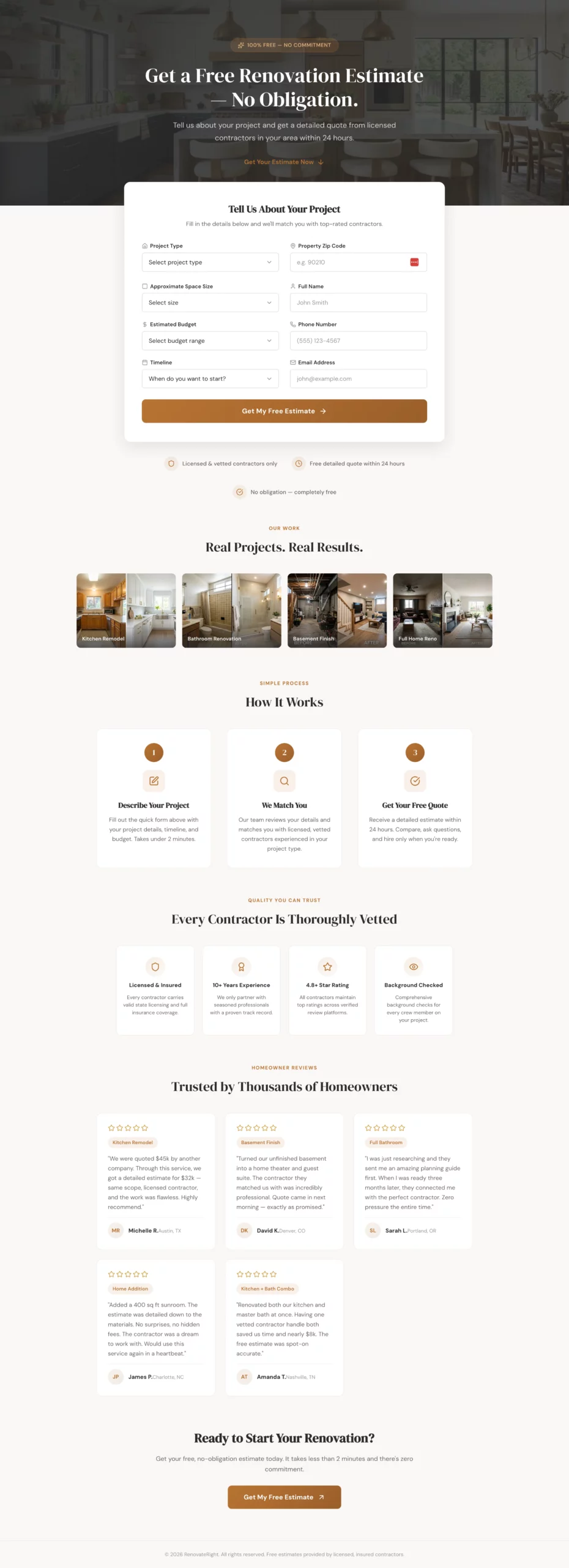
優れている点:フォームには時期についての質問があり、「情報収集中」という回答には、行き止まりではなくナーチャリングの導線を用意しています。多くのリード獲得ページは、初期段階の訪問者を価値の低い存在として扱います。このページは、計画ガイドのオファーで彼らを取り込み、準備ができたときにフォローアップするため、取りこぼしがありません。
コンバージョンする理由:住宅リフォームは検討期間が長い買い物です。ほとんどの訪問者は、ページに来たその日に施工業者を予約する準備はできていません。予約の準備ができた訪問者しかコンバージョンしないページは、トラフィックのかなりの割合を取りこぼしています。ナーチャリングの導線が、そうした訪問者を取り戻します。
真似したい点:購入意欲に大きなばらつきがあるフォームには、時期についての質問を加えましょう。そして回答ごとに異なるフォローアップの導線をつくります。このデータは、営業チームの時間をホットなリードに集中させるのにも役立ちます。
コピー
Create a home renovation lead gen page targeting homeowners planning a major renovation project (kitchen, bathroom, basement, full home).

Angle: Free project estimate with no commitment. The visitor is in the planning phase and shopping around.

Hero section: Headline "Get a Free Renovation Estimate — No Obligation." Subheadline: "Tell us about your project and get a detailed quote from licensed contractors in your area within 24 hours." Hero image: beautiful renovated kitchen or bathroom. No navigation.

Form: Single page, all fields visible at once. Clean two-column layout so it does not feel long.
Left column:
- Project type (dropdown: Kitchen, Bathroom, Basement, Addition, Full home, Other)
- Approximate space size (dropdown: Under 100 sq ft, 100-300 sq ft, 300-500 sq ft, 500+ sq ft, Not sure)
- Estimated budget (dropdown: Under $10k, $10k-$30k, $30k-$75k, $75k-$150k, $150k+, Not sure yet)
- Timeline (dropdown: ASAP, 1-3 months, 3-6 months, Just researching)

Right column:
- Property zip code
- Name
- Phone
- Email
- CTA button: "Get My Free Estimate" (full width, spans both columns)

If Timeline is "Just researching," show an inline note: "No problem — we will send you a free planning guide and follow up when you are ready."

Trust elements below the form: "Licensed & vetted contractors only," "Free detailed quote within 24 hours," "No obligation," portfolio image strip of before/after projects.

Below the fold: "How it works" in three steps. Contractor vetting badges. Five-star reviews with project types mentioned.

Color scheme: Warm white, charcoal, muted brass or terracotta accent. Premium but approachable.
13. 広告ではなく記事のように読める健康系の記事広告
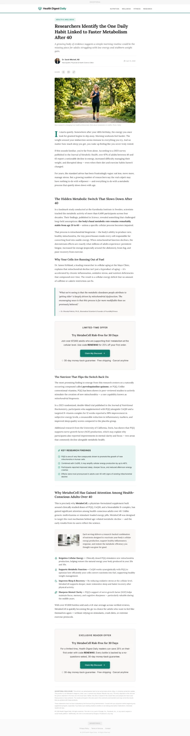
優れている点:メディアのようなヘッダーと著者のバイラインが、訪問者がコピーを1語も読まないうちに、信頼性づくりの大部分を担います。商品は、問題を十分に積み上げたあと、コンテンツの自然な中間地点で登場します。
その時点で読者はすでにうなずいており、商品の紹介は売り込みではなく推薦のように感じられます。
コンバージョンする理由:記事広告ページは、多くの人がランディングページに持ち込む、広告に対する反射的な警戒心を回避します。訪問者は評価モードではなく、読むモードにいます。この心の状態の切り替えは、標準的なページで見出しやオファーをどれだけ変えても得られない価値があります。
真似したい点:ページ中盤へのCTAの配置。オファーの提示を最後まで待たないでください。問題が確立されたあと、解決策を完全に説明する前に、CTAを置きます。それがコンテンツの流れの中で最も購入意欲が高まる瞬間です。
コピー
Create a health advertorial landing page in a news article format to warm up cold paid social traffic before sending to a product offer page.

Format: Styled to look like an editorial health article. Include a publication-style header with a credible outlet name (e.g., "Health Digest Daily"), a category tag ("Health & Wellness"), a byline with a named author and credentials, and a publish date.

Headline: Curiosity-gap or discovery angle. Example: "Researchers Identify the One Daily Habit Linked to Faster Metabolism After 40."

Opening hook: Two to three paragraphs describing a relatable problem (low energy, stubborn weight, poor sleep) in conversational, empathetic language. No product mention yet.

Middle section: Introduce a discovery tied to a specific mechanism (a nutrient, a habit, a compound). Include a pull quote styled like a researcher or doctor statement. Use subheadings to break up content. 400 to 600 words total for this section.

Product introduction: Natural transition — "This is why [product name] has gained attention among health-conscious adults over 40." One paragraph introducing the product, followed by three to four benefit bullets.

CTA block: "Try [Product] Risk-Free for 30 Days." Include a discount or limited offer. CTA button: "Claim My Discount."

Second CTA block mid-page after the pull quote.

Footer: "Advertorial" disclosure at top and bottom. Standard legal disclaimer about results.

Color scheme: Clean white, editorial black text, one accent color matching the product brand. Should feel like content, not an ad.
14. 商品ではなくストーリーから始まる金融系の記事広告
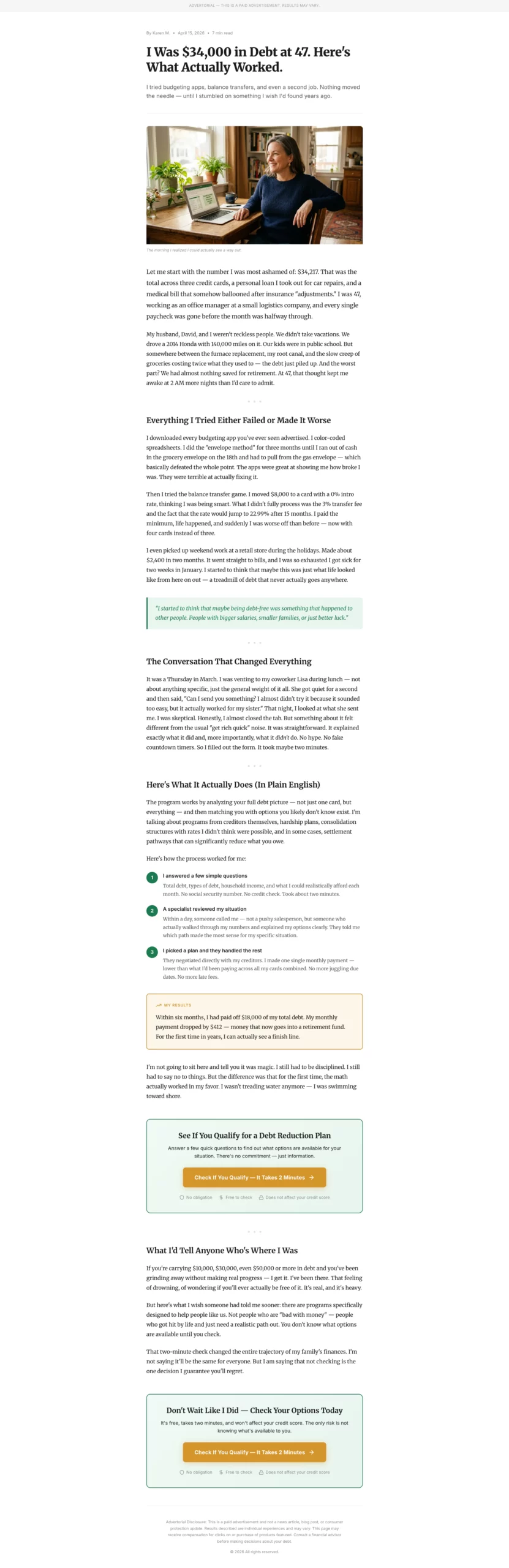
優れている点:冒頭の具体的な数字(借金の額、年齢、職種)が、証拠を求めずに信頼性を生み出します。「私は47歳のとき、$34,000の借金を抱えていた」のほうが、「私は多額の借金を抱えていた」よりも信じられます。語り手が一般的なアドバイスを試して失敗する問題の積み上げのパートで、読者は感情的に引き込まれます。解決策が登場するころには、読者は語り手を応援しています。
コンバージョンする理由:金融系の記事広告は、ターゲット層の感情が動いているため、借金やクレジット関連のオファーにおいて標準的なページより成果が出ます。彼らが探しているのは商品ではなく、解決策があると信じてよいという許しです。自分の経験を映したストーリーが、その許しを与えます。
真似したい点:「試したが失敗した」という段落。解決策を紹介する前に、読者がすでに試したことを認めましょう。状況を理解していることが伝わり、読者がすでに退けたものとの違いも際立ちます。
コピー
Create a personal finance advertorial landing page in a first-person story format. Target audience: adults 35 to 55 dealing with debt, savings shortfall, or retirement anxiety.

Format: Personal essay style, not news article. Written in first person as a relatable narrator who discovered a solution to a financial problem.

Headline: Story-hook format. Example: "I Was $34,000 in Debt at 47. Here Is What Actually Worked."

Opening: Two paragraphs establishing the narrator's situation. Specific details (debt amount, age, job type) make it credible. Conversational, honest tone.

Problem build: Two to three paragraphs describing the frustration of trying and failing with conventional advice (budgeting apps, balance transfers, etc.).

Turning point: One paragraph introducing the discovery. Keep it vague enough to create curiosity.

Solution section: Explain the mechanism or service in plain language. Use a numbered list or short paragraphs. Include a concrete result: "Within six months, I had paid off $18,000 and my monthly payment dropped by $400."

CTA block: "Check If You Qualify — It Takes 2 Minutes." Frame it as checking eligibility, not signing up. CTA button in a contrasting color.

Trust elements: "No obligation," "Free to check," "Does not affect your credit score."

Second CTA at the bottom.

Disclosure: "This is a paid advertisement. Results may vary." at top and bottom.

Color scheme: Clean white background, dark readable text, one warm accent color (green or gold). Reads like a blog post.
15. お願いする前に教える、住まいのサービスの記事広告
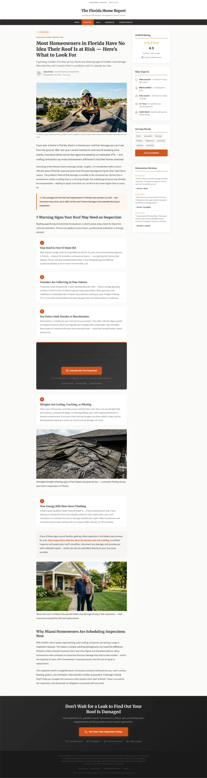
優れている点:警告のような見出しが、サービスを積極的に探していなかったかもしれない訪問者に、問題への気づきを生みます。リスト記事の形式(屋根の点検が必要かもしれない5つのサイン)は、教育と見込み判定を同時に行います。訪問者がCTAに着くころには、自分のサービスが解決する問題を抱えている人だと、自分で認識しています。
コンバージョンする理由:課題に気づいていないトラフィックは、標準的なランディングページではコンバージョンさせるのが最も難しい層です。訪問者はまだ、売っているものが必要だと知らないからです。教育型の記事広告は、ページ内で気づいていない状態から気づいた状態へ移行させるため、CTAが割り込みではなく自然な次のステップに感じられます。
真似したい点:リスト記事の3つ目の項目のあとに配置するCTA。オファーの提示をコンテンツの最後まで待たないでください。3つ目の項目ですでにうなずいている訪問者は、受け入れ度が最も高い状態です。ボタンはそこに置きます。
コピー
Create a home services advertorial landing page targeting homeowners who may not know they have a problem. Best used for roofing, HVAC, plumbing, or pest control verticals.

Format: Educational article style with a warning or discovery headline.

Headline example: "Most Homeowners in [State] Have No Idea Their Roof Is at Risk — Here Is What to Look For."

Opening: Two paragraphs establishing the scope of the problem using real-feeling statistics or seasonal context. "After last year's hailstorms, insurance claims in [region] increased by X%." Conversational but informative tone.

Middle section: List format — "5 Signs Your Roof May Need Inspection." Each sign is two to three sentences with a practical description. This educates the reader and qualifies them simultaneously.

Transition: "If any of these sound familiar, getting a free inspection is the fastest way to know for sure. Most inspections take less than 30 minutes and cost nothing."

CTA block after sign number 3: "Book a Free Roof Inspection in Your Area." Include a note: "Licensed inspectors. No obligation. Most insurers cover the cost of damage found."

Second CTA at the bottom of the page.

Trust elements: Contractor license badges, Google rating, "Serving [City/Region]."

Footer: Disclosure that this is a sponsored post. Standard legal language.

Color scheme: Clean white, charcoal text, one warm accent (orange or red). Feels like helpful local journalism.
16. ためらいゼロのSaaS無料トライアルページ
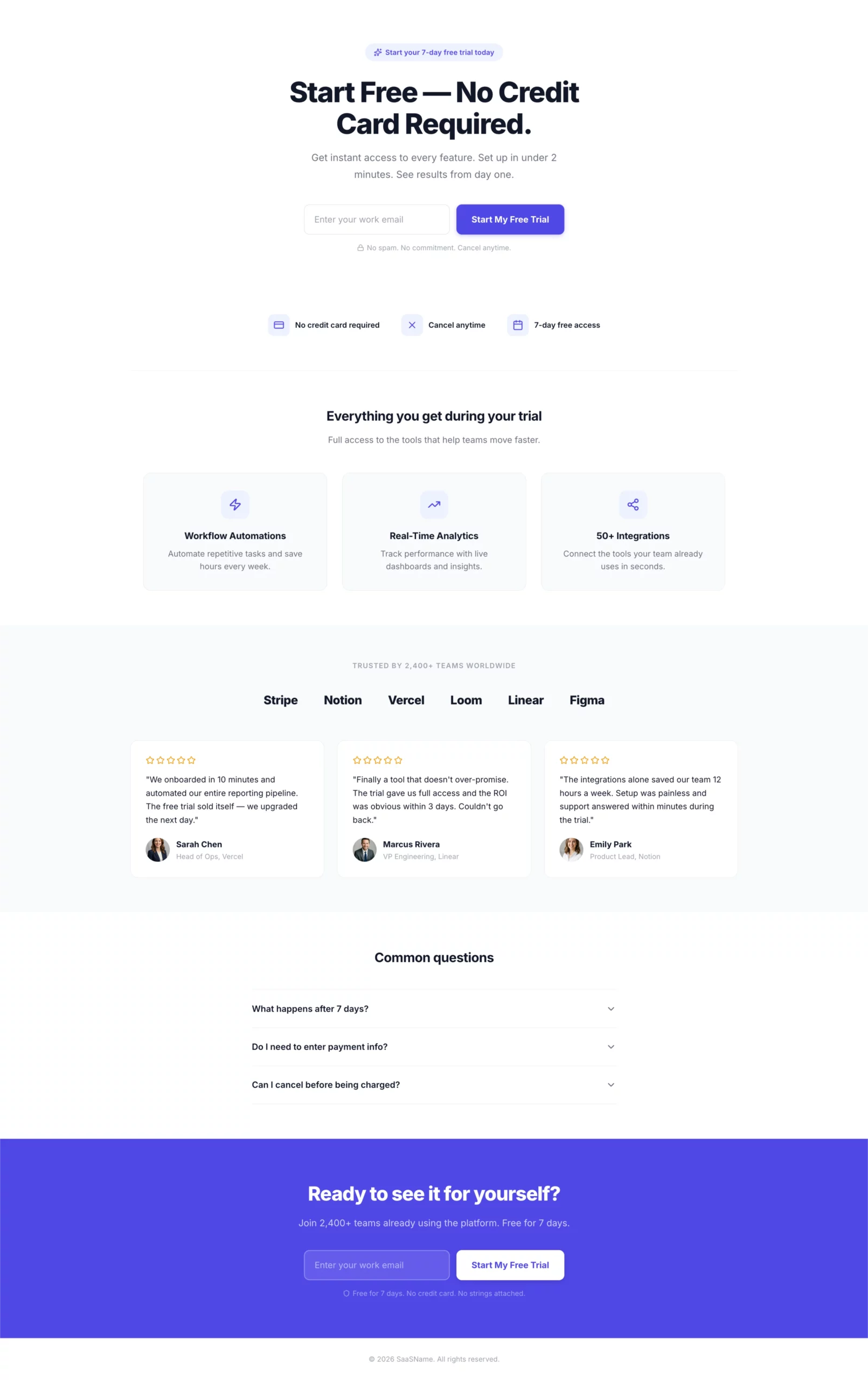
優れている点:項目は1つ。ボタンも1つ。見出しとCTAは広告とまったく同じです。「無料で始める、クレジットカード不要」は、最大の懸念2つを1行で取り除きます。このページには、ほかに決めることが何もありません。
コンバージョンする理由:訪問者は無料トライアルを求めてクリックしました。ページは無料トライアルであることを確認します。必要なステップは、メールアドレスの入力だけです。追加の項目、ナビゲーションのリンク、副次的なオファーはどれも、コンバージョンを失わせる判断ポイントになります。このページには、そのどれもありません。
真似したい点:フォームの下の信頼アイコン。「クレジットカード不要、いつでも解約可能、7日間無料でアクセス」は、無料トライアルの訪問者がメールアドレスを入力する前に、心の中で問いかける3つの疑問に答えます。答えをまさにその場所に置きましょう。
コピー
Create a SaaS free trial landing page.

Hero section: Headline "Start Free — No Credit Card Required." Single email input field with a bold CTA button: "Start My Free Trial." Clean white layout with one bold accent color. No navigation.

Below the form: Three trust icons in a horizontal row.
- Icon 1: "No credit card required"
- Icon 2: "Cancel anytime"
- Icon 3: "7-day free access"

Below the trust icons: Three-column feature highlights showing what the visitor gets access to during the trial. Keep each to one line of copy.

Below the fold: Social proof section — logos of recognizable companies using the product, or a testimonial strip with headshots, names, and company names.

FAQ section: Three questions addressing common hesitations — "What happens after 7 days?", "Do I need to enter payment info?", "Can I cancel before being charged?"

Footer CTA: Repeat the email form and button.

Color scheme: Clean white background, one bold accent color for CTA and highlights. Minimal. Fast. No distractions.
17. ボーナス:結果をメールアドレスの先に置く健康クイズファネル
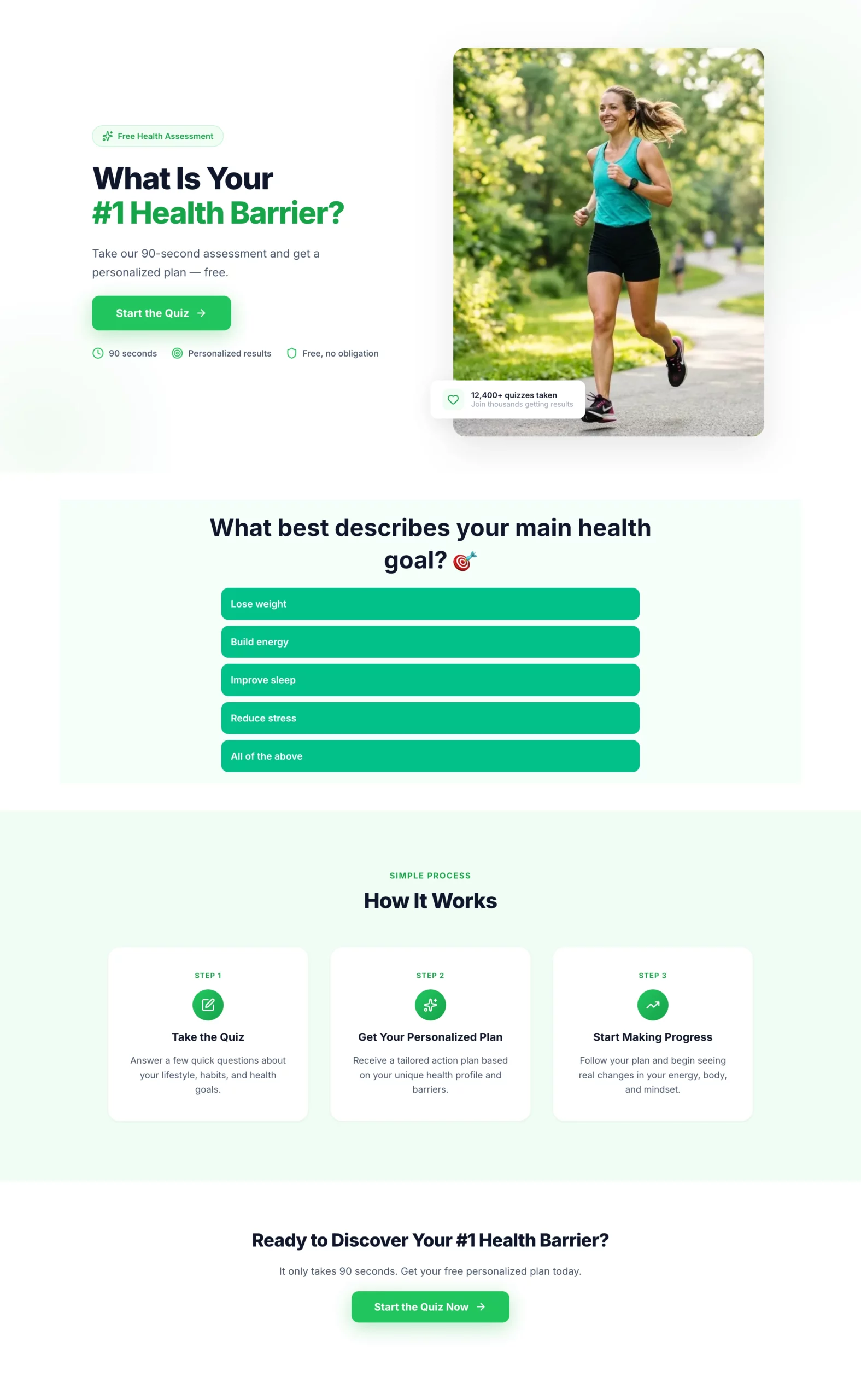
優れている点:メールアドレスの入力は、入り口ではなく結果画面で求められます。訪問者がそこに着くころには、すでに6つの質問に答えていて、結果に本気で興味を持っています。その投資により、いきなり表示するオプトインよりもはるかにメールアドレスを渡しやすくなります。最後のコミットメントの質問は、リードがフォローアップのシーケンスに入る前に、リードの質を事前に見極める役割も果たします。
コンバージョンする理由:クイズファネルは、何かを求める前にエンゲージメントを築くため、コールドなトラフィックに対して標準的なリード獲得フォームを一貫して上回ります。訪問者は、何か(連絡先情報)を差し出すよう求められるのではなく、何か(質問への回答)をしています。この切り替えが、コンバージョンの力学をまったく変えます。
真似したい点:最後の事前見極めとしてのコミットメントの質問。フォームの完了率には影響しませんが、フォローアップチームがどのリードを優先すべきかを判断する手がかりになります。「非常に前向き」と答えた人は、「ただ見ているだけ」の人とは営業の会話が変わります。
ステップ1:LanderLabでランディングページを作成
コピー
Create a landing page for a health and wellness quiz funnel. This page introduces the quiz and gets the visitor to click through to it.

Hero section: Headline "What Is Your #1 Health Barrier?" Subheadline: "Take our 90-second assessment and get a personalized plan — free." Single CTA button: "Start the Quiz." Clean, energetic design with a motivating health-focused visual. No navigation.

Below the CTA: Three short trust bullets — "90 seconds," "Personalized results," "Free, no obligation."

Below the fold: Brief "how it works" section — Take the quiz, Get your personalized plan, Start making progress. Keep it to three steps with icons.

Color scheme: Bright and motivating. Greens and whites. Bold CTA button.
ステップ2:LanderLabのクイズビルダーでクイズを作成
コピー
Create a health and wellness quiz funnel that qualifies visitors and captures an email before showing results.

Quiz questions (one per screen, progress bar throughout):
- Q1: "What best describes your main health goal?" (Lose weight, Build energy, Improve sleep, Reduce stress, All of the above)
- Q2: "How would you describe your current diet?" (Mostly healthy, Hit or miss, Could be better, Pretty poor)
- Q3: "How often do you exercise?" (Daily, 3-4x per week, 1-2x per week, Rarely, Never)
- Q4: "How many hours of sleep do you get on average?" (Under 5, 5-6, 7-8, More than 8)
- Q5: "What has held you back from reaching your health goals?" (No time, No motivation, Tried and failed, Not sure where to start, Cost)
- Q6: "How committed are you to making a change in the next 30 days?" (Very committed, Somewhat, Just exploring)

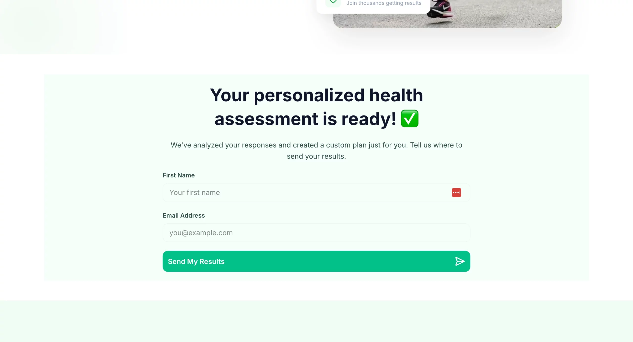
Results gate: "Your personalized health assessment is ready. Where should we send it?" Name + email field. CTA: "Send My Results."

Results page: Personalized summary based on quiz answers. Transition into offer: free consultation, product recommendation, or program signup. CTA above the fold on results page.

Design: Bright and motivating. Progress bar visible throughout. Mobile-first. One question per screen with large tap targets for answer options.
18. ボーナス:セールスファネルではなく助けのように感じられる資産診断クイズ
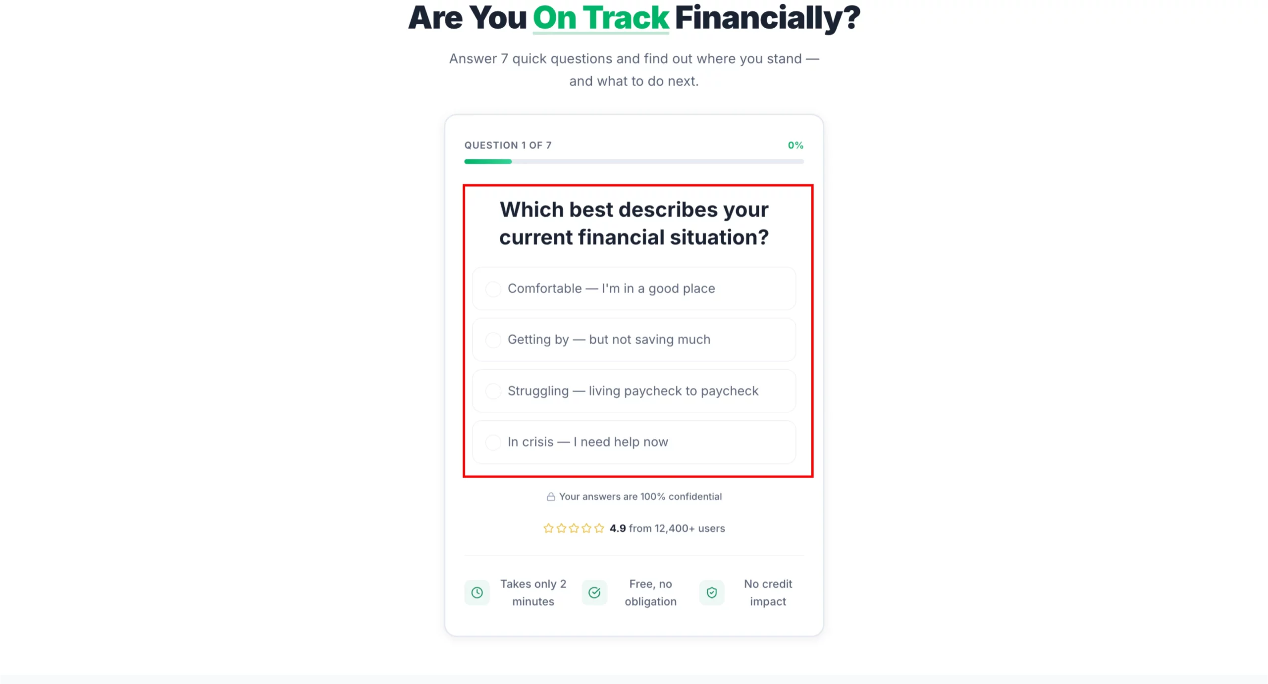
優れている点:このクイズは、特定の商品に一切触れません。資産診断ツールとして自らを位置づけているため、訪問者は売り込みを避けるために答えを取り繕うことなく、正直に答えます。結果ページに着くころには、訪問者は自分の資産状況を自分で診断しており、追加販売ではなく、自分向けにあつらえられたアドバイスのように感じられるおすすめを受け取る準備ができています。
コンバージョンする理由:金融商品は、信頼が最大の壁となる、検討度の高い買い物です。訪問者の状況を理解していることを7つの質問をかけて示すクイズは、ほとんどの商品ページがスクロール全体を使って築く以上の信頼を、2分で築きます。
真似したい点:複数のオファーを提示する結果ページ。訪問者を1つの商品に誘導するのではなく、回答に基づいて2~3件のおすすめを表示します。これにより、合致する可能性が高まり、おすすめが本当にパーソナライズされたものに感じられます。
ステップ1:LanderLabでランディングページを作成
コピー
Create a landing page for a financial assessment quiz funnel. This page introduces the quiz and gets the visitor to click through. No product mention yet.

Hero section: Headline "Are You On Track Financially?" Subheadline: "Answer 7 quick questions and find out where you stand — and what to do next." Single CTA button: "Take the Free Assessment." Clean, professional design. No navigation.

Below the CTA: Three short trust bullets — "Takes 2 minutes," "Free, no obligation," "No impact to your credit score."

Below the fold: Brief reassurance section — "This is not a sales pitch. It is a free tool to help you understand your options." Then a three-step how it works: Answer 7 questions, Get your personalized summary, Review your options at no cost.

Color scheme: Professional and trustworthy. Navy and white or charcoal and green. Mobile-first.
ステップ2:LanderLabのクイズビルダーでクイズを作成
コピー
Create a financial needs assessment quiz that qualifies visitors for debt relief, insurance, or investment products. The quiz feels like a helpful tool, not a lead form.

Quiz questions (one per screen, progress bar throughout):
- Q1: "Which best describes your current financial situation?" (Comfortable, Getting by, Struggling, In crisis)
- Q2: "Do you have more than $10,000 in unsecured debt?" (Yes / No / Not sure)
- Q3: "Are you currently saving for retirement?" (Yes, regularly / Sometimes / Not yet)
- Q4: "Do you have life insurance?" (Yes, enough coverage / Yes, but not sure if it is enough / No)
- Q5: "What is your biggest financial concern right now?" (Debt, Retirement savings, Monthly expenses, Unexpected emergencies, All of the above)
- Q6: "What is your household income range?" (Under $30k, $30k-$60k, $60k-$100k, $100k+, Prefer not to say)
- Q7: "How soon are you looking to address your financial situation?" (Immediately, In the next 3 months, Just researching)

Results gate: "Your financial assessment is complete. Where should we send your personalized action plan?" Name + email + phone (optional). CTA: "Get My Plan."

Results page: Personalized summary with two to three recommended actions based on answers. Each recommendation links to a relevant offer (debt consolidation, life insurance quote, retirement consultation). Include urgency where relevant.

Design: Professional and trustworthy. Navy and white or charcoal and green. Progress bar clearly visible. No jargon. Reassuring tone throughout.
これらのページを数分で作る方法
上の事例にはいずれも、LanderLabにそのまま貼り付けられるプロンプトが付いていました。
AIランディングページビルダーは、あなたのブリーフをもとに、見出し、サブ見出し、本文コピー、フォーム構成、CTA、レイアウトまで、説明した切り口に合わせた完成ページを生成します。
白紙のテンプレートから始めるわけではありません。オファーをすでに理解しているページから始めるのです。
そこから複製して切り口を調整すれば、配信中の広告ごとに合ったバリエーションを用意できます。
どんなものになるか見てみたい場合は、LanderLabを無料で試して、上のプロンプトのひとつから最初のページを作ってみてください。
早見表:ランディングページのベストプラクティス
| 原則 | 実践での意味 |
|---|---|
| メッセージマッチ | ページの見出しが、広告の見出しと言葉と意図の面で一致している |
| CTAは1つ | 1ページにつき行動は1つ。ナビゲーションや副次的なリンクは削除する |
| オファーはファーストビューに | 核となる約束が、スクロールしなくても見える |
| フォーム項目は最小限に | 必要なことだけを尋ねる。項目が増えるたびに完了率は下がる |
| ソーシャルプルーフの配置 | レビューやロゴはCTAの前に置き、ページの下部に埋もれさせない |
| モバイルファースト | 有料トラフィックの多くはモバイルに着地する。まずその画面向けに設計する |
| ターゲットに合わせたデザイン | デザインの複雑さとコピーのトーンは、販売する相手に合わせる |
| 広告の切り口ごとに1ページ | 複数の広告の切り口を同じページに送らない |
まとめ
ベストなランディングページは、最も美しいページではありません。1つの明確な約束を軸に、適切な人に、適切なタイミングで、クリックからコンバージョンまでの摩擦を極力抑えて届けるページです。
上の事例はどれも、この考え方に沿っています。ミニマルなものもあれば、長いものもあります。感情から入るものも、数字から入るものもあります。共通しているのは意図があることです。ページ上のすべての要素に、理由があります。
これらを最も手早く取り入れる方法は、今のキャンペーンに合う事例を選び、プロンプトを使ってLanderLabで作成し、現在運用中のものと比較テストすることです。
次のベストなランディングページの事例は、プロンプトひとつで手に入ります。