Most landing pages are built the wrong way. Not because the people building them don’t care, but because the advice they’re following is vague, generic, and not tied to actual conversion data.
“Make your CTA button red.” “Keep your form short.” “Add a hero image.” These aren’t best practices. They’re decorating tips.
This guide is different. Every practice here is backed by specific 2026 data, organized by the stage of your page where it applies, and written for people who are actually running paid traffic and need their pages to convert.
The median dedicated landing page converts at 4.02% in 2026, nearly double the 2.35% median for general website pages.
The top 25% convert at 11.45% or higher. The gap between the median and the top quartile is almost entirely explained by the practices in this guide.
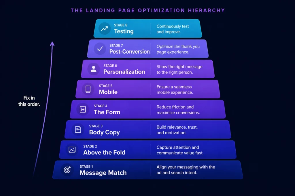
How to Use This Guide
Landing page best practices are only useful when applied in the right order.
Fixing your CTA copy before fixing your headline is like trying to repaint a car with a broken engine.
The practices below are organized by stage: before the click, above the fold, the body, the form, mobile, personalization, post-conversion, and testing. Work through them in order. The earlier the stage, the higher the impact.
Stage 1: Before the Click (Message Match and Traffic Alignment)
The biggest conversion problems on landing pages happen before anyone lands on the page. They happen in the gap between the ad and the page, between what the visitor expected and what they found.
Match Your Headline to Your Ad Exactly
Message match is the single highest-impact variable on any landing page. When someone clicks an ad promising “Emergency Roof Repair Denver,” they expect to land on a page that says exactly that.
If your headline says “Smith Roofing Services, Serving Colorado Since 1998,” you’ve broken the implicit contract of the click.
Changing a single CTA from “Sign up for free” to “Trial for free” resulted in a 104% increase in trial start rate. That’s the power of using the correct CTA phrase. The same logic applies to headlines: match the exact promise of the ad, not a paraphrased version of it.
A personal injury law firm was sending Google Ads traffic to their general About Us page.
After building a dedicated landing page whose headline matched the ad copy exactly, their conversion rate went from 3.1% to 8.4% in six weeks.
Same offer. Same budget. Same targeting. Different page.
Build One Page Per Ad Group, Not One Page Per Campaign
Over half of B2B PPC ads point to homepages. The same mistake occurs across campaigns when multiple ad groups route to the same landing page.
A visitor who clicked “emergency plumber” and a visitor who clicked “bathroom renovation quote” have very different needs and levels of urgency. One page cannot serve both well.
Companies with 40 or more landing pages see 500% more conversions than those with fewer than 10.
That correlation exists because more pages mean more message matches, not because more pages magically create conversions.
The math is simple: a page that’s perfectly matched to one ad group will outperform a page that’s roughly matched to five.
LanderLab’s AI builder is built for exactly this problem. You can generate a fully structured landing page from a single prompt describing your offer, vertical, and target audience.
Then duplicate it and adapt it for each ad group in minutes, changing only the headline, hero copy, and CTA to match each specific campaign. What used to take hours per page takes minutes per variant.
Remove Navigation Before You Do Anything Else
Only 16% of landing pages have no navigation bar. The other 84% still show a full menu, which means 84% of landing pages are actively leaking the traffic they paid to acquire.
Every navigation link on a landing page is an exit opportunity you paid to create. WordStream found that 33% of the links on landing pages were sending visitors away from the page entirely, often to social media profiles.
Remove the navigation menu. Remove social links. Remove footer links. The only clickable element on a landing page should be the CTA and any essential legal links required for compliance.
Stage 2: Above the Fold (The First Three Seconds)
Visitors decide within three seconds whether to stay or bounce. Everything above the fold must simultaneously confirm message match, state the primary benefit, establish credibility, present the CTA, and load fast enough that they actually see it before making that decision.
Write a Headline That Answers “What’s in It for Me?”
Your headline should answer the visitor’s question “What’s in it for me?” within five seconds. The average high-performing H1 headline contains under eight words. That constraint forces clarity and eliminates jargon.
A well-crafted headline can lead to a 3x higher conversion rate. It is the single highest-impact element on the page.
The headline types that consistently outperform:
- Benefit-led: “Get a Free Roof Inspection in 24 Hours” outperforms “Smith Roofing Services” because it answers the question before the visitor asks it.
- Specific and quantified: “California Homeowners Are Saving $2,340/Year on Electricity” outperforms “Switch to Solar Today” because the benefit is real and measurable.
- Problem-aware: “Struggling With Credit Card Debt Over $5,000?” outperforms “Debt Relief Solutions” because it meets the visitor where they already are.
- Geographic for local campaigns: “Emergency HVAC Repair in Phoenix, Available Now” outperforms a generic headline because it confirms local relevance immediately.
Test your headline before you test anything else. It has more impact on conversion rate than any other single element.
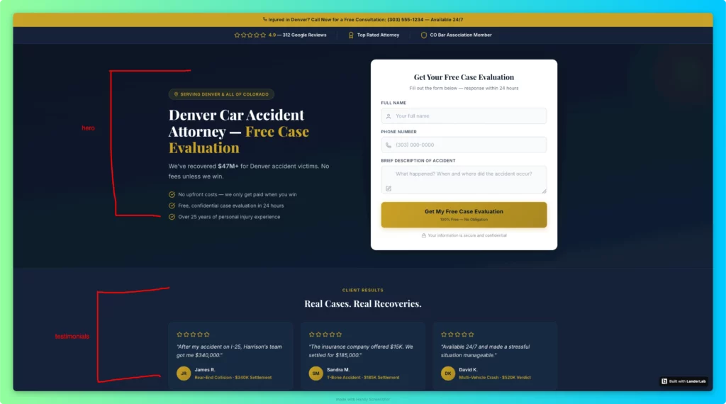
Put Social Proof Where Visitors See It Without Scrolling
The most common issue when auditing landing pages is trust signals buried below the fold. Cold traffic, particularly from paid campaigns, needs proof before they scroll, not after. Customer testimonials increase conversions by 34%. But placement matters as much as presence.
What belongs above the fold for trust:
- A star rating and total review count immediately adjacent to the headline or form
- A recognized client logo or certification badge that signals credibility at first glance
- A specific number that makes the claim real: “4.9 stars from 847 verified customers,” not “Highly rated.”
Generic social proof doesn’t move conversion rates. “Thousands of satisfied customers” tells visitors nothing. “Increased conversion rates by 47% in 60 days” tells visitors exactly what to expect.
Collect testimonials with specific outcomes, full names, photos, and job titles. Vague praise is decoration. Specific outcomes are proof.
Speed Is a Conversion Problem, Not a Technical Problem
Pages that load in one second convert at 9.6% versus 3.3% at five seconds. Every one-second delay in page load time reduces conversions by 7%.
For a business generating $100K monthly through landing pages, reducing load time from five to two seconds could add $21,000 in monthly revenue.
53% of mobile users abandon pages that take more than three seconds to load. If your page takes five seconds on mobile, you’re losing more than half your paid traffic before they read a single word.
Target under 1.5 seconds for Largest Contentful Paint on mobile. Compress all images to WebP. Remove third-party scripts that aren’t essential to conversion. Use a CDN.
Pages achieving “Good” ratings across all three Core Web Vitals metrics (LCP under 2.5s, INP under 200ms, CLS under 0.1) are converting at 35% above mobile industry averages. Core Web Vitals are not a Google ranking nicety. They are a direct conversion lever.
Stage 3: The Body (Building the Case and Handling Objections)
Visitors who scroll past the fold are interested. The body of the page is where you handle their objections, build desire, and give them the specific information they need to act.
Most landing pages fail here by either saying too little (thin content that doesn’t answer real objections) or too much (a wall of features that reads like a product brochure no one asked for).
Structure Copy Around the Visitor’s Decision, Not Your Company’s Structure
The body of a high-converting landing page follows a logical sequence: state the problem the visitor is experiencing, demonstrate that you understand it more deeply than they expected, introduce your solution, prove it works with specific outcomes, and make the next step obvious. Most landing pages do this in reverse order.
Use short sentences of 15 to 20 words maximum, active voice, and an 8th-grade reading level.
Pages written at a 5th- to 7th-grade reading level achieve 11.1% conversion, compared with 5.3% for college-level copy. Simplified writing signals confidence. Complex writing signals a complex product.
Social Proof in the Body: Layers and Placement
Social proof in the body section should be layered, not repeated. Don’t use three identical testimonial formats. Instead, stack different proof types:
- Named testimonials with outcomes: “Sarah from Phoenix saved $187 on her first month’s electricity bill” above the CTA after the solution section
- Aggregate numbers: “$23M in claims processed” or “847 Denver homeowners served” in a statistics block after social proof
- Case studies or before/after results: For high-ticket offers where a single data point isn’t enough to overcome skepticism
- Trust badges and certifications: BBB rating, Google reviews badge, industry certifications placed near the form to reduce form anxiety at the moment of decision
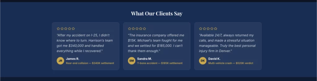
Displaying reviews can boost conversions up to 270%. Testimonials are featured in 36% of the top-performing landing pages. The difference between pages that use them well and pages that use them as decoration is specificity and placement.
How to Use Video Without Hurting Conversions
Landing pages featuring videos see an 86% increase in conversion rates, but that number comes with a critical caveat: the video has to directly address buyer concerns or demonstrate product value. A three-minute explainer video that describes features the visitor didn’t ask about converts worse than no video at all.
Video works when it shows transformation: here is the problem, here is what changed, here is the specific result. Use it for high-ticket offers where trust is the primary barrier (VSL pre-landers, high-ticket affiliate offers), for complex products that benefit from demonstration, and for audiences where video consumption is native to the channel that sent the traffic.
In 2026, AI-personalized video that dynamically reflects the viewer’s traffic source or industry is converting at 105% above pages without video, compared to the baseline 86% lift for standard embedded video. If you’re running video on landing pages, personalization is the next optimization layer worth testing.
One CTA, Repeated Strategically
Landing pages should have a single, consistent CTA repeated at three points: prominently near the hero section, after building desire mid-page, and near the final content.
Short-form pages (under 600 words, simple offer) convert 17% better with a single above-the-fold CTA. Long-form pages with complex offers convert 23% better with multiple CTAs spaced throughout the page because the decision requires scrolling.
First-person CTAs outperform second-person by 14%. “Start My Free Trial” outperforms “Start Your Free Trial.” “Get My Free Inspection” outperforms “Get Your Free Inspection.”
The difference is subtle, but the mechanism is clear: first-person language makes the visitor feel like they’re choosing, not being told.
Bad CTA copy versus good CTA copy, side by side:
| Bad CTA | Good CTA | Why It’s Better |
|---|---|---|
| Submit | Get My Free Quote | States the benefit, not the action |
| Sign Up | Start My Free Trial | First person, frames as low-commitment |
| Learn More | See If I Qualify | Frames the step as eligibility, not a sale |
| Contact Us | Book My Free Call | Specific, low-commitment, first person |
| Get Started | Get My Free Inspection | Names the exact deliverable the visitor receives |
Stage 4: The Form (Where Most Conversions Are Permanently Lost)
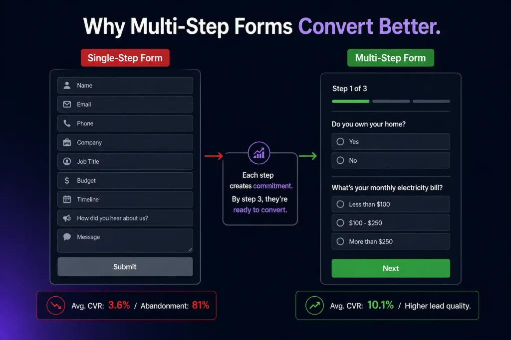
Form design is where most conversion opportunities are destroyed. 81% abandon forms after starting, with 67% never returning. The top reasons for abandonment are security concerns (29%) and excessive length (27%), both of which are entirely solvable.
Cut Your Form to the Minimum Fields Needed to Route the Lead
Three-field forms convert at 10.1%, while nine-field forms convert at 3.6%. Reducing a form from 11 fields to 4 fields yields a 120% increase in conversions. The practical rule that holds across every vertical: collect the minimum data needed to route the lead to the right next step, then qualify further in a follow-up email, a scheduling flow, or the sales call itself.
The specific conversion impact of individual form fields:
- Phone number fields drop conversion by 5% when required, 2% when optional
- Company-size or budget dropdowns drop conversion by 8% but improve lead quality by 34%
- Job title fields drop conversion by 3% but improve lead quality by 18%
- Password fields on signup forms drop conversion by 14%
- Captcha challenges drop conversion by 3.2%; invisible challenges drop it by only 0.4%
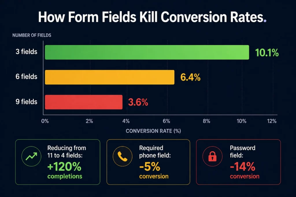
Every field has a cost. Know what you’re paying and what you’re getting in return. If a field improves lead quality without killing enough volume to make a difference, keep it. If it’s just nice to have in the CRM, cut it.
Multi-Step Forms: The Structure That Converts Better Than Single-Step
Multi-step forms consistently outperform single-step forms because they use the psychology of incremental commitment. Once a visitor answers one question, they’re invested in seeing the result.
Each step commits them a little more. By the time they reach the contact information fields, they’ve already decided to engage.
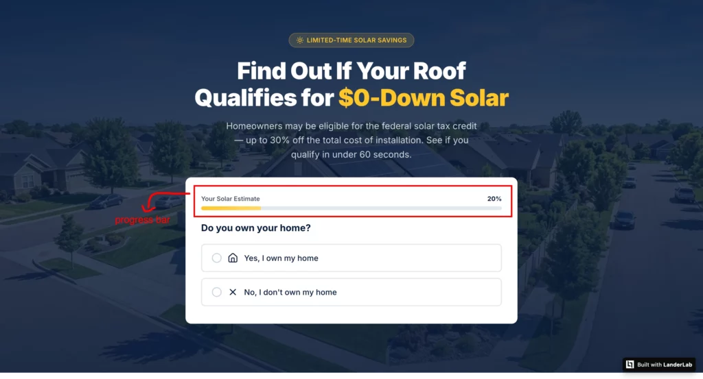
The structure that works: start with the lowest-commitment question relevant to your qualification logic, never ask for contact information in the first step, keep each step to two or three fields maximum, use a progress bar so visitors know how close they are to their result, and make the final step feel like a logical continuation rather than a sudden ask for personal data.
A multi-step form that collects 12 data points across four steps will consistently outperform a single-step form asking for only four fields, because each step feels manageable and the visitor is committed before the personal data ask arrives.
LanderLab’s AI quiz funnel builder generates complete multi-step flows from a single prompt, including conditional logic that routes different visitor types to different questions or offers based on their answers.
A Medicare quiz funnel that routes 65-year-olds differently than 70-year-olds, or a solar quiz that routes homeowners differently than renters, produces dramatically better lead quality than a single-path form.
What would take days to build manually is live in minutes.
Conditional Logic: The Upgrade That Most Builders Don’t Offer
Standard multi-step forms ask everyone the same questions in the same order. Conditional logic changes what a visitor sees based on their previous answers.
A visitor who selects “I own my home” sees different follow-up questions than one who selects “I rent.” A visitor who indicates a $300 monthly electricity bill sees different solar savings calculations than one who pays $80.
Conditional logic makes a form feel like a conversation rather than a questionnaire. It signals that the result will be genuinely personalized, which increases completion rates and improves quality.
LanderLab’s quiz funnel builder supports conditional branching natively, including routing visitors to entirely different offer pages based on their qualification profile.
Mobile Form Design Is a Separate Problem
62% of mobile form abandonments cite form complexity as the cause. Autofill-enabled forms convert 24% better on mobile than forms without autofill hints. Sticky mobile CTAs (bottom of viewport) lift conversion by 14% on scrolling pages. Tap targets under 44 pixels square increase accidental dismissals by 31%.
Add autocomplete attributes to every field. Make tap targets at least 48×48 pixels. Break long forms into steps on mobile, even if they’re single-step on desktop.
The mobile form experience is not a scaled-down version of the desktop form. It’s a different design problem that requires a different solution.
Stage 5: Mobile (The Largest Traffic Source and the Worst Conversion Rate)
Mobile drives 83% of all landing page traffic. Desktop achieves a 12.1% conversion rate compared to mobile’s 11.2% in a dataset of 464 million visitors.
That gap represents over 1.3 million missed conversions in this dataset alone.
This is not a device problem. It’s a friction problem. Mobile-optimized sites convert 100% higher than non-optimized ones. Among top-performing landing pages, 86% have been optimized for mobile.
If your page is a desktop design that scales down, it is not mobile-optimized. It is mobile-tolerant.
The specific mobile issues that destroy conversions:
- Google found that 70% of mobile landing pages take more than five seconds to display above-fold content
- Tap targets under 44 pixels square increase accidental dismissals by 31%
- Accordion sections on mobile lift conversion by 9% versus long-scroll equivalents
- Forms without autofill attributes abandon 24% more than autofill-enabled forms
- A 0.1-second improvement on mobile increases conversion by 8% to 10%
Build for mobile first, then adapt for desktop. That means designing the hero, form, and CTA for a thumb-sized screen before you worry about how it looks on a monitor. The majority of your traffic will never see the desktop version.
Stage 6: Personalization and Dynamic Content
Dynamic personalization, swapping the headline, hero image, or testimonials based on traffic source, geography, or industry, lifts conversion by 9% to 18% on average when the segments are meaningful and the variants genuinely differ.
Personalized CTAs convert 202% better than generic versions.
Dynamic landing pages convert 25.2% more mobile users than static ones.
These numbers are real, but they come with a caveat: personalization applied to segments of fewer than 1,000 weekly sessions usually loses to a single well-written generic page because variant volume fragments learning.
Personalize only where your traffic volume justifies it.
Dynamic Tokens: The Fastest Form of Personalization
The simplest and most immediate form of personalization is dynamic keyword insertion. If a visitor arrives from an ad targeting “solar installation Phoenix,” the landing page headline automatically reads “Solar Installation in Phoenix” rather than a generic headline.
This keyword-to-headline matching typically improves click-through rates by 20 to 30% and reduces cost-per-click by maintaining high relevance scores.
LanderLab supports dynamic tokens that automatically pull in visitor data from URL parameters.
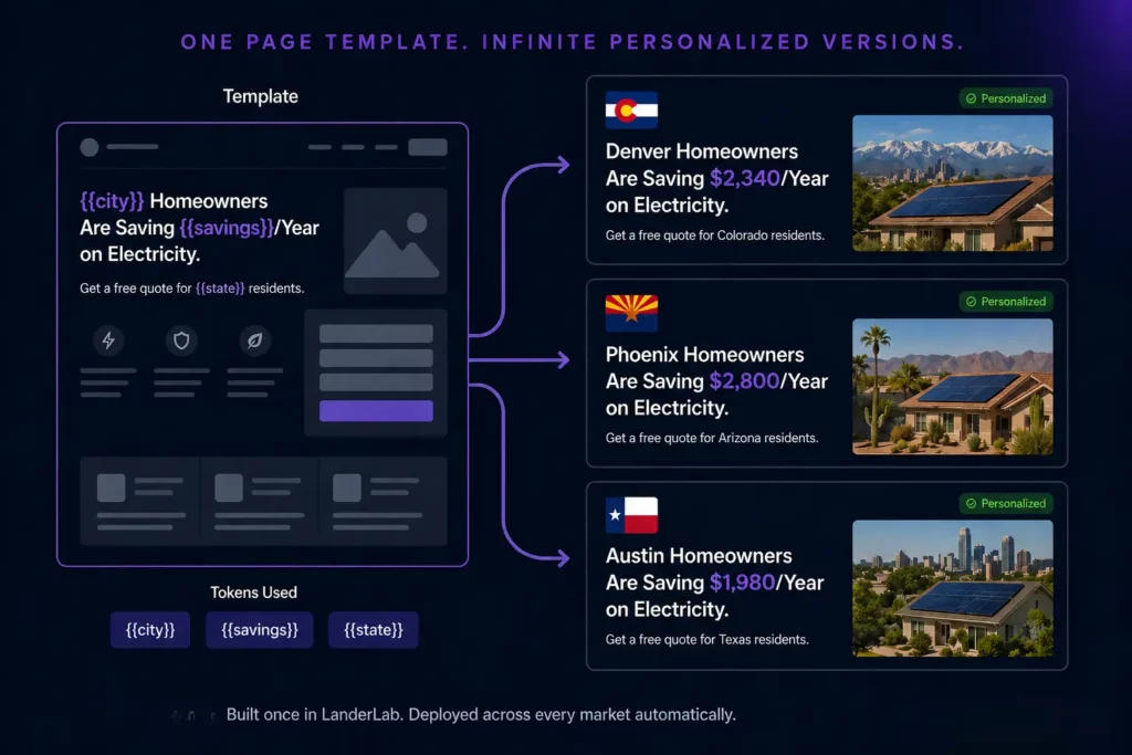
You can insert the visitor’s city, the specific product they searched for, their industry, or any other URL parameter into any element on the page: headlines, subheadlines, body copy, form labels, or CTA text.
A single landing page template becomes dozens of personalized experiences without requiring separate builds.
Traffic Source Personalization
A visitor who arrives from a Facebook ad is in a completely different mental state than one who arrives from a Google search for the exact product you’re selling. The Facebook visitor wasn’t looking.
The Google visitor was. The same headline and offer that converts a high-intent Google searcher will often fail to engage the lower-intent Facebook visitor, and vice versa.
Using URL parameters to identify traffic source and adjusting the hero section accordingly, different headline, different subheadline, different opening, is one of the highest-leverage personalization tactics available without requiring complex infrastructure.
LanderLab’s dynamic token system handles this natively.
Geographic Personalization for Local and Regional Campaigns
For campaigns running across multiple geographic markets, a single landing page showing “Homeowners Are Saving Money on Electricity” underperforms against pages that say “Denver Homeowners Are Saving $2,340/Year on Electricity” for Denver traffic, “Phoenix Homeowners Save $2,800/Year” for Phoenix traffic, and so on.
Geographic personalization with LanderLab’s dynamic tokens means you build one page structure and deploy it across every market, with the city, state, and local social proof automatically populating for each visitor’s location. For solar, home services, roofing, HVAC, and local lead gen campaigns running in multiple markets simultaneously, this is the difference between building 50 pages manually or building one that serves all 50.
Stage 7: Post-Conversion (The Stage Nobody Optimizes)
The thank-you page is the most neglected real estate in digital marketing. After someone converts, most landing pages deliver a generic “Thanks, we’ll be in touch” message and stop there. That’s a missed opportunity at the moment of highest engagement.
What a High-Converting Thank-You Page Does
A well-designed thank-you page does three things: confirms what happens next so the visitor knows what to expect, reduces post-conversion anxiety by clarifying the timeline and next step, and introduces a secondary offer or action while the visitor is still engaged.
The specific elements that belong on a thank-you page:
- Confirmation of the action: “Your request has been received. A specialist will call you within 2 hours.” Not “Thanks for your submission.”
- What happens next: Exact timeline, exact contact method, what to expect in that contact. Visitors who know what to expect don’t churn before the sales call.
- A low-commitment secondary action: “While you wait, download our guide to understanding solar financing” or “Book your call now to skip the queue.” Something that keeps engagement high and provides value before the sales conversation happens.
- Phone number: For high-intent offers, give leads a way to call you immediately if they don’t want to wait. Some of your best leads are ready to talk right now.
Thank-You Pages and Conversion Tracking
The thank-you page is also where your conversion tracking lives. Google Ads conversion tags, Meta Pixel purchase events, and offline conversion imports all typically fire on the thank-you page URL.
If your thank-you page is generic and unmemorable, that’s a tracking problem as much as a conversion problem. Make sure your tracking fires correctly, that the confirmation is specific enough that visitors don’t doubt whether their submission went through, and that the page loads fast enough for tracking to fire before a visitor closes the tab.
Stage 8: Testing (The Practice That Compounds Everything Else)
Only 17% of marketers actively A/B test their landing pages. But those who test see 37% higher conversion rates. Testing is not optional when you’re running paid traffic.
Every dollar you spend on ads is also a vote on whether your current page is optimal. If you’re not testing, you’re assuming.
What to Test First and Why
Form length reduction delivers the highest conversion lift at 120%, followed by headline optimization at 27% to 104%. Both require minimal technical complexity and can be implemented in hours. Start there before testing button colors, font sizes, or background images.
The full testing priority order based on the impact-to-effort ratio:
- Headline. Highest impact. Test problem-focused vs. benefit-focused, question format vs. statement, specific vs. general, with and without geographic specificity for local campaigns.
- Form length. Cut one field and measure for two weeks. Repeat until lead quality drops. That’s your optimal form.
- CTA copy. Test first person vs. second person, specific deliverable vs. generic action, urgency-based vs. benefit-based.
- Social proof placement. Test above the fold vs. below. Test named testimonials vs. aggregate review counts. Test with photos vs. without.
- Hero image. For local campaigns, test real job photos vs. stock photos. Real photos almost always win.
- Page length. For complex offers, test long-form vs. short-form. Let the data tell you how much explanation the offer actually needs.
Companies testing 10 or more variations see 86% better results than single tests. Only 1 out of 8 A/B tests produces a statistically significant result. Run tests continuously.
The teams that compound small wins over 12 months produce results that look impossible to those who only test once a quarter.
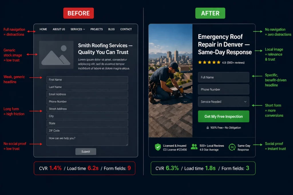
Before and After: What These Best Practices Look Like in Practice
The fastest way to understand the cumulative impact of landing page best practices is to see them applied to a real page. Here’s a before and after for a roofing company running Google Ads in Denver.
Before: The Underperforming Page
Headline: “Smith Roofing Services — Quality You Can Trust”
Navigation: Full menu with About, Services, Gallery, Blog, Contact
Hero image: Stock photo of a generic suburban house
Social proof: “Over 20 years in business” (below the fold, no reviews visible)
Form: 9 fields including “How did you hear about us?” and “Preferred contact time”
CTA: “Submit”
Mobile load time: 6.2 seconds
Thank-you page: “Thanks for your submission. We’ll be in touch.”
Conversion rate: 1.4%
Every best practice in this guide is violated on this page. The headline doesn’t match the ad. Navigation gives visitors six exit opportunities before they read a word.
The stock photo signals “national aggregator”, not “local roofer.” Nine form fields at the top of the funnel. Social proof is invisible unless you scroll. “Submit” tells the visitor nothing about what they get.
Six-second load time means a significant portion of mobile visitors never see the page at all.
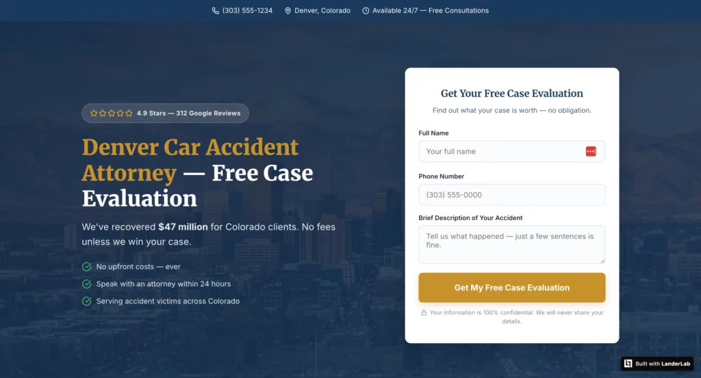
After: The Optimized Page
Headline: “Emergency Roof Repair in Denver — Same-Day Response”
Navigation: Removed entirely
Hero image: Photo of an actual completed job in Denver with the homeowner visible
Social proof: “⭐⭐⭐⭐⭐ 4.9 stars from 847 Denver homeowners” above the fold, adjacent to the form
Form: 3 fields (Name, Phone, Address), multi-step with progress bar
CTA: “Get My Free Inspection”
Mobile load time: 1.8 seconds
Thank-you page: “Your request is confirmed. A Denver roofing specialist will call you within 2 hours. In the meantime, here’s what to expect during your free inspection.” Plus a calendar booking option for those who want to schedule immediately.
Conversion rate: 6.3%
Same ad budget. Same keywords. 4.5x better conversion rate from applying the best practices in this guide systematically, in the right order.
Landing Page Best Practices by Vertical
Best practices are universal. How they’re applied varies by vertical, audience, traffic source, and what “conversion” actually means for that specific offer.
Here’s how the fundamentals translate across the verticals where high-performing landing pages are built and tested in 2026.
Affiliate Marketing and Paid Traffic
The primary challenge in affiliate traffic is warming up cold visitors who weren’t actively searching for your offer. Someone clicking a native ad or a Facebook carousel wasn’t looking for your product.
They were doing something else entirely. Sending that person straight to a sales page is like proposing on a first date.
A presell page between the ad and the offer builds trust before the landing page asks for anything. The presell warms the visitor up. The landing page closes.
Message match with the presell page matters as much as message match with the ad: the visitor has been through one conversation already, and the landing page needs to continue it, not start a new one.
For pay-per-call verticals (insurance, solar, Medicare, home services), phone number prominence matters more than form completion. Many high-intent visitors in these verticals prefer to call rather than fill out a form, especially when the problem is urgent. Make the phone number large, tappable on mobile, and visible without scrolling.
For native traffic where the visitor wasn’t actively searching, advertorial-style pages that lead with a story before introducing the offer consistently outperform direct response pages because they earn attention before asking for action.
The highest-converting affiliate landing pages in 2026 share one structural characteristic: they don’t feel like ads.
The best ones read like editorial content, position the offer as the logical conclusion of information the reader was already looking for, and make the CTA feel like the natural next step rather than an interruption.
Insurance and Medicare
Insurance landing pages operate under a compliance layer that most other verticals don’t. Claims must be accurate, disclosures must be present, and the page must not make promises the product can’t deliver.
The FTC and CMS have specific requirements for Medicare advertising in particular, and violations result in ad account shutdowns, not just poor performance.
Within those constraints, the highest-converting insurance pages share a consistent structural approach. Qualification-based CTAs (“See if you qualify,” “Check your eligibility”) consistently outperform direct CTAs (“Buy now,” “Get a quote”) because they frame the next step as low-commitment eligibility verification rather than a purchase decision. The visitor isn’t buying. They’re finding out if they qualify. That’s a much lower psychological barrier.
For Medicare specifically, quiz funnels that ask age, current coverage status, state, and budget questions before the lead form produce leads that close at 2 to 3x the rate of single-step form pages.
The mechanism is qualification: a visitor who answers four questions about their specific coverage situation before giving their phone number is already engaged and already invested.
They know the result will be relevant to them. That is a fundamentally different lead than someone who filled out a generic name and email form.
Trust signals matter more in insurance than in almost any other vertical because the primary objection is legitimacy. Is this real? Is this a scam? Is my personal information safe?
Specific trust signals that work: Better Business Bureau ratings and accreditation displayed prominently, state license numbers visible near the form, named agents or company identity rather than generic “Insurance Experts,” and SSL security badges adjacent to the contact fields.
Compliance disclosure language at the bottom of the page, done well, actually reinforces trust rather than undermining it because it signals that you’re operating by the rules.
Solar
Solar lead generation has one of the widest CPL ranges of any vertical because page quality variance is enormous. The same traffic that generates a $40 lead on a well-built page generates a $180 lead on a generic one.
The difference is almost entirely in how specifically the page speaks to the visitor’s financial situation and geographic context.
Geographic specificity in the headline outperforms generic solar messaging by a significant margin. “California homeowners are saving $2,340 per year on electricity” converts better than “Switch to solar today” because the benefit is local, specific, and tied to something the visitor can verify against their own electricity bill.
“Are you overpaying for electricity in Arizona?” outperforms “Save money with solar” because it creates immediate self-identification.
An embedded savings calculator that lets visitors input their monthly electricity bill and see a personalized savings estimate is one of the most powerful conversion tools in solar.
It transforms an abstract benefit (save money) into a specific personal number (you could save $2,340 this year), and it creates investment.
A visitor who has input their own data and seen a personalized result is significantly more likely to complete the lead form than one who reads a generic claim.
Pre-qualification is critical for solar lead quality. The highest-converting solar pages ask three questions before the lead form: Do you own your home? What state are you in?
Is your monthly electricity bill over $100? Visitors who answer “no” to owning their home or who have low electricity bills are poor solar prospects, regardless of how interested they seem.
Filtering them out before collecting contact information dramatically improves the quality of what goes to the sales team, which in turn improves close rates and the economics of the entire campaign.
Solar campaigns running across multiple states benefit enormously from dynamic token personalization. One page template with geographic tokens automatically references the correct state, local utility companies, and relevant state incentives for each visitor’s location.
Building 50 state-specific pages manually is impractical. Building one page that serves all 50 with dynamic content is not.
Home Services (Roofing, HVAC, Plumbing, Remodeling)
Home services is the most volatile vertical in paid traffic. Roofing CPL in major metros can exceed $200 for exclusive leads. HVAC and plumbing sit significantly lower.
The conversion gap between a well-built local home services page and a generic one is the largest of any vertical precisely because local trust signals have such an outsized impact.
The primary objection in home services is not price. It’s trust. Will this person actually show up? Will they do quality work? Will they leave my house a mess?
Landing pages that overcome this objection fastest are those built around visual local proof: photos of actual completed jobs in the specific area you’re targeting (not stock images of a generic house), named testimonials with neighborhoods or even street intersections (“Sarah from Littleton, CO”), license numbers and certifications visible near the form, and a clear response timeline promise.
Emergency service verticals (emergency plumbing, emergency HVAC, emergency roof repair after a storm) have a uniquely high urgency dynamic. The visitor has an immediate problem and limited patience.
The page needs to communicate response speed before anything else. “Denver’s Fastest Emergency Plumber – We Answer in 60 Seconds” does more conversion work in a headline than a paragraph of copy about qualifications.
Click-to-call is often more important than the form for local home services. Many high-intent leads, especially for emergency or high-ticket jobs, prefer to call rather than wait for a callback from a form submission.
Make the phone number large, prominently placed above the fold, tappable on mobile, and ideally present in a sticky header that stays visible as the visitor scrolls.
For businesses that track calls as conversions, the phone number placement and prominence often has a larger impact on total leads than any other page element.
Seasonal targeting matters in home services. A roofing page running after a hailstorm converts differently than one running in calm weather.
An HVAC page running in a summer heat wave in Phoenix converts differently than one running in mild temperatures. Landing pages that reference current local conditions (“Phoenix is hitting 115°F this week. Is your AC ready?”) consistently outperform evergreen generic pages because they meet the visitor exactly where they are right now.
Real Estate
Real estate landing pages operate in a long decision cycle. Buying or selling a home is one of the largest financial decisions most people make, and they’re not going to be persuaded by a single landing page visit.
The job of a real estate landing page is not to close a deal. It’s to start a conversation.
The highest-converting real estate pages are hyper-local and value-forward. Rather than leading with agent credentials or brokerage brand, they lead with market data relevant to the specific visitor’s situation.
A buyer landing page might open with “Denver homes sold for 4.2% above asking price last month. Here’s what that means if you’re ready to buy.” A seller landing page might open with “See what your Highlands Ranch home is worth in today’s market.” The visitor immediately receives something of value before being asked for anything.
Quiz funnels work exceptionally well for real estate lead qualification because they segment buyer intent before collecting contact information. A four-question quiz that establishes buyer vs. seller, budget range, timeline, and specific area of interest produces dramatically different leads than a generic “Get a free home valuation” form.
A visitor who completes that quiz has already demonstrated serious intent and provided qualification data that makes every follow-up more relevant.
For real estate agents running Google Ads on specific neighborhood or ZIP code terms, geographic specificity in the headline is essential. “Homes for Sale in Cherry Creek, Denver” needs to match the ad exactly. If the visitor searched for Cherry Creek homes and the landing page talks about Denver real estate broadly, they’re bouncing.
The more specific the search, the more specific the landing page needs to be.
Social proof in real estate takes a different form than in most verticals. Generic five-star reviews matter less than recent transaction data. “Sold 47 homes in Scottsdale in the last 12 months at an average of 98% of asking price” is more persuasive than “Great agent, highly recommend” because it proves market expertise, not just likability.
Legal Services
Legal landing pages have the highest average Google Ads CPL of any vertical at $132, and for good reason: a client worth $50,000 to $500,000 in fees justifies significant acquisition cost.
The economics mean that page quality has an enormous dollar impact. Improving a personal injury landing page from 3% to 6% conversion rate doesn’t just double leads. It potentially doubles revenue from the same ad spend.
Legal landing pages live or die on specificity and credibility. “Personal Injury Attorney” is a category. “Denver Car Accident Attorney -We’ve Recovered $47M for Colorado Clients” is a claim that creates immediate differentiation and credibility.
The specificity of the recovery amount signals that the attorney has real cases and real results, not just a law degree.
The primary objection in legal services is risk. Hiring the wrong attorney for a major case is an expensive mistake. Visitors are evaluating whether to trust you with something important.
Social proof needs to be outcome-focused and verifiable: named case results (where ethically permissible), bar association memberships and ratings, years of practice in a specific practice area, and testimonials that reference specific situations rather than generic praise.
Legal pages often benefit from consultation-framed CTAs rather than lead-form CTAs. “Get a Free Case Evaluation” outperforms “Contact Us” because it defines the value exchange: the visitor gives their information, they receive a professional assessment of their case.
That’s a compelling trade. “Schedule My Free Consultation” outperforms “Get Started” for the same reason: it makes the next step concrete, low-risk, and valuable.
For practice areas with extreme urgency (criminal defense, immigration, emergency protective orders), the page needs to communicate immediate availability. “Available 24/7 – Call Now” with a clickable phone number is often the highest-converting element on the page because the visitor’s urgency is genuine and they need to know someone will actually answer.
Healthcare and Medical
Healthcare landing pages operate under HIPAA considerations and the unique psychology of medical decision-making. Patients researching healthcare options are often anxious, in pain, or worried. The landing page’s tone has to match that emotional context. A page that feels transactional or sales-driven creates dissonance with the visitor’s emotional state and increases bounce rates.
The highest-converting healthcare pages lead with empathy before credentials. “You shouldn’t have to live with chronic back pain” opens a conversation that the visitor is already having internally.
It meets them where they are before it asks anything of them. Credentials, certifications, and board memberships then follow as proof that the empathy is backed by competence.
Trust signals in healthcare are different from other verticals. Patient testimonials (where HIPAA permits and with appropriate consent) matter.
But so do specific certifications, hospital affiliations, insurance acceptance, and years of specialized practice. A visitor evaluating an orthopedic surgeon wants to know that the doctor is board-certified, affiliated with a recognized hospital, and has performed the specific procedure they need. Generic “5 stars” doesn’t answer those questions.
Forms in healthcare need to be exceptionally sensitive about what they ask. Asking for a specific diagnosis or condition in a public form creates HIPAA exposure and makes many visitors uncomfortable enough to abandon.
The safest approach is to collect name, phone, and preferred contact time in the initial form, and handle clinical details in the actual intake process.
The conversion goal of the landing page is to get the phone call or appointment booking, not to pre-qualify the patient’s condition.
Financial Services and Debt Relief
Financial services landing pages convert at the highest average rate of any vertical at 8.4%, primarily because search intent is extremely high and specific.
Someone searching “debt consolidation loan bad credit” has already decided they need help and is actively evaluating providers. The job of the landing page is to win that evaluation, not to convince the visitor they have a problem.
The problem/solution page format works exceptionally well in financial services because visitors arrive problem-aware. Lead with the pain point they’re already experiencing: “Making minimum payments but the balance barely moves?” That headline creates immediate identification.
The visitor thinks “that’s me.” Once they’re nodding, the solution section can introduce the offer with credibility already established.
Compliance language in financial services is non-negotiable and, when handled well, actually converts better than omitting it. Clear disclosures (“Individual results vary. This is not a guaranteed outcome.”), FTC-compliant claims, and realistic representations of what the program delivers build more trust than overpromised results that visitors are skeptical of anyway.
The best debt consolidation landing pages include specific stats that are carefully caveated: “$23,000 average debt enrolled” and “46% average reduction negotiated” are persuasive and specific without overpromising individual outcomes.
Finance CPL on Meta rose 24% between January 2025 and January 2026. That means your landing page has to work harder in 2026 than it did two years ago to produce the same economics.
Form optimization and qualification-based multi-step flows are not optional in this environment. They’re the primary lever available to media buyers who can’t control Meta’s rising CPL.
SaaS and B2B Technology
B2B SaaS landing pages face a unique challenge: the buying committee. Enterprise software purchases involve an average of 4 to 6 stakeholders.
The landing page visitor might be a technical evaluator, a department head, a finance approver, or a CEO. The same page needs to be compelling to each of them, which requires careful content hierarchy rather than a single-audience message.
The highest-converting B2B SaaS pages lead with an outcome-specific headline that speaks to the primary decision-maker’s KPIs. “Close 30% more deals without adding headcount” speaks directly to a VP of Sales.
“Reduce IT provisioning time by 60%” speaks to a CTO. The headline targets the most common visitor profile, and the body copy addresses the concerns of supporting stakeholders through specific sections or tabbed content.
Specificity is the sharpest weapon in B2B SaaS copywriting. “The CRM for sales teams” is a category description. Anyone could say it. “Close 30% more deals without adding headcount” is a claim that creates immediate differentiation, implies a mechanism, and makes the visitor want to know more. Social proof follows the same rule: “Trusted by thousands of businesses” is meaningless. “Sarah, VP of Sales at Acme Corp (200 employees), reduced her team’s close rate from 12% to 18% in 60 days” is something a VP of Sales can immediately see themselves in.
Free trial CTAs consistently outperform demo request CTAs in self-serve SaaS because they lower the commitment threshold. “Start My Free Trial” requires no sales interaction. “Request a Demo” requires scheduling, a call, and time with a sales rep.
For products that can demonstrate value without human intervention, the trial CTA wins. For complex enterprise products that genuinely require discovery and customization, the demo CTA is the right choice because the wrong customers in a self-serve trial cost support resources and produce churn.
For B2B campaigns running across multiple verticals (selling the same SaaS to healthcare companies, legal firms, and financial services firms simultaneously), dynamic token personalization that swaps the industry-specific headline, testimonial, and use case for each traffic segment consistently outperforms a single generic page.
A healthcare company landing on a page that shows healthcare-specific use cases and healthcare customer logos converts at dramatically higher rates than the same company landing on a generic “works for any business” page.
Lead Generation Agencies and Performance Marketing Teams
Agencies and performance marketing teams running landing pages for multiple clients simultaneously face a production problem more than a conversion problem. The best practices are known.
The challenge is building and iterating fast enough across dozens of campaigns and clients to actually apply them.
The highest-performing agency landing page workflows in 2026 share common characteristics. They use AI-assisted page generation to produce first drafts from a brief rather than building from scratch.
They clone and adapt winning page structures across similar verticals rather than rebuilding the same structure repeatedly. They run split tests continuously rather than launching pages and leaving them static.
And they use dynamic token personalization to serve multiple client markets from single page templates rather than maintaining separate page inventories for each geographic or demographic variant.
LanderLab was built specifically for this workflow. The AI builder generates a complete page from a prompt describing the client’s offer, vertical, and target audience. The URL importer pulls in competitor page structures as a reference that can be adapted rather than built from scratch. Split testing is native to the platform, so tests run without external tools.
Dynamic tokens enable multi-market deployment from a single template. And the flow map view gives agencies visibility into how all the pages in a quiz funnel connect, which is essential for managing complex conditional logic across multiple client funnels simultaneously.
For agencies managing landing pages across solar, insurance, home services, and debt verticals simultaneously, the ability to move from brief to live-tested page in hours rather than days is not a convenience.
It’s a competitive differentiator that determines whether you can profitably serve the volume of clients that agencies need to operate at scale.
How to Build a Landing Page That Converts: The Process
Knowing the best practices is half the job. The other half is building pages fast enough to actually test them. Most teams lose here, not because they don’t know what a good landing page looks like, but because building one from scratch takes too long to iterate at the speed paid traffic demands.
Here’s the process that works for media buyers and lead gen teams managing multiple campaigns simultaneously.
Step 1: Define one conversion goal before you open any builder. What is the single action you want the visitor to take? Everything on the page is either helping that action happen or getting in its way.
Step 2: Write the headline first. If you can’t state the primary benefit in eight words or fewer, you don’t understand the offer well enough to build the page yet. The headline is the single highest-impact element on the page. Get it right before you design anything.
Step 3: Identify the primary objection. Every offer has one main reason a cold visitor wouldn’t convert. Your page needs to address that objection explicitly before the CTA appears. Define it before you write a word of body copy.
Step 4: Build the form last. Decide how many fields you actually need to route the lead. Remove everything else. Add one field back only if lead quality genuinely requires it.
Step 5: Build at least two variants from the start. The first version of any landing page is a hypothesis, not a finished product. Build version B before you launch version A. You need something to test against from day one.
Step 6: Connect tracking before you send traffic. Conversion tracking, call tracking, and downstream lead quality data need to be in place before a single dollar of ad spend hits the page.
Frequently Asked Questions: Landing Page Best Practices
What are landing page best practices?
Landing page best practices are the proven design, copy, and structure decisions that consistently improve conversion rates across paid traffic campaigns. The highest-impact practices, in order of effect size, are: message match between the ad and the landing page headline, removing navigation menus and all exit opportunities, placing social proof above the fold, reducing form fields to the minimum needed to qualify the lead, ensuring mobile load time under 1.5 seconds, and testing the headline before anything else. The median dedicated landing page converts at 4.02% in 2026. The top 25% convert at 11.45% or higher. That gap is almost entirely explained by how consistently these practices are applied.
What makes a good landing page?
A good landing page has six characteristics: it matches the headline to the ad or traffic source that sent the visitor (message match), it has a single conversion goal with no competing links or navigation, it loads in under two seconds on mobile, it places a specific trust signal above the fold before the visitor scrolls, it uses a form with four fields or fewer, and its CTA describes what the visitor gets rather than what they’re doing (“Get My Free Quote” not “Submit”). A good landing page is not a homepage. It is a conversion system designed around one visitor type, one offer, and one desired action.
How many fields should a landing page form have?
Three to four fields is the sweet spot for most landing pages. Three-field forms convert at 10.1% while nine-field forms drop to 3.6%. Reducing a form from 11 fields to 4 fields yields a 120% increase in completions on average. The practical rule: collect only the minimum data needed to route the lead to the right next step. For most lead gen offers, name, phone, and email is sufficient. Everything else can be collected during the follow-up conversation. If lead quality is a concern, a multi-step form that qualifies intent across multiple steps will outperform a long single-step form both on volume and quality.
What is message match on a landing page?
Message match is the alignment between the promise made in your ad and the headline on your landing page. When someone clicks an ad that says “Emergency Roof Repair Denver,” they expect to land on a page that says exactly that. If the headline says “Smith Roofing Services, Serving Colorado Since 1998,” there is a message mismatch and the visitor is likely to bounce. Strong message match means the visitor’s first thought on landing is “yes, I’m in the right place.” Weak message match means doubt, which means bounces. Message match affects both conversion rate and Google Ads Quality Score, which directly affects your cost per click.
How long should a landing page be?
Landing page length should match the amount of trust required to convert the visitor. Short-form pages (under 600 words) work for simple offers where the visitor already has high intent and the ask is low-commitment. Long-form pages work for complex offers, high-ticket products, or cold traffic that needs significant warming before they’ll act. A roofing company running local search ads can often convert with a short page because the visitor is already looking for a roofer. A high-ticket course or SaaS product targeting cold traffic typically needs a longer page to build the trust and handle the objections that a high-ticket purchase requires. Let the data tell you: if visitors are scrolling to the bottom but not converting, the page is too short. If they’re bouncing without scrolling, the problem is above the fold.
What is a good landing page conversion rate?
The median dedicated landing page converts at 4.02% in 2026. The top 25% convert at 11.45% or higher. But benchmarks vary significantly by vertical: financial services averages 8.4%, legal services 4.2%, home services 3.8%, healthcare 3.6%, insurance 3.3%, and B2B SaaS 2.5-4%. If your conversion rate is below the median for your vertical, the most common causes are message mismatch between your ad and page headline, too many form fields, insufficient social proof above the fold, or slow mobile load time. Fix those four in that order before drawing conclusions about your offer or targeting.
How do I create a landing page that converts?
To create a landing page that converts, follow this sequence: define one conversion goal before you open any builder, write a headline that matches your ad and states the primary benefit in under eight words, identify and address the primary objection in the body copy before the CTA appears, build the form last with only the minimum fields needed to qualify the lead, ensure the page loads in under two seconds on mobile, and build two variants from the start so you have something to test against immediately. Connect conversion tracking before you send any traffic. Then test the headline first, form length second, and CTA copy third. The first version of any landing page is a hypothesis. The version that emerges from three months of testing is the one that actually converts.
Should a landing page have navigation?
No. Navigation menus on landing pages consistently reduce conversion rates because every navigation link is an exit opportunity you paid to create. Only 16% of landing pages have no navigation bar, which means 84% of landing pages are actively leaking paid traffic. WordStream found that 33% of the links on landing pages were sending visitors away from the page entirely, often to social media profiles. Remove the navigation menu, remove social links, and remove footer links from any page receiving paid traffic. The only clickable element on a landing page should be the CTA and any legally required links such as privacy policy or compliance disclosures.
The Bottom Line
Landing page best practices are not a checklist. They’re a hierarchy. Message match comes before headline optimization. Headline optimization comes before CTA copy. Form design comes before button color. Speed comes before design. Testing comes last, and then repeats forever.
Most landing pages underperform for the same reason: teams fix what’s visible instead of what’s measurable. Across thousands of A/B tests, a small set of variables consistently drives the largest conversion gains: form length, headline clarity, mobile friction, page speed, and proof placement. When these are wrong, no amount of traffic compensates. When they’re corrected, lift appears quickly.
Work through the stages in this guide in order. Fix message match first. Speed the page up. Move social proof above the fold. Shorten the form. Add conditional logic for qualification. Optimize the thank-you page. Test the headline. Everything else is optimization on top of a solid foundation.


