In the unforgiving landscape of digital marketing, conversion rates tell a brutally honest story. Across industries, the average landing page conversion rate hovers at a mere 2.35%, while the top performers command an impressive 5.31% or higher. We’re not talking about a small difference here. This is the razor-sharp line dividing brands that thrive online from those that are practically invisible to their target audience.
The truth is, a high landing page bounce rate isn’t just a number; it’s a sign that something’s not clicking with your visitors, and it’s quietly killing your chances of converting them. Each visitor who bounces represents more than a lost opportunity; they’re a direct hit to your marketing ROI. In an era of shrinking attention spans and relentless digital competition, landing pages have approximately 3-5 seconds to make a compelling first impression.
Jump to Section:
- Understanding Bounce Rate
- 1. Optimize Page Load Speed
- 2. Nail the Above-the-Fold Experience
- 3. Match Ad Messaging to Landing Page Content
- 4. Optimize for Mobile First
- 5. Use Visual Hierarchy & Scannable Layouts
- 6. Leverage Social Proof for Trust
- 7. Streamline Your Forms
- 8. Use Microcopy to Reduce Friction
- 9. Optimize Your Call-to-Action (CTA)
- 10. Recover Visitors with Exit-Intent Popups
- Bringing It All Together
- Final Thoughts
🚀 KEY TAKEAWAYS
- Slow-loading pages push people away – speed is your silent salesperson.
- What visitors see first matters most. Nail your headline, image, and CTA right at the top.
- Don’t confuse people. Make sure your ad and landing page tell the same story.
- Mobile-first isn’t optional; it’s essential. If it’s hard to read or tap, they’re gone.
- Break up big chunks of text. Keep it clean, clear, and easy to skim.
- Trust is everything. Use real testimonials and social proof, not stock fluff.
- Forms should be simple. The less effort you ask for, the more people will say yes.
- Microcopy (those tiny helpful texts) can make people feel safe and understood.
- Your CTA button needs to stand out and tell people exactly what to do next.
- If someone’s leaving, offer them something that makes them pause—nicely, not pushy.
Understanding Bounce Rate: What It Really Means for Your Business
A 70-80% bounce rate might slide on a blog, but it’s a critical failure for a landing page designed to convert. The performance gap between high and low-performing landing pages isn’t just a metric; it’s a revenue opportunity.
Top-performing landing pages turn bounce rates into a strategic advantage, transforming casual visitors into committed customers by understanding and eliminating friction points.
Why High Bounce Rates Are Conversion Killers
The monetary loss due to excessive bounce rates is staggering. Businesses lose billions of dollars each year due to abandoned landing pages, and even small decreases in bounce rates can significantly boost conversions.
With all these aspects emphasizing significance, let’s examine the top ten expert tips for lowering the landing page bounce rate.
10 Expert Tips to Reduce Your Landing Page Bounce Rate Listed
1. Optimize Your Page Loading Speed
The statistics don’t lie: users prefer pages to load quickly and will leave a slow-loading page. According to Think with Google, as page load time increases from one second to five seconds, the probability of bounce increases by 90%. The longer a page takes to load, the more likely a visitor will bounce.
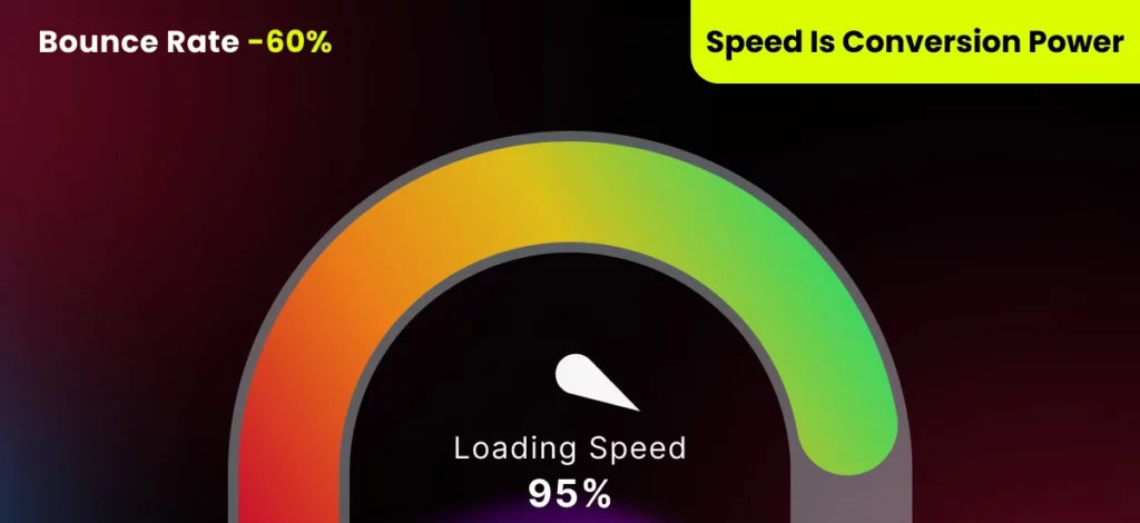
Load Speed After Optimization
Practical Implementation Steps:
- Compress and optimize images without sacrificing quality (can reduce page weight by up to 80%)
- Minimize HTTP requests by consolidating CSS and JavaScript files
- Eliminate unnecessary plugins and scripts that slow down performance
2. Create a Compelling Above-the-Fold Experience
It is proven that visitors focus most of their attention above the fold, transforming this top section into the most decisive moment for capturing user interest and preventing immediate page abandonment.
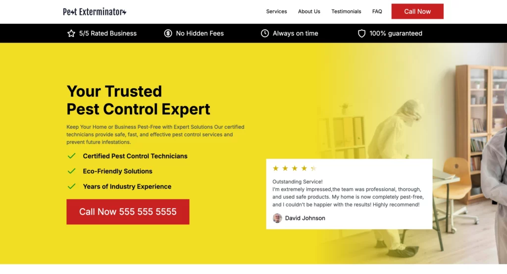
LanderLab Template Example
Practical Implementation Steps:
- Write a concise, benefit-focused headline that addresses your visitor’s pain
- Add a complementary, high-quality hero video or image that reinforces your message
- Create a clear, prominent call-to-action that shows up without scrolling
- Keep your design simple and centered with lots of white space
- Make your unique selling proposition (USP) clear from the start
Elements of an Effective Above-the-Fold Section:
- A headline that addresses a pain point or desire: “Stop Losing Sales to Abandoned Carts“
- Subheadline that expands on the benefit: “Our smart recovery system brings back abandoning customers automatically.“
- Visual element that reinforces the message: An image showing the recovery process or results
- CTA that’s clear and action-oriented: “Start Recovering Lost Sales“
💡 Struggling with High Bounce Rates?
Launch faster pages that convert better with LanderLab. Simple, effective, and built to perform.
3. Ensure Message Match Between Ads and Landing Pages
Most landing pages also carry completely different messaging than their respective ads. This inconsistency produces cognitive dissonance and is the reason why the majority of paid campaigns underperform despite quality traffic.
Practical Implementation Steps:
- Maintain visual continuity between landing pages and ads
- Use the exact keywords and vocabulary in both touchpoints
- Adhere to a particular promise made in your ad or referral link
- Make use of distinctive landing pages for distinctive traffic sources whenever possible
- Match the offer precisely without bait-and-switch
Message Match Checklist:
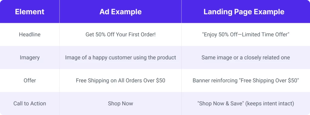
Mesagge Match Checklist
4. Implement Strategic Mobile Optimization
Today, mobile traffic is the majority of web traffic worldwide, yet few companies are sure they have a mobile landing page experience. Mobile bounce rates are usually greater than desktop.
Practical Implementation Steps:
- Utilize a responsive design that is responsive to any screen resolution
- Streamline navigation and forms to thumb-friendly interactions
- Make phone numbers and addresses tap-to-call/navigate
- Emphasize button size and spacing to avoid mis-taps
- Test your page on a variety of devices and operating systems
- Employ AMP (Accelerated Mobile Pages) for super-quick loading
Mobile-Specific Design Considerations:
- Font size: At least 16px for body copy prevents the need for zooming
- Touch targets: Links and buttons at least 44×44 pixels to ensure tap target size
- Content hierarchy: The most important content should be further up in mobile layout
- Page loading speed: Even more essential on mobile because different connections are slower
5. Use Strategic Visual Hierarchy and Scannable Content
Studies show that readers skim a few words per page. Content must be scannable to lower bounce rates in our read-skim society.
Practical Implementation Steps:
- Use simple headings and subheadings irrespective of context
- Make data easy to consume using bulleted lists
- Make top-level information stand out using bold type, color, or other visual signals
- Split text using relevant images and white space
- Keep paragraphs brief (3-4 lines max)
- Logical flow leading visitors to conversion
Skimmable Content Structure Example:
- Headline: Grab visitor attention and present major benefit
- Subheadlines: Break content into bite-sized pieces
- Bullet points: Emphasize major features or benefits
- Visuals: Display textual content and stagger text
- Testimonial blocks: Place social proof prominently
- CTA sections: Placed strategically on longer pages
A/B test repeatedly demonstrate that optimized, scannable landing pages beat out dense text versions by wide conversion margins.
6. Incorporate Relevant Social Proof
The social proof psychology is strong: customers believe in word-of-mouth endorsements more than brand communications. Did you know you can use social proof to increase your landing page conversion?
Practical Implementation Steps:
- Utilize actual customer testimonials with names and photos whenever possible
- Utilize logos of prominent clients or media mentions
- Utilize relevant trust badges (security metrics, industry affiliations)
- Highlight key figures that demonstrate results or popularity
- Add social media feeds to demonstrate positive engagement
- Use case studies or success stories for high-consideration products
Social Proof Types to Consider:
- Expert social proof: Industry expert quotations
- Celebrity social proof: Celebrity endorsements and word of mouth
- User social proof: Quotations and opinions of real customers
- Wisdom of the crowd: Emphasis on popularity scores
- Wisdom of friends: Featuring coworkers who use your product
Researchers have established that well-placed social proof signals can lower the landing page bounce rate and boost average order values.
7. Optimize Form Design and Length
Forms are usually the last hurdle to conversion, and their design can make or break your bounce rate. Minimizing form fields will dramatically improve conversions.
Practical Implementation Steps:
- Request only information that is absolutely required at this point in the customer process
- Split longer forms into more steps with progress indicators
- Enable autofill function wherever possible
- Implement inline validation to prevent errors from happening in the first place
- Display clear and useful error messages instead of technical ones
- Put forms in their place in the refinement of your offer
Form Optimization Best Practices:
- Use logical field grouping to reduce cognitive load
- Make button text action-oriented: “Get My Free Guide” vs. “Submit”
- Consider removing non-essential fields like “Company Size” or “Phone Number” for initial conversions
- Test multi-step forms against single-step forms for your specific audience
Studies have found that many users abandon forms because they’re “too long,” making form optimization one of the highest ROI activities for reducing bounce rates.
8. Implement Persuasive Microcopy
Microcopy the small instructions and encouragement words surrounding your underlying content. This can dramatically influence conversions and bounce rates. An extremely well-optimized microcopy can substantially boost conversions.
Practical Implementation Steps:
- Put reassuring words under form fields: “We respect your privacy and never spam you.“
- Put benefit-focused hints: “Put in your email to get instant access.“
- Put action-specific button labels: “Start My Free Trial” instead of “Sign Up”
- Use scarcity or urgency language if needed: “5 left” or “offer ends tomorrow.“
- Provide helpful tooltips if needed for complicated fields or jargon
- Make all of the microcopy your brand voice and sound like it’s authentic
High-Impact Microcopy Locations:
- Form field labels and help text
- CTA buttons and surrounding text
- Modal windows and pop-ups
- Error messages
- Success confirmations
9. Create Clear and Compelling CTAs
Call-to-action buttons are the critical conversion points on your landing page, and their design and placement can dramatically impact bounce rates. Personalized CTAs perform better than default versions.
Practical Implementation Steps:
- Use action verbs that create momentum: “Get,” “Start,” “Discover,” “Join”
- Make buttons visually distinctive with contrasting colors
- Size buttons appropriately for easy clicking (minimum 44x44px on mobile)
- Include directional cues like arrows pointing toward CTAs
- Position primary CTAs in natural eye-flow paths
- Consider using secondary CTAs for different stages of buyer readiness
CTA Best Practices by Industry:
- E-commerce: Focus on action + benefit: “Shop Now and Save 20%“
- SaaS: Emphasize ease and low commitment: “Start Your Free Trial“
- B2B: Address business pain points: “Boost Your Team’s Productivity“
- Local businesses: Highlight immediacy: “Book Your Appointment Today“
Research has found that first-person phrasing on CTAs (“Start My Free Trial” vs. “Start Your Free Trial“) can increase click-through rates in many industries.
10. Use Exit-Intent Strategies to Recover Bouncing Visitors
While the first nine methods aim to prevent bounces, the last method has a second chance to convert an already-intending-to-leave visitor. The exit-intent popup has also been proven to reclaim a significant percentage of would-be lost visitors.
Practical Implementation Steps:
- Trigger gentle popups or overlays when users display exit intent (moving cursor toward browser controls)
- Provide a sound reason to stay behind: discount, free resource, or just a conversion offer
- Make exit offers pertinent to the interest shown by the visitor
- Experiment with various kinds of incentives for various audience segments
- Provide an easy way to close the popup without annoyance
- Use progressive exit intent that displays varied offers on repeated exit attempts
Effective Exit Intent Offers:
- First-time visitor discount: “Wait! Get 10% off your first order.“
- Lead magnet: “Before you go, grab our free guide to [solving relevant problem].“
- Simplified conversion: “Not ready to buy? Join our newsletter instead.“
- Survey: “Help us improve! What brought you here today?“
Bringing It All Together: The Holistic Approach
The combined impact of all ten methods is strong: Organizations that employ all ten methods have experienced substantial bounce rate decreases and conversion improvements.
Implementation Timeline:
- Immediate fixes (Week 1-2): Fix technical issues such as page load time and mobile responsiveness
- Short-term gains (Week 3-4): Refresh messaging, imagery, and layout to enhance scannability and salience
- Mid-term optimization (Month 2): Apply form optimization, microcopy refinement, and CTA optimization
- Long-term plan (Month 3+): Embrace the testing program and keep iterating with feedback.
Conclusion
Landing page optimization is about converting visitors into customers. It’s one of the highest-leverage digital marketing activities.
Companies that optimize landing pages see a good ROI on those efforts, said those who do.
By building fast-loading landing pages that are easy to communicate, match visitor intent, function on all devices, display data well, establish trust by showcasing social proof, facilitate conversions with optimized forms, inform users with purposeful microcopy, influence action with compelling CTAs, and re-engage bouncing visitors with exit intent strategies, you’ll not only lower bounce rates, but you’ll also develop a deeper connection with your audience that drives long-term business growth.
Keep in mind that optimization is a process, not an end.
The digital landscape and user expectations are constantly changing, so continuous monitoring of your landing pages becomes vital to effective marketing.
Armed with these advanced techniques and the right tools, such as our landing page builder, you are well-equipped with the information to craft landing pages that engage, convert, and produce fantastic results in this age of competition in the digital world.


